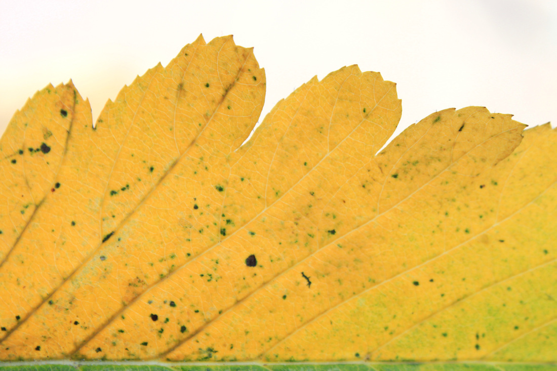
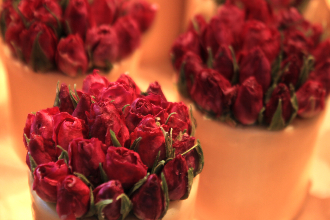
Texture and SurfaceAims: I wanted to take photo's of brightly coloured photo's that present a combination of different texture and surfaces.
Process: I took photo's outdoors in natural sunlight of objects that I felt really captured the essence of a combination of strong textures.
Critique: Although I really like the extent of detail in each photo I would prefer to produce an outcome where the photo's are unidentifiable, for example, a crack in a wall to look like a crack in the earth taken from a great distance. Further Development: If I was to further develop this set I would ensure the photo's I was taking were more complex to look at, I would zoom as close as I could to the object in order to keep it's true identity a mystery. |
|


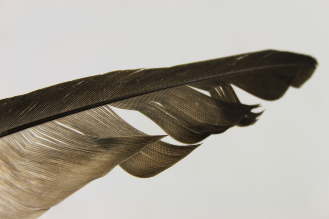
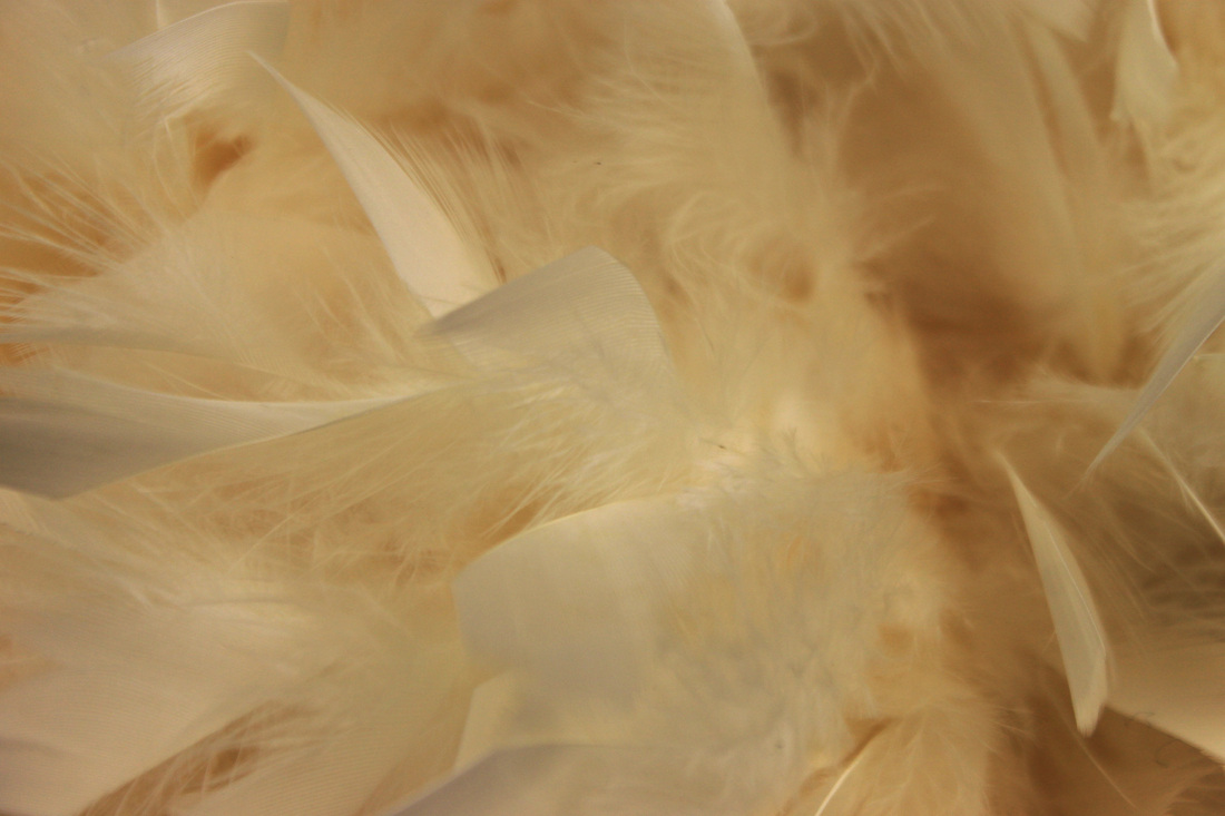
Close up of textured objects - using studio lighting:Aims: I took a set of photo's using the studio, of a variety of different textures. I tried to vary the objects used in order to produce a contrasting set with a variety of different colours and textures.
Process: I took this set using the studio. I ensured that, for most of the objects, only the object was photographed to avoid any distracting background colour or shapes. I also like photographing up close, because if the object is unusal enough (perhaps not a plastic bag) it's difficult to establish what the object is!
Critique: Although I managed to create a set with a variety of different textures, I feel that the objects used are very boring! and lack interesting shape. Further Development: If I was to further develop this set I would use a variety of more vibrant objects wit more unusual shape to them! |
       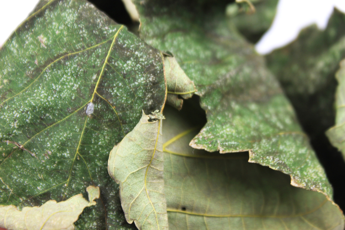     |
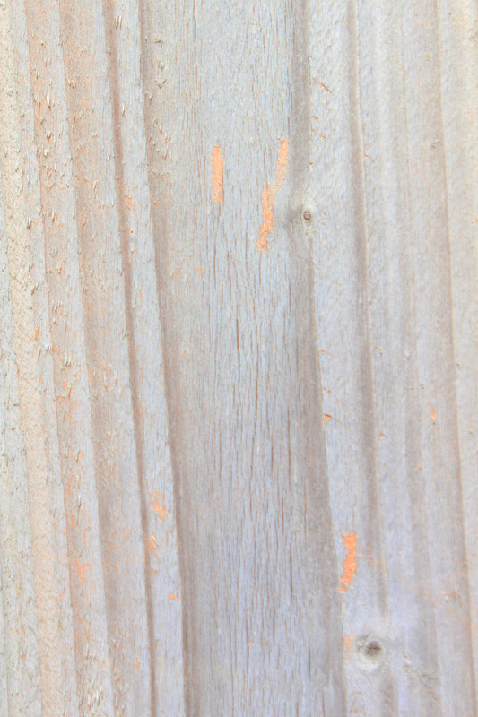
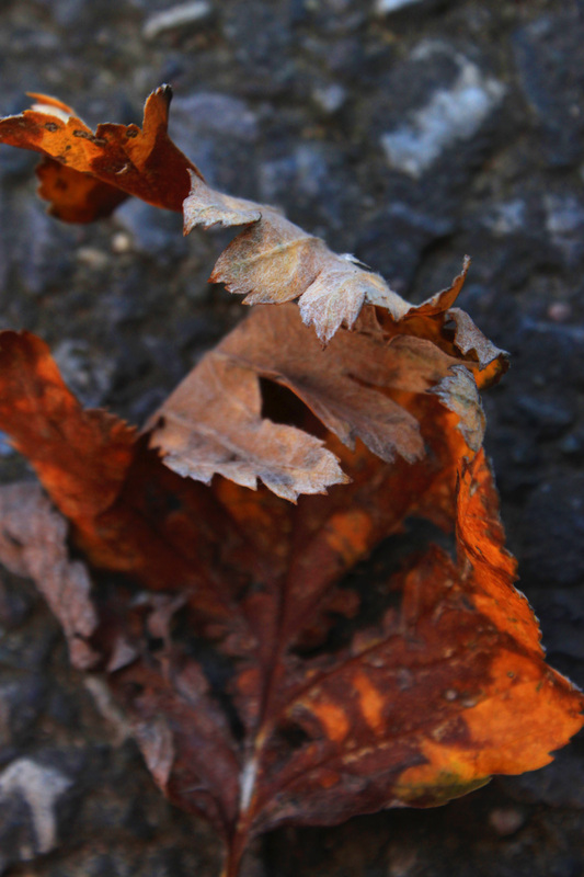
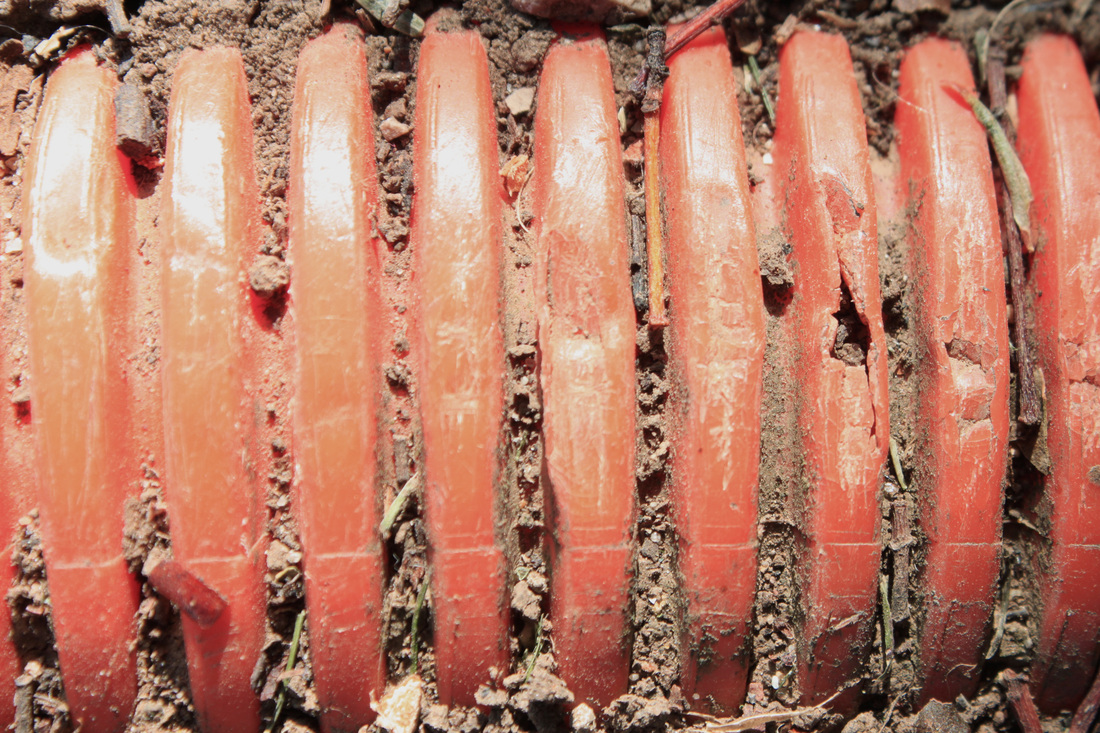
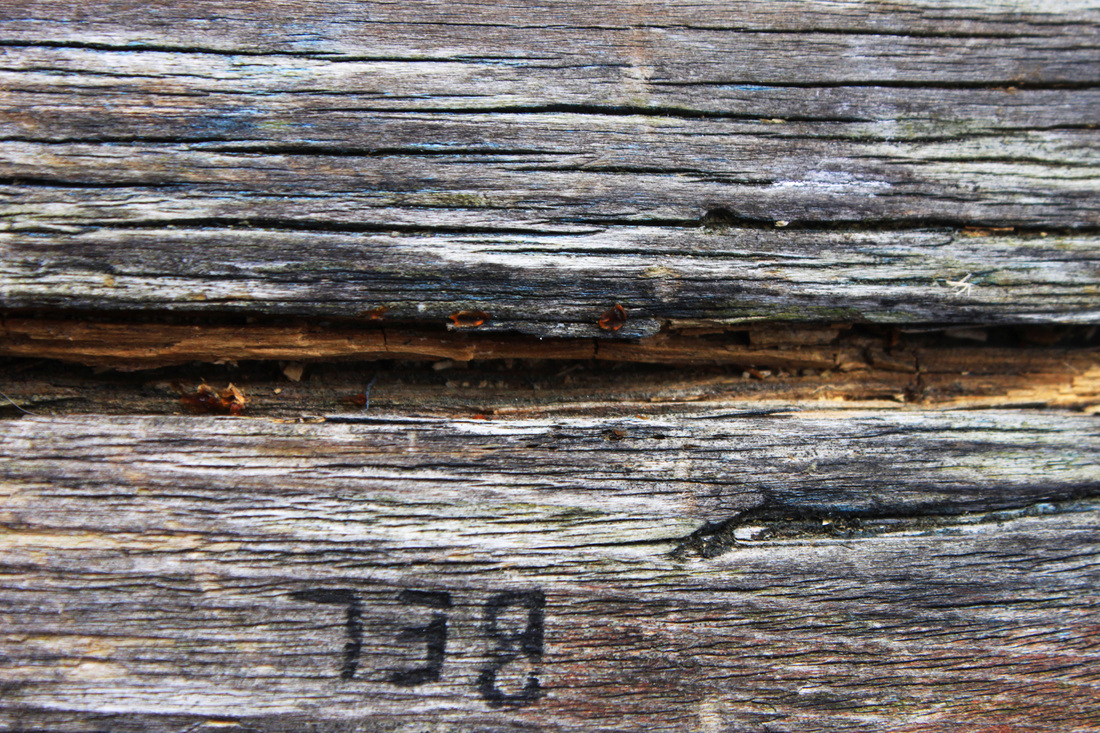
Outdoor close up texture:Aims: I took a set of photos of outdoors objects that I came across in London. Some of the objects I photographed because I liked the vibrance and strong sense of texture, but other I liked the fact that when they were photographed up close it was quite difficult to establish what they are.
Process: I took outdoors photos in daylight, all the objects and surfaced photographed were photographed spontaneously. I tried to photograph objects and surfaces that I felt held a strong and interesting sense of texture. For some of the photo's, particularly the last 4, I tried to go for the effect of photographing objects so closely that a viewer would find it difficult to establish what the object of surface was. Something that create questions when looked at.
Critique: Further Development: It can get very repetitive photographing outdoors objects and surfaces that capture a strong sense of texture. Instead of photographing objects I find, I would like to be in charge of the composition of my photos. Putting contrasting textured objects together and photographing them under studio lighting would be something I would prefer to do, rather than relying on finding something interesting to photograph in the street. |
|

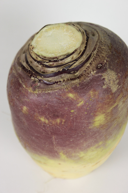
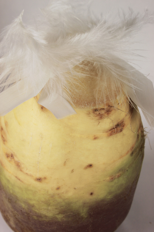
Life of a Swede:Aims: As I stated above, I wanted to take a set of photos that represent contrasting textures. I decided to take photos using a swede. Obviously a swede lacks in variety and is a bit of a boring shape to photograph but I liked the strong texture represented through the interesting indents in the top of the vegetable. I tried to capture the sense of contrasting texture by adding pins, paper clips and feathers into the photo. I used studio lighting in order to avoid shadowing, I also used a white backdrop to create the feeling that the swede was being photographed in an apetising way, obviously this was ironic because a raw swede looks far from apetising.
The only other texture I liked with the swede was the feather, but even then it doesn't create a very interesting photo. Process: I took the photos in the studio using strong lighting and a white backdrop. I used a tripod so I could use a slow shutter speed without getting a blured effect. I also used a low ISO in order to achieve clear focus. I zoomed in very close in order to get as much detail from the swede as possible.
Critique: A swede hasn't got much personality to it and is quite a boring object to decide to photograph, the shape lack of shape doesn't create a very eye catching photo. Further Development: If I was to further develop this set I would definitely chose a more vibrantly coloured object, with more shape to it! As I want to create a final piece that holds a strong sense of contrasting texture I would chose more interesting objects to contrast with one another such as pepper and barbed wire, something that will stand out and look unusual when photographed. |
|


|
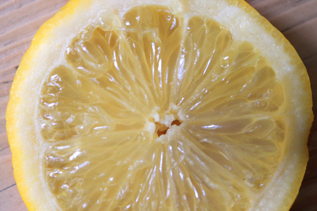
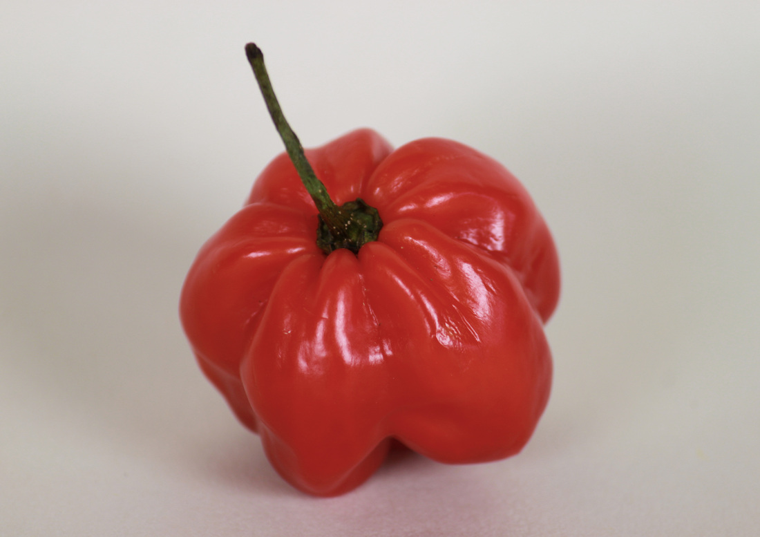
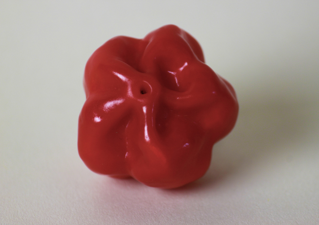
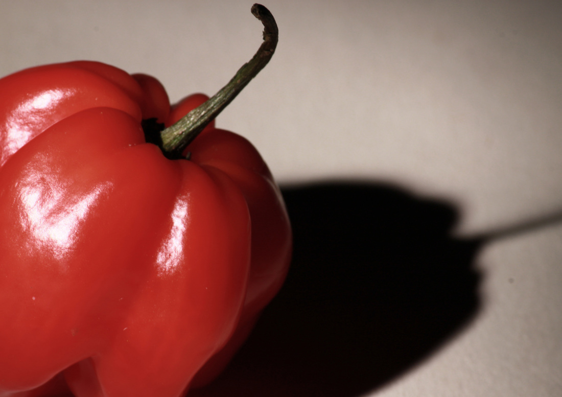
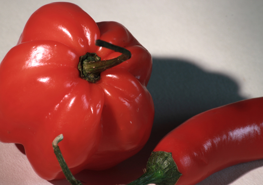
Aims: I wanted to try and take photo's of a slightly more interesting fruit/vegetable. Something with more character than a swede.
Process: I took a set of photo's using the studio and tried to achieve a better and more unusual effect than produced by the photos taken of the swede. Critique: Obviously a pepper and a chilli is more vibrantly coloured than a swede, however I still don't particularly like the photos produced. They lack character. Even the close up photos of the swede are more interesting than these photos. Pepper and chilli don't have very interesting texture, they're smooth and don't produce a very interesting image in a textural sense. Further Development: I don't think I would further develop this set as I haven't been impressed with the outcome each time I have taken photo's of vegetables/fruit. But if I was to further develop it I would take close ups of objects (like the swede) that are so close up that they make the photo unrecognisable as an object. |
    |
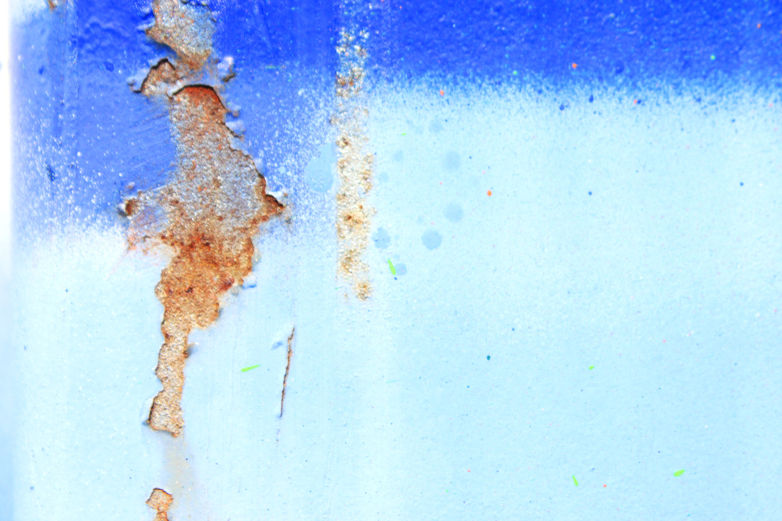
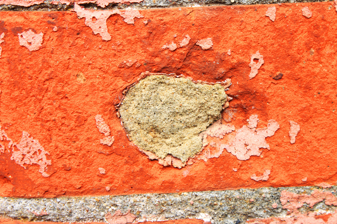
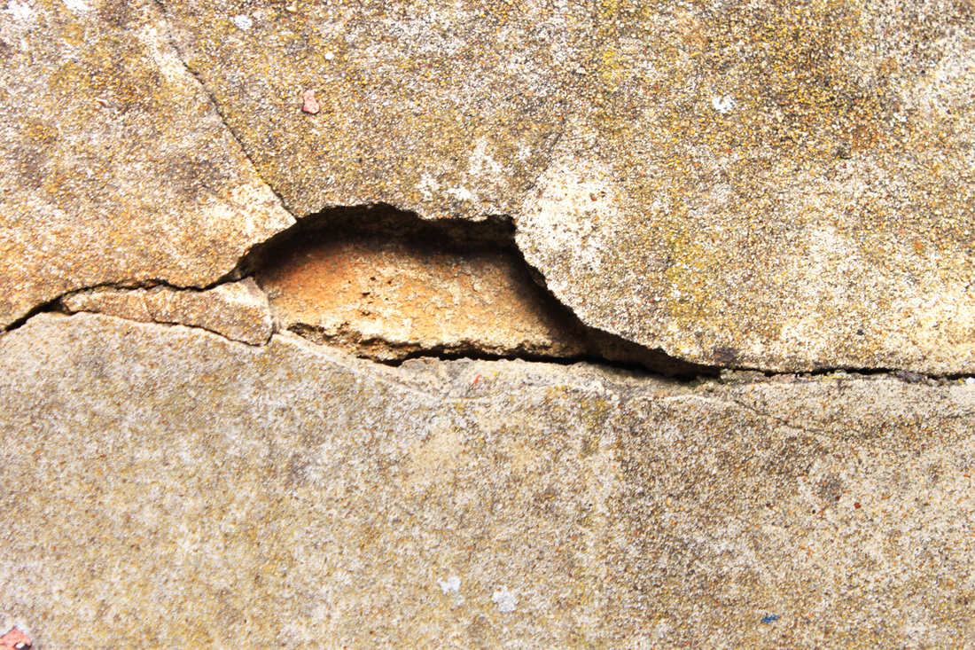
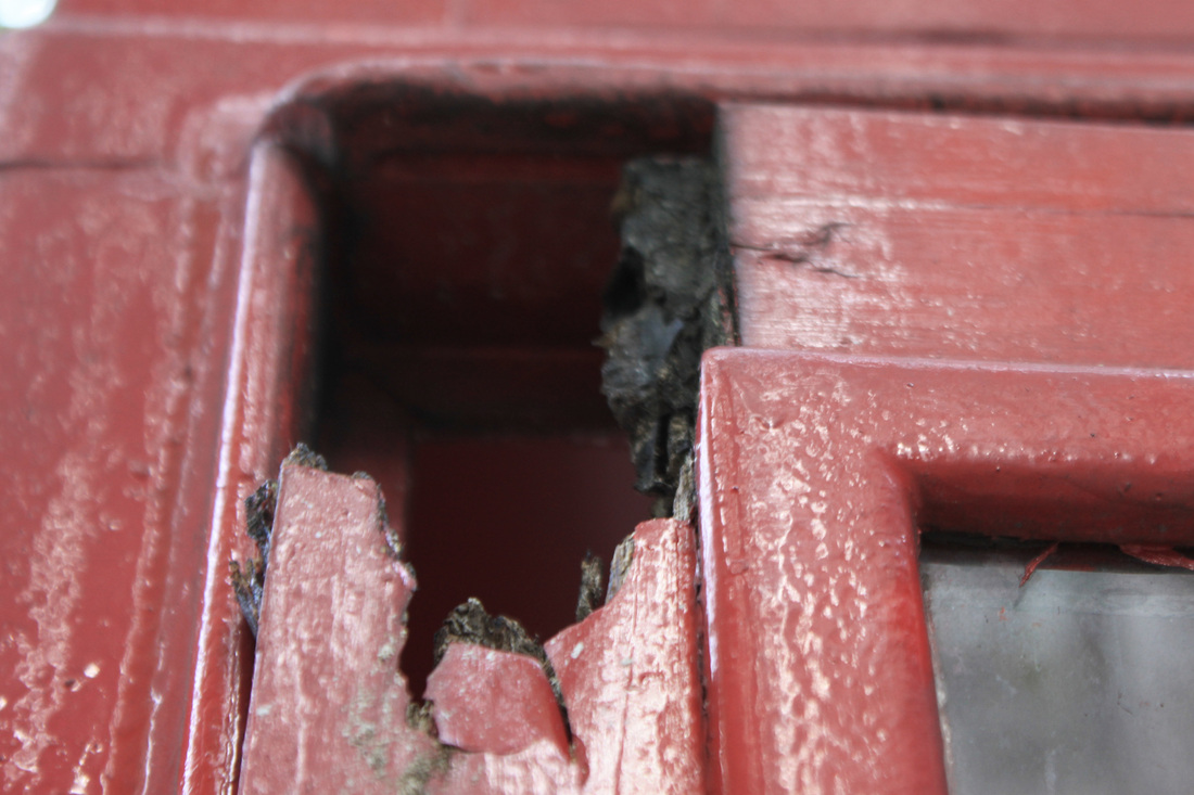
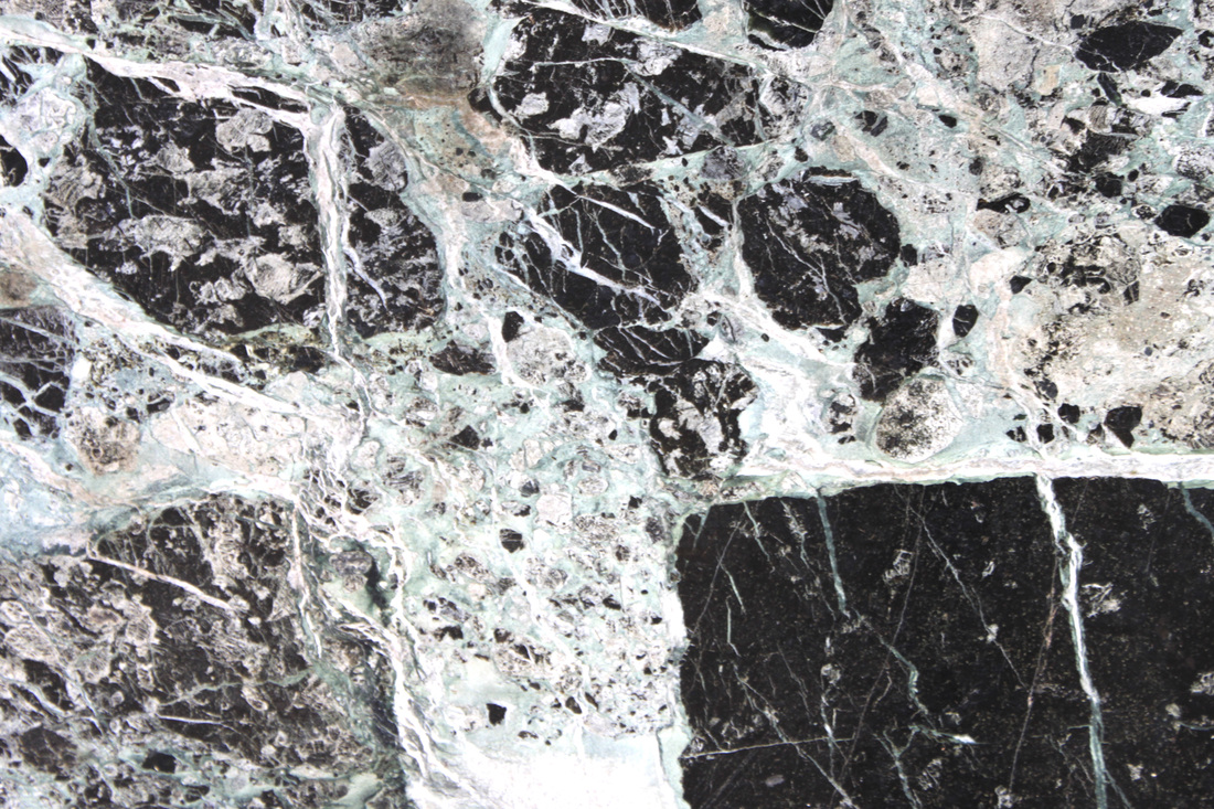
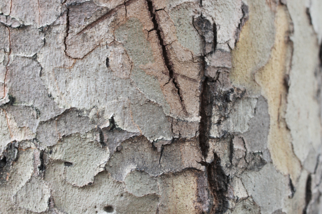
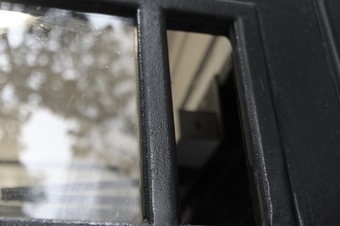
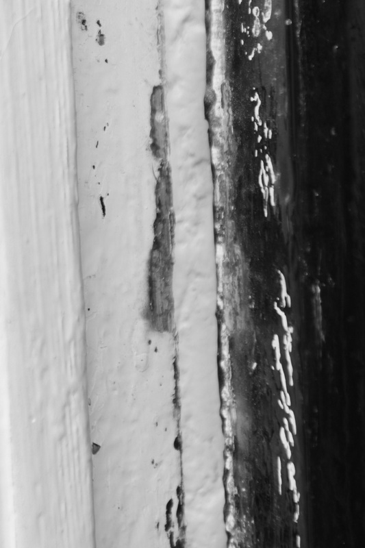
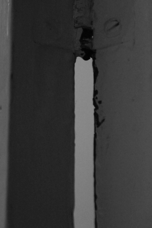
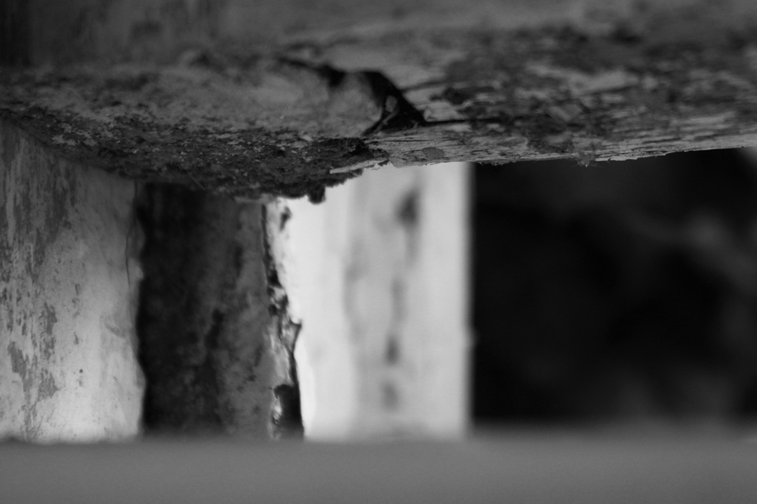
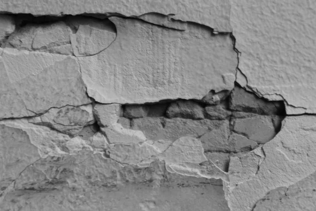
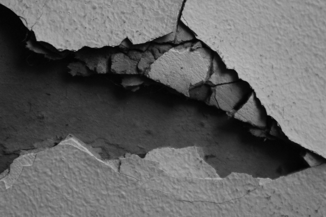
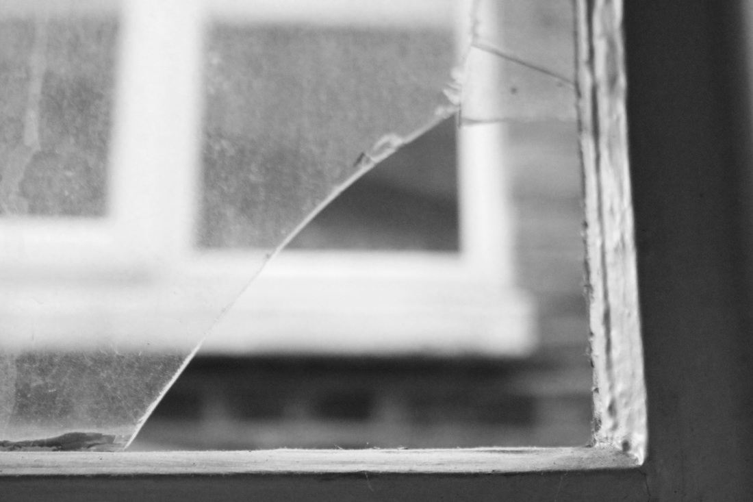
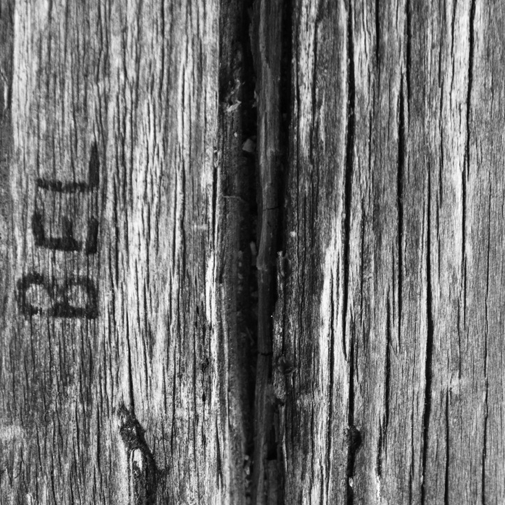
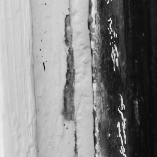
Decay and Erosion- First set:Through taking various different photos of textural objects and surfaces I came to the conclusion that I COULD continue to take random photo's of objects that I feel represent a strong sense of texture or I could refine my ideas and choose one set theme to focus on within my theme of texture. I have decided on Decay and Erosion as a starting point. Aims: My aims for this set was to create a strong sense of age and decay through close up photography of eroding objects. Process: I took photo's of cracks in the wall, eroding paint and worn down paint. During photographing these objects and surfaces I discovered I really liked the effect created when photographing through a hole, a couple of the above photos are taken through a window with the foreground in focus and the background out of focus. I like the strong sense of depth of field that is created through this technique. I then edited all the photo's on photoshop adjusting the contrast and turning them black and white.
Critique: I really like the effect that is created from the photo's taken through a gap, It adds a lot more depth to the photo rather than just photographing a flat surface. Further Development: If I was to further develop this set I would continue to take photo's playing with depth of field. I would try out different editing techniques and have some photos with a stronger sense of colour rather than black and white. |
|


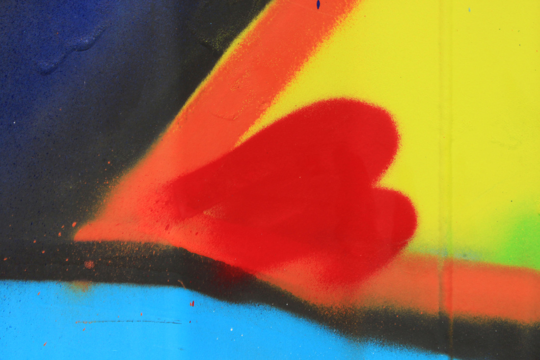
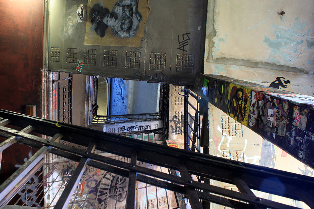
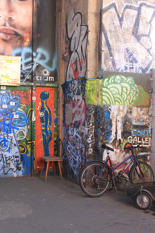
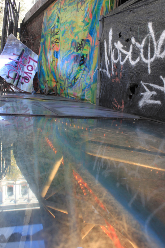
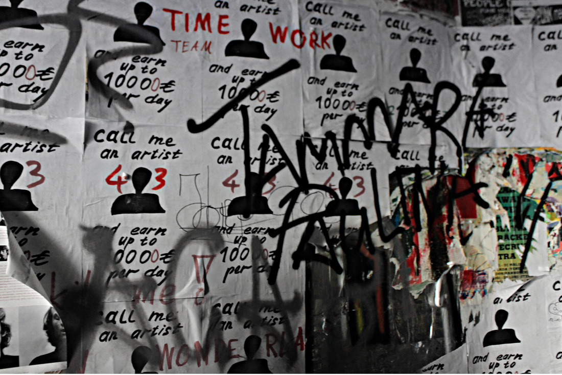
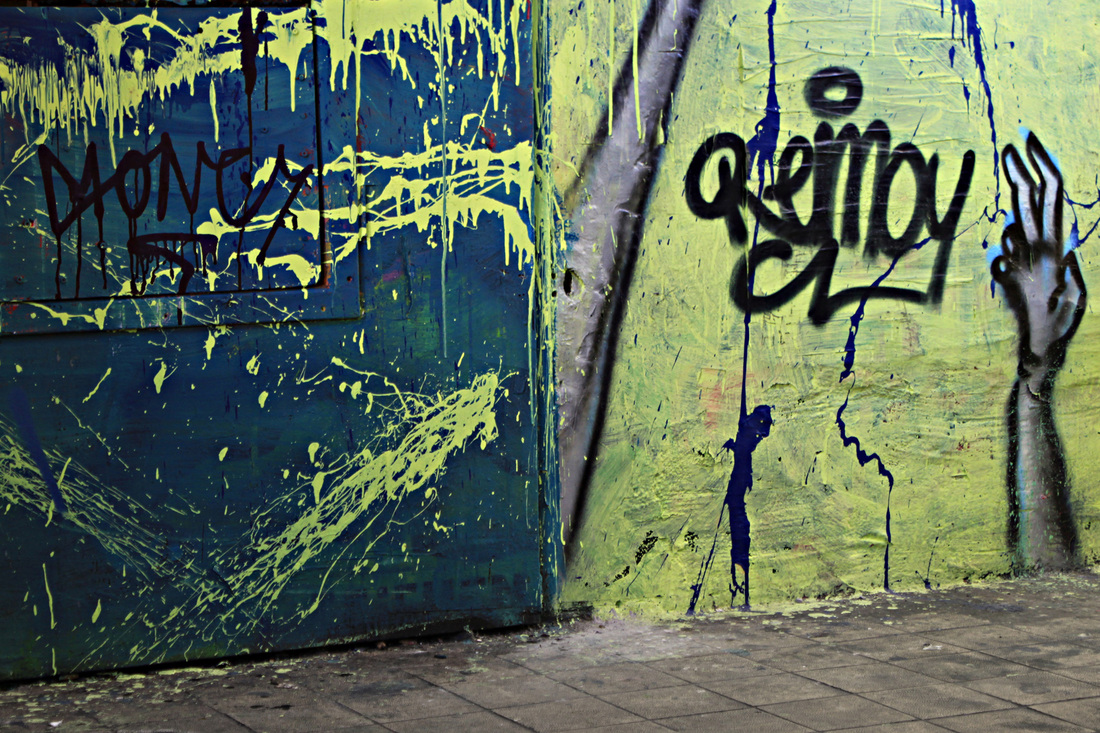
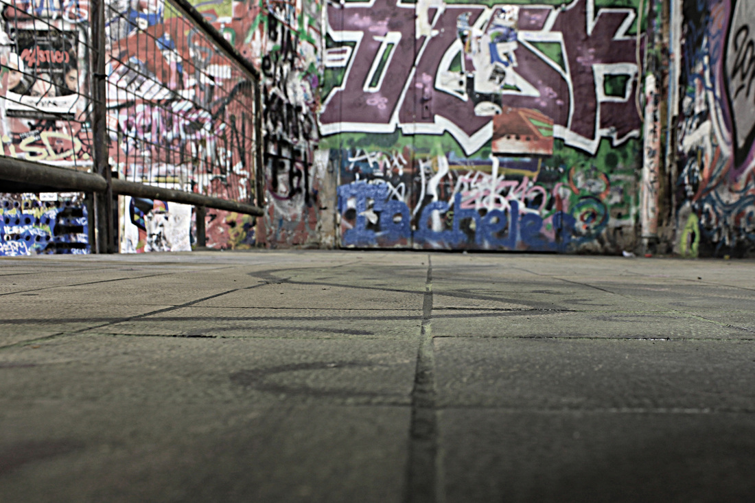
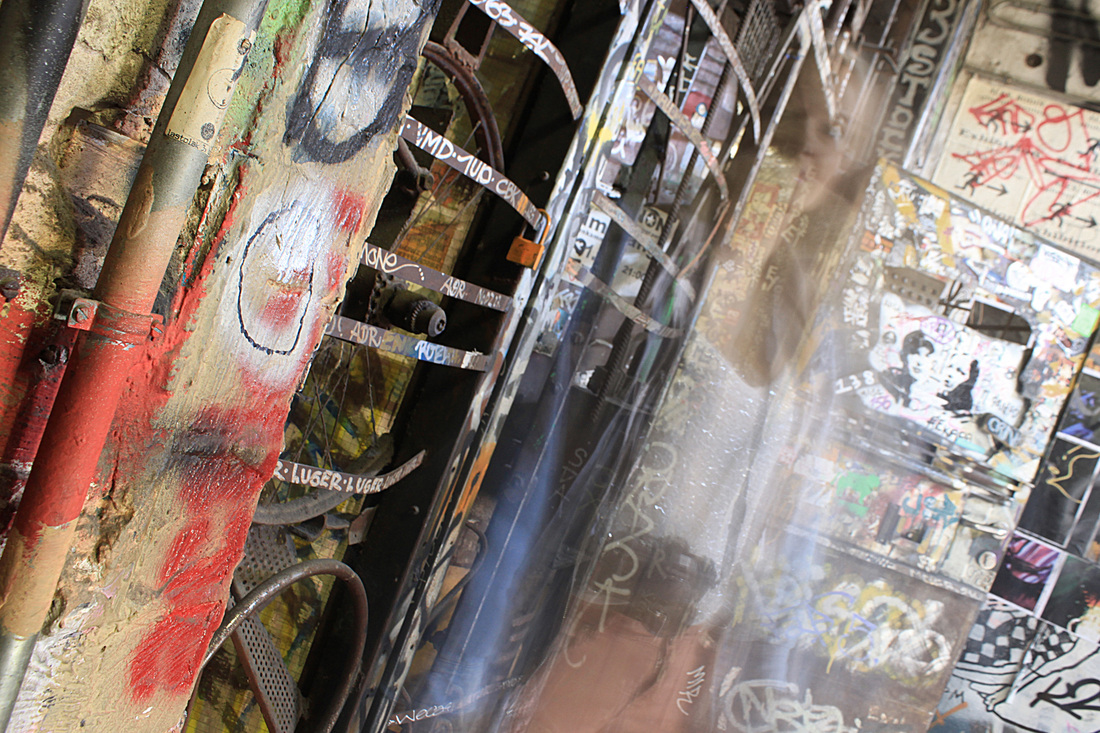
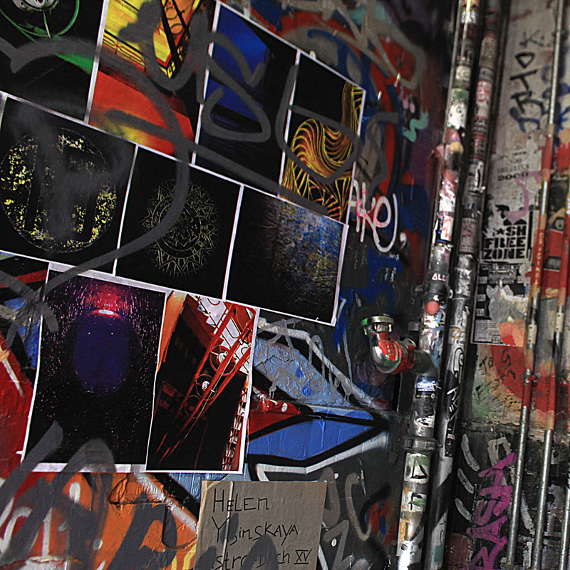
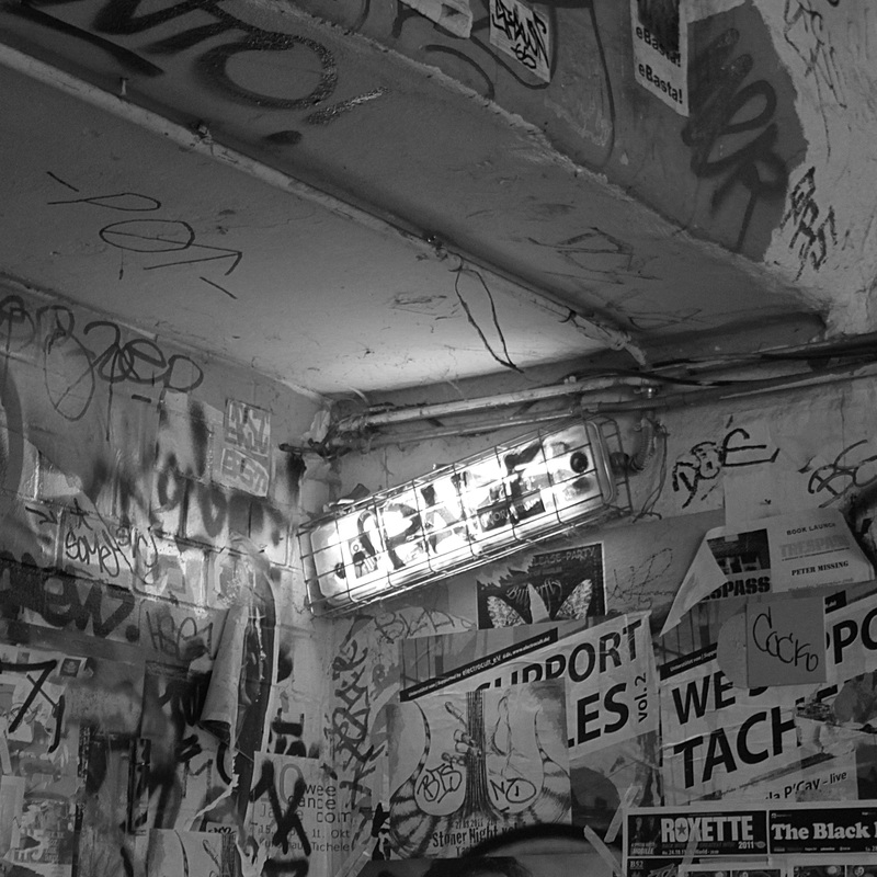
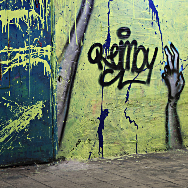
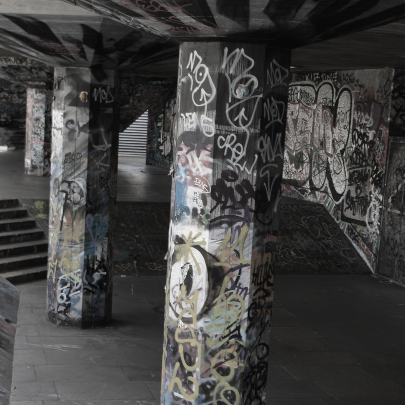
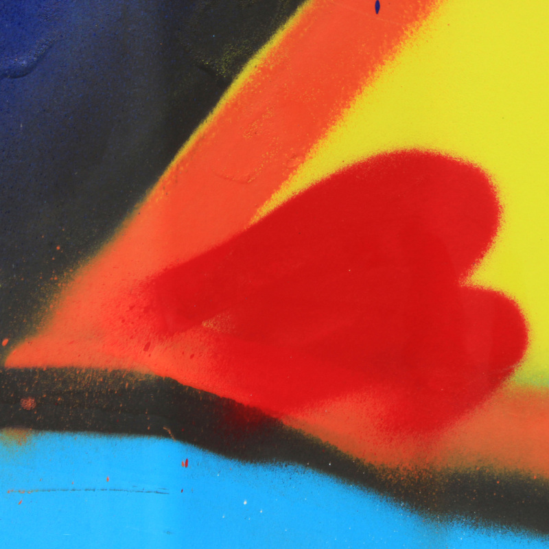
Grafitti from Berlin:
|
|


Final photos - 3x3 layout:
Comments:
I decide on using these photos for my final set as they were my favourite.
I tried to compose my photos in the best and most effective possible way, I thought the middle photo would make a good centre point, I then positioned the photos with low saturation in either side of the centre photo. I ensured there was some sort of order to the way my final piece was composed, to avoid the composition looking 'messy'.
I couldn't decide whether I wanted to have my photos in black and white like Paul Politis's work or very vibrant like Barry Lewis's.
Therefore I chose to include a selection of de-saturaed photos as well as very vibrant ones.
It was difficult to combine such a mixture of differently saturated photos and make them work well together but I think my choice of composition ensured this wasn't a problem.

New branch - experimenting with collages on photoshop:
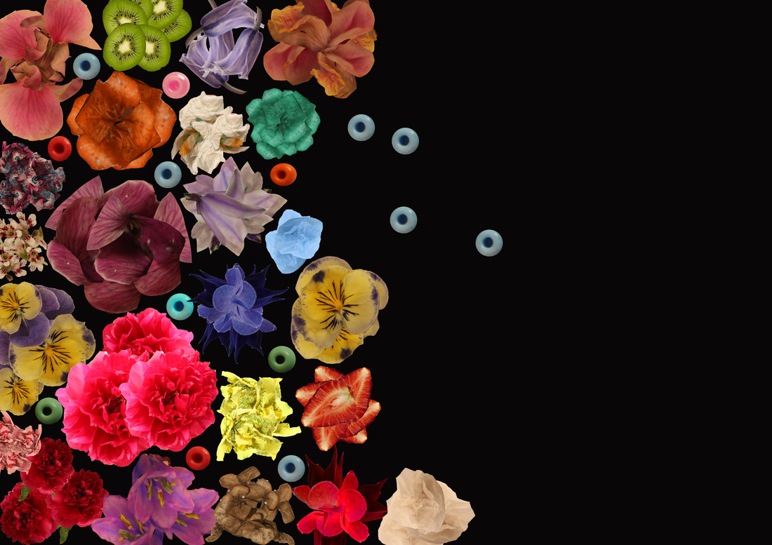
Research - lisa creagh:
Creagh is an artist/photographer. In the below photo collages she has used individual photographs of flowers and edited them to make brightly coloured collages on a black background.

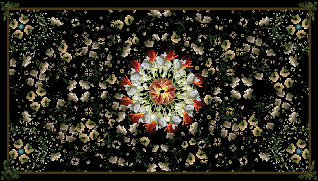
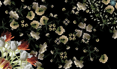
Comments: I particularly like the middle collage as I feel the first one seems a little empty, almost unfinished and the third lacks in symmetry.
I feel the black background works very well with the colour contrast of the brightly coloured flowers, resembling a kaleidoscope pattern. The collages are very hypnotising. I am impressed that such a simple idea can look so effective and would definitely like to try out my own flower collages.
I feel the black background works very well with the colour contrast of the brightly coloured flowers, resembling a kaleidoscope pattern. The collages are very hypnotising. I am impressed that such a simple idea can look so effective and would definitely like to try out my own flower collages.
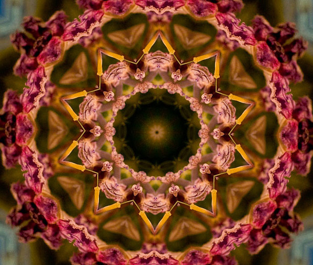
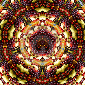
Research - Kaleidoscope pattern:
During research into the different photography people have produced in response to Kaleidoscope patterns I came across the below images which helped give me ideas into the different types of patterns I could produce in this similar style.
I like the last pattern as it's made up of different types of fruit which I think is very unusual, you cannot tell it is fruit unless you really examine the pattern closely. However, I feel the pattern is a little 'busy'. Overall I prefer Lisa Creagh's flower collages as they achieve a similar look to the Kaleidoscope patterns without coming across as too busy, the black background nicely breaks down the business of the image.
I like the last pattern as it's made up of different types of fruit which I think is very unusual, you cannot tell it is fruit unless you really examine the pattern closely. However, I feel the pattern is a little 'busy'. Overall I prefer Lisa Creagh's flower collages as they achieve a similar look to the Kaleidoscope patterns without coming across as too busy, the black background nicely breaks down the business of the image.
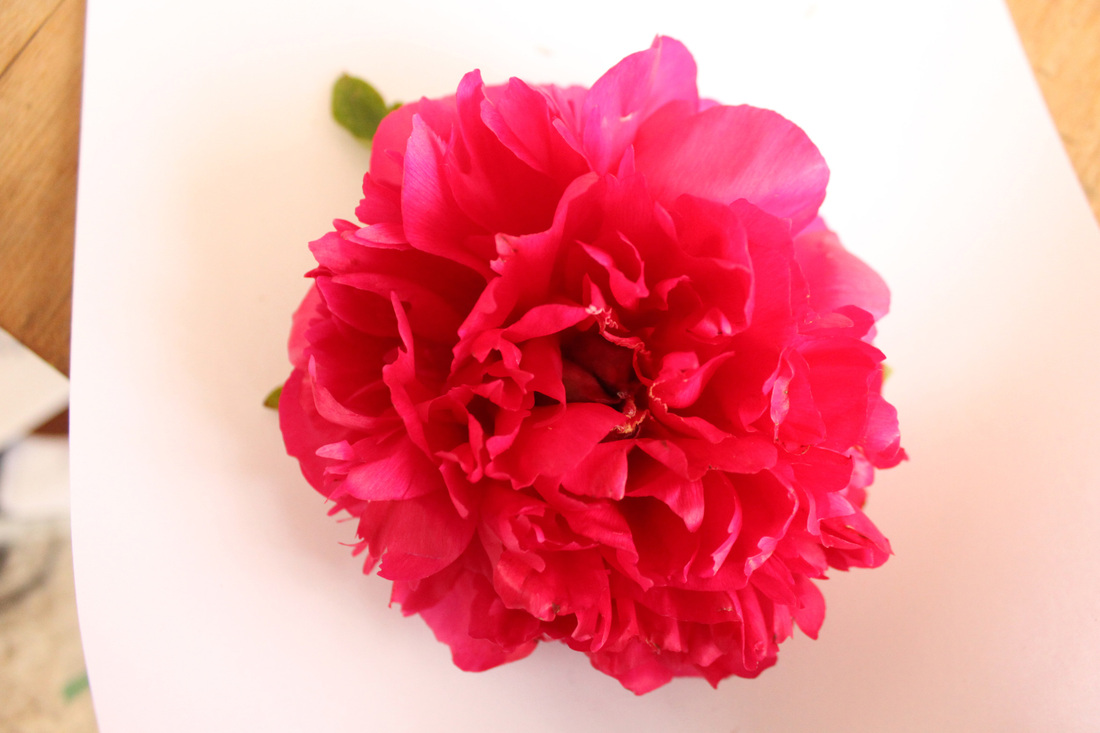
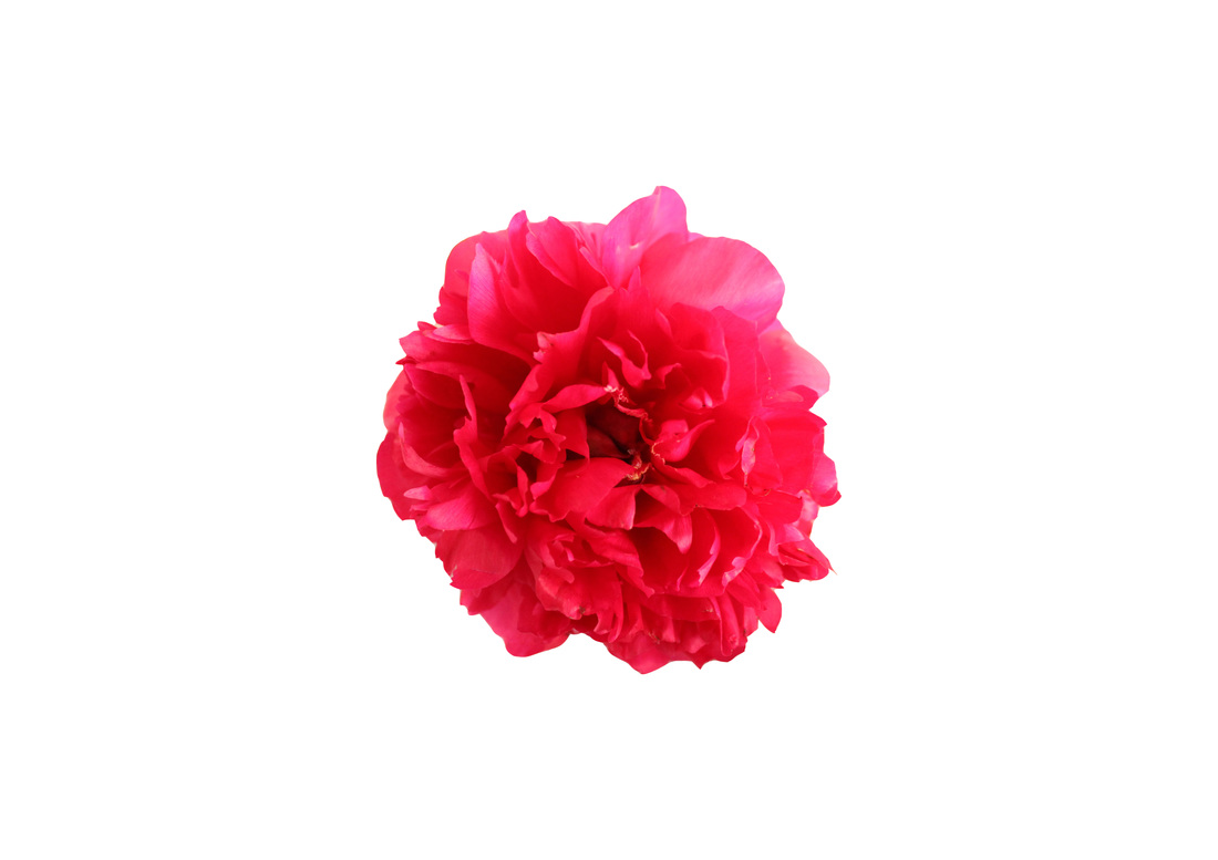
Own photography - Single shots - flowers/beads/paper:
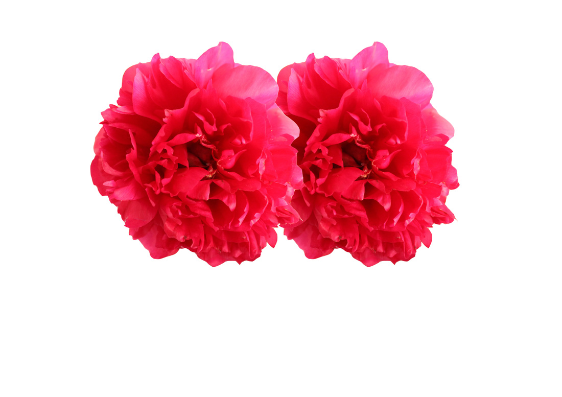
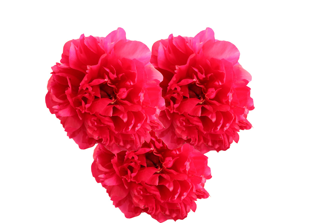
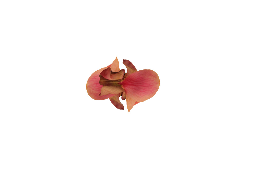
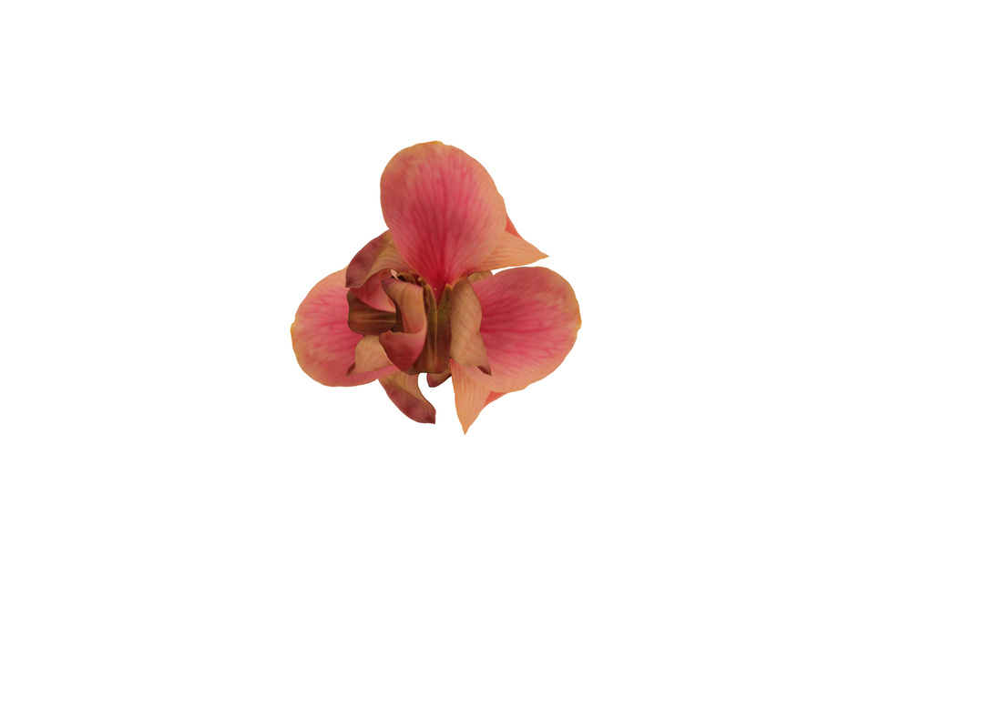
Aims: In this set I aimed to take individual photos of both synthetic and real objects (vibrantly coloured) which I will then make into a collage on photoshop.
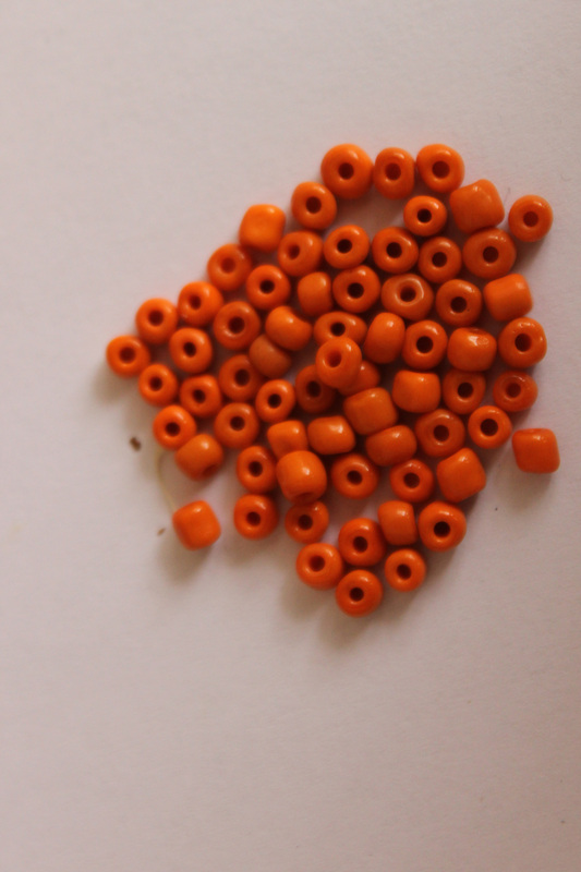
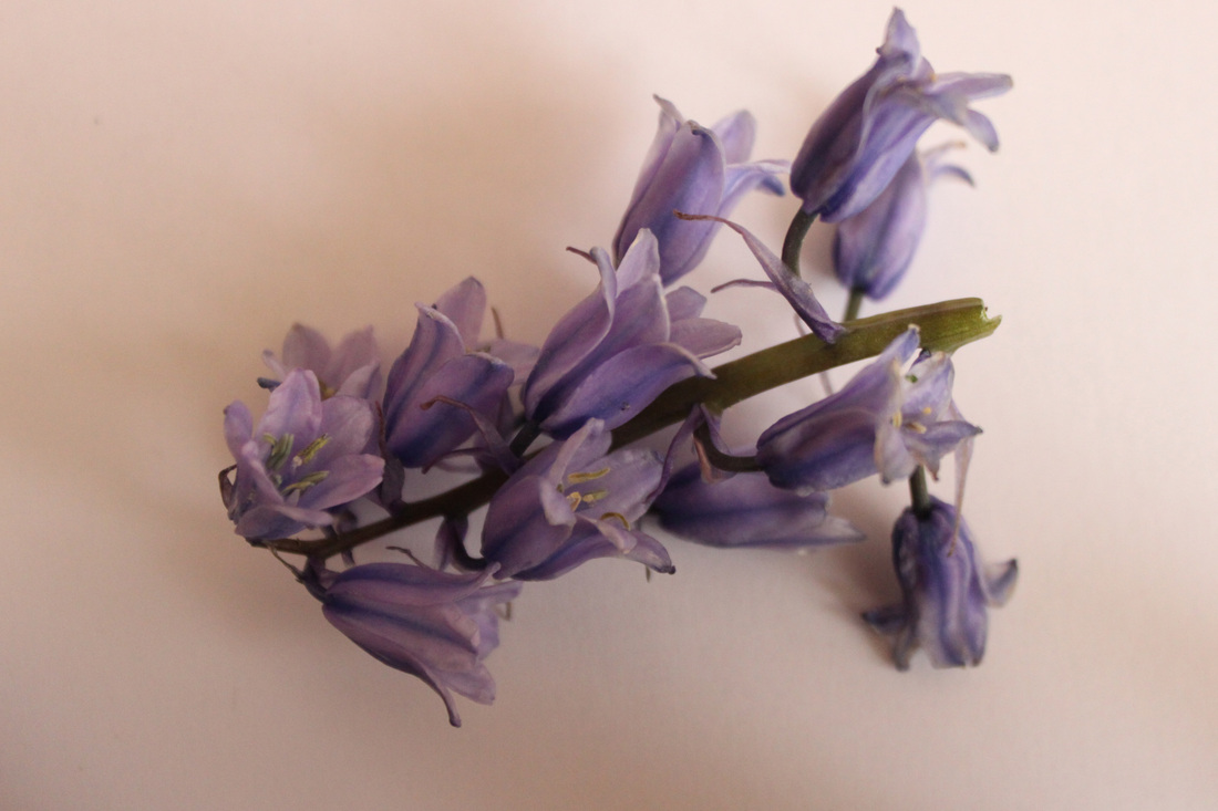
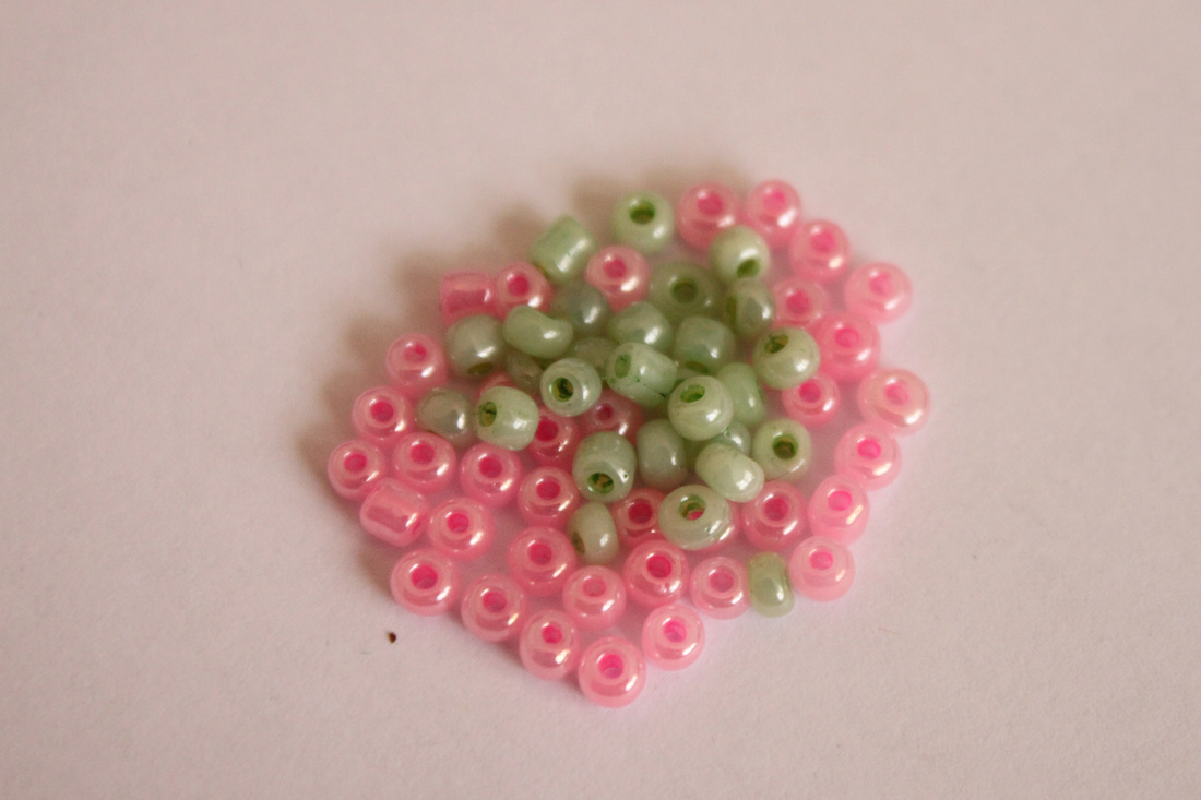
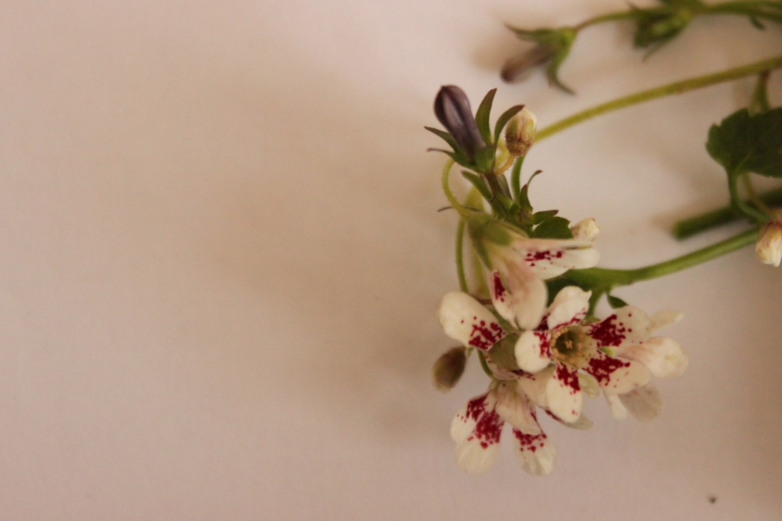

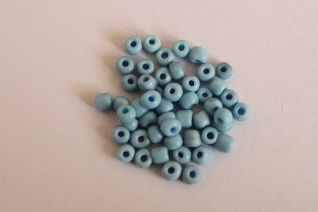
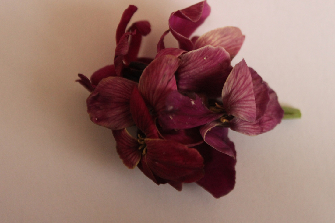
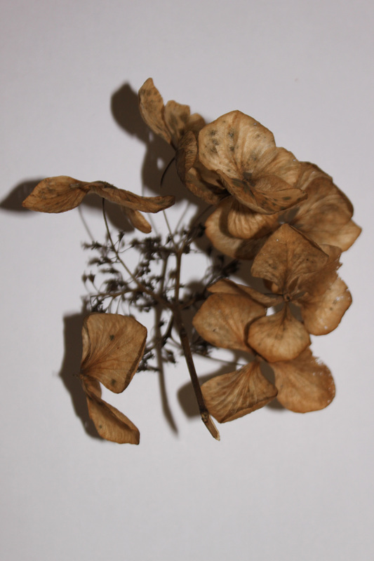
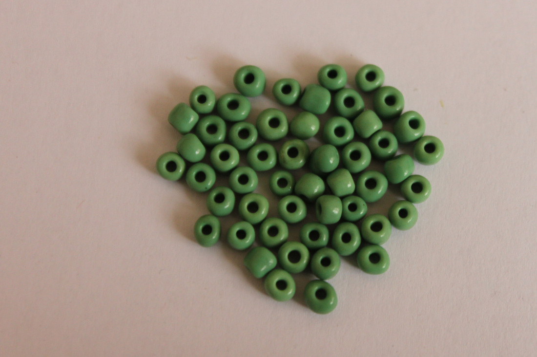

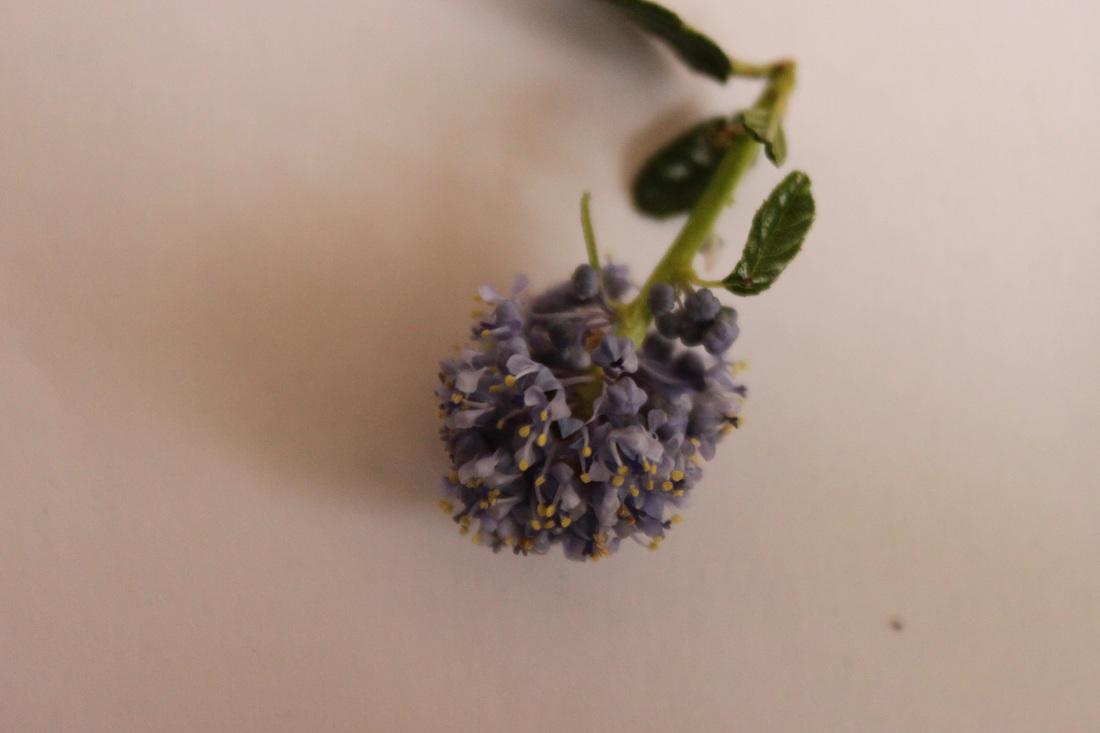
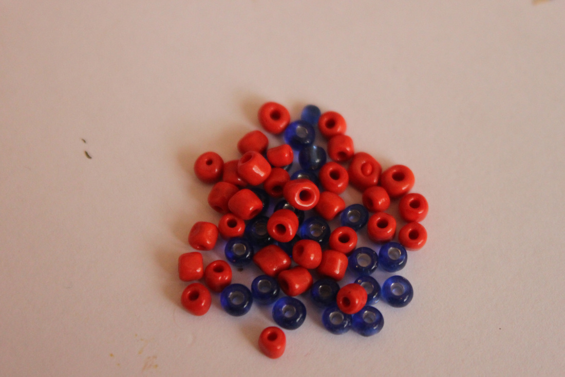
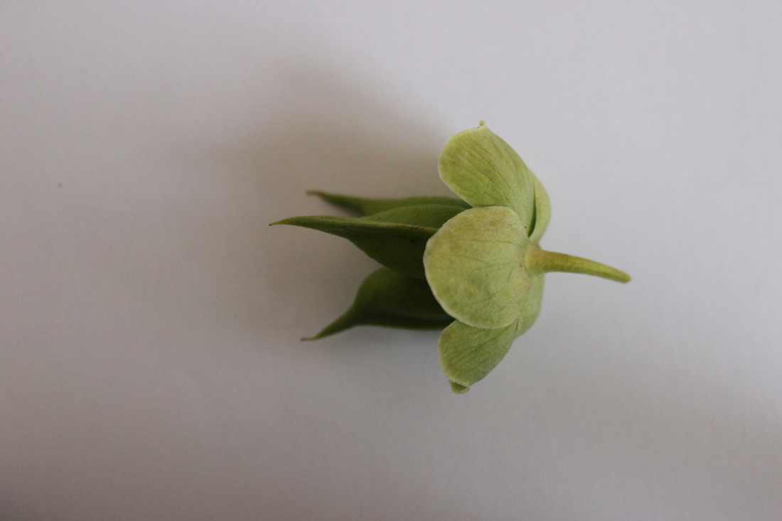
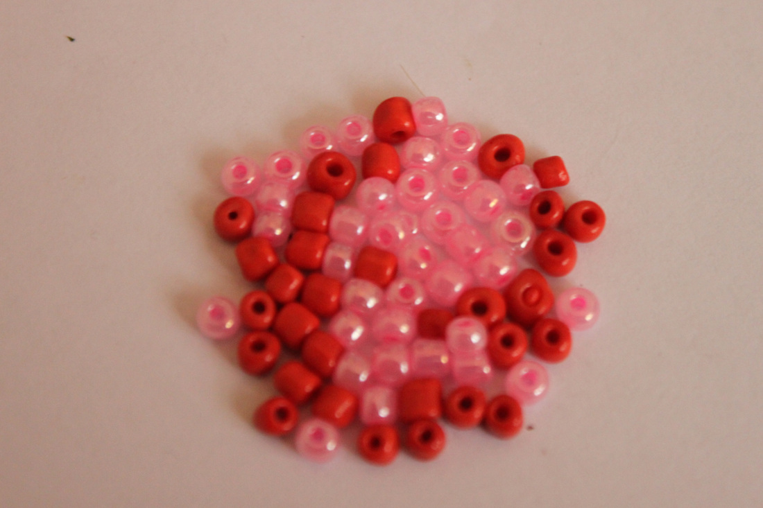
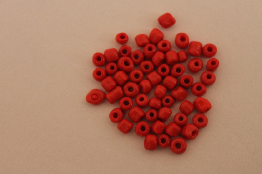
Process: I took close up photos of flowers, beads and scrunched up paper using natural lighting and a white background. I wasn't really too bothered about the quality of the images as I would be making them into a collage where they are cropped to a very small size, however I wanted to achieve clarity on the vibrant colours.
Critique: I feel this set could have been taken in better lighting and better quality, the beads were very hard to focus as they're so small and I took the photos inside so I couldn't achieve natural lighting.
Further Development: If I was to further develop this single shots I would take more photos and attempt to take them at a better quality using natural light to achieve a more vibrant outcome.
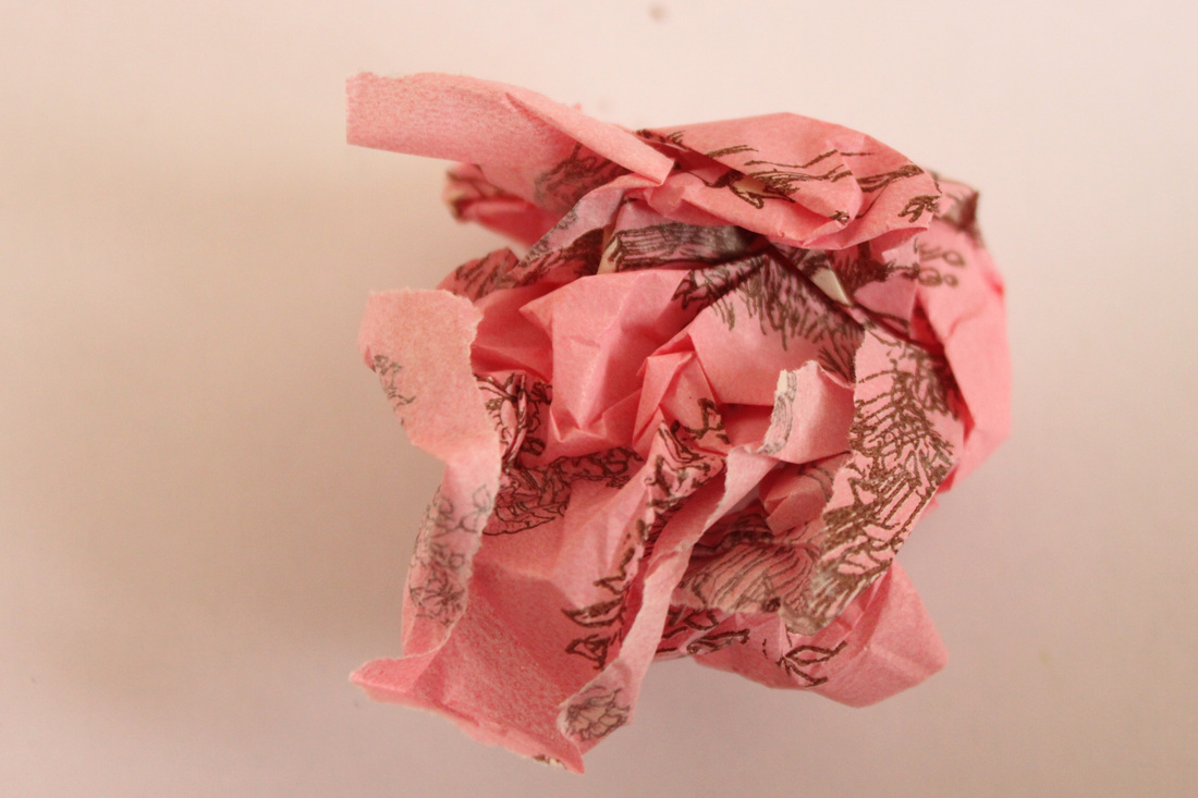
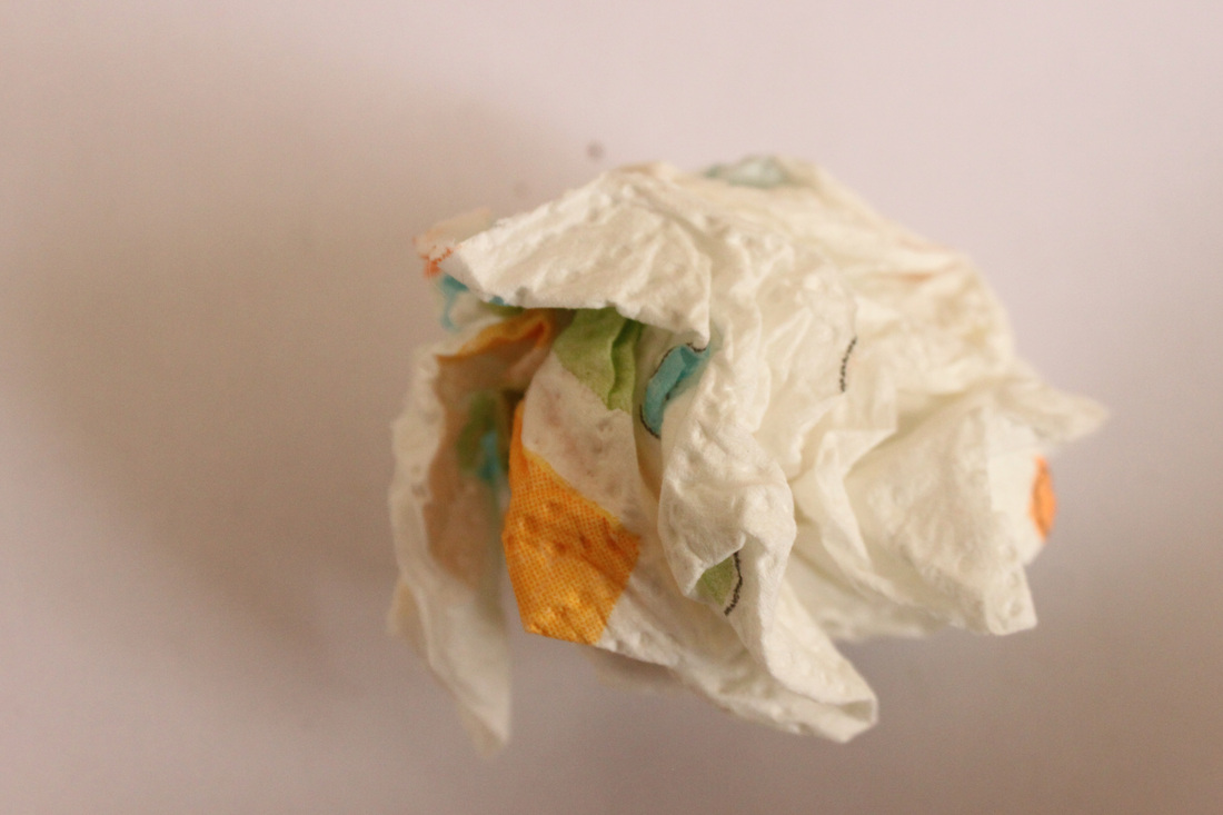
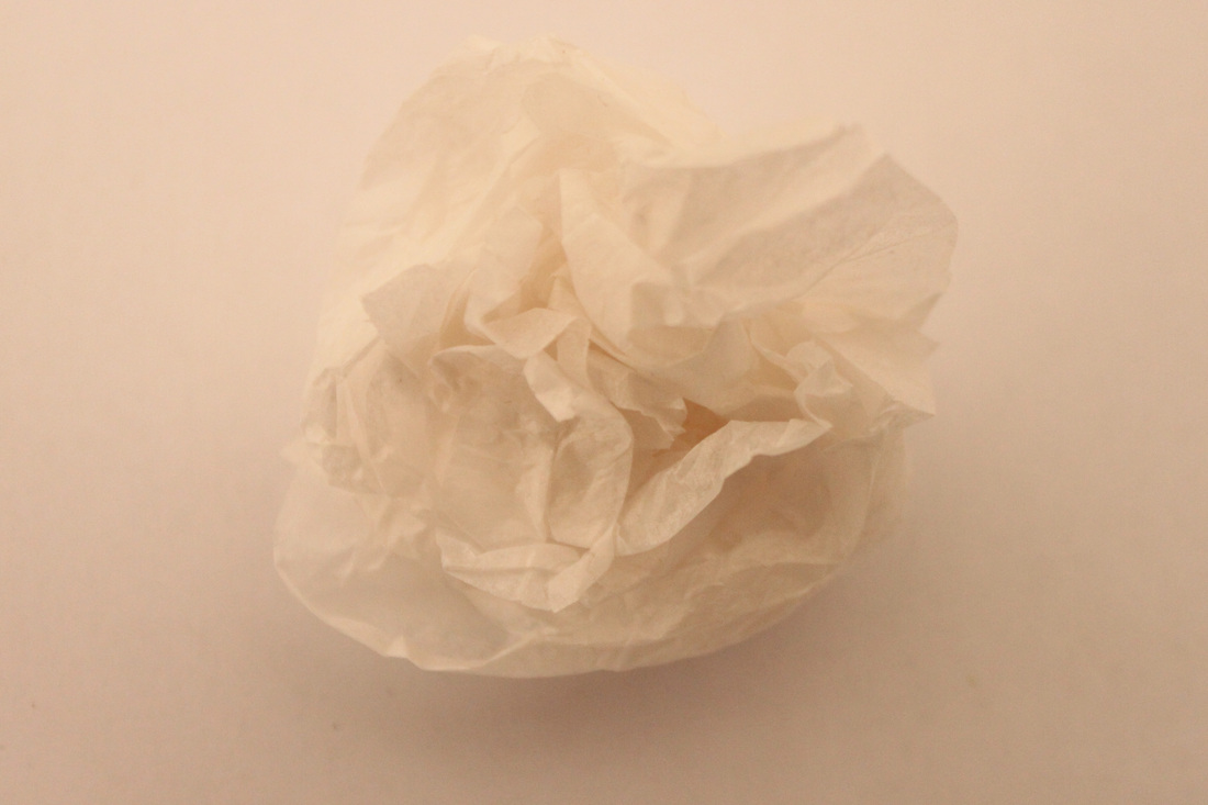
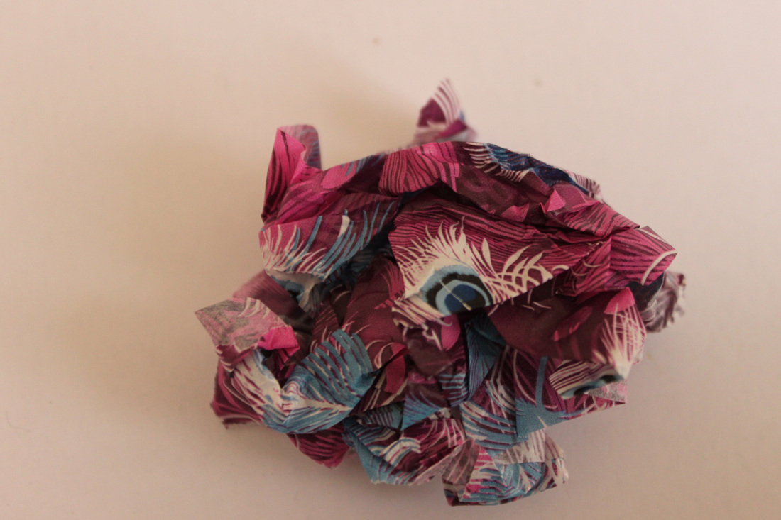
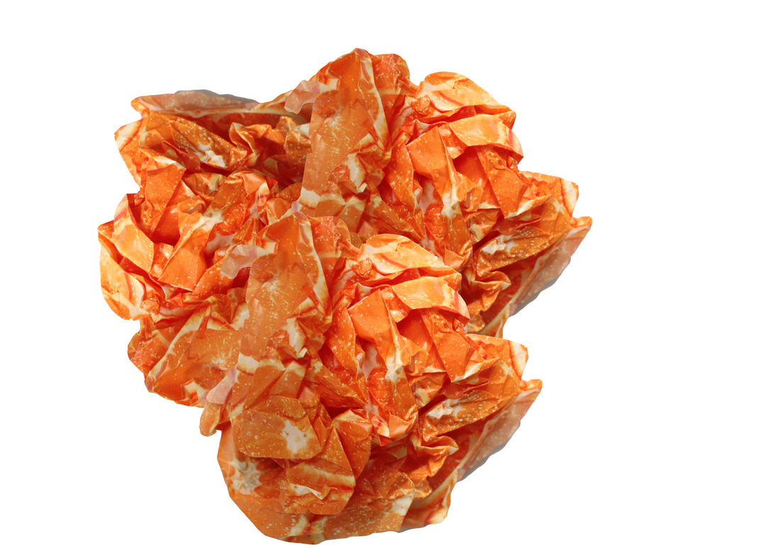
Own photography - Tissue:
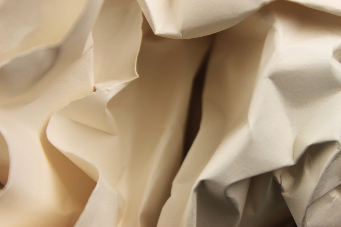
Aims: In this set I aimed to take photos of different coloured scrunched up tissue paper to look like flowers.
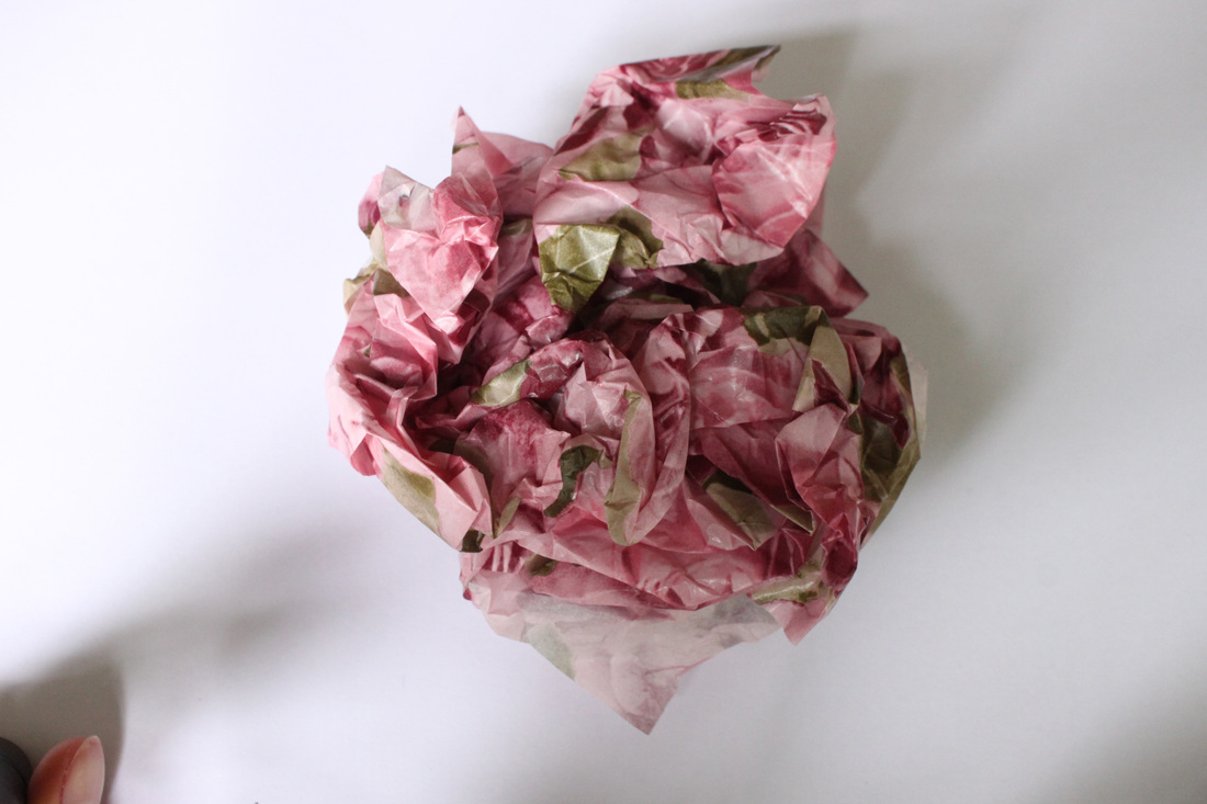
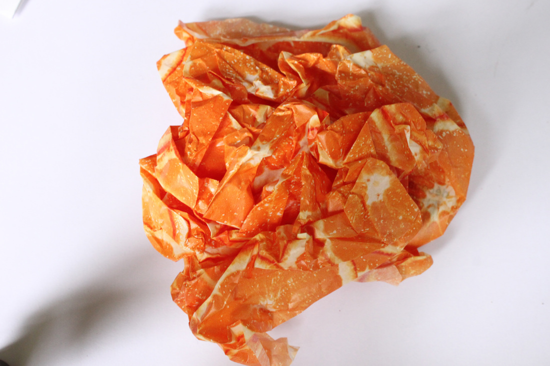
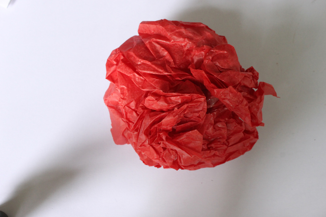
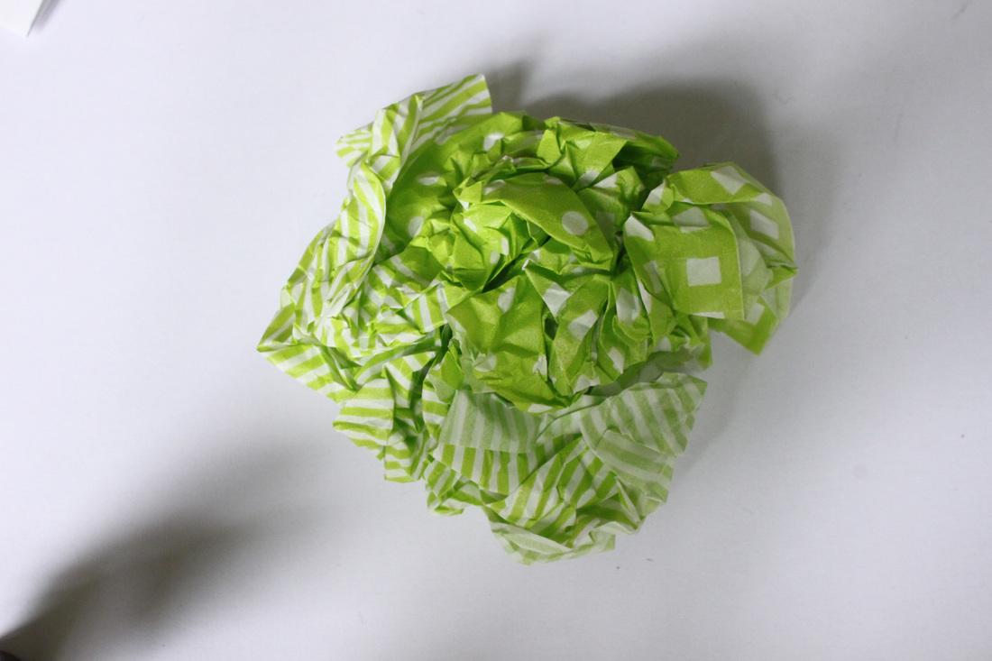
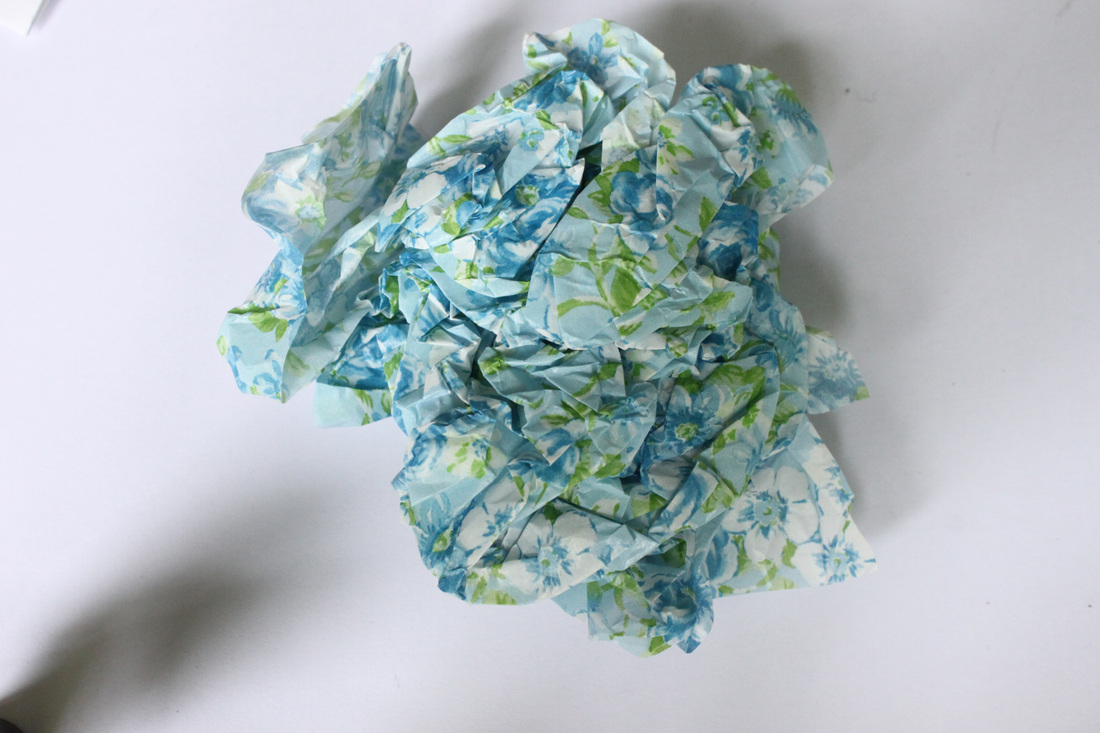
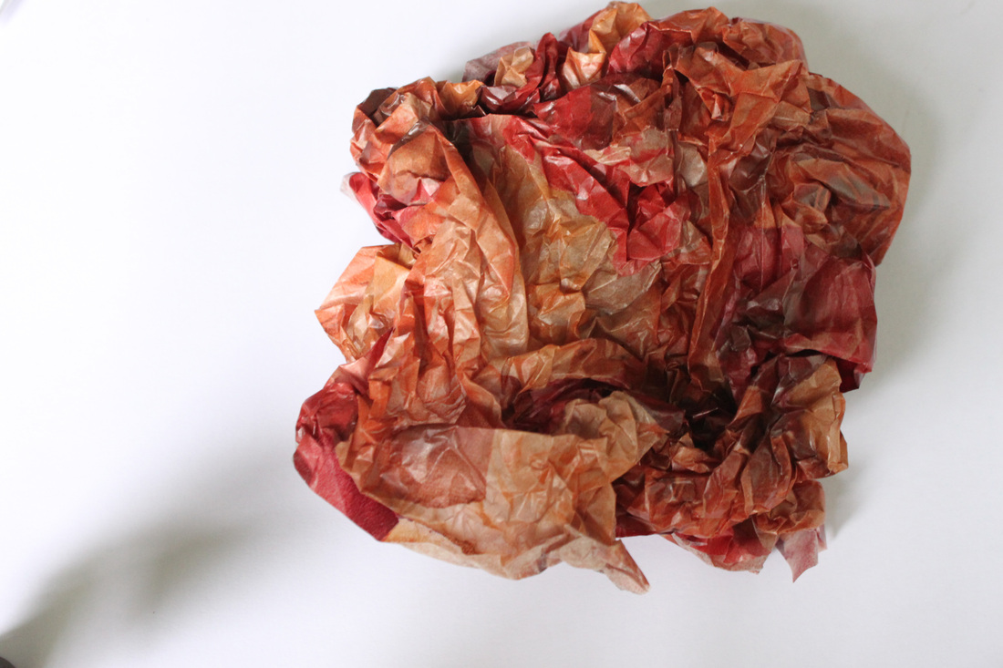
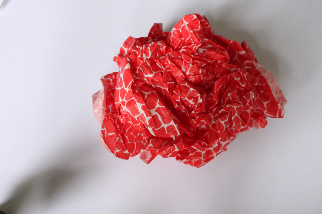
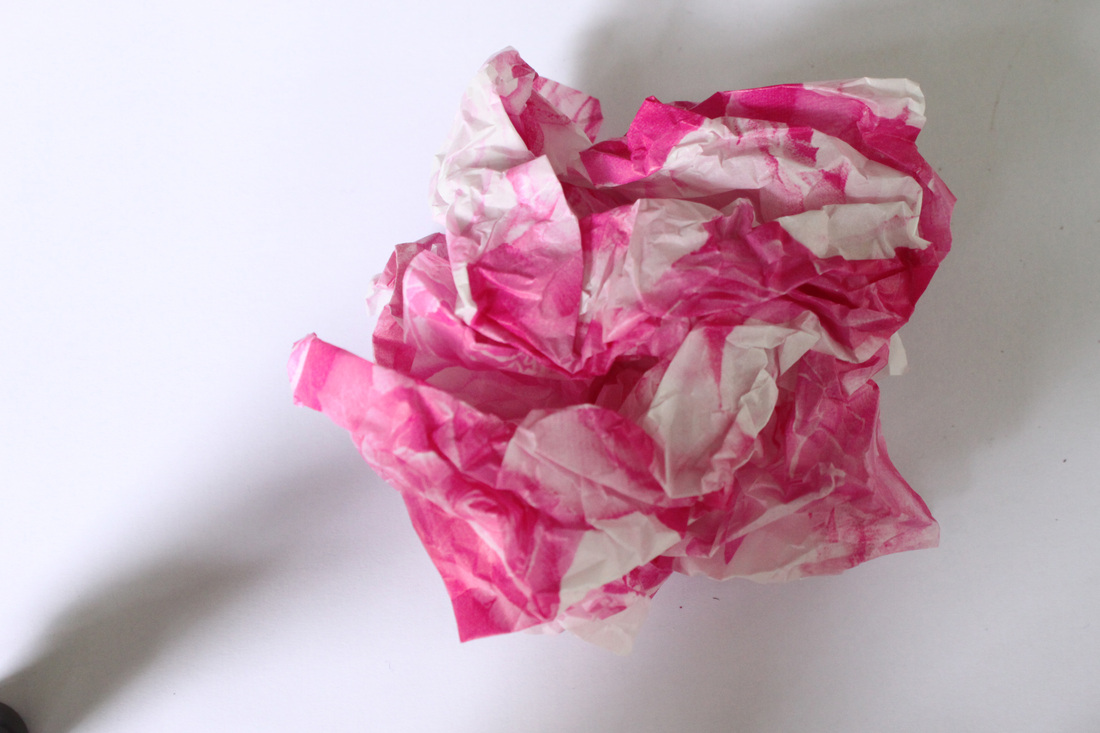
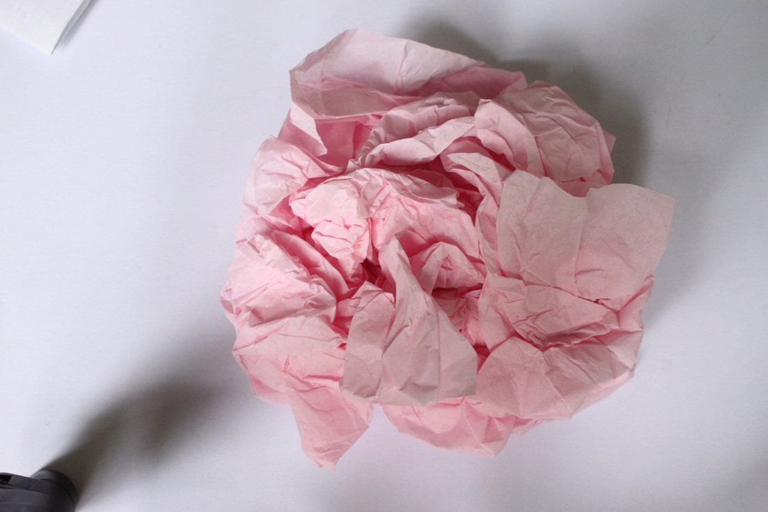
Process: I got a variety of vibrantly coloured tissue paper, some plain and some with patterns on, and scrunched them up into flower-like shapes. I used a white background so the tissue would be easy to crop when making a collage.
Critique: I feel I could have been a little more creative with my attempts at making the tissue resemble flowers.
Further Development: If I was to further develop this set I would cut out the tissue into different shapes for a more ambitious outcome.
Critique: I feel I could have been a little more creative with my attempts at making the tissue resemble flowers.
Further Development: If I was to further develop this set I would cut out the tissue into different shapes for a more ambitious outcome.
Own photography - Stages of collage development - editing:
Aims: In terms of editing, I wanted to take flowers and other objects e.g tissue paper, and produce a collage that from far away looks like loads of different flowers put together but when you see it close up you're able to establish the different objects within the collage such as fruit, tissue paper and beads.


Process: For the above photo editing I used photoshop. I edited the images using the 'magnetic lasso tool' and pasted each individual flower/object onto the collage. I then rearranged the shape, angle and position of the objects. I used more than one object for each one "flower" as I wanted to create interesting shapes.
Critique: I feel I could have taken a few more photos of flowers and objects as I had to resort to using some found photos in my collage to take up space.
Further Development: If I was to further develop this set I would take more photos so that I wasn't using ANY found footage.
Critique: I feel I could have taken a few more photos of flowers and objects as I had to resort to using some found photos in my collage to take up space.
Further Development: If I was to further develop this set I would take more photos so that I wasn't using ANY found footage.
Own photography - Final Collages:
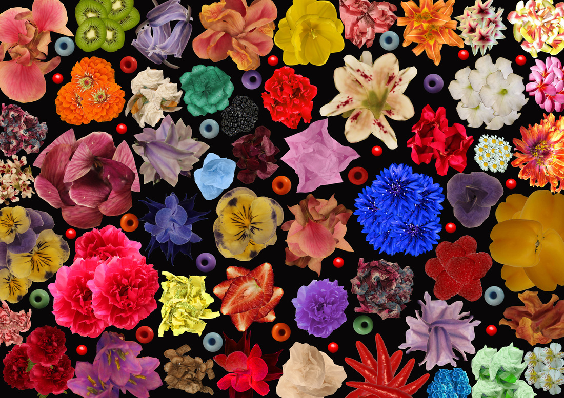

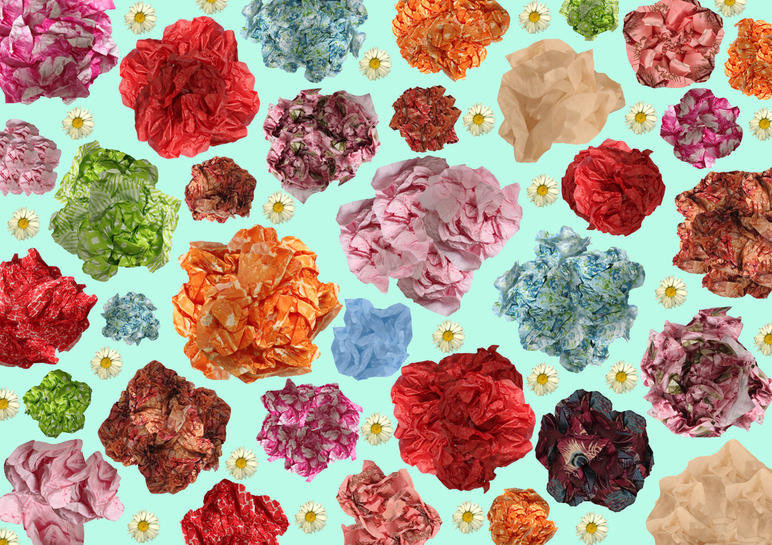
Comments:
For the two above collages I tried to achieve different outcomes, for the first I wanted a close compact collage with a black background, where as with the second I wanted something with more space and a vibrant background that creates a colour clash between the foreground and background. For both I followed the theme of a flower collage, the first collage includes both flowers and beads, fruits, vegetables and tissue paper. I chose to do this to create an effect where from a distance the collage looks merely as if it is just made up of flowers but when you get close up you can identify the other objects within it. For the second I used a variety of differently coloured tissue paper scrunched up and edited into the shape of flowers, again from a distance the collage looks like one full of flowers and close up the viewer can identify the flowers as being tissue paper.
Although I prefer the outcome of the first collage as I think the compact effect works better and the background being black makes for a more striking photo where the foreground really stands out to the background. Although I'm less fond of the second collage in terms of appearance, I am happy that I tried out more than one outcome.
Own experiment - Hand-made collage:
Aims: I wanted to take a different approach with my collages and chose to produce a hand-made collage with flowers and beads.

Process: In the above photo I took a more physical approach with producing a hand-made collage from found flowers and different coloured beads. I rearranged the objects to produce a colourful vibrant collage.
Critique: Although I think the collage looks quite effective I feel I could have been more ambitious and produced something on a larger scale.
Further Development: If I was to further develop this particular idea of a hand-made collage I would be more ambitious by producing a physical outcome on a larger scale, perhaps an A3 sized board with flowers and various other objects mounted on it. I feel this would be an interesting outcome as it would be something different and more ambitious.
_ < This is a link to the Fortismere Flickr page where a past student produced a similar idea to mine, which I have used for ideas.
Further research - Flower face & Egon Schiele:
As I was researching into different types of flower collaging I came across the below photo of a face that has been manipulated on photoshop by placing flowers on the face. I really likes this effect and decided to try out my own attempt at this, additionally I c
Own photography - Flowers and the body:
Aims: In this set I aimed to combine both photography of the body with flower collages and produce something quite surreal.


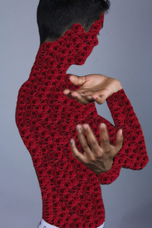
Process: The process I used for this set was editing on photoshop, I used studio portraits and edited flowers onto different body parts creating 'flower arms' etc. I chose to use only one flower per body part as I felt it created a more symmetrical look.
Critique: Although I am very pleased with my experimentation in this set i feel only some of the images work, I do not like the images where the whole body is covered as I feel it defeats the object of combining skin and flowers to produce something surreal. I like the effect of the combination of the dark skin tone and the texture of the brightly coloured flowers.
Further Development: If I was to further develop this set I would take more body photos and think of different ways to combined naturalistic objects with skin, perhaps using the kaleidoscope pattern covering parts of the body.
