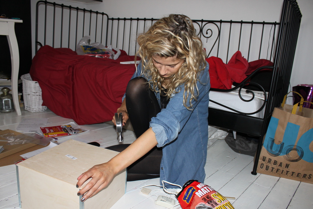
Brief
In this Project we have been given 8 weeks to develop a final piece of Photography work, capturing the theme of 'Mystery and Imagination'.
► Start by completing 3 sets of observations based on your 3 practical starting points to show a range of experimental ideas. Ensure that you show refinement of ideas and techniques throughout the project.
3 starting points:
-Film Noir
-Out of focus works (Uta Barth and Hirochi Sugimoto)
-The everyday (Richard Wentworth's and Barry Lewis)
3 starting points:
-Film Noir
-Out of focus works (Uta Barth and Hirochi Sugimoto)
-The everyday (Richard Wentworth's and Barry Lewis)
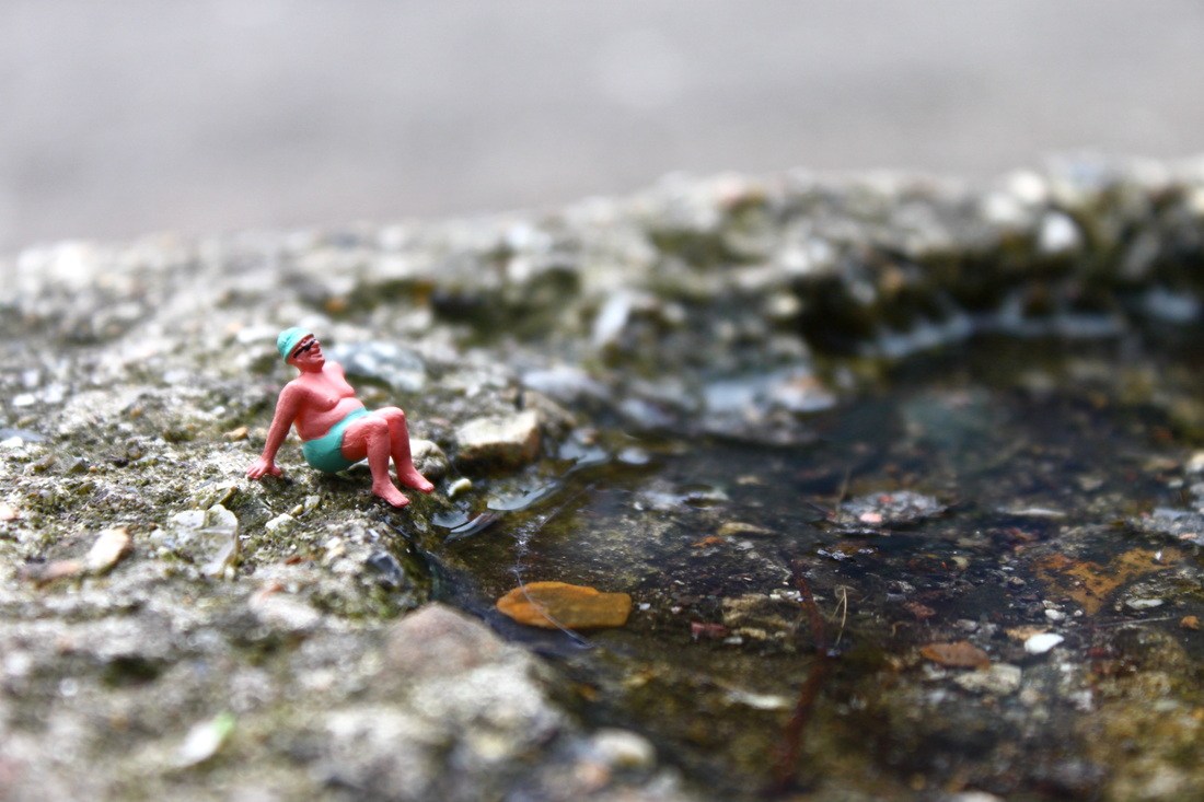
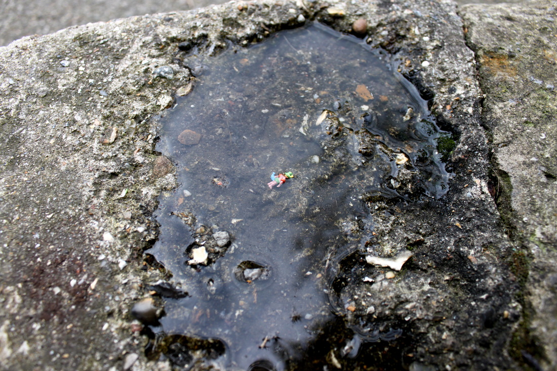
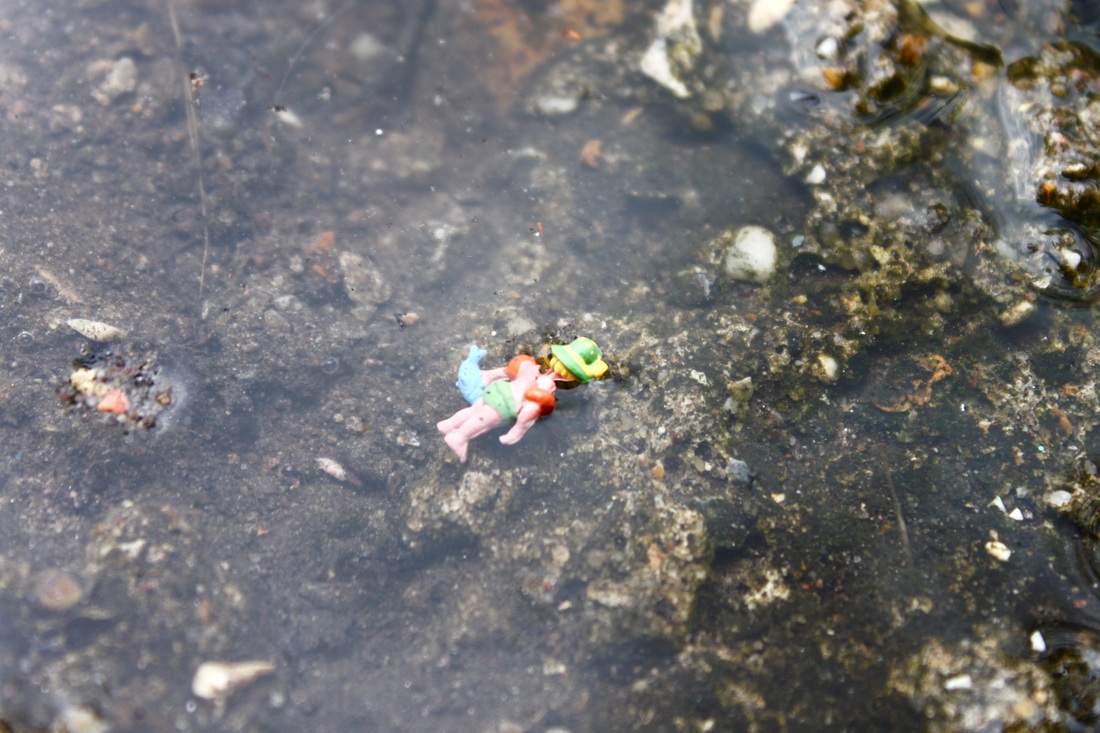
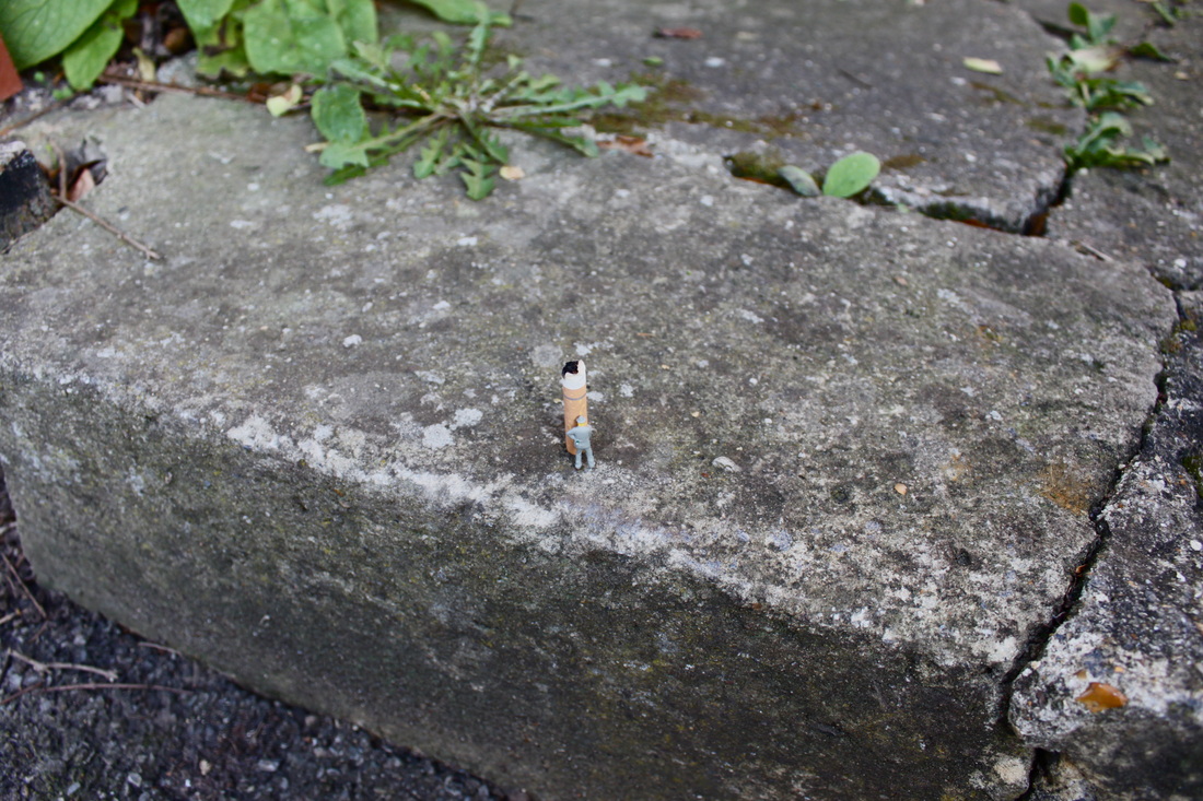
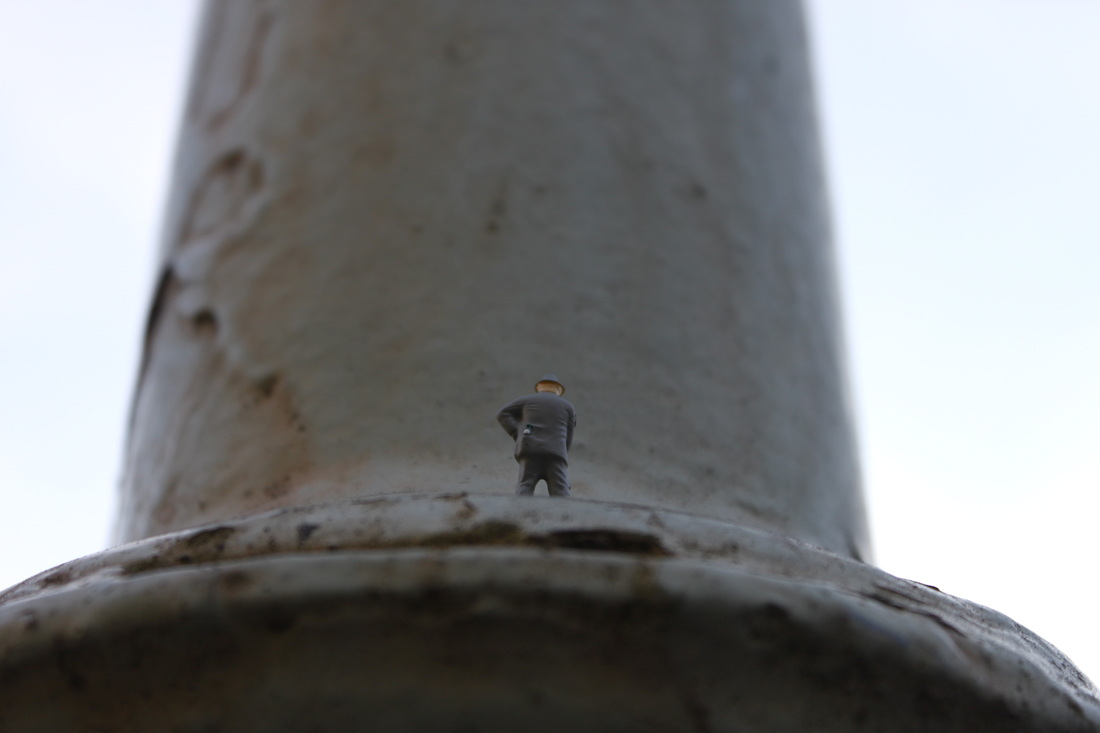
Response to Richard Wentworth and Barry Lewis - The everyday
Aim: I took a set of images responding to Richard Wentworth and barry Lewis' 'The everyday'. When editing these photos I adjusted the colour contrast and applied the selective colouring process on the pictures to ensure a harsh contrast between the brightly coloured objects and the plain, bleak pavement.
I used these 8 they share similarities in colour and work well together.
I used these 8 they share similarities in colour and work well together.
|
My response to Barry Lewis' and Richard Wentworth's photographs of 'the everyday'.
|
Photographs by Barry Lewis and Richard Wentworth. Visual noise and 'the everyday'.
|


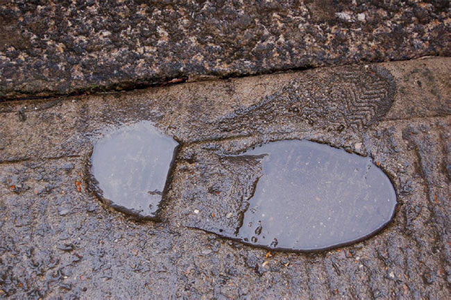
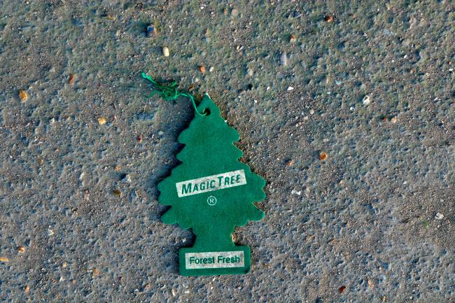
Process: In all the above photos I used the 'close up' setting, to ensure the highest quality photos. Whilst editing the pictures I tried to achieve a high colour contrast, I heightened the saturation and contrast of each individual photo. As all photos come under the same colour scheme of oranges/yellows I tried to ensure the colour stood out as much as possible in contrast to the background, therefore I made sure to photograph my objects on simple, boring backgrounds.
Critique: I feel my photos lack variety, they're very similar colours. I think for a set to capture a more interesting point of view they need to have more variety, and include more vibrant colours.
Further Development: If I was to develop my photos I would ensure I took a larger variety of photos using more vibrant coloured objects that reflected more of the works of Barry Lewis and Richard Wentworth.
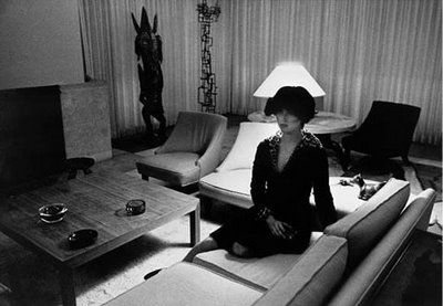
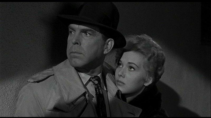
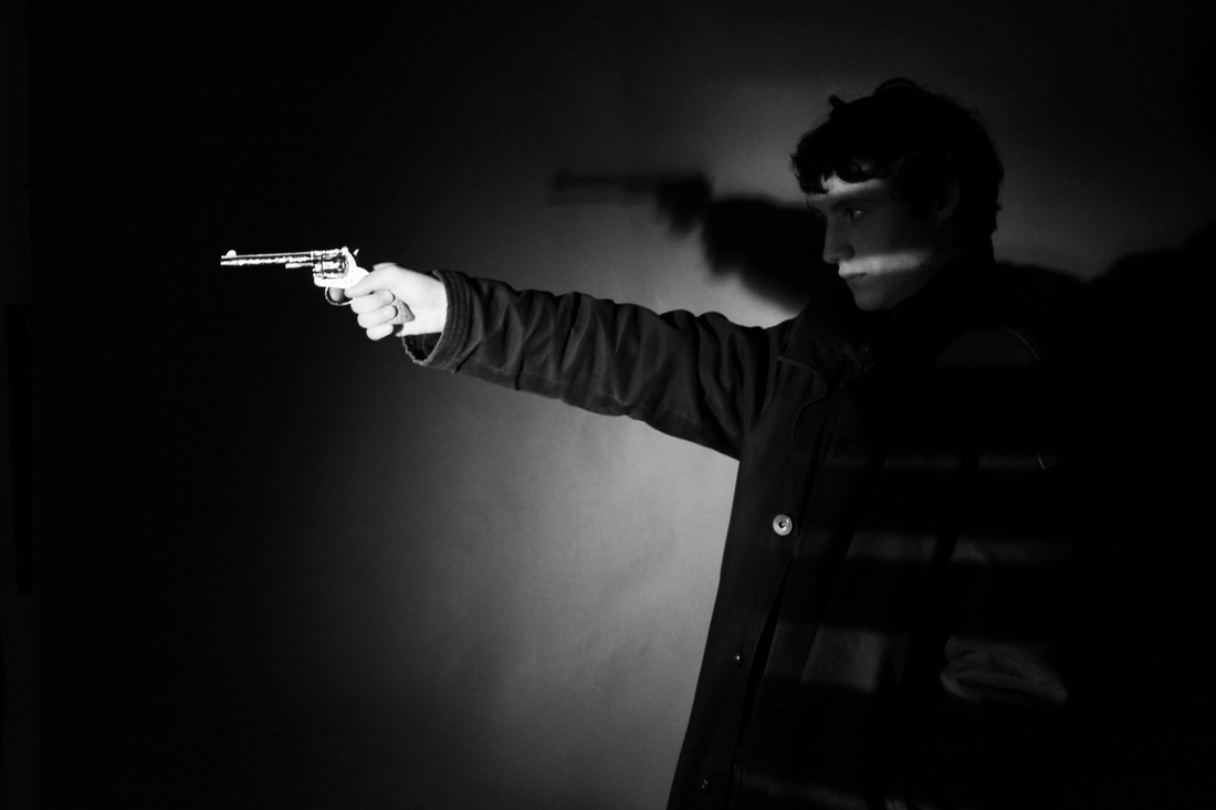
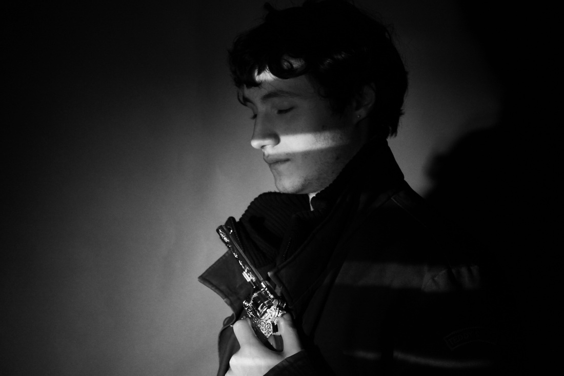
Research on Film Noir: - Meaning 'Black Film' in French. A genre that began in the early 1940's.
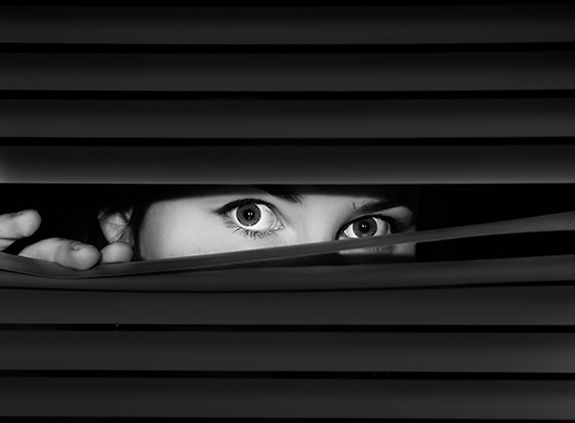
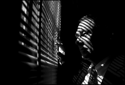
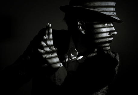 A classic example of Film Noir style is a single, harsh light aimed through a set of horizontal window blinds. The light projects the shadows of the blinds on the actors face. The reduced visibility of the actors face creates a dark a brooding mood.
|
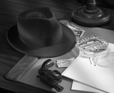 Cigarettes, fedora hats and guns are very much 'iconic' items In film Noir.
FIlm Noir is a very distinct genre due to the specific attire worn by the characters. |


I would like to focus on the expression of the characters when taking my Film Noir photos, masking the facial expressions of my characters through shadows and smoke will hopefully create a mysterious, dark, bleak and melancholy scene.
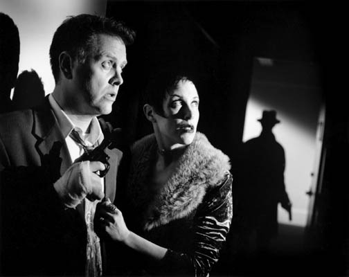
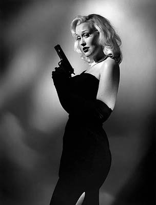
All the above processes capture the mood, tone, point of view and style of Film Noir. Very often Film Noir was developed around a cynical, hard hearted, disillusioned male character who encountered a beautiful but promiscuous, amoral, double-dealing and seductive femme fatale.
All the above processes capture the mood, tone, point of view and style of Film Noir. Very often Film Noir was developed around a cynical, hard hearted, disillusioned male character who encountered a beautiful but promiscuous, amoral, double-dealing and seductive femme fatale.
Some key features of Film Noir:
|
-Shadows and silhouettes are as much part of the image as the subject
-Dark bleak mood -Femme Fatal: most often depicted as a beautiful woman, cruel and dishonest, who is willing to do anything necessary to reach her ends. -Detective character -Night time shots -Gloomy/mysterious mise en scene -Dim low key lighting -Use of existing light sources such as car headlights, street lamps etc. -Extreme camera angles -Black and white -Expressionist distortion -Diffused light through smoke and mist -High contrast, distinct ares of light and dark |
|
Film Noir photography research:
I particularly like the photographic work of American Photographer and Film Director Cindy Sherman. Sherman produced a series of Untitled Film stills, 1997-1980, with which she achieved international recognition. The stills consists of 69 black-and-white photographs. In these stills the artist poses in different roles and settings producing a result reminiscent of stills typical of Italian neorealism or American Film Noir of the 1940's, 50's and 60's.
Within the 69 stills, Sherman took a series of photographs shot around New York often featuring a blonde victim typical of Film Noir.
Within the 69 stills, Sherman took a series of photographs shot around New York often featuring a blonde victim typical of Film Noir.

Film Noir Studio Shots
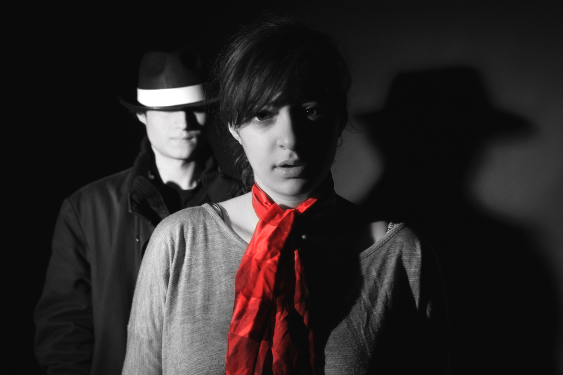
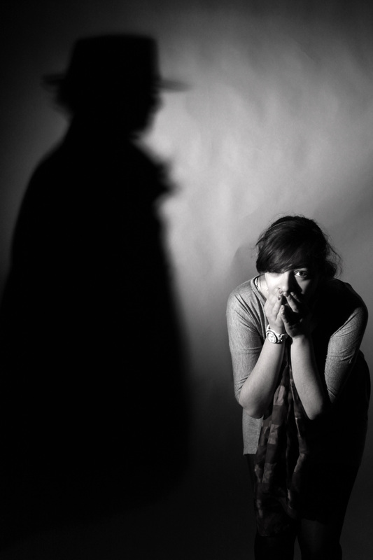
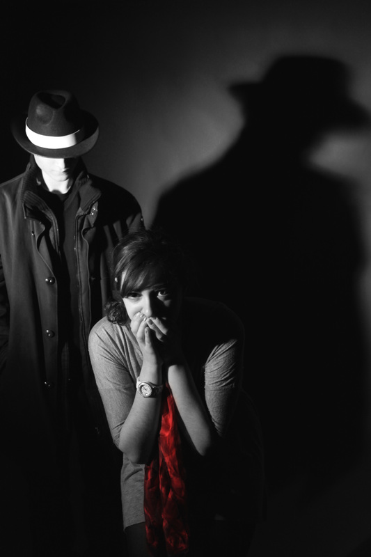
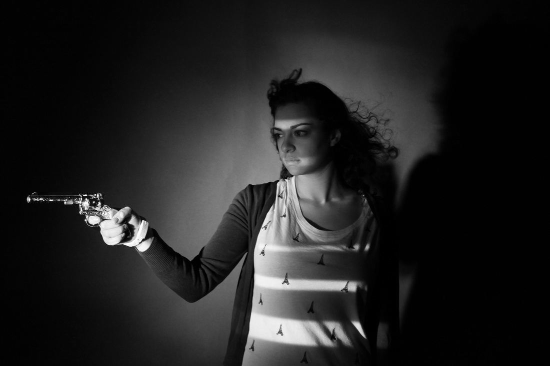
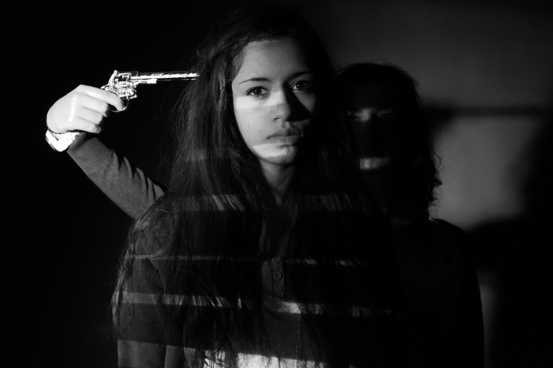
I took a series of photos using the studio, playing with shadows and lighting. I tried created a scene where the femme fetal character was being harassed by her stalker. - I experimented with costumes and lighting to create an eerie and somewhat disturbing setting.
I edited the photos on photoshop and changed them all to black and white, to really create the Film Noir effect. I then did selective colour on some of the pictures, I liked the way the red of the scarf really stood out in contrast to the bleak black and white mood of the picture. I used the two photos below as inspiration for this set - I tried to create a selection of pictures using selective colouring similar to these.
I edited the photos on photoshop and changed them all to black and white, to really create the Film Noir effect. I then did selective colour on some of the pictures, I liked the way the red of the scarf really stood out in contrast to the bleak black and white mood of the picture. I used the two photos below as inspiration for this set - I tried to create a selection of pictures using selective colouring similar to these.
Aims: I wanted to create a scene through these sets of pictures, of a femme fetal Film Noir character being stalked by a brooding dark male character.I like the lack of visibility in facial expression as it successfully helps to create a brooding, dark and somewhat unreadable character. - Facial expression, especially in a picture, tell us everything. Because we cannot hear a character speak or see their actions through a photograph their facial expression is the key to understanding what the character is thinking/doing. I like the sense of mystery that the hidden emotion given in this set of photos. Additionally the fact that you cannot see the characters face at all makes the photo seem more unusual and a bit horrific. You could be endlessly guessing as to who/what was beneath the oversized trench coat and fedora
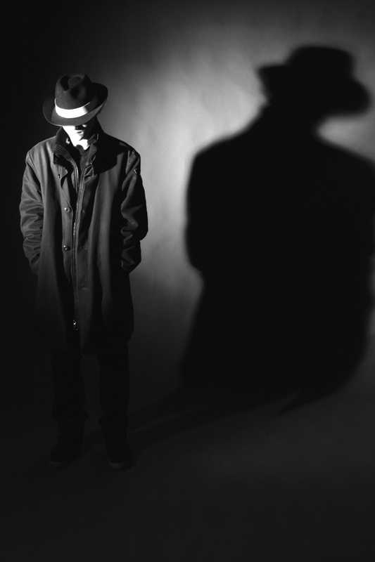
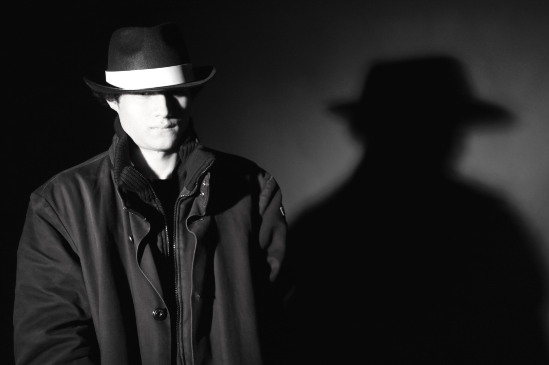

Process: I used the studio for this set as I wanted to create exaggerated shadows that would not be possible if taken outside with natural lighting. I used strong lighting to create very visible shadows on the characters faces, Film Noir reguarly uses a dark scene with a strong light source so that shadows are made very visible, to create a creepy, eerie and mysterious setting.
Critique: The above set lacks variety, the photos are all very similar, with similar expressions used by the models, and all the same props and costume.
Further Development: If I was to develop these photos I would try and create a 'Film Noir' type movie, through photos. Each photo representing a scene in a movie. For example, the beginning would be photo's introducing all the characters, and the last photo would be the ending of my movie, perhaps with one of the characters dead.
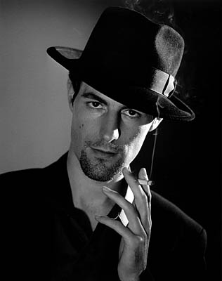
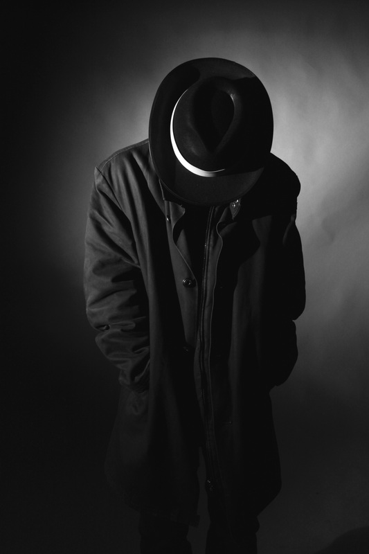
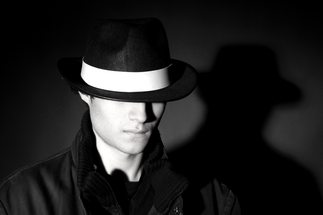
Film Noir: Male character
Very often, a film noir story was developed around a cynical, hard-hearted, disillusioned male character - I have tried to create this type of Film Noir character in this set of photos. I went for a dark and brooding character, using a dark haired male model. I dressed my model in dark clothing and a hat that looks like a 'fedora' a hat commonly worn by the male characters in Film Noir. I looked at actors such as Robert Mitchum, Fred MacMurray and Humphrey Bogart, who were famous Film Noir actors during the 1960's. I tried to mimic these characters appearance in my own work to create a believable Film Noir male character.
Robert Mitchum, Fred MacMurray and Humphrey Bogart:


Film Noir blinds photos
I have tried to create a classic example of Film Noir style photography in this set, an image where a character is photographed with the shadow of a set of blinds on their face, this effect minimizes visibility of the characters face creating a dark and brooding mood. I created this blinds effect by cutting up thin pieces of card and placing them on a projector and shining the projector on my models face. - To portray the image of a Film Noir character looking through a set of blinds.
Aims: In the below set I aimed to take a realistic selection of classic Film Noir styled photos of a character with harsh light aimed through a set of horizontal window blinds shadowing their face.
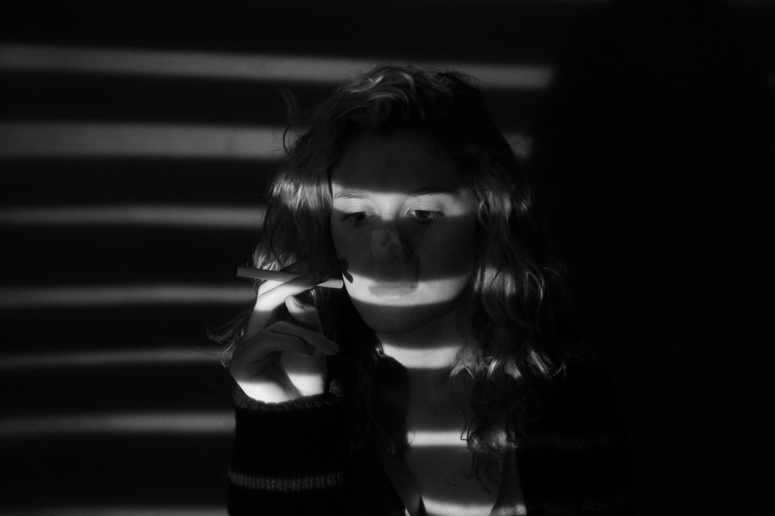
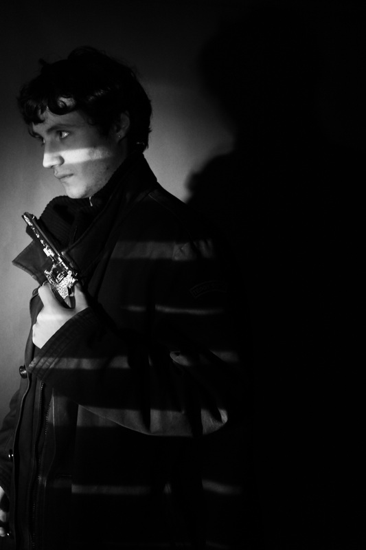


Process: The process I used for taking this Film Noir style photos including using a harsh light source: a projector, with cut up pieces of card on the projector used for the shadow of blinds. I used the studio to create a simple and plain background where the shadow of the blinds would be made visible.
Critique: I think the photo's do not look very realistic as they are all taken in the studio and a large variety of props were not used.
Further Development: If I were to develop this set further I would take the photos in more interesting mise en scene to ensure they looked more realistic, and instead of a simple close up studio shot I would like to achieve a photo that looked like a scene from a Film Noir film.
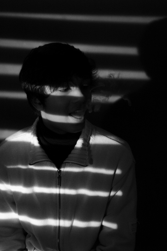
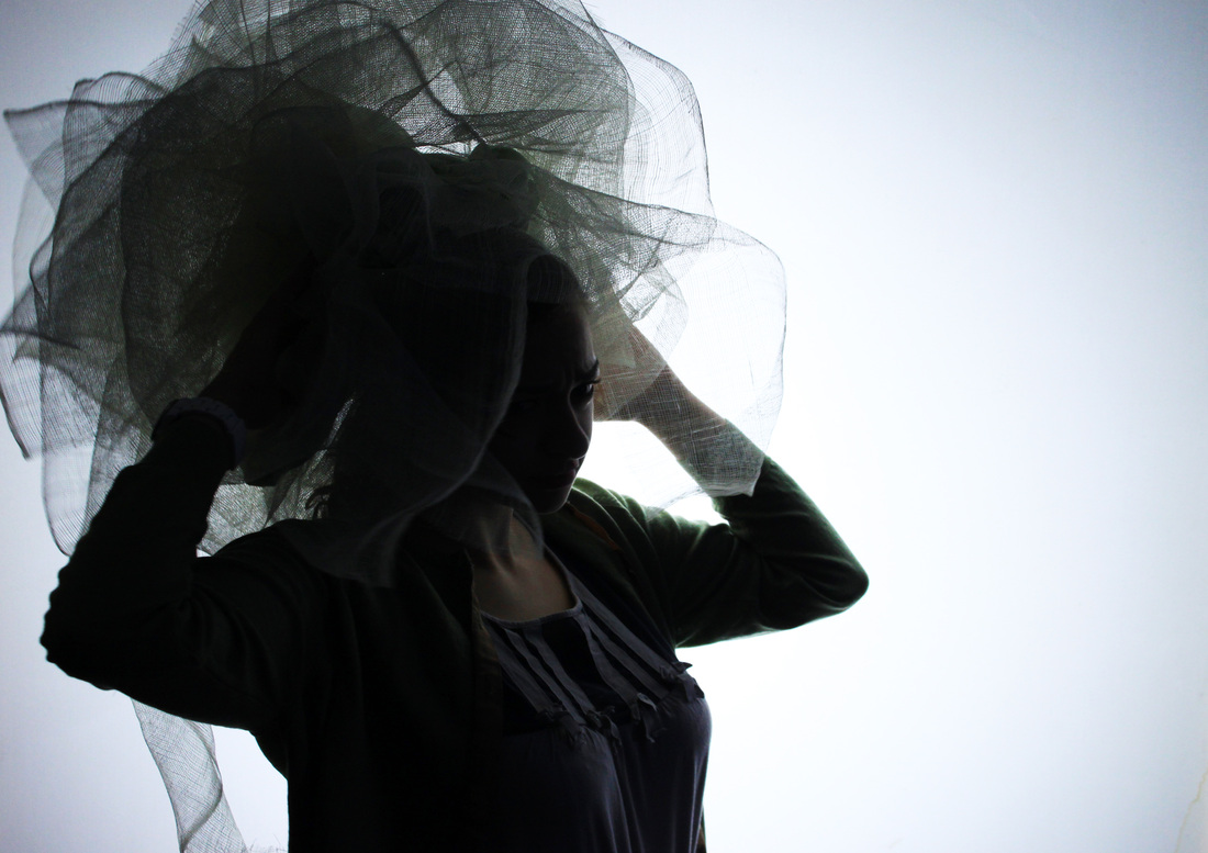
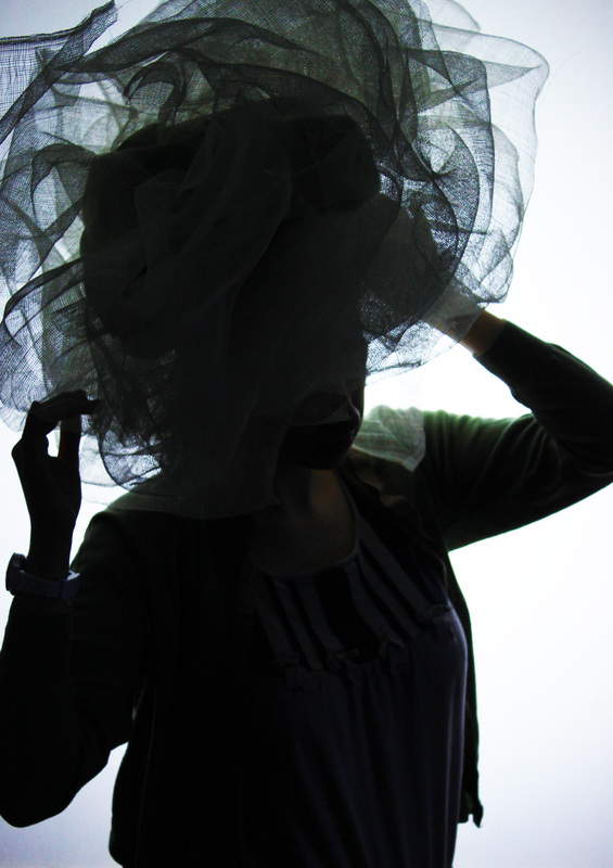
Mysterious studio shots
I took a set of 'mysterious' photos using the studio. I dressed my model up with a selection of unusual props to create a kooky image. As I still very much want to create a final piece based around the genre of Film Noir I edited my photos on photoshop to make them black and white and changed the brightness and contrast to create a feeling of Film Noir even though the costume used in this set doesn't particularly stand out as typical 1940's-60's Film Noir styled costume.
Aims: I wanted to take a series of silhouette photos using interesting props to create slightly distorted images where the props and model were 'as one'.


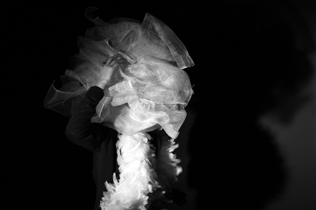
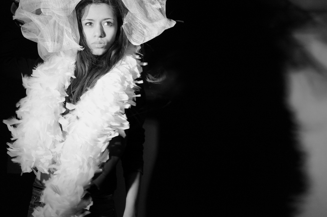
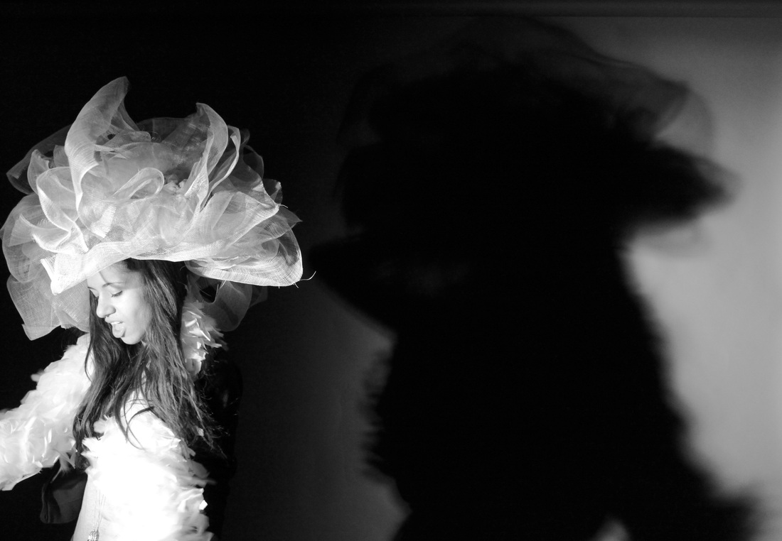
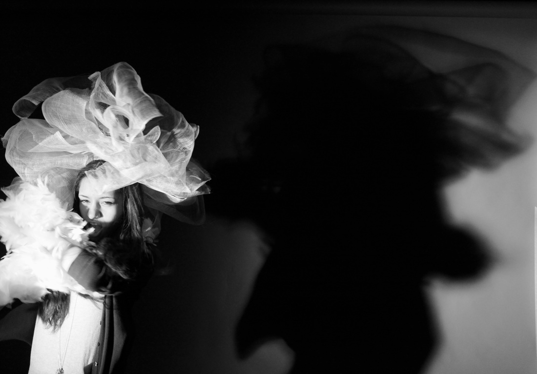
Process: I used the studio, and a source of strong lighting to create a set of photos with unusual props and visible shadowing. - The use of props create very interesting shaped shadows.
Critique: Again my set lacks variety, the same model and the same props are used. The poses are all very similar also, each picture looks to alike the last. It might be more interesting if I used more colour and a variety of more interesting props.
Further Development: If I was to develop this set further, I would ensure I used more props, a variation of different models, different editing techniques,and more colour. The first two pictures are very unusual, I would take some more photos like those instead of just portrait studio shots.
Silhouettes
Aims: In the below set I have tired to create slightly silhouetted photos. I did not want the entire picture to be a blacked out silhouette, I achieved this effect by using a slow shutter speed setting on my camera ensuring the model is only half lit - creating the partially silhouetted effect I was going for.
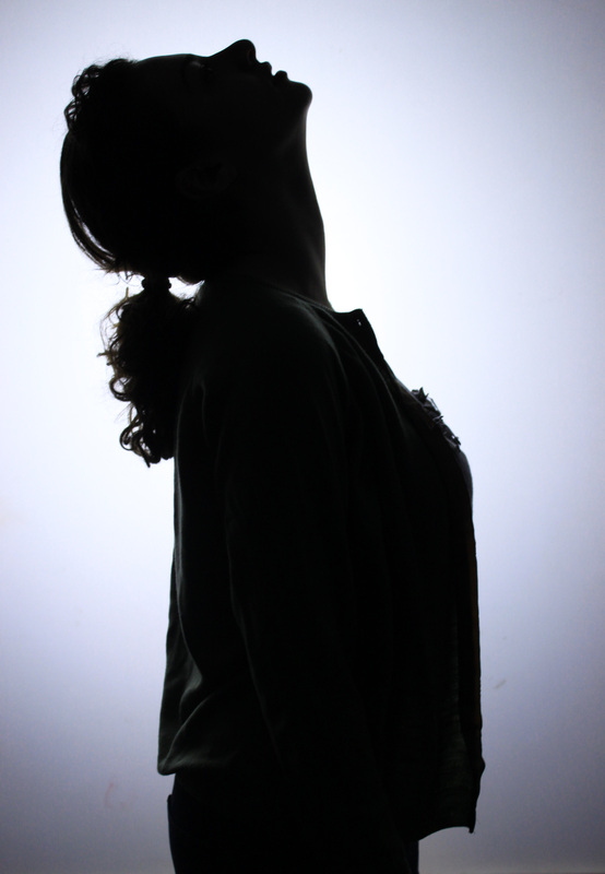
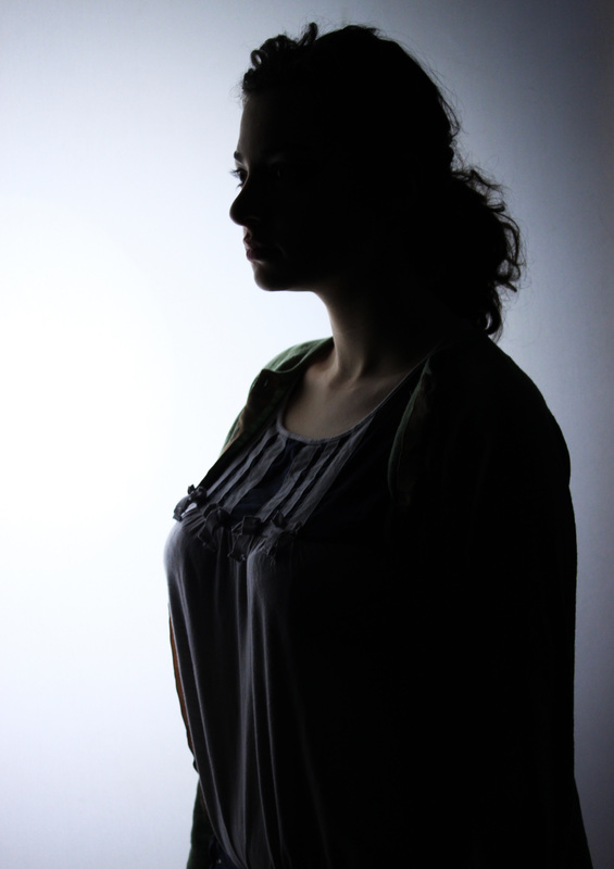
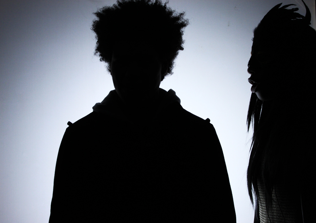

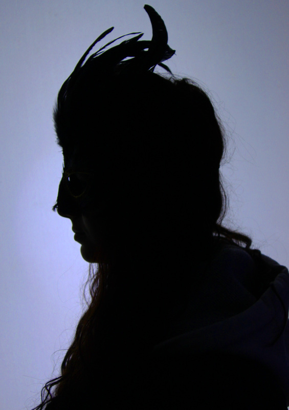
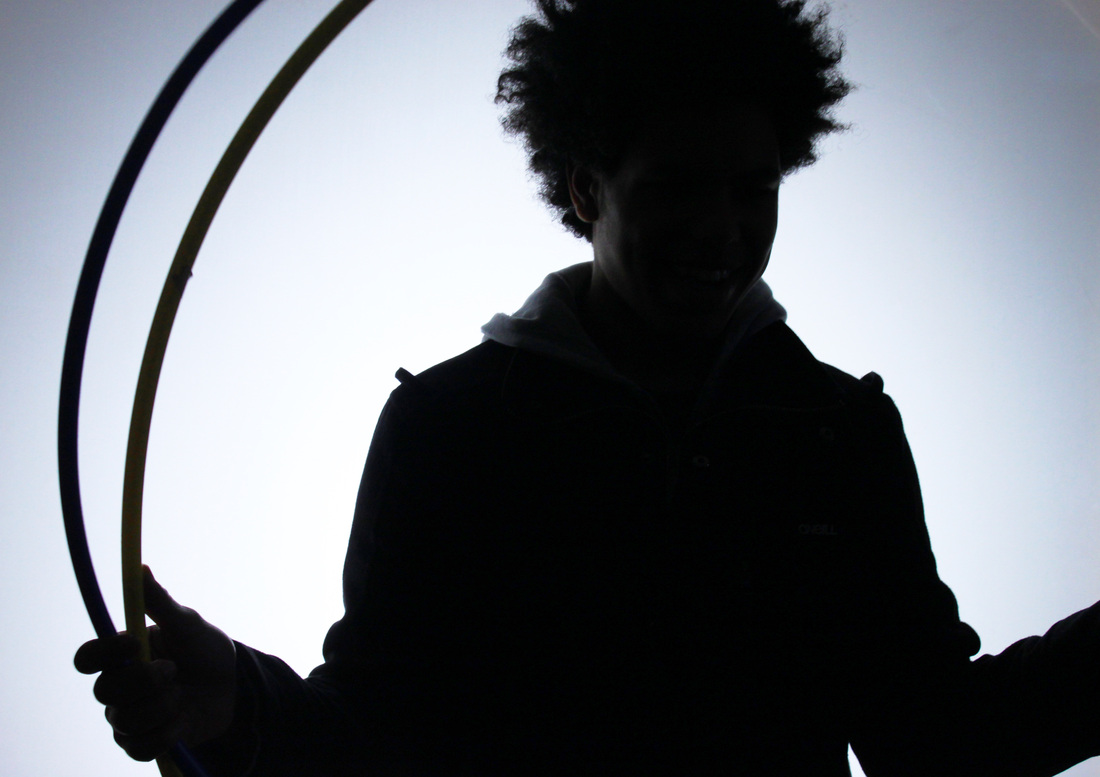
Process:I used the studio to take a set of silhouettes, using props such as unusual head-wear and masks. I wanted to create silhouettes that weren't completely black, as I like half-silhouettes where some of the body parts are visible and some are silhouetted. I prefer this process as it has a more mysterious effect.
Critique: A lack of props resulted in a set of photos that were quite similar looking and that lack in variety. The mask and netting headpiece were used multiple times therefore the photos becoming quite boring after a while.
Further Development: If I was to develop this set further I would use a larger variety of props to ensure my photos had a stronger sense of diversity. I would additionally use a larger variety of models pulling more interesting poses, so again, the photos didn't look too similar and come across as lacking in variety.
Research on John Stezaker:
John Stezaker, boring in Worcester in 1949, is an English conceptual artist. His work is surreal in tone and re-examines the various relationships to the photographic image: as documentation of truth, purveyor of memory, and symbol of modern culture. In his collages, Stezaker appropriates images found in books, magazines, and postcards and uses them are 'readymades'. Through his elegant juxtapositions, Stezaker adopts the contexts of the original images to convey his own witty and poignant meanings.
|
|
Our photography AS class visited the Whitechapel gallery with see John Stezaker's photographic exhibition. I found some of his work incredibly detailed, Stezaker would take classic black and white movie stills, and make collages out of them by simply placing a different image of some type of landscape, perhaps a postcard on top. The final collages are very unique and fascinating to look at, the accuracy of Stezaker's work is remarkable, the pictures or postcards he has placed on top of the old fashioned stills fit perfectly to the shape of the models face creating a surreal yet beautiful outcome. "This first major exhibition of John Stezaker offers a chance to see work by an artist whose subject is the power in the act of looking itself. With over 90 works from the 1970s to today, the artist reveals the subversive force of images, reflecting on how visual language can create new meaning." |
Critical analysis of John Stezaker collage:
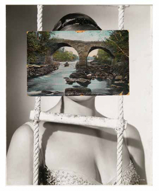
This is my favorite John Stezaker collage, I love the elegant surreality of the image. The unusual combination of portraiture and landscape fascinates me. The fact that Stezaker has managed to combine two very different images to create one amazing piece of photography that works so well together is inspiring. The contrast between landscape and portrait is very powerful, as well as the strong colour contrast between the 'black and white' film still and very vibrant colour of the postcard. It is obvious that the postcard looks eerily like a face, the way in which Stezaker has positioned the postcard works perfectly with the film still beneath it creating a mysterious image.
Form: This photo is a black and white portrait of a female acrobat standing behind a rope ladder. We can assume she is an acrobat because of the ladder she's standing behind - it looks as if she is in the circus or something similar. The model's face is not visible, instead there is a coloured photo of a bridge stuck over her face.
Process: This photo has been taken on a manual camera creating an old fashioned effect. The portrait photo is in black and white where as the stuck on image of a bridge is in colour - this creates an interesting colour contrast.
Content: The photographer has created a contrasting image that collages portraiture and landscape together. The bridge almost looks like a face, the way in which it is positioned works perfectly as the position of the stone eyes, mouth and nose is placed exactly where the models actual features would be.
Research on Eugene Meatyard:
Eugene Meatyard was an American photographer (1925-1972).
His most famous works involved masks and dolls, worn by posing people, or ordinary objects.Meatyard often photographed his family, friends and neighbors pictured in abandoned buildings or in ordinary suburban backyards. While he lived Meatyard's work was shown and collected by major museums, published in important art magazines, and regarded by his peers as among the most original and disturbing imagery ever created with a camera. Meatyard's work challenged most of the cultural and aesthetic conventions of his time and did not fit in with the dominant notions of the kind of art photography could and should be.
His most famous works involved masks and dolls, worn by posing people, or ordinary objects.Meatyard often photographed his family, friends and neighbors pictured in abandoned buildings or in ordinary suburban backyards. While he lived Meatyard's work was shown and collected by major museums, published in important art magazines, and regarded by his peers as among the most original and disturbing imagery ever created with a camera. Meatyard's work challenged most of the cultural and aesthetic conventions of his time and did not fit in with the dominant notions of the kind of art photography could and should be.
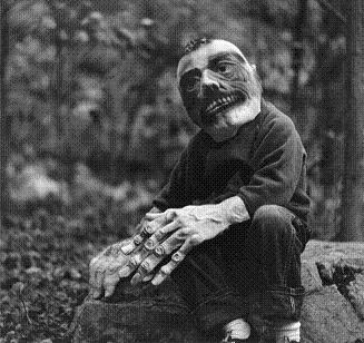
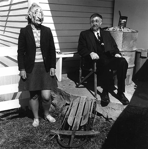
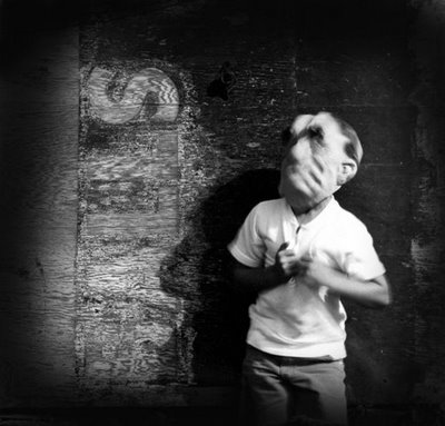
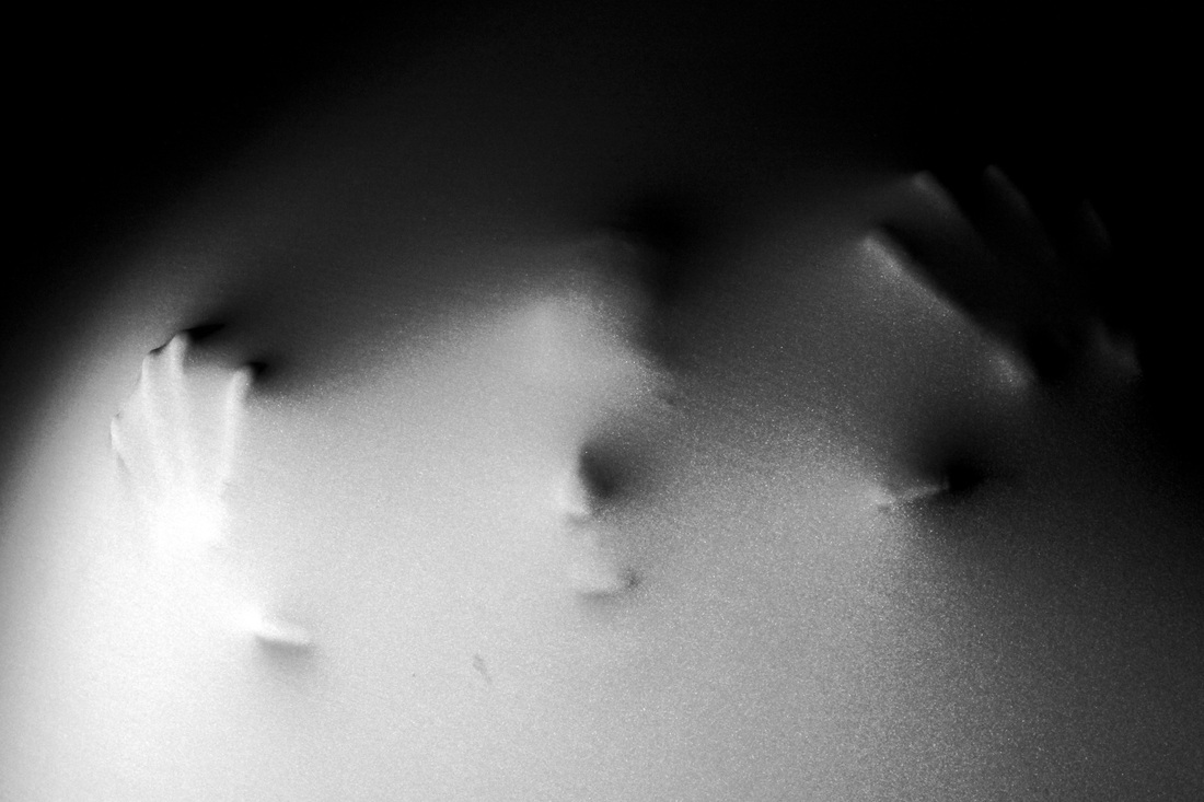
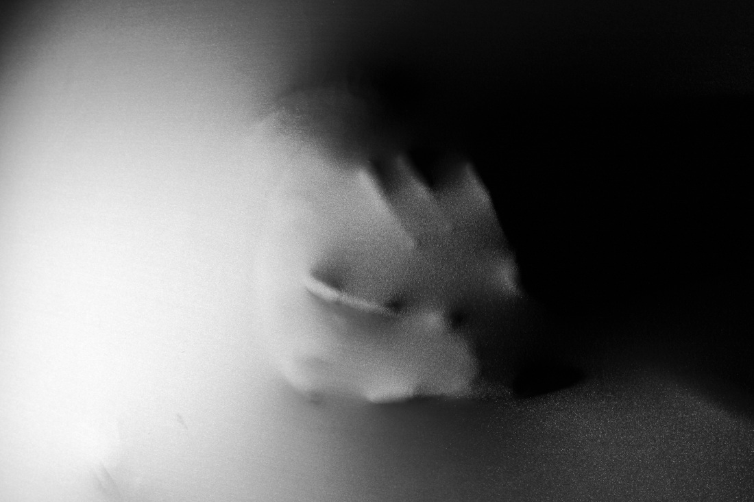
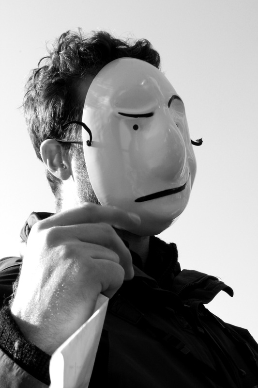
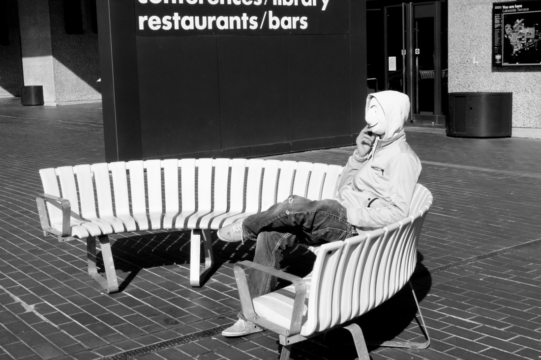
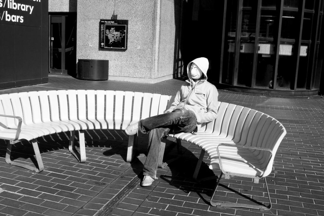
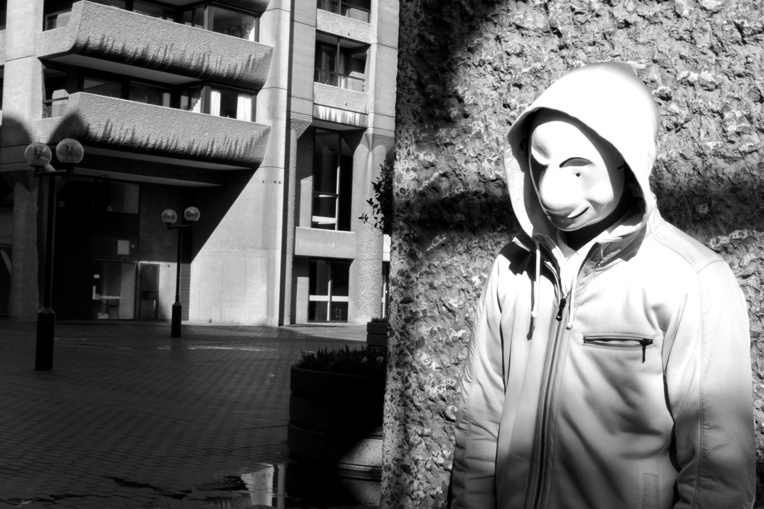
Aim: I wanted to take a set of photos in response to Eugene Meatyard's masked photography. I took these photos during my time at the Barbican centre, I tried to achieve a mysterious effect through the use of masks and other forms of masking/disguise. Although Eugene Meatyard's photo's are more dated, and have a more eerie vibe about them, as he regularly photographed children wearing disfigured masks, I liked the idea of using masks to create a 'mysterious' photo, even if they didn't look all too similar to Eugene Meatyards.
Response to Eugene Meatyard:After looking at some of Eugene Meatyard's photographic work using masks I decided to take a set of photo's also using masks, I find masks very mysterious as they have the ability to bring life and surrealism to what may be seen as a standard, boring photo. Furthermore I like how masks can hide facial expression, this creates a sense of mystery to a picture - not being able to read the models emotions.
In the picture below none of the models are actually wearing any masks but I found the way in which the models were sitting very similar to this photo by Eugene Meatyard. |
|


 |
Aim: In a response to Eugene Meatyards work I took a set of photos using masks. I wanted to create an image where the facial features were masked. Creating a sense of mystery. Masking is a good way of covering up any visible signs of emotion in a picture.
Process: I took a set of photos using masks. I decided to use this one as I liked the conrast between the very bright background and the dark, solem expression that the mask creates. Critique: The photo is very random and does not really portray any set theme/idea. Further Development: If I was to further develop my set of masked photos I would ensure they all linked together in some way. Simply photographing models wearing masks is a very vague idea and does not really show that any thought or planning has gone into it. |
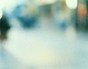
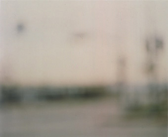
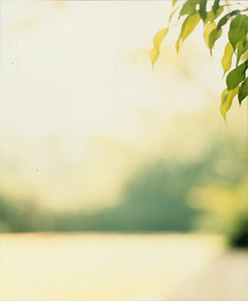
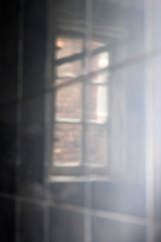
Uta Barth Research - Out of focus:
Uta Barth (born 1958 in Berlin) is a contemporary photographer who lives and works in Los Angeles.
Uta Barth's recent project examines the conventions of photographic presentation. Over the past three years she has created two series, Ground and Field , which consist of blurred images generated by focusing the camera on an unoccupied foreground. These unframed, empty images present only background information, implying the absence of subject and referring to the function of images as containers of information.
“My primary project has always been in finding ways to make the viewer aware of their own activity of looking at something.” -In this quote by German-born photographer Uta Barth, she concisely states her artistic intentions. By using the conventions of photography (composition, lighting, focus, depth of field, etc.) and our expectations of those conventions, Barth makes photographs that shift our attention away from what is pictured to visual perception itself.
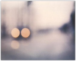
Critical analysis of Ura Barth's out of focus work:
|
Form: This photo is from Ura Bath's set of out of focus work, it's of what looks like a park or field. All that is visble in the photo is some greeny yellow leaves in the top right hand corner of the photo. Everything else in the photo is blurred and all that can be made out is faint shapes and colours. - the photo is very much green.
Process: The photo has been taken with a digital camera, depth of field is portrayed in the pictures as the foreground is in focus when the background is completely blurred. The photo has been taken outside during the day using natural light, in a park perhaps. Content: The photo is unusual because of the extent of it's blurriness. The only part of the picture in any focus is the few leaves, which aren't particuarly exciting. The rest of the image in completely blurred. I prefer this photo out of all Uta Barth's other blurred works as I like the depth of field. I do not see much point in having a photo that is completely blurry, however if something in the image in is focus is creates an interesting and mysterious contrast between the foreground and background. I have taken my set of images using depth of field, and the idea of having an objects, may it be a plant or an object, in the foreground IN focus and the background out of focus. |
 |
Response to Uta Barth's out of focus work:
Although I have uploaded a set of 18 images in response to Uta Barth's photography, I feel the 6 images below reflect most on the out of focus works of Uta Barth as they have the simplicity and minimalist effect that Uta Barth's work achieves.
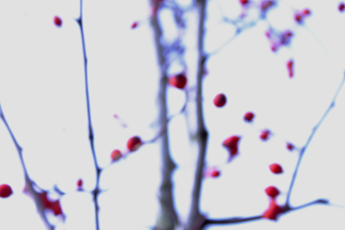
Aim: My aim for this set of photos, taken as a response to Uta Barth's out of focus photography, was to create photos that were out of focus only in some areas. I wanted to produce images that portrayed a strong depth of field. I understand the below do not really resemble those of Ura Barth', however I consciously made the decision to take photos using depth of field rather than having the entire image out of focus.
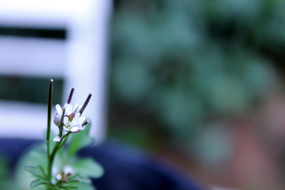

Process: I took these images on a manual setting, with auto-focus off, I played with the depth of field to ensure all my photos had an interesting sense of perspective, with only parts of each image in focus and the backgrounds very much out of focus. I really like this effect as it creates a strong contrast between the in focus image and out of focus background, making the object being photographed stand out.
Critique: I do not think the above 12 photo's look much like Uta Barth's out of focus images, they are too 'in focus'. The objects I have photographed look much more modern and busy in comparison to Uta Barth's photography.
Further Development: If I was to develop this set further I would ensure I took photos that mirrored the work of Uta Barth, just to show that I have the ability to try out new techniques. I would also make sure I photographed slightly more simple objects to get the simple minimalist effect that Uta Barth manages to achieve in her work.
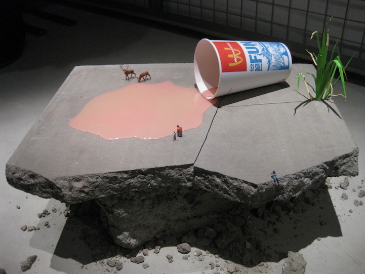
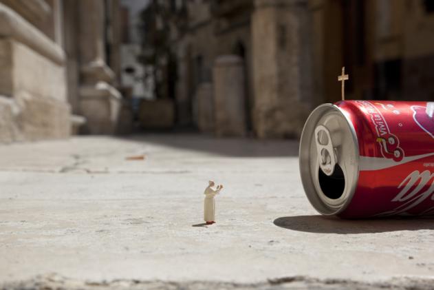
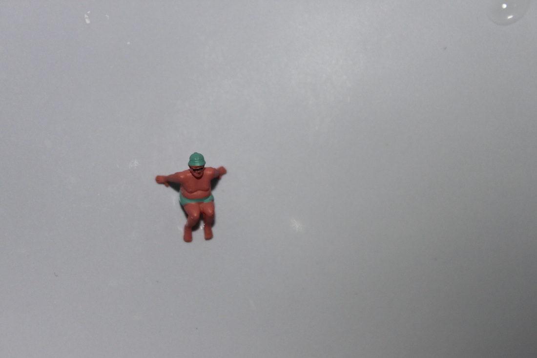
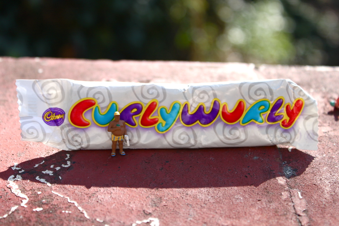
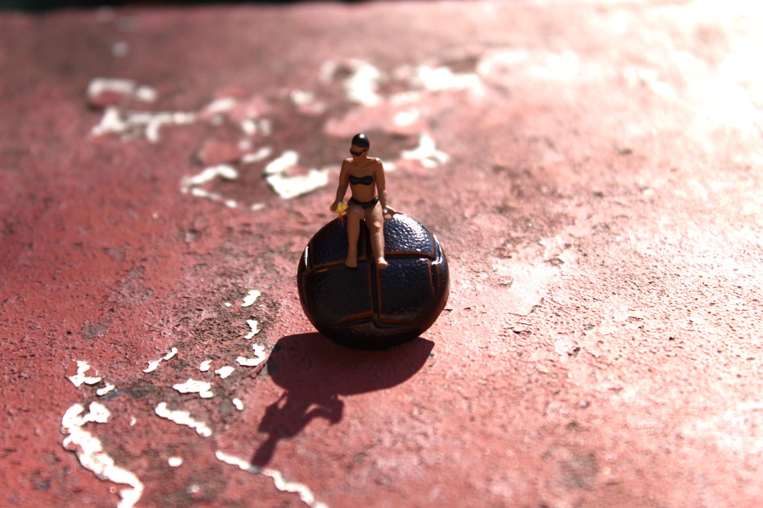
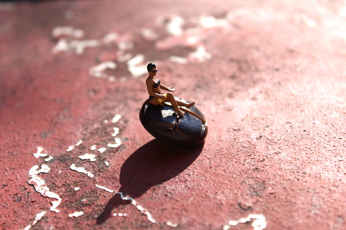
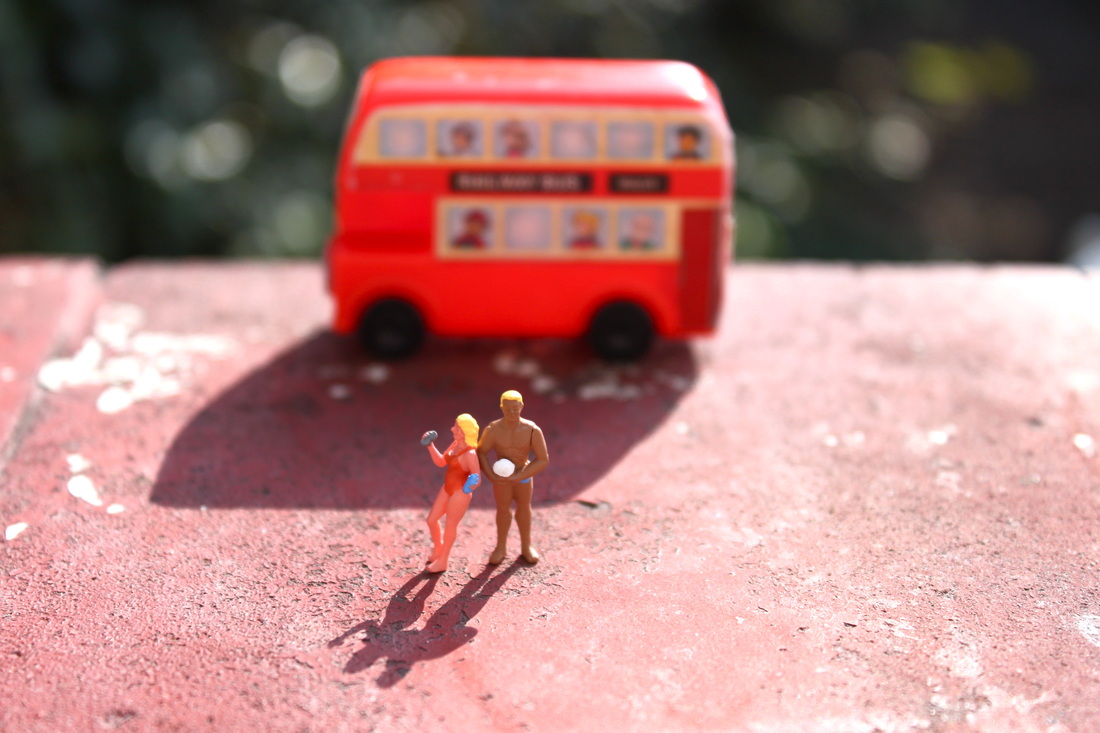
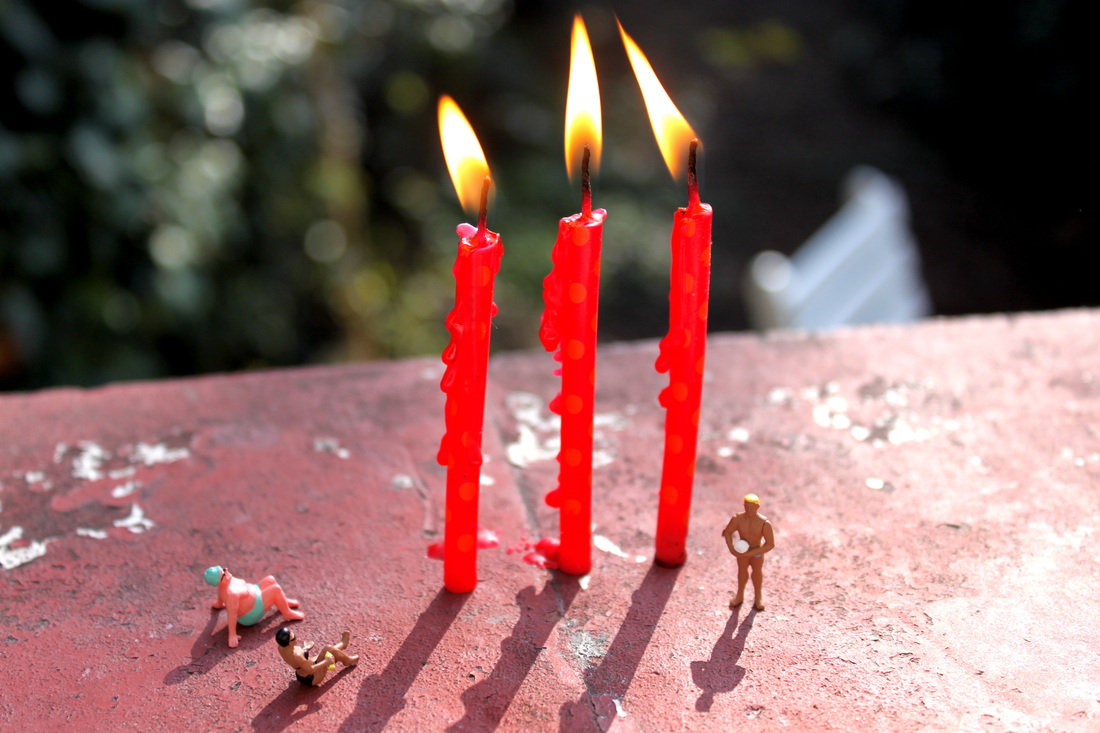
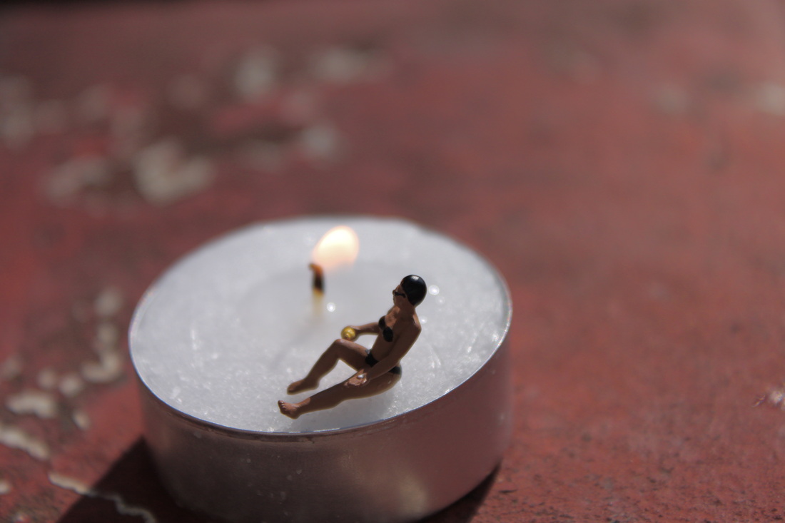
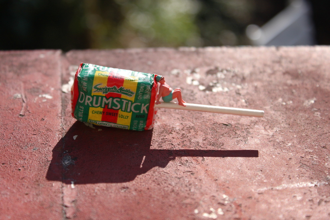
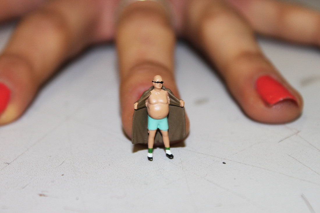
Little people project- Slinkachu:
Slinkachu is a London-based artist who creates very small street-based installations and then photographs them: from far away and up-close. He could also be described as a miniaturist. He modifies tiny human figurines from model train sets and places them in real urban situations, capturing them sight-seeing, camping, grocery shopping, fighting and dying.
"My little people project started in 2006. It involved the remodelling and painting of miniature model train set characters, which I then place and leave on the street. It is both a street art installation prokect and a photography project. The street-based side of my work plays with the notion of surprise and I aim to encourage city-dwellers to be more aware of their surroundings. The scenes I set up, more evident through the photography, and the titles I give these scenes aim to reflect the loneliness and melanchloy of living in the big city, almost being lost and overwhelmed. But underneath this, there is always some humour. I want people to be about to empathise with the tiny people in my works."
"My little people project started in 2006. It involved the remodelling and painting of miniature model train set characters, which I then place and leave on the street. It is both a street art installation prokect and a photography project. The street-based side of my work plays with the notion of surprise and I aim to encourage city-dwellers to be more aware of their surroundings. The scenes I set up, more evident through the photography, and the titles I give these scenes aim to reflect the loneliness and melanchloy of living in the big city, almost being lost and overwhelmed. But underneath this, there is always some humour. I want people to be about to empathise with the tiny people in my works."

|
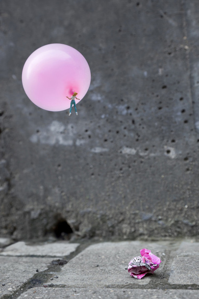
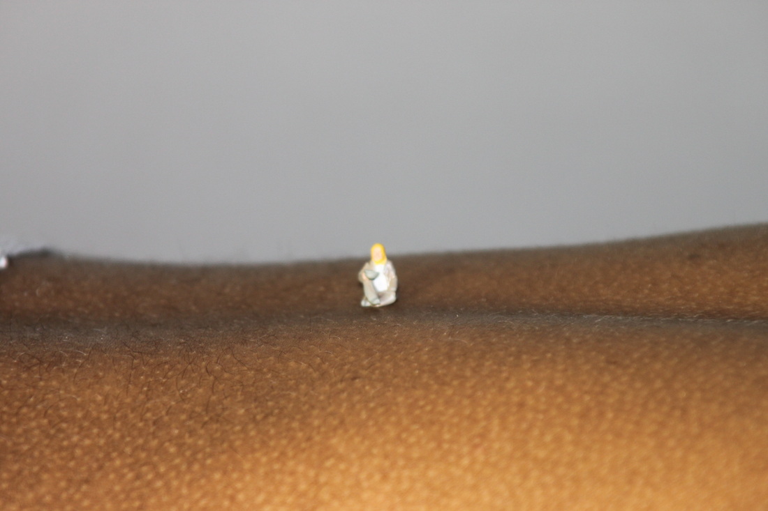
This is my personal favourite Slinkachu photo.
I like the simplicity yet comicalness of the picture. The colour contrast between the vibrance of the pink gum and the bleakness of the plain grey wall and pavement work very well together. Slinkachu is particularly good at creating images with a strong sense of contrast, using brightly coloured objects that successfully stand out in somewhat dull backgrounds. - This effect makes his photos more eye-catching. As Slinkachu's focuses on miniatures being photographed in everyday city life scenarios, it's important that the miniatures are the main focal point of the picture hence the brightly coloured clothing or props used in his pictures. Critical analysis of Slinkachu's work:Form: The photo is of a miniature figure blowing a bubble with a oversized piece of bubble gum, causing her to be taken up into the air with the bubble gum. Process: Slinkachu has used natural sunlight to take this photo. He's somehow got the bubble to float and attached the miniature figure to the bubble to create the effect that the miniature has blown the bubble and been carried up into the air. The bubble gum wrapped creates an interesting and comical effect. The bubble gum wrapper makes the distinction that the figure is supposed to be seen blowing a bubble, rather than just floating with a balloon. Content:Slinkachu's work reflects the loneliness and melancholiness of living in a big city, capturing the feeling of alomst being lost and overwhelmed. I think this photo particuarly captures this sense of lonliness. It reminds me almost of a mock of Banksy's 'baloon girl', a girl floating in the air holding onto a bouquet of baloons. |
 |
Experimental Slinkachu response:
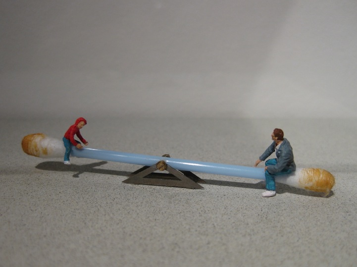
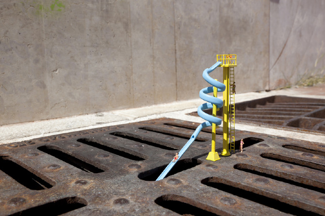
Toilet flume!
Aim: I wanted to create an interesting scene using the the miniature figurines. I decided on taking pictures of one of the beach miniatures using the toilet at a water slide as I thought the massive difference is size between the two is very comical, and Slinkachu often creates very comical scenes through his miniature photography.
Aim: I wanted to create an interesting scene using the the miniature figurines. I decided on taking pictures of one of the beach miniatures using the toilet at a water slide as I thought the massive difference is size between the two is very comical, and Slinkachu often creates very comical scenes through his miniature photography.
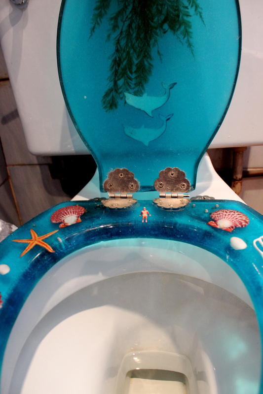
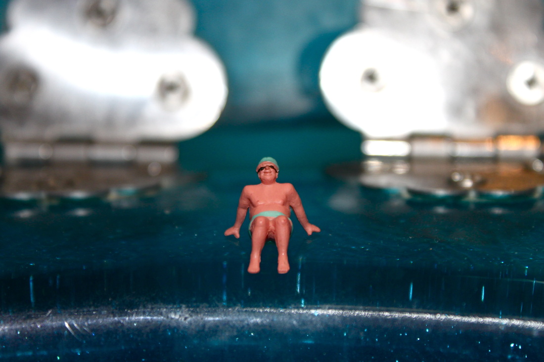

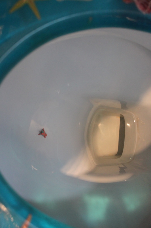
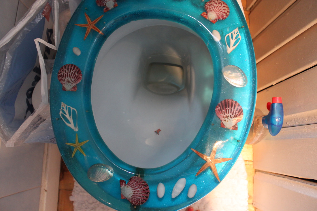
Process: I took a set of photos creating the scene of a miniature figurine using a toilet as a water slide. I took a variety of close up and far away shots to express my idea as clear as I could. The photos show the miniature figurine sitting on the edge of the toilet seat and then inside the toilet bowl creating the idea that he jumped off the edge and into the bowl, like a water slide.
Critique: The lighting wasn't very good in my toilet so I needed to use flash on my camera, however this created an unpleasent reflection of the silver parts of the toilet seat.
Further Development: If I was to further develop this set I would try and find an (unused) outdoor toilet where I could take my photo's using natural lighting, preventing unpleasant reflections in my final pictures. I would also like to create a similar set to this but using a sink or a bath, so I could have a selection of similar sets portraying the same idea.
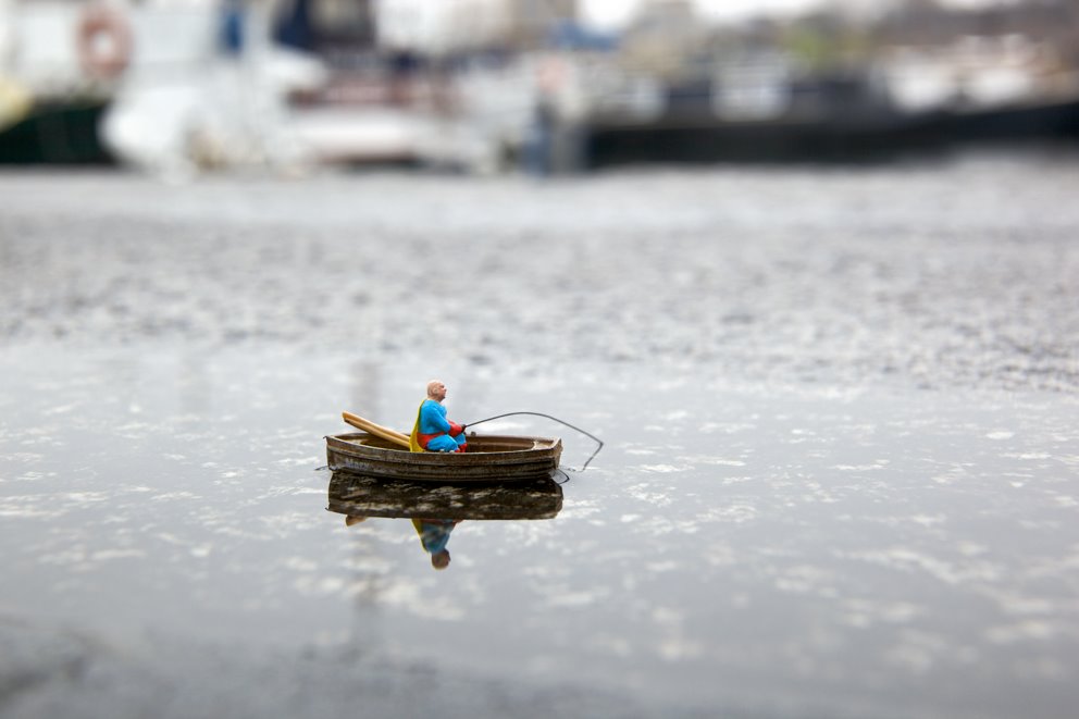
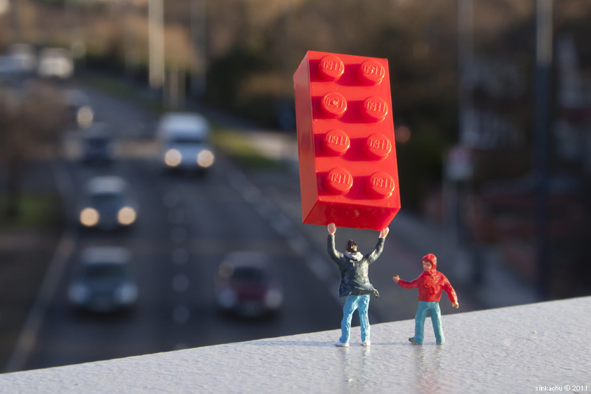
Respose to Slinkachu's 'little people project':


Process: I have taken a set of pictures using miniature figurines, I decided to use real life objects as props in the photos as I wanted to create a sense of scale. I also think some of the images look quite surreal due to the contrast in size between the miniatures and the real life objects.
Critique: The set doesn't really come under a particular theme or idea, it's very much experimental. This suggests I have not thought much about a set idea and have just carelessly taken photos.
Further Development: If I wanted to create another set portraying the contrast in size between miniature figures and real life objects, I would narrow down my ideas and categorise them as one set theme, so the photo's all resembled a similar idea/theme and were less random.
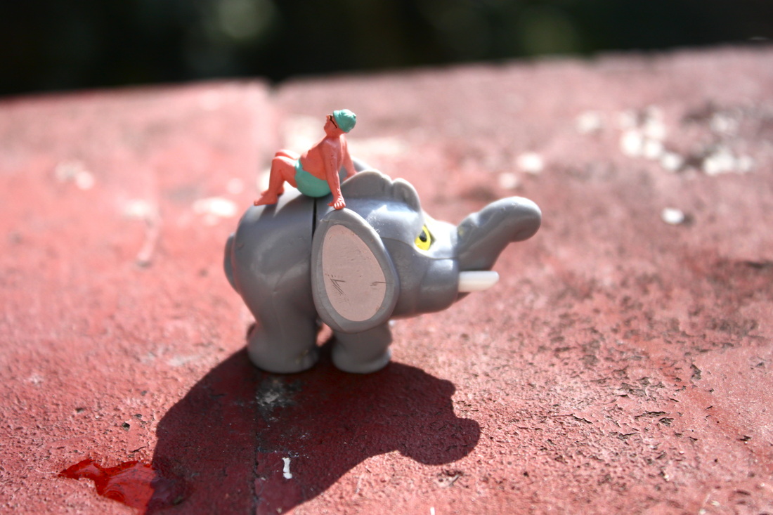
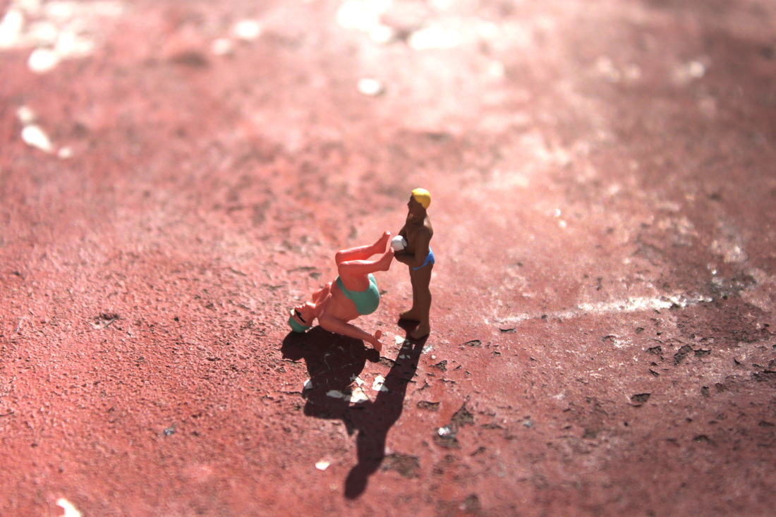
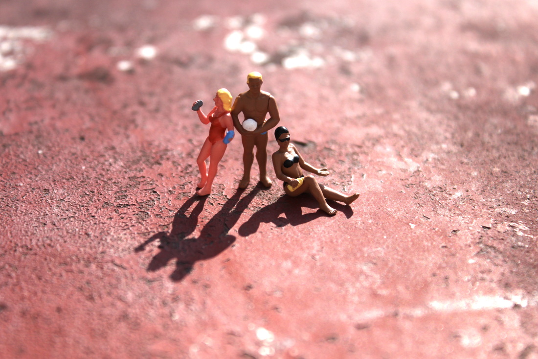
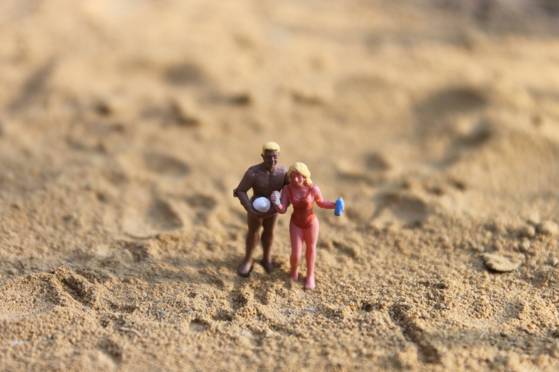
Slinkachu response -Miniature beach:
Aim: My aim was to create a realistic looking miniature beach using sand and miniature figurines. My set was taken in a response to Slinkachu's 'little people project', therefore I tried to maintain some aspects of his work within my own set -such as the contrast in scale between the miniature figurines and real life objects: the cocktail umbrella.
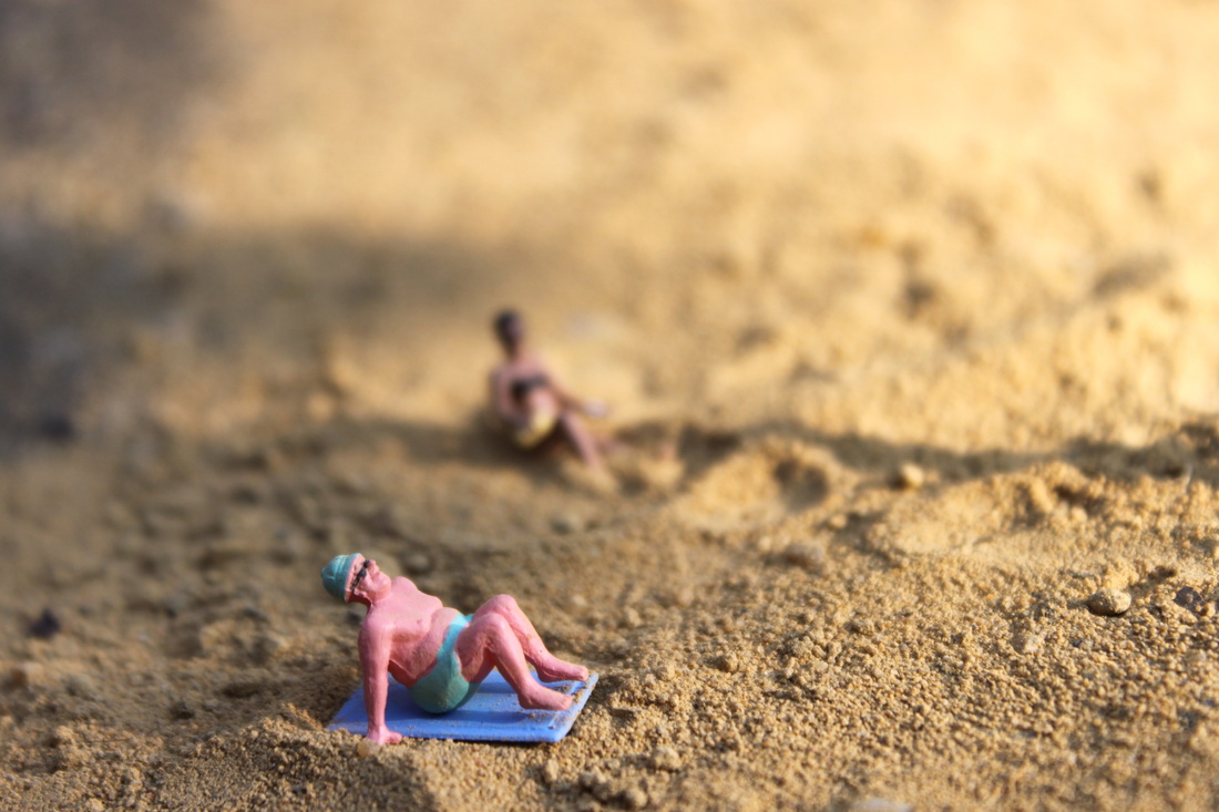
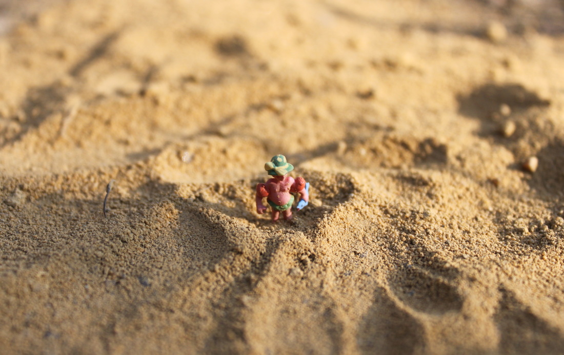
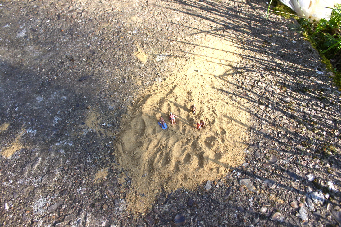
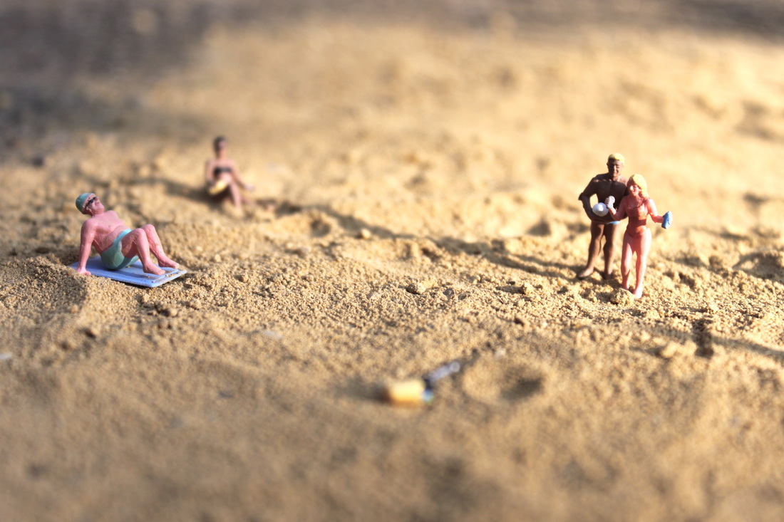
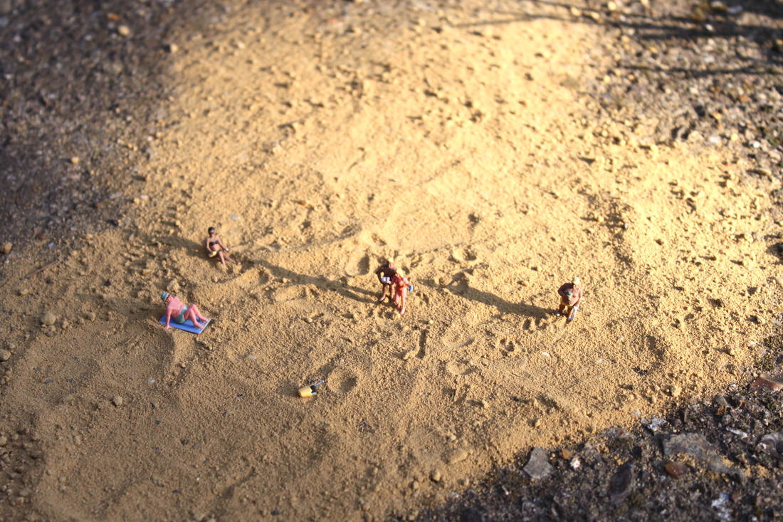

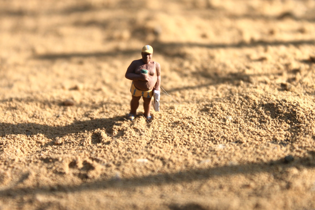

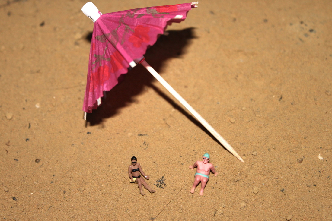
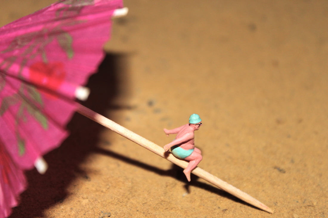

Process: I took a set of pictures of miniature beach themed figurines and created a beach for them. I gathered sand and cocktail umbrella's to create the beach scene. I took all my photos in natural day light as I wanted to get as much of a realistic effect as I could, the photo's were taken on a very sunny day effectively creating strong shadows and a noticble reflection of sunlight shimmering on the sand.
Critique: I would have liked to have more figurines to work with as some of the shots become a bit repetative after using the same figurines twice. I think the beach would also look more realistic if I had a larger variety of props are perhaps some how made a sea, or photographed the actual see in the background.
Further Development: If I was to further develop this set I would go to an actual beach and take these photos will the sea in the background to create a more ralistic effect. I would also try and vary the shots taken by using more props and different editing skills such as selective colouring, to perhaps make the miniature figurines stand out more in contrast to the props used. -making them the main focal point.
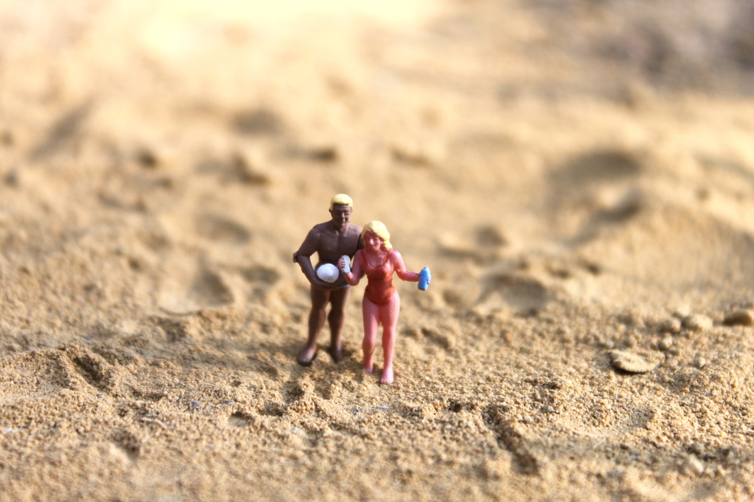
Close up and far away shot of miniature beach:
The 2 photos above show a far away shor and close up shot of my response to Slinkachu's little people project. The two shots are of the same miniature figurines but the far away shot gives a sense of perspective and real scale.
I wanted to show how a close up of even the smallest figurines, no bigger than a finger nail, could look incredibly realistic when viewed as a close up.
I wanted to show how a close up of even the smallest figurines, no bigger than a finger nail, could look incredibly realistic when viewed as a close up.
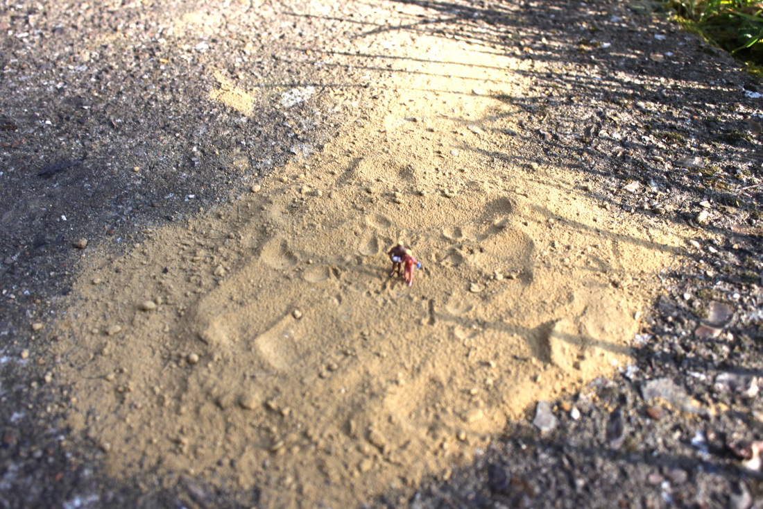
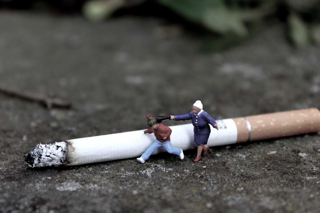
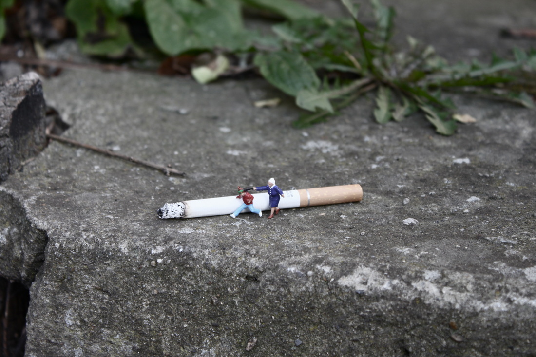
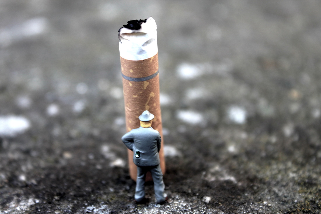
Close up and far away shots - Slinkachu response:
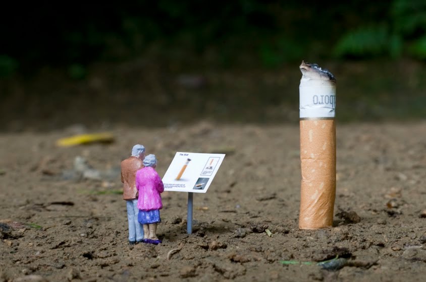
Aim: I experimented with different props similar to those used by Slinkachu in his 'little people in the city' such as cigarette butts. I took a close up and a far away shot of each image to show the real-life scale of the objects used.


A tiny Barbie's paradise:
Aim: I wanted to take a simple set of photo's with vibrant foreground colours to see what effect this had. I decided on taking a selection of photo's using a miniature barbie type figure standing in front of several vibrantly coloured nail varnish bottles.
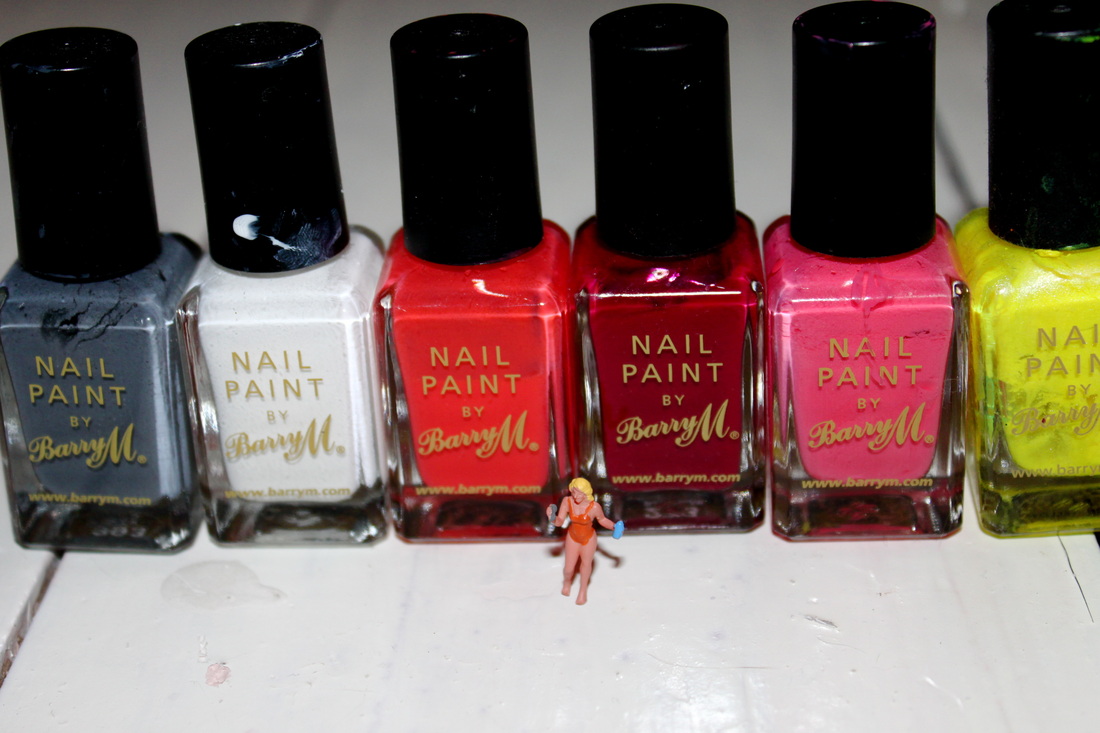
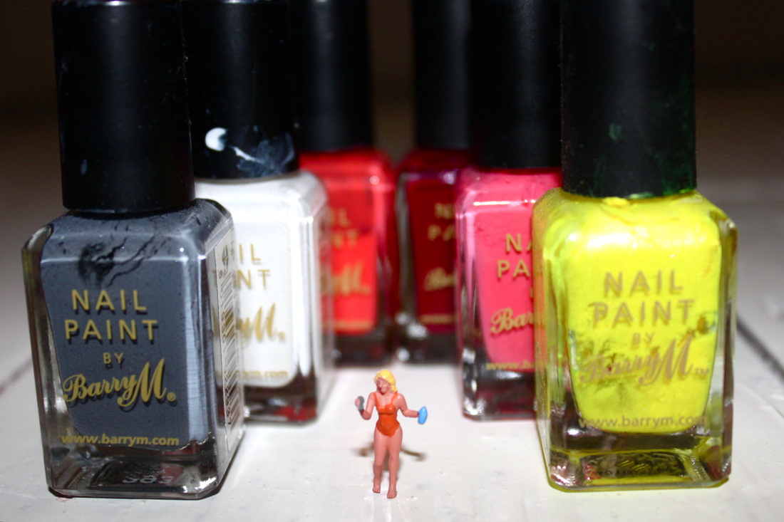

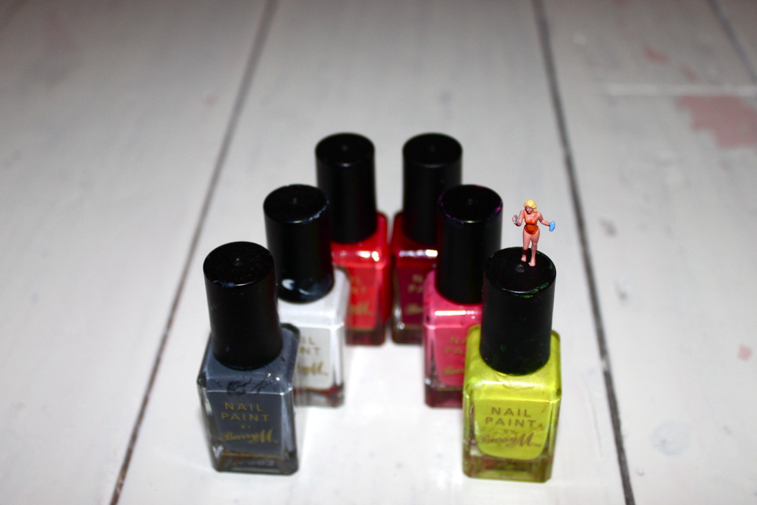
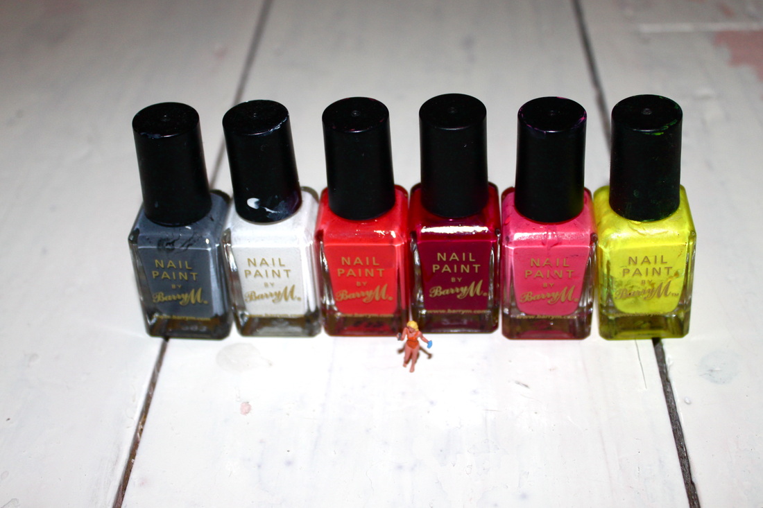
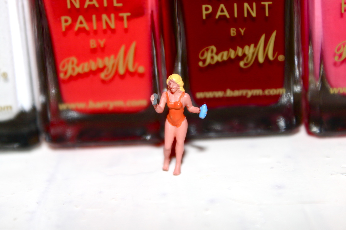
Process: I took this set of photo's indoors using flash. I wanted as much light as possible to exaggerate the colours of the nail varnish bottles. I photographed the miniature figurine close up and far away ensuring I got the vibrant colours in the background in each shot.
Critique: The set may look more interesting if they were taken outside rather than indoors on a plain floor. The photo's lack in variety, every picture includes the same miniature figurine and the exact same bottle's of nail varnish.
Further Development: If I was to further develop this set I would use a larger variety of props, perhaps other types of makeup. I would also experiment taking the photo's outside, maybe in grass, as it would exaggerate the miniature scale of the figurine if the photo's were taken in long grass and the green grass would also add to the vibrant colour scheme.
Miniatures on body parts:
Aim: I wanted to try something a bit different out, using the miniatures. I placed them on different body parts to see the effect it created.

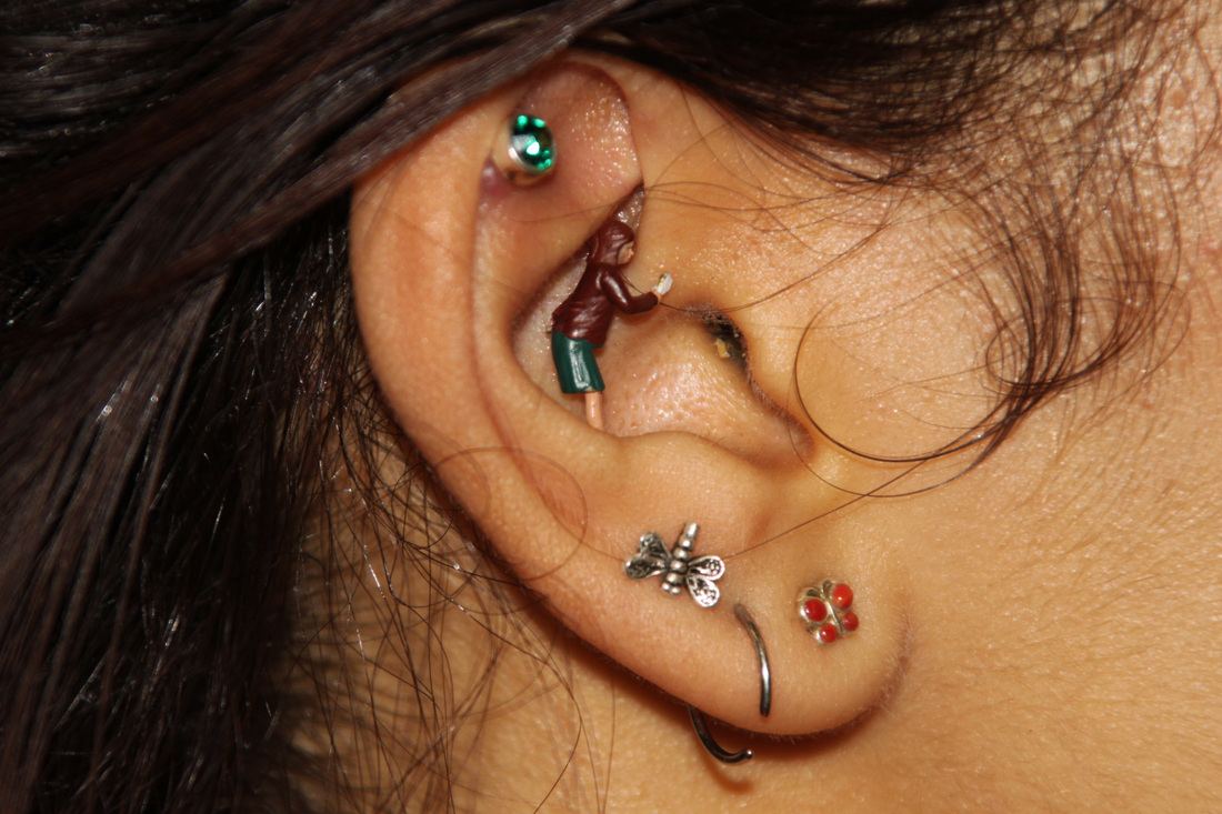
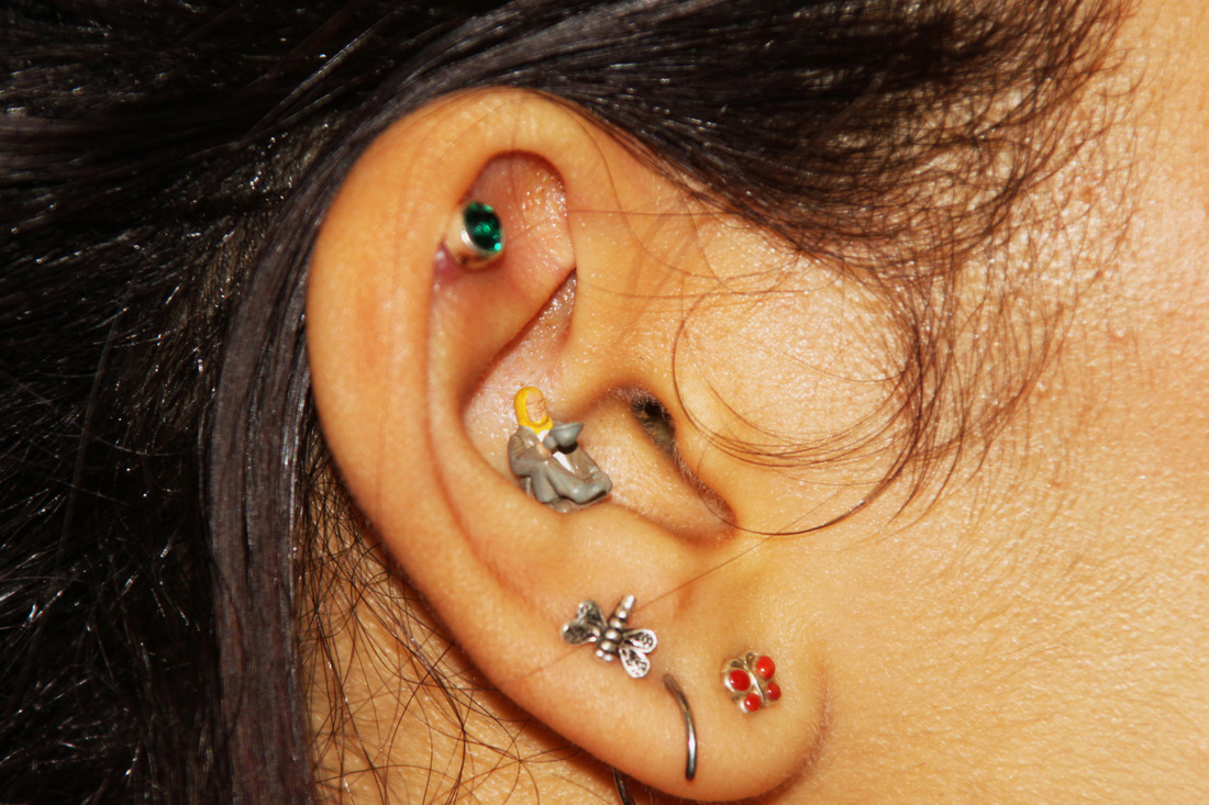

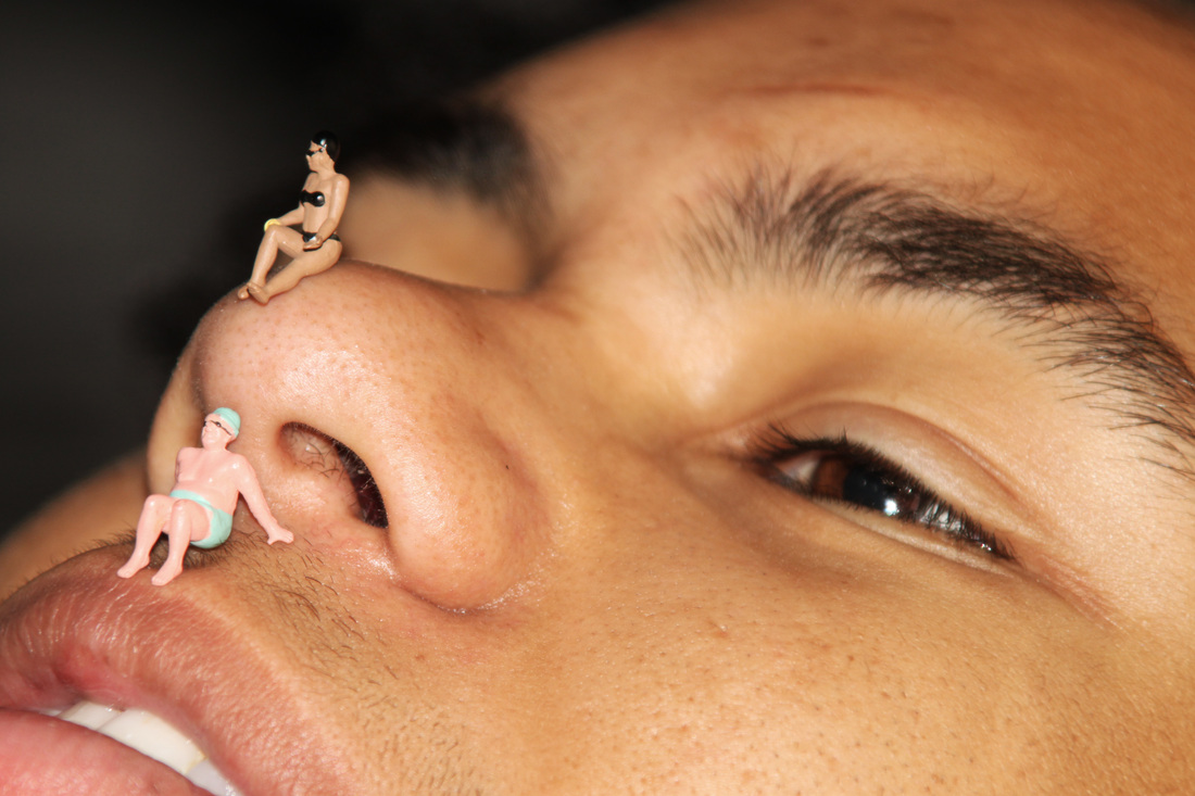
Process: I took a set of images in doors/in the studio using artificial lighting, I placed the miniature figurines on various different body parts. I wanted to create a clear and interesting sense of scale.
Critique: When I had the idea of using body parts along side the figurines I initially wanted the body parts to be unidentifiable to create a mysterious image where the viewer would have to really think about what they were seeing. I found it very difficult to disguise the body parts as the figurines are hard to focus in on as they're so small, and my lens isn't very strong.
Further Development: If I was to further develop this set I would try and use different more interesting body parts such as a stomach or hair, something that is less distinctive than say an ear or a nose.
Less identifiable body parts:
The two pictures below were taken on a models back. I thought the colouring was similar to a golden brown sandy beach - or that was the effect I was going for.

Aims: In these two images I think it's less clear what body parts the miniatures are on. I wanted to create an image that was quite unusual, perhaps the backs could be mistaken for sand..
Process: I took these pictures inside using artificial lighting from the studio. I found it hard to focus the miniatures clearly therefore they are slightly blurry, but I zoomed in as much as I could used manual zoom settings.
Critique: The miniatures are slightly blurred. The pictures might look more realistic and less like a back if it was taken outside and I could get the sky into the image as well to create the feeling that the miniatures were on a sunny beach.
Further Development: If I was to develop this set further I would ensure that the images were taken outside, I would try and get a more interesting setting in the background to create a more realistic looking image.
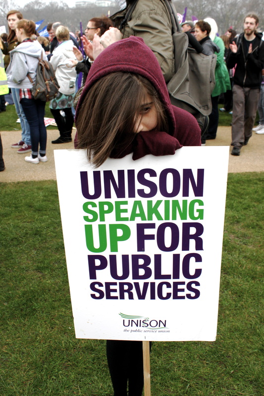
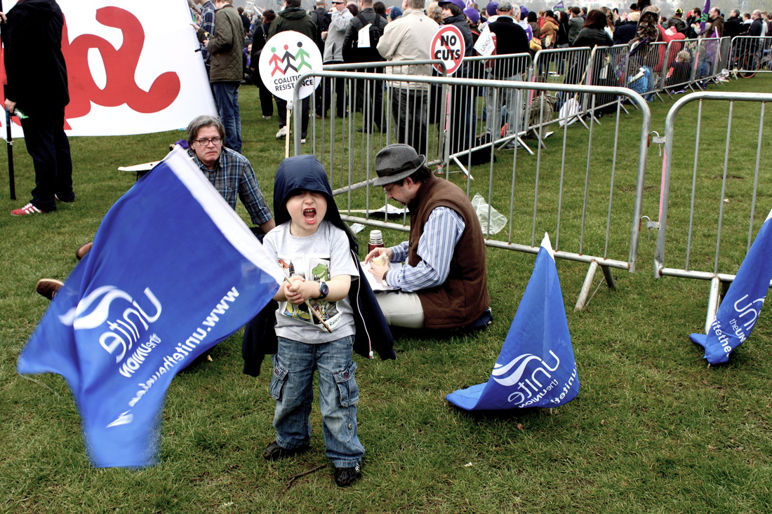
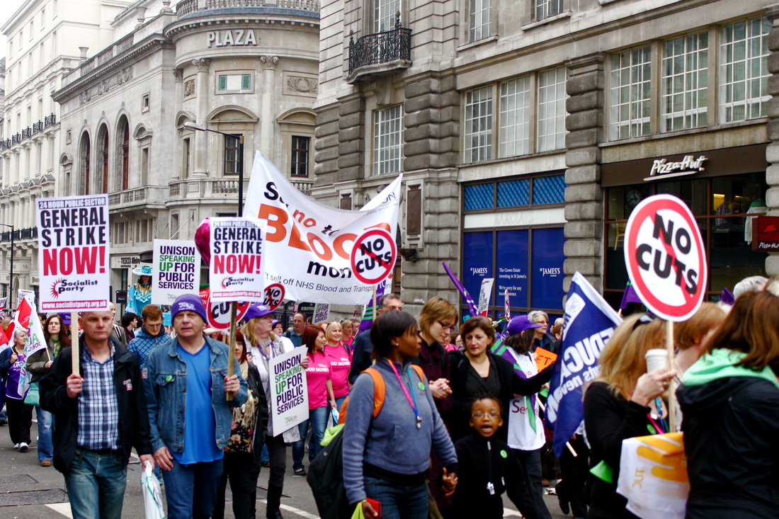
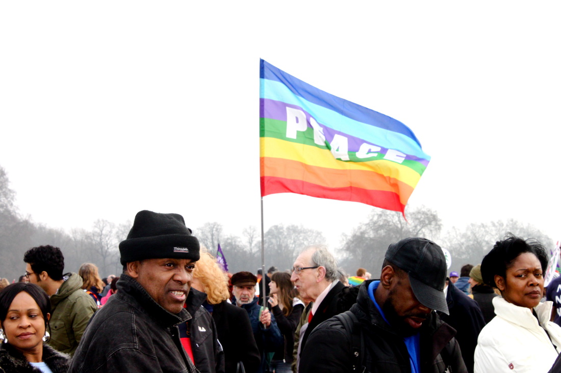
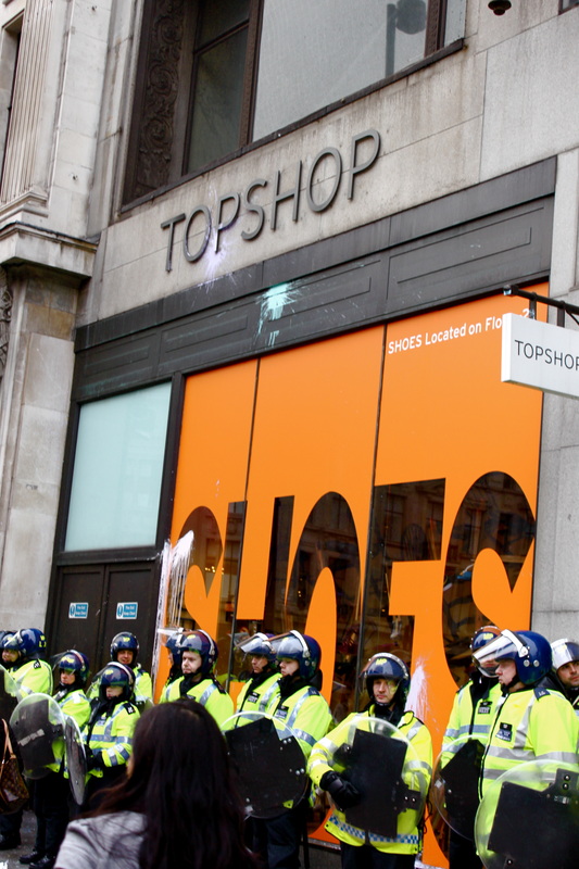
March against the cuts - on the 26th of March 2011:
On the 26th of March I took part in the march in London against the cuts being made to public services by the UK coalition Government. The march was organised by the TUC and it's been estimated that around 500,000 protestors attended.
Activists protesting against tax avoidance by big businesses targeted the flagship Topshop in central London, demonstrating against Sir Phillip Green's tax bills.
Activists protesting against tax avoidance by big businesses targeted the flagship Topshop in central London, demonstrating against Sir Phillip Green's tax bills.

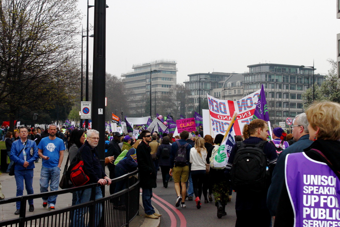
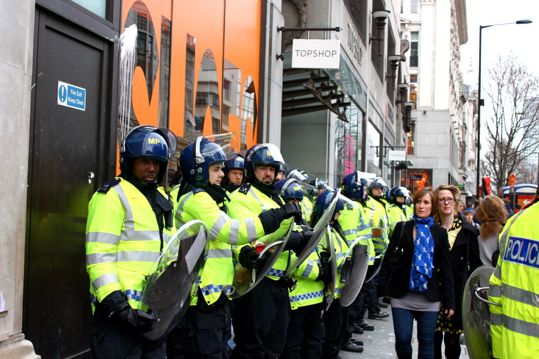
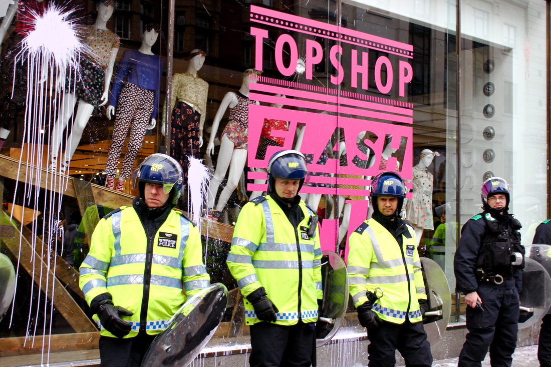
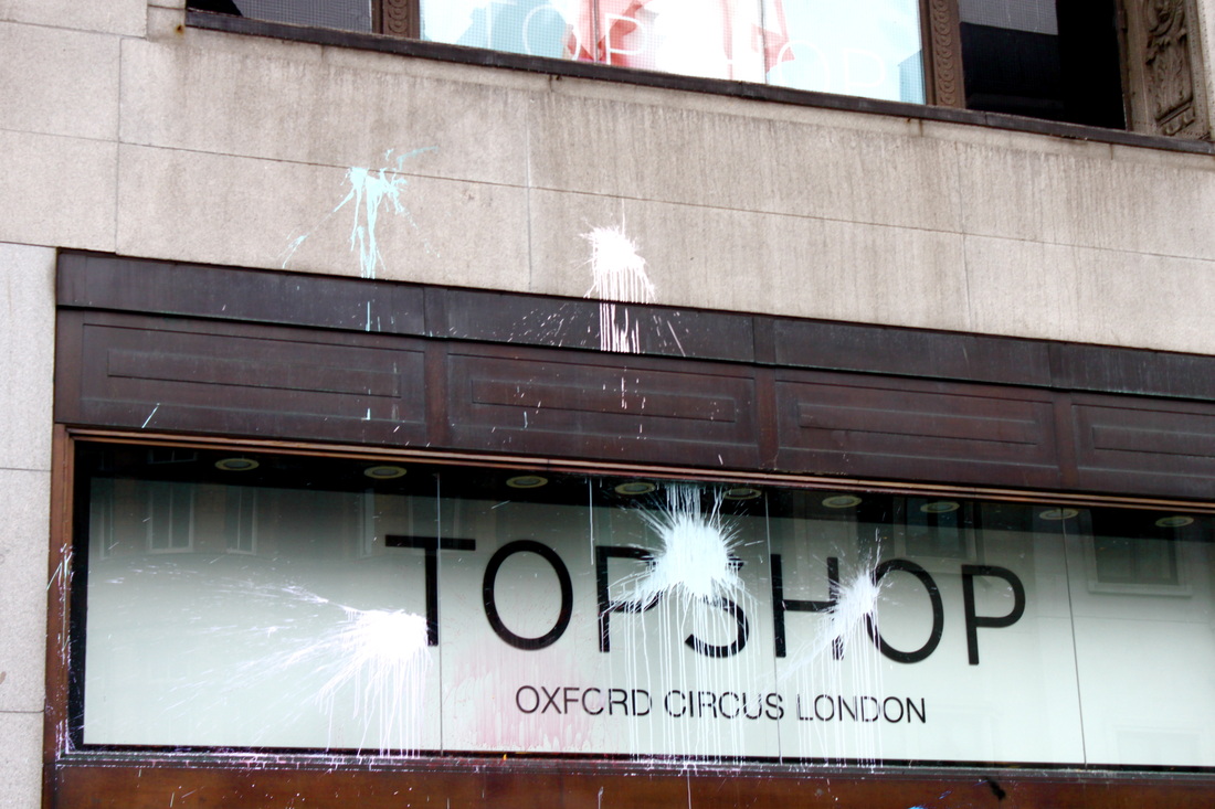


In the above set I aimed to capture some spontaneous photos at the march on the 26th of March against Government cuts. I particuarly like the photo of 3 police officers standing in front of a paint splattered Topsop window with the hot pink words 'Topshop flash' in background. I like the colour contrast of this image, the fluorescent yellow Police jackets work well with the bright hot pink letters behind them. In the window you can see a selection of manakins which add to the surreality of the image. It's hard to believe, when you're shopping in Topshop, that it would be a target for political activists and vandalists.
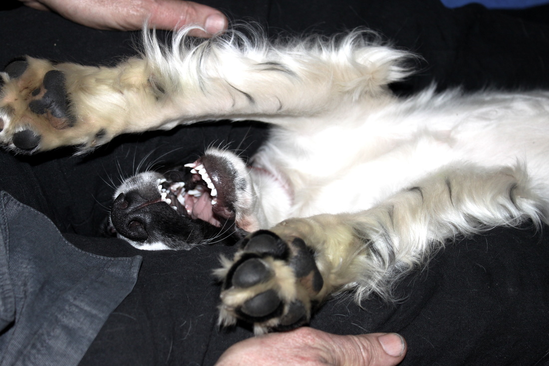
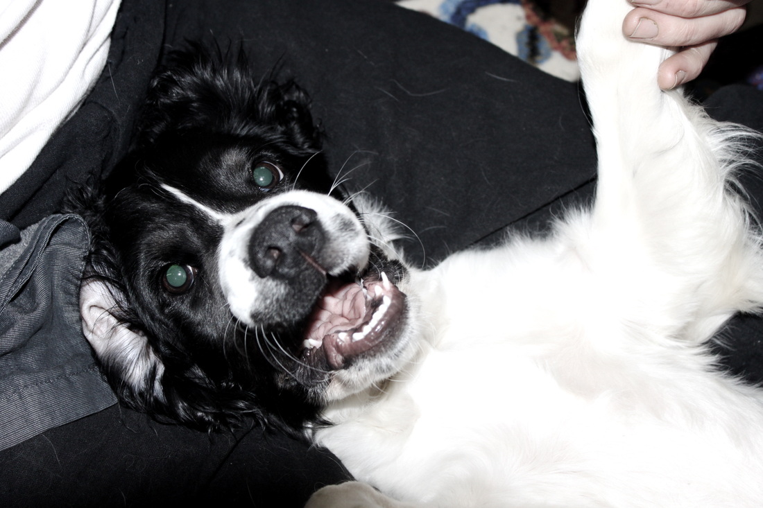
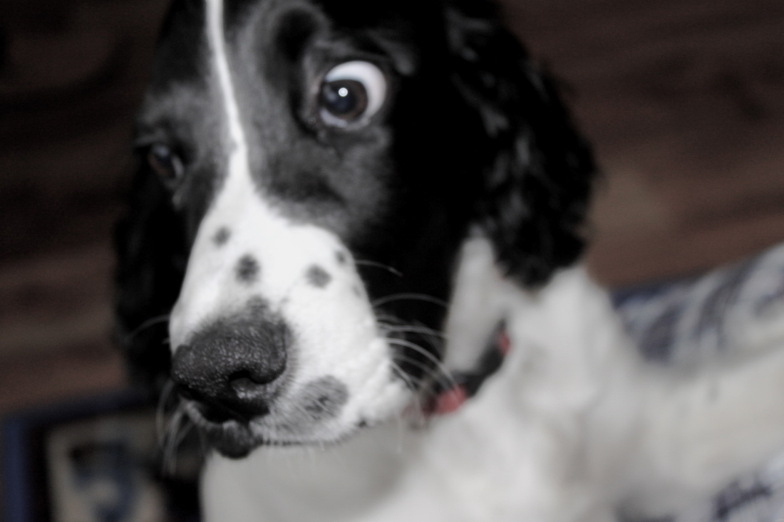
Charlie:
Aim: There's no aim to this set - I just wanted to share pictures of this gorgeous doggy.

Research on photographer that uses mirror reflections - Hannah Starkey:
"Mirror reflections for me are a really good analogy for my photography because they picture the interior and exterior on one plane."
"Mirrors, reflections more generally, are the only way we see ourselves in the world outside photography."
Hannah Starkey is one of the most influential and significant photographers of her generation.She creates images that emerge from the split second of the everyday and are resolved into what appears to be an extended moment in time.
Her work is exquisitely composed, drawing on the languages of cinema and of painting to create scenes in which the figure and the surroundings are held in perfect tension, each defining the other.
Hannah Starkey born in Belfast in 1971, she studied Photography and Film at the Napier University, Edinburgh and Photography at the Royal College of Art, London. She currently lives and works in London.
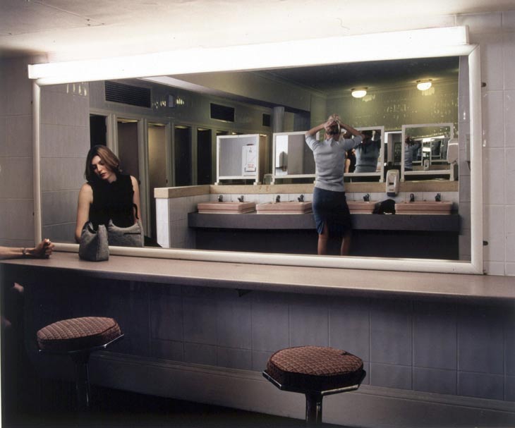
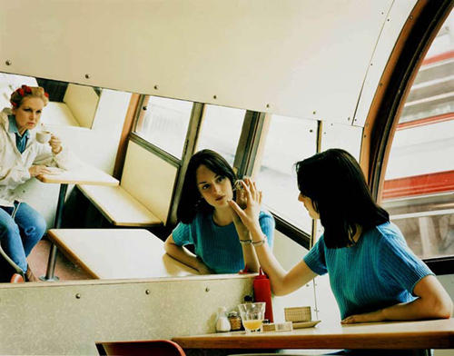

I particularly like the 3 photos by Hannah Starkey above. They're all very interesting shots, taken in every day places such as a cafe, public toilet and bedroom. The first photo is interesting as it's like a reflection within a reflection, the positioning of the mirrors in photo creates a very unusual composition. The reflection within a reflection gives the image a sense of layers to it. In the second photo I like the way in which the mirror creates a distorted angle to the reflection. I admire the over the shoulder shot as it creates a mysterious feel to an image, being able to see both the back and front of a person in a photo is very interesting as usually we can only see one or the other in real life. It creates an unusual sense of perspective. Over the shoulder shots are also interesting as they create a sense of secrecy and intrusion into the picture, you feel as if you should not be looking at it, as if the photographer has not been noticed. It also makes the photo's look un posed and natural like the photographer has caught the models off guard.
All 3 photos were taken indoors the first and last image have very dim artificial lighting which adds to the eeriness of the images. The second photo is also taken indoors, however the light is natural and coming from a large window behind the model, the day light from outside reflects onto the mirror causing a much brighter image.
All 3 photos were taken indoors the first and last image have very dim artificial lighting which adds to the eeriness of the images. The second photo is also taken indoors, however the light is natural and coming from a large window behind the model, the day light from outside reflects onto the mirror causing a much brighter image.
Artists that use mirror reflections - Lisa Jacoby:
"My photographic work seeks to investigate the idea that the appearance of what we see as “reality” is malleable and constantly shifting. Reflections allow the camera, a single point perspective tool, to see from multiple viewpoints at once, thus potentially destabilizing the viewer’s personal sense of visual authority or any fixed sense of “point of view”. The presence of multiple visual channels can challenge assumptions about perspective, both journalistic and personal; it can even argue that the camera’s truest marker is not image but time. By marking a specific moment, the camera allows the opportunity to take “point of view” itself as a vehicle forcontent and contemplation.I use mirrors to combine their reflections with reality. None of these images have been digitally contrived."
|
|
Critical analysis of Lisa Jacoby's reflection portraiture:Form: The photo is a black and white reflection of a woman holding a camera looking into a mirror, there appears to be two mirrors as part of her head is slightly distorted and appears to be coming reflected from another direction. - This combination of unusual reflections going off into different directions is very surreal looking.
Process: The photo appears to be taken indoors, however it seems as if there is a door open behind the photographer, natural sunlight is reflected onto the mirrors creating a strong contrast of dark and bright. The photographers face is very dark which contrasts against the brightness of the sun-lit sky reflected in the mirror. Content: The image is very unusual looking, it's hard to read the photographers facial expression. She appears to be gazing off into nothing. He eyes look blank |
None of Lisa Jacoby's other reflection portraiture is available online therefore I have no been able to access any other photo's to share on my weebly. The link below is her website where there is a large variety of her amazing photography where she uses mirrors to photograph very unusual and surreal portrait reflections.
http://www.lisajacoby.com/
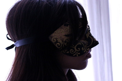
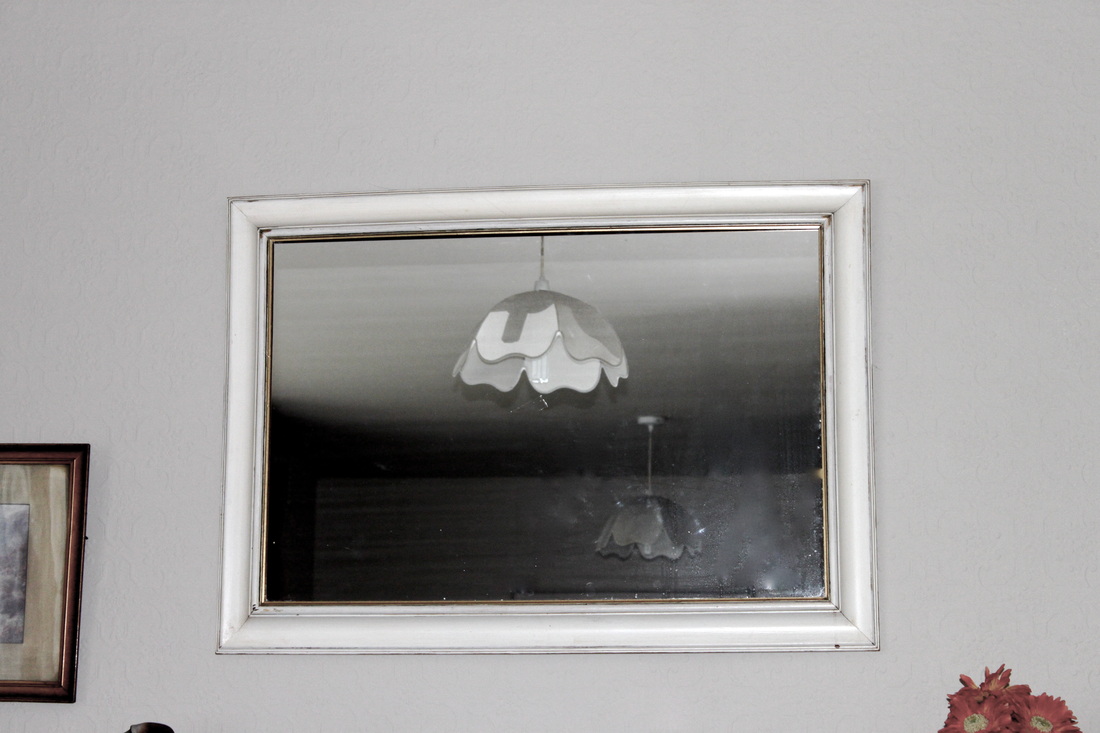
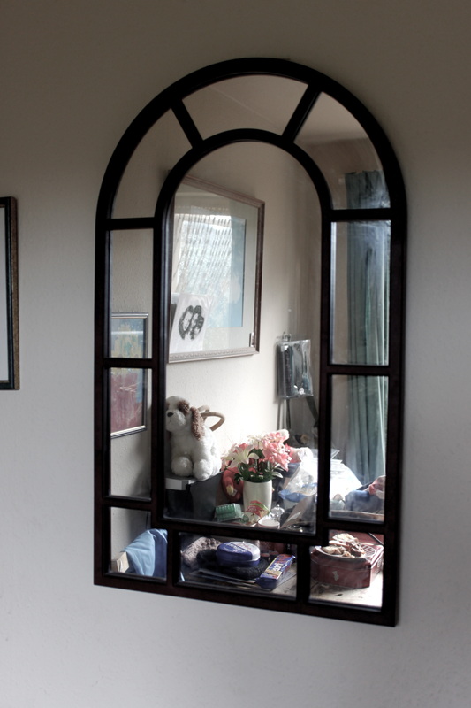
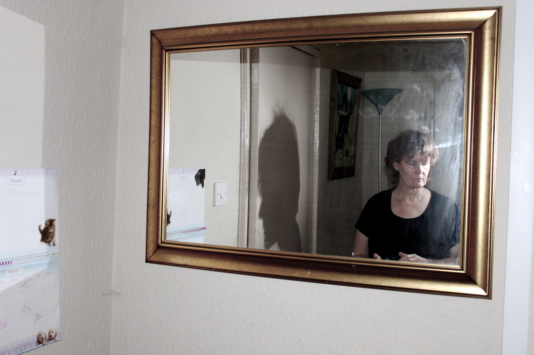
Examples of effective mirror reflections:
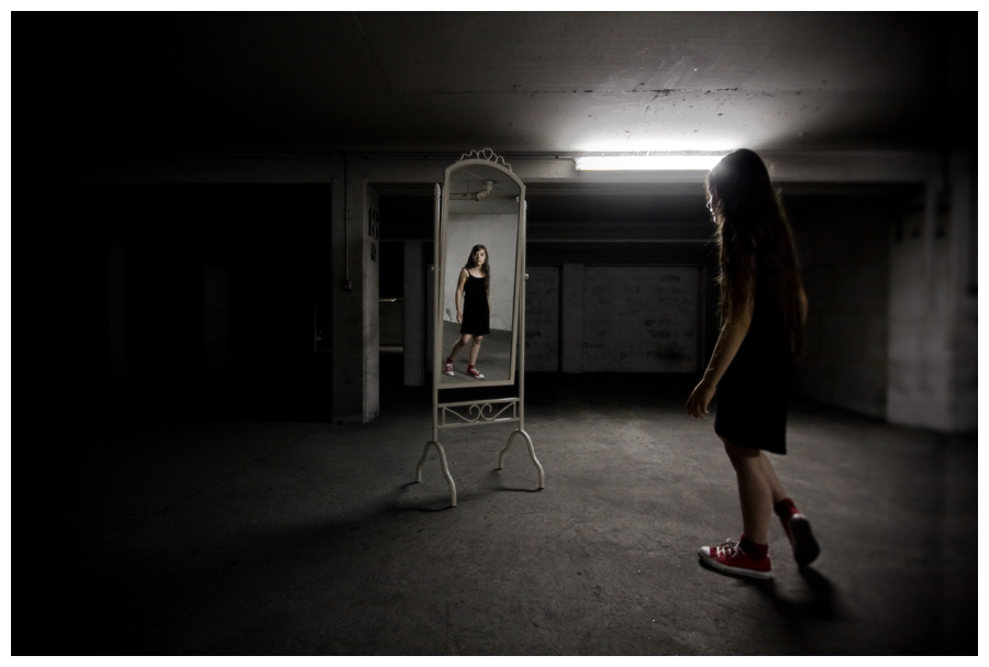
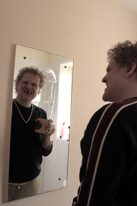
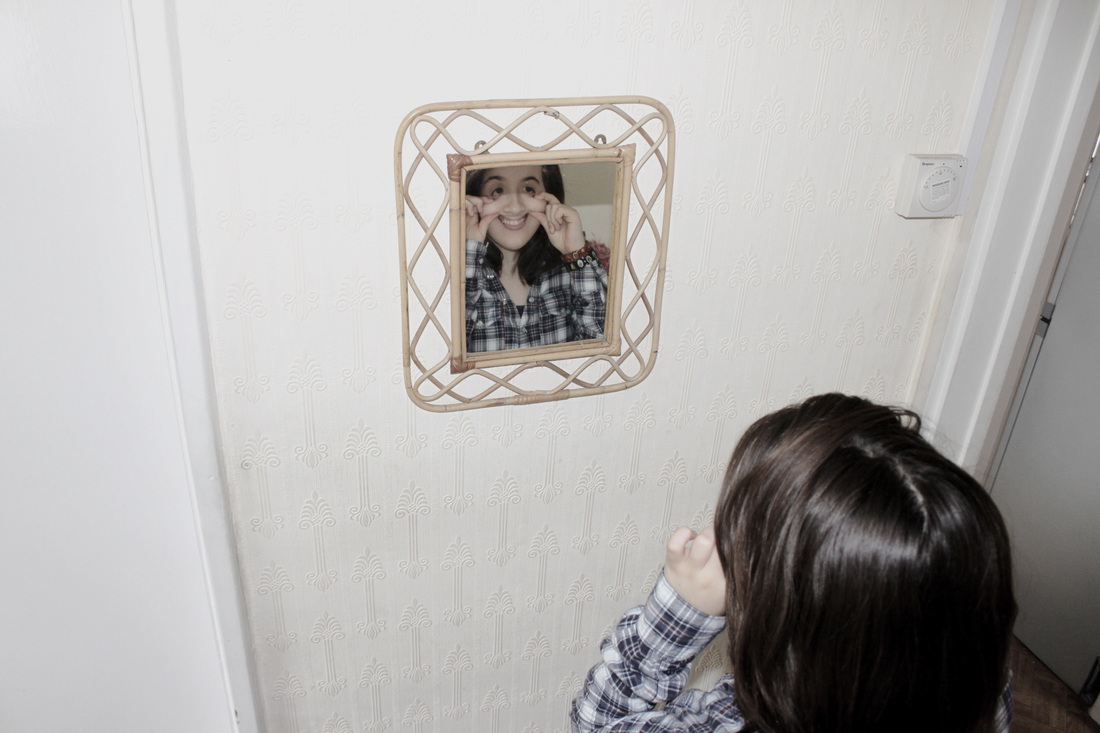
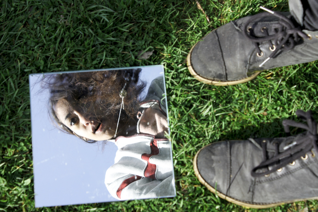
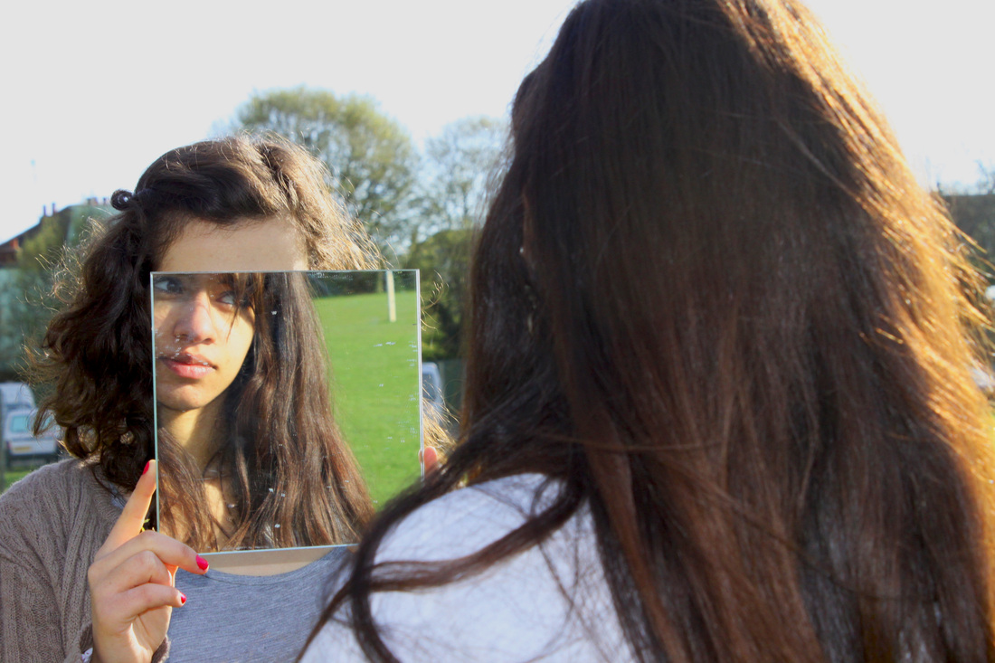
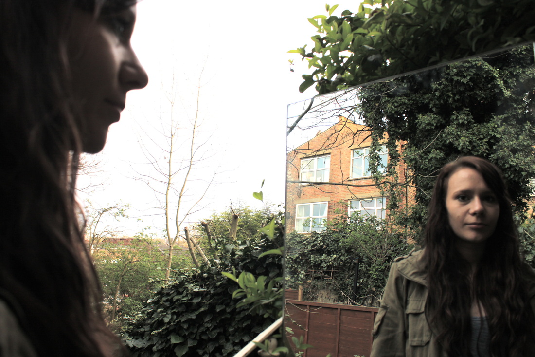
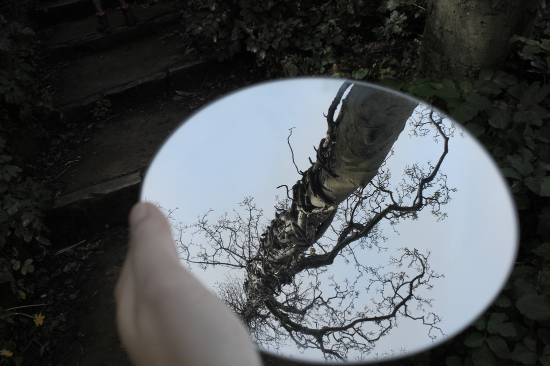
I found a selection of portraiture images using mirrors to create interesting reflections. I have decided I want to create a final set of observations using mirrors to create unusual reflections that portray the theme 'mystery' and 'imagination'. The below images caught my attention as they're all very simple yet effective, they're all very different; black and white, very colourful, close up, far away shot, profile shot, face on shot, taken indoors, taken outdoors etc.


Portraiture mirror reflection analysis:
|
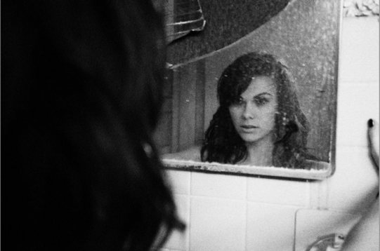
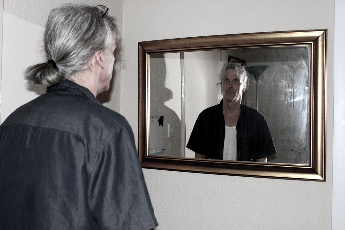
Form: The photo is an over the shoulder reflection of a female looking into a dirty mirror. The photo is in black and white and there is a very high contrast. Process: The photo was taken indoors with artificial lighting, perhaps with the flash on the camera as the right hand corner of the mirror appears to be lighter than the rest, this suggests that the camera's flash was on or a light was on in the room and the light has reflected off the mirror. Content: The image is effectively creepy and eerie. The black and white has a large impact on the way the photo is interpreted, it successfully creates a mysterious effect and sense of seriousness. The expression on the models face also creates a sense of mystery and uncertainty about the photo. The models expression is very difficult to read, the dirtiness of the mirror helps cover up her expression. The over the shoulder shot creates a sense of intrusion, as if the photographer should not have been there at the time; an effect often used in horror films - to give the audience the feeling that they are there in the room. |
 |
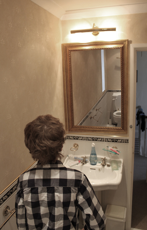
Indoors reflections:
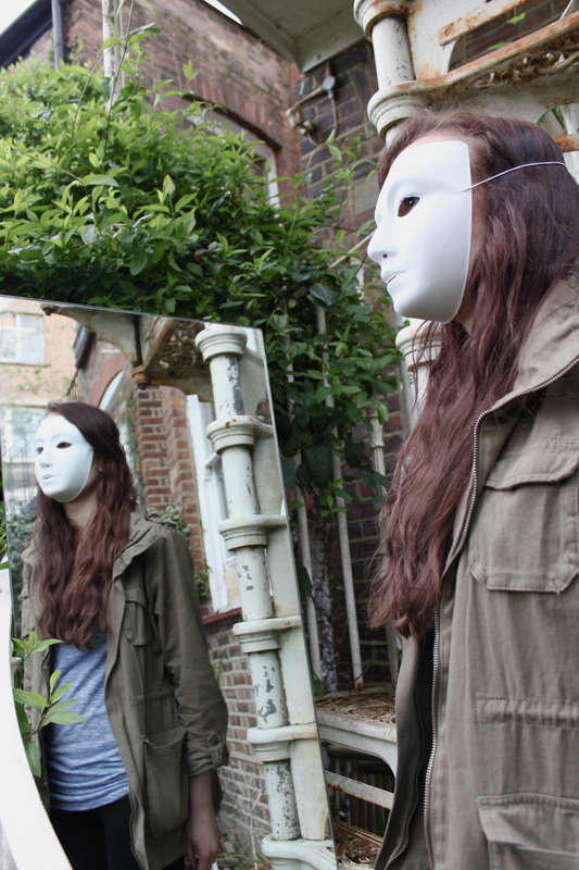
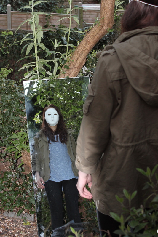
Aim: I have decided to take a set using mirrors and reflective surfaces to create interesting and mysterious reflections. This is an experimental set but I want to take the idea further and try to create images that portray another world inside a mirror. For example, taking two reflection pictures in different settings and then editing the images by using photoshop to create an image where you see the back of a young girl looking into a mirror and in the mirror you see the reflection of a man in a mask looking back at her.


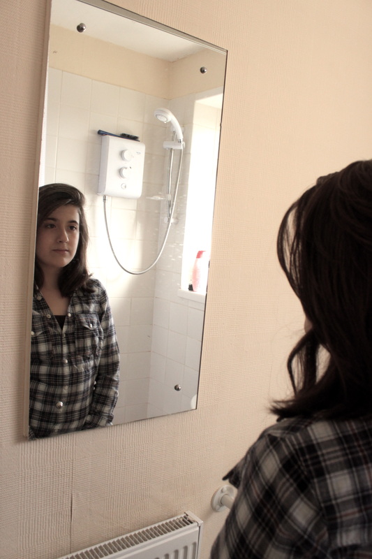
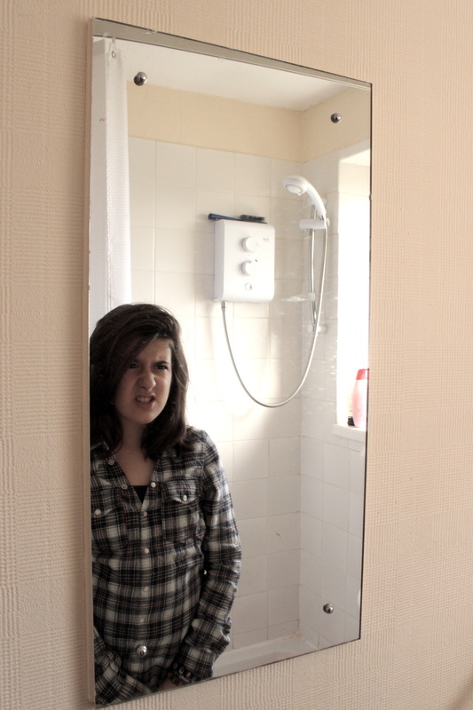
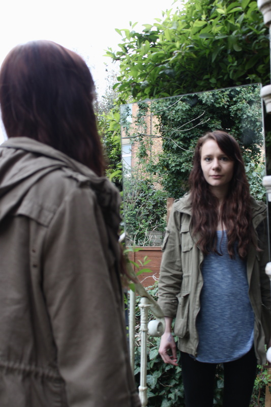
Process: I took a set of indoor photos of reflections from mirrors. I didn't want to be seen in the reflection so I angled myself where I couldn't be seen. I like the idea of being able to see the behind and front of a model in the reflection as it creates an unusual image as we don't usually get to see both the back and front of a person in a portrait.
Critique: Apart from the mirrors being dirty.. I think the images are a little repetitive and lacking in variety and mystery. There's nothing very mysterious about a persons reflection in a mirror, even if they're pulling a horrible face.
Further Development: If I was to further develop this idea I would use photoshop to create an image where the reflection in the mirror is different to the person looking into the mirror. I would also like to take a set with a mirror outside as I think more could be done with a portable mirror, the reflection in the mirror could be a different setting from the setting where the image is taken behind the model looking into the mirror.
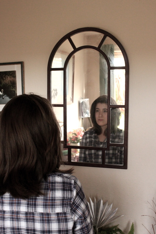
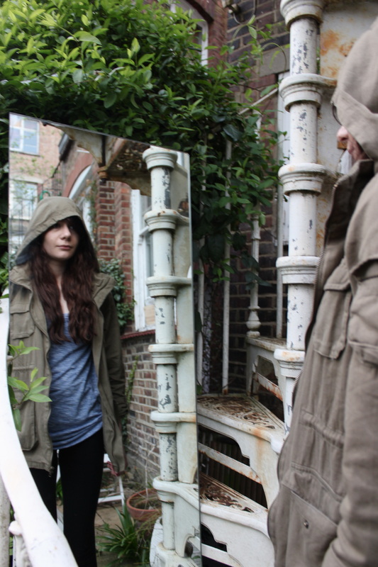
Outdoors reflections:
Aims: I wanted to take a simple set of photos using mirrors to create reflections taken outside in natural sunlight. I much prefer this set in comparison to the indoors set as the colouring in the images is much more vibrant and bright due to the sunlight.
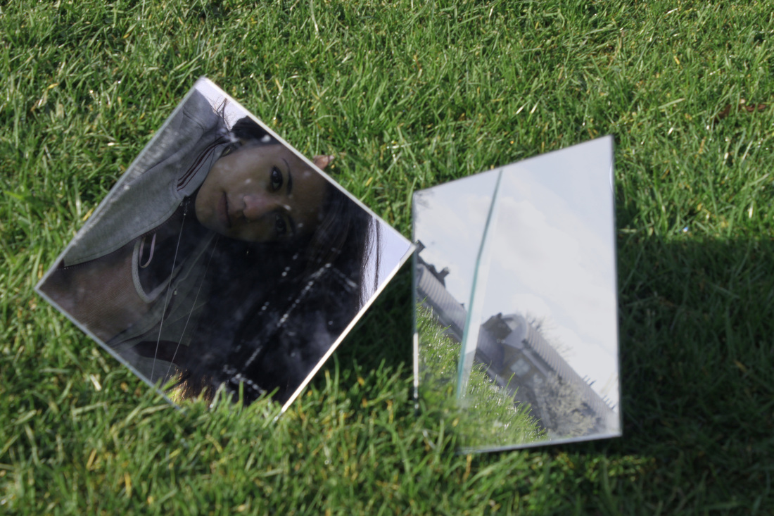
Process: I took these photos outside in natural sunlight using manual focus to avoid depth of field between the person looking into the model and their reflection.
Critique: The photo's aren't very mysterious, they're all quite similar and lack the themes of 'mystery' and 'imagination'. Additionally, the mirrors I used in this set were very small therefore the images lack variety, all that is seen in each picture is a face, nothing more.
Further Development: If I was to further develop this set I would definitely progress to creating edited images on photoshop that appear to have a mysterious and unexplainable world inside the reflection of the mirror.
For example, I take a simple picture of a model standing in front of a mirror balanced up against a brick wall and then I take another photo with the mirror placed amongst a forest with a different person's reflection in the mirror, perhaps wearing a mask, then merge the reflection of the masked figure into the other photo creating the idea that there is another world in the mirror. I would also use a larger mirror so that more of the body could be seen in the image, creating a more realistic looking photo.
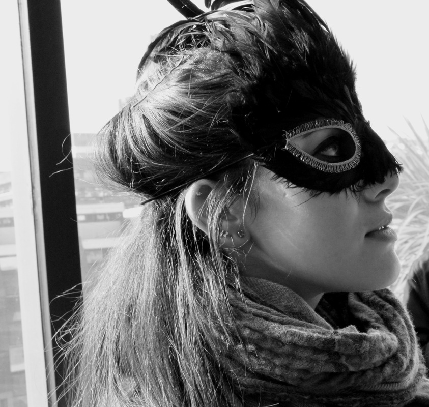
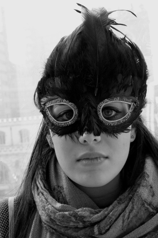
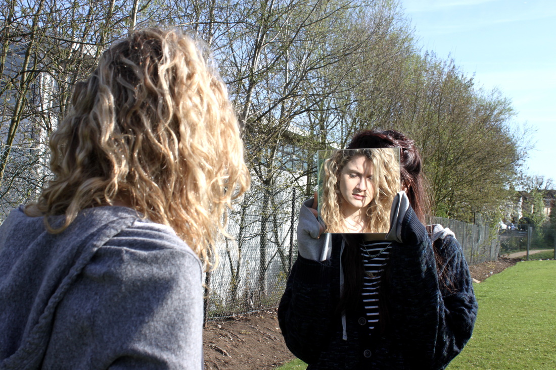
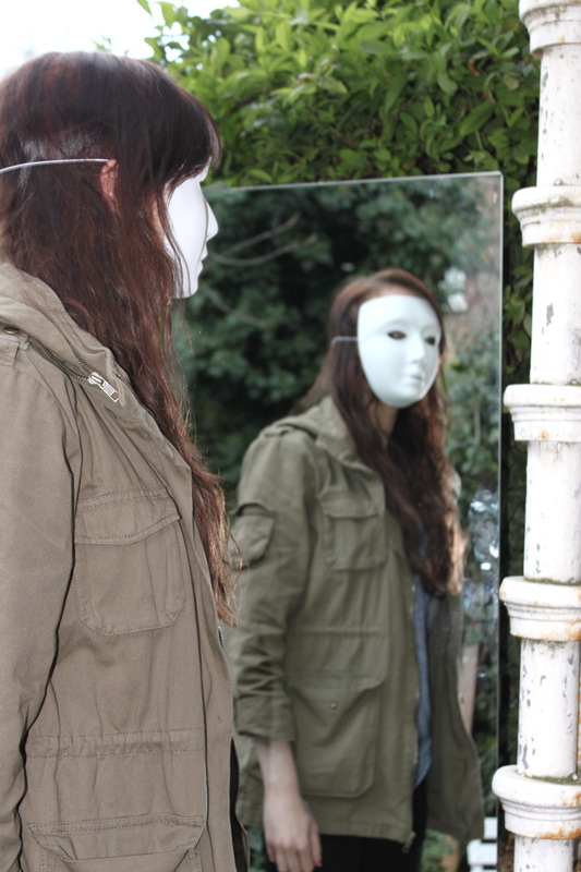
Outdoor reflections - masked (split personality)
Aim: I want to attempt to portray the idea of a split personality through the use of reflections. The good and the bad sides of a person. Obviously, with the masked figure representing the 'bad' and the figure with no masking representing the 'good'.
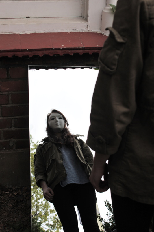


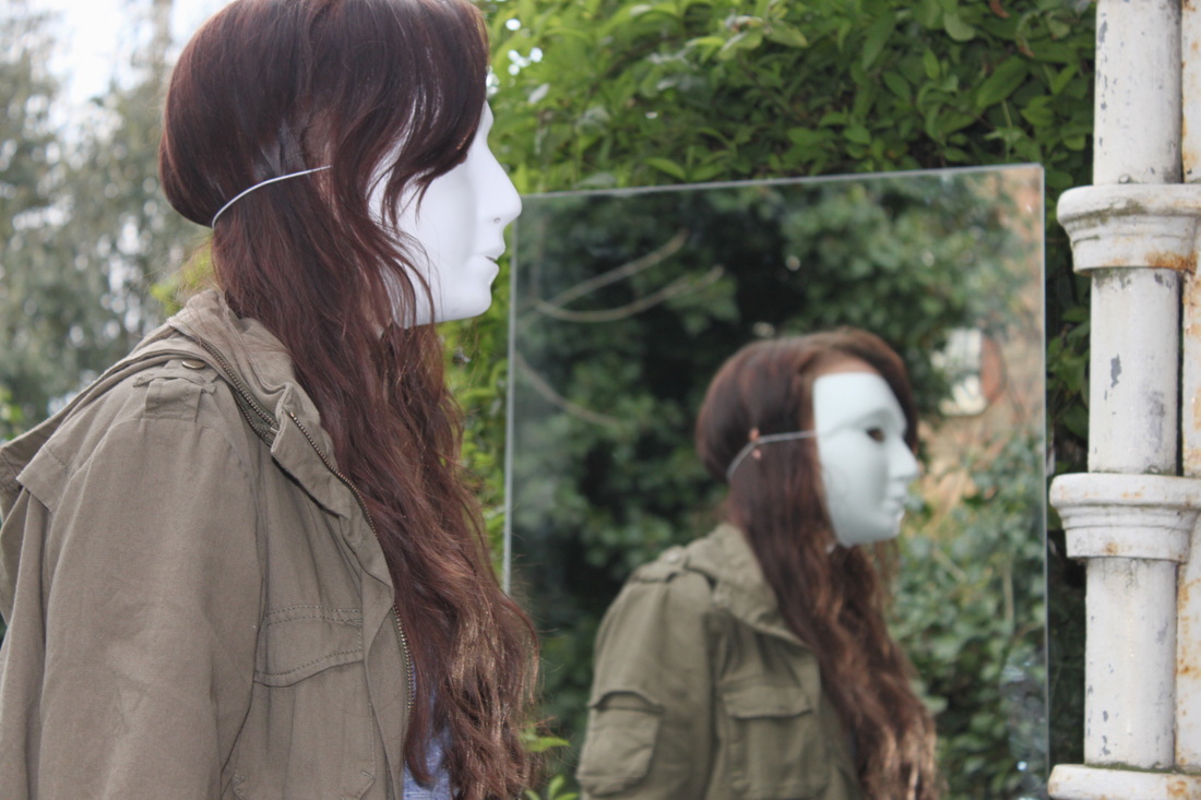
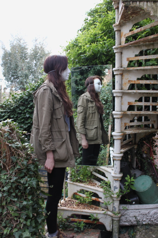


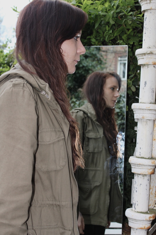

Process: I wanted to expand my idea of using mirrors, I experimented with taking outdoors photos with a mirror. I took a selection of photo's with my model wearing a mask and then without her wearing a mask. I will further edit this set to create an image where the model is seen in the reflection wearing a mask but aren't wearing a mask when looking into the mirror. The photos are all taken over the shoulder, I like the sense of intrusion and perspective this creates - when looking at the image you feel as if you should not be there, that the model is unaware of the photographers presence.
Critique: Again these photos are a bit repetitive, however, I wanted to try out the mask idea to get a feel of how it would look.
Further Development: Firstly I will edit the above images to achieve the effect I want, almost a split personality being portrayed through a reflection. good on the outside, evil in the reflection. I was also chose a variety of different locations to take these pictures possibly including a beach as I like the idea of having sand and sea in the reflection of the mirror. A wide variety of different locations would change the vibe of each picture, some could be taken and night and some at day. I may even experiment with the editing of the photos and have one photo taken where it's daylight outside of the mirror and then edit the reflection to appear that it's night time inside the mirror, visa versa.
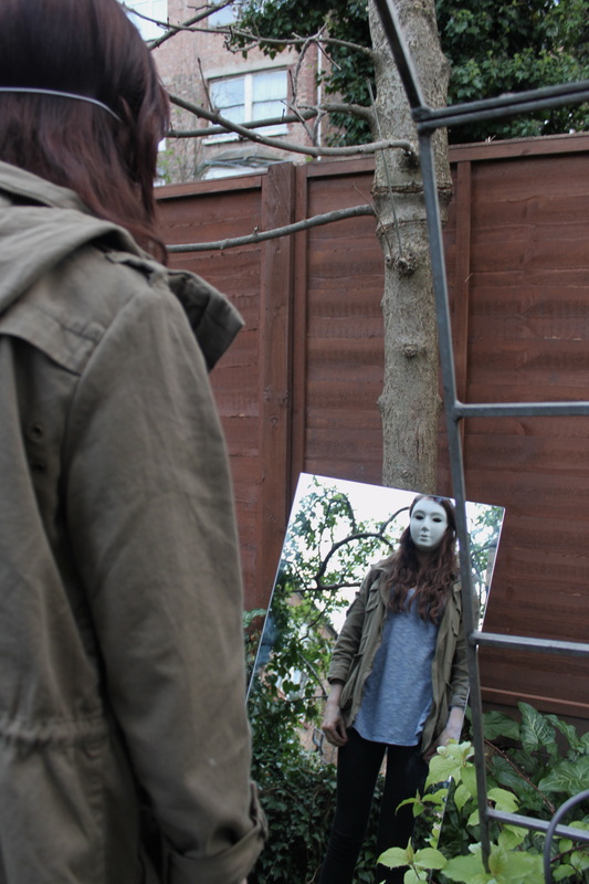
Plans for editing reflection images:
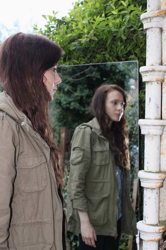
In the photo's above I've tried to mirror two very similar poses, one with my model wearing a mask the other without. I have tried to mirror the images to ensure that when editing, the reflection of the figure in the mirror looks realistic and matches the figure standing in front of the mirror. When it comes to editing I want to switch the characters reflections around and ultimately produce a photo where a figure is looking into a mirror and the reflection is of them-self but wearing a mask. I like this idea as I think it portrays mystery and imagination perfectly. The view that the picture could represents a split personality, the 'good' and the 'bad' sides of a person, is very mysterious. I also like the effect the use of a mask has on the image as it's a subtle way of identifying/representing evil or badness, where as having a completely different character in the reflection would be more of an obvious editing technique and less believable.
|
Aim: My aim was to edit two very similar photos of a model standing in front of a mirror, the only difference between the images would be the expression on the models face. I would then use photoshop to combine a reflection from one photo and the model from the other photo, ultimately creating one image with a model looking into a mirror with their reflection looking back at them pulling a different face.
Process: I used photoshop to edit the photos. I used the magnetic lasso tool to crop the reflection out of one image and then layer in on top of the other image. I then adjusted the contrast, saturation and brightness to ensure the image looked as realistic as possible, with the colouring in the reflection matching the colouring of the model standing in front of the mirror. Critique: If you look very closely to the model's top you can see on the bottom right hand corner the stripes of her top don't perfectly align. This is due to the fact I must of moved when taking the second image instead of standing in the exact same position. Further Development: If I was to further develop this process, I would ensure that when taking my two photo's I made sure the model stayed in the exact same position and I would use a tripod to ensure the background framing would be the same in each photo making editing a lot easier! |
Edited - Reflection.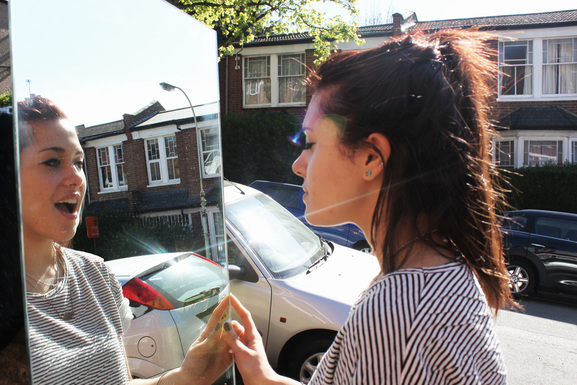 |
Bizarre reflections:
Below is two photo's I have taken, and then edited on photoshop to create interesting and unusual reflections.

I used the same editing techniques as described in the above image.
For the image on the right, I wanted to create a ghostly effect where a character is looking into a mirror and appears to have no reflection, I like this effect because it's simple to do using photoshop and yet it looks very effective and mysterious. I like the fact that there is no visual facial expression in the image, the image can be read in many different ways as there is no expressions to help the audience come to a conclusion. You cannot see if the character is happy, angry, sad etc.
The photo on the left is similar to my edited image above, however, I played around more with the effects on photoshop in this image. I tried to make the reflection look ghostly by bringing the vibrance down, I wanted to make a clear distinction between the character and her reflection to show that they are almost two different people.
Devon reflections:
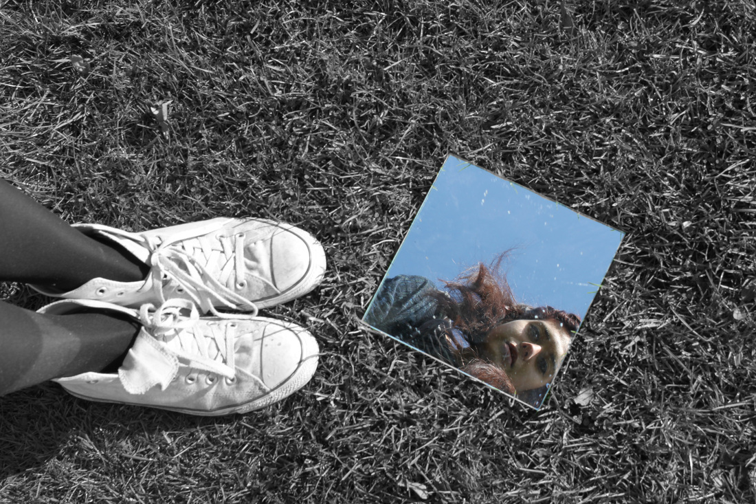
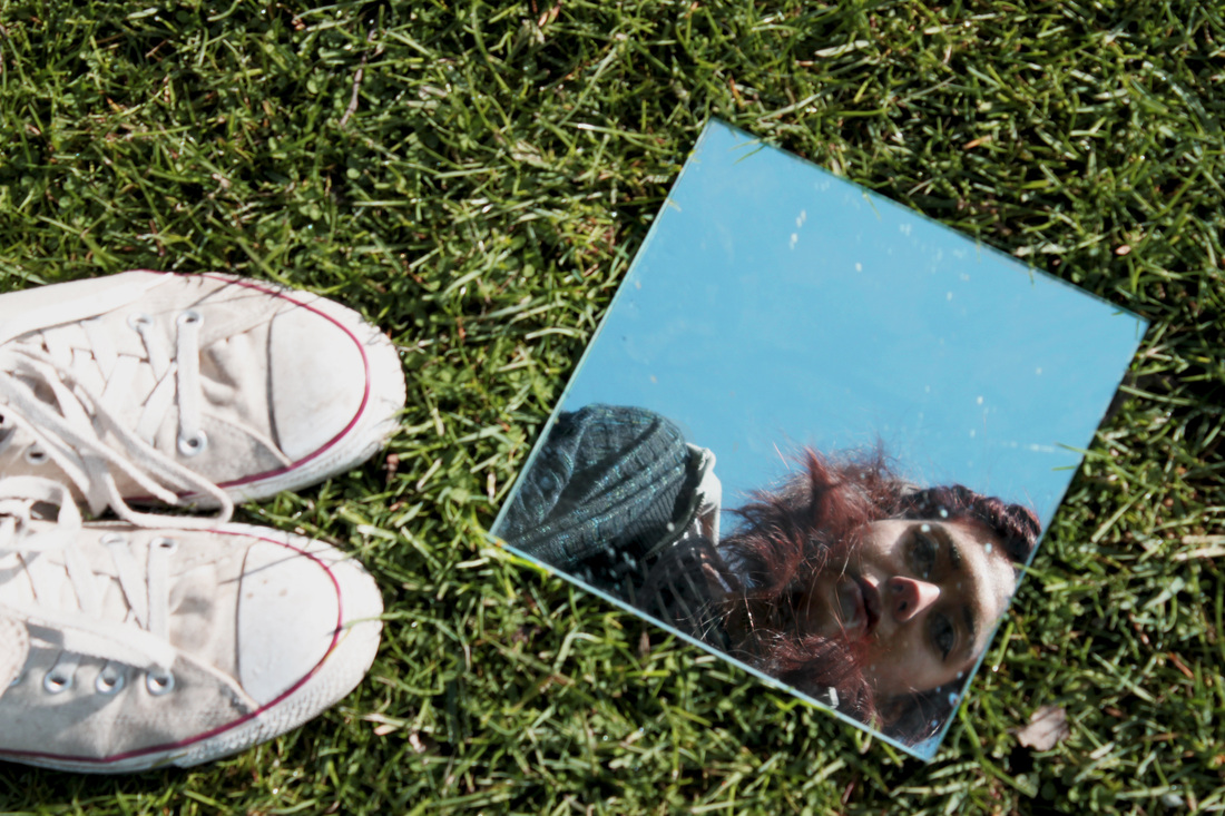
Below is a set of reflections I took whilst I was in Devon. The images include a variety of landscape reflections such as the sea, cliffs and trees. I have tried to place the mirror in an unusual place to create a visually confusing and slightly surreal contrast.
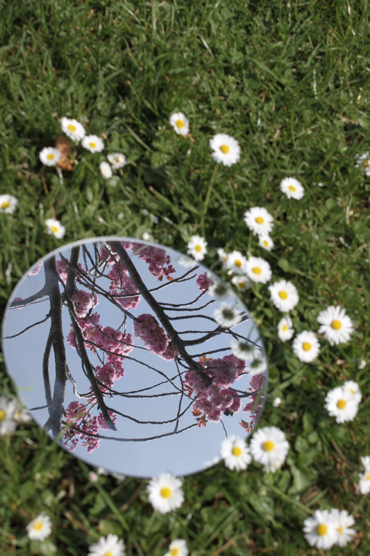
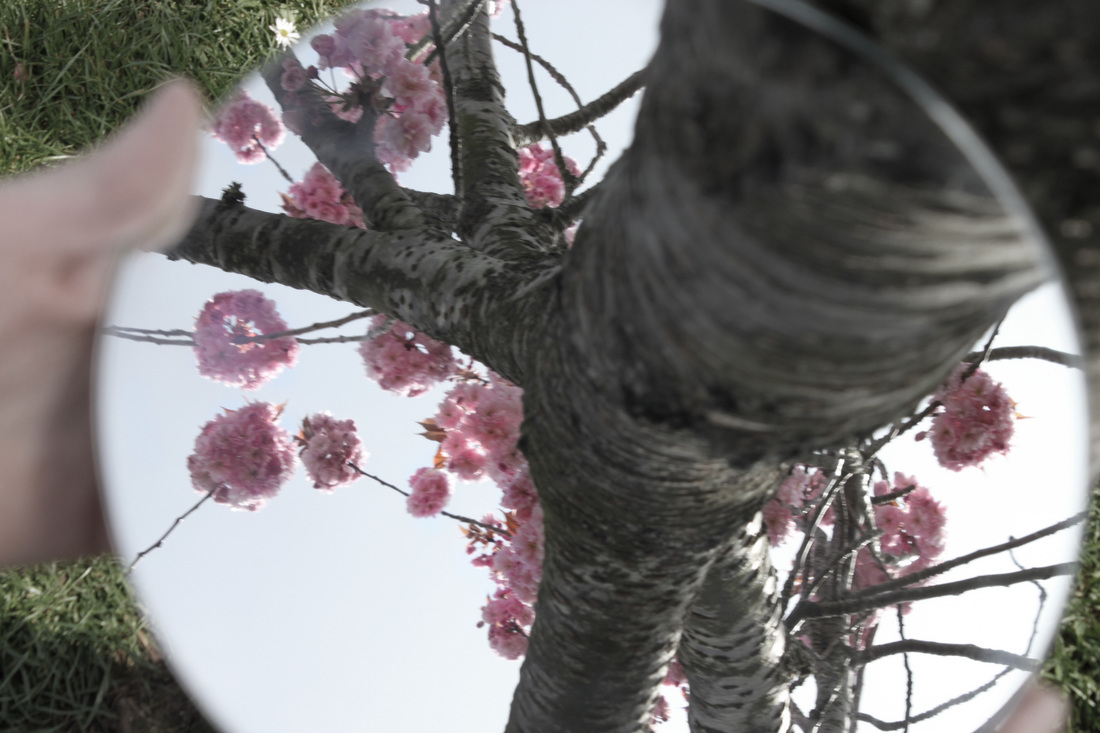
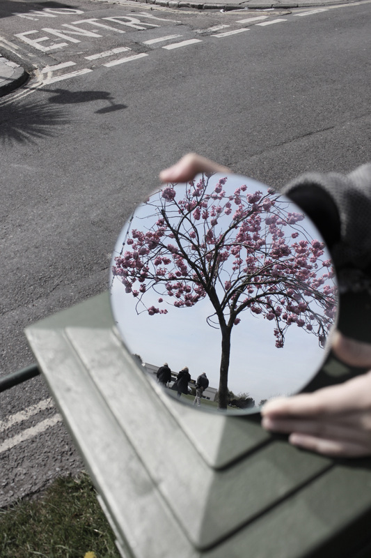
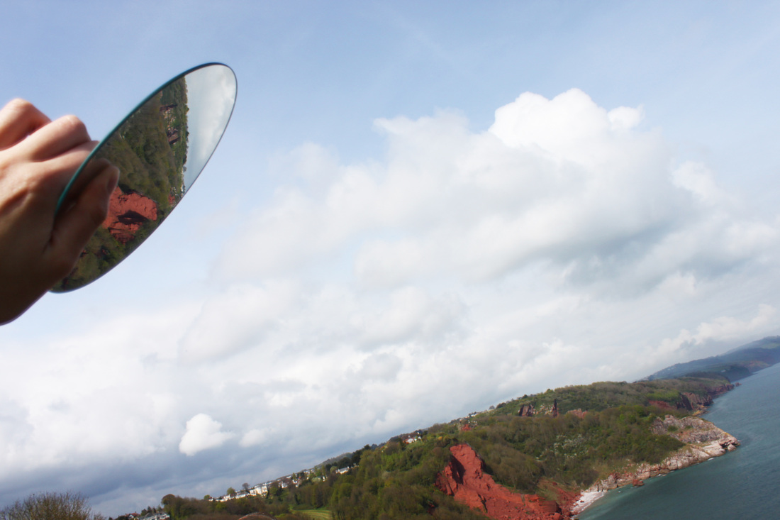
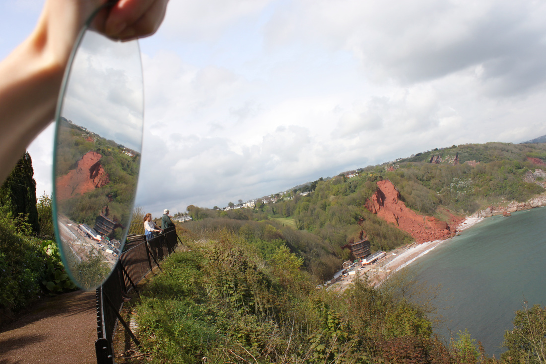
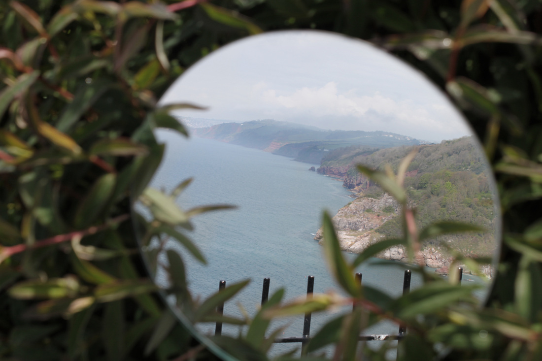
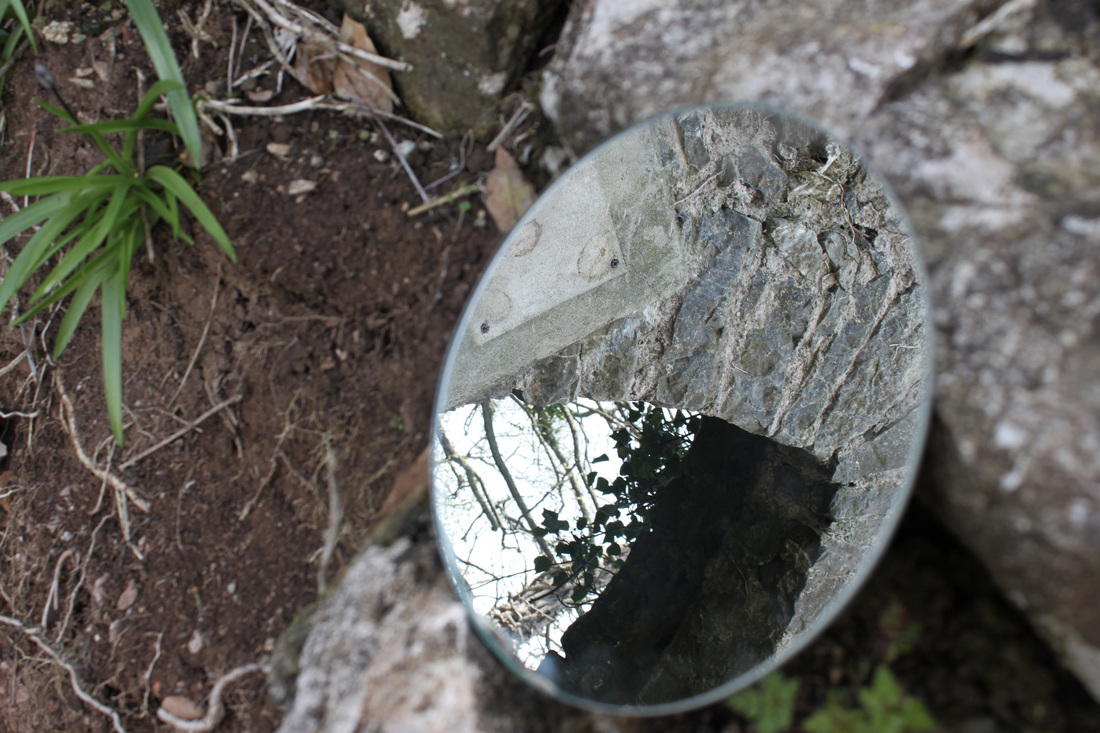
Aims: I wanted to try landscape reflections as well as portrait reflections to see what I prefer. As I was exposed to some very beautiful scenery in Devon I decided to use this against my advantage and get some interesting reflections of the sea and other objects I found mysterious to look at.
Process: All the above photo's were taken outside on a sunny day. The good weather and sunshine resulted in my images being very vibrant and bright. I used a circular mirror to capture reflections in unusual placed, I tried to have the mirror in an 'out of the place' area so that the reflections looked unusual. For example, the reflection of the sea where the mirror is placed in a bush almost looks as if the reflection inside the mirror is a completely different location to where the mirror is.
Critique: From taking these images of landscape reflections I have decided that I prefer portraiture reflections, simply because I feel it's a more effective way of presenting mystery and imagination. I also feel that the above images lack variety, they're all very similar, taken outside, reflections of similar things, reflected into a circular mirror.
Further Development: If I was to further develop this set I would take a different approach and combine these landscape reflections with portraiture. I like the way in which mystery and imagination can be conveyed through portrait photography.
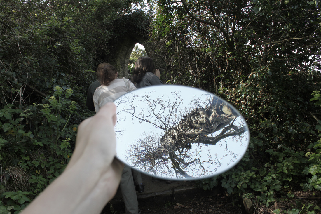
Andrey Rogach photography:
Andrey Rogach (24-06-1987) is a photography from Belarus. I came across his work whilst carrying out research online. I found his photography very fascinating and inspirational. One of the most interesting aspects of Andrey is the fact he doesn't have a professional photography website. He displays his work on a simple live journal page. Despite Rogach's lack of self promotion, his photo's can be seen online on many blogs and photo sites.

Above is a selection of Andrey Rogach's work I found where he uses mirror reflections, I like Andrey's style of photography as it's very bizarre to look at. I particularly like the first two images. When I have been using mirror reflections in my photography the reflections have always been the main subject of the image, however, Andrey does not make the reflection the subject of the image, I think this is a really unusual and effective approach. I would like to try something similar as it creates a less obvious effect. When using reflections in photography they don't necessarily need to dominate the photo. The two photo's above are unusual without the reflections, the reflections simply add to the photo. Why is the mirror there? What is it's purpose? - Many questions arise when looking at the image concerning the presence of the mirror.
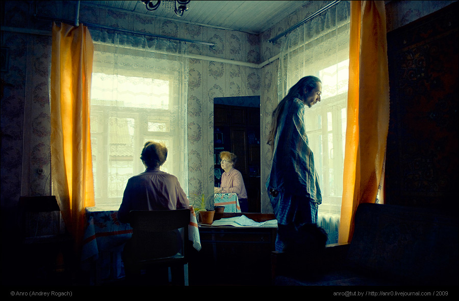
The last image is very simple, two characters looking out of opposite windows in a house. The reflection creates what could be seen as a third person. The woman is not facing the camera, her facial expression can only be seen in the reflection which is interesting and a bit spooky. Whenever I see an image where a persons face is only visible in a mirror I find it very mysterious, almost as if the reflection isn't a true reflection on their emotions. I like this photo as it's very mysterious, nothing is made obvious in the photo therefore when you look at it you are not quite sure what is going on and your mind is left to wonder.
The last image is very simple, two characters looking out of opposite windows in a house. The reflection creates what could be seen as a third person. The woman is not facing the camera, her facial expression can only be seen in the reflection which is interesting and a bit spooky. Whenever I see an image where a persons face is only visible in a mirror I find it very mysterious, almost as if the reflection isn't a true reflection on their emotions. I like this photo as it's very mysterious, nothing is made obvious in the photo therefore when you look at it you are not quite sure what is going on and your mind is left to wonder.
Andrey Rogach - Some more of his photography:
When looking for photographers who use reflection, I came across Andrey Rogach. I could only find 3 images (above) which he used mirrors/reflections in, however I particularly liked his style of photography. His photo's are very ghostly and surreal looking. Here is a selection that I found very mysterious and relevant to the current project I am completely in photography on 'Mystery' and 'Imagination'. After looking at these images I have decided I would like to take photo's using similar camera techniques to create a more ghostly and mysterious effect to my images.

Although none of the above photo's by Rogach have mirror's or reflections in them, I find them all very interesting and inspirational nevertheless. Each image is very individual, yet they all capture a ghostly feel when looking at them.
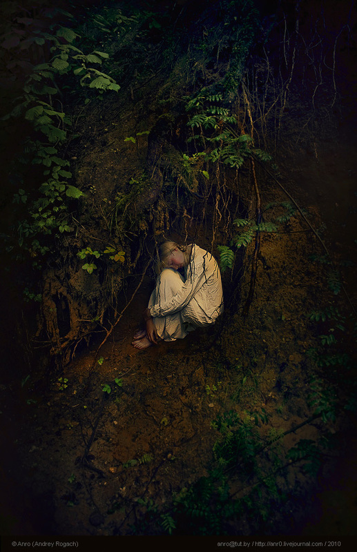
First Image: The costume in this photo was what grabbed my attention, the old fashioned white nighty contrasted against the deep wild greenery of the forest around the girl create a mysterious, horror film like vibe to the photo. The girl appears to be hiding from someone or something, the fact that we do not know what she is hiding from, again, creates a sense of mystery. The photo is incredibly simple yet the colour contrast is very powerful. A variety of different emotions are captured when looking at the image, we sympathise with the girl, we're afraid for her, and we are curious as to what her situation is.
Second Image: I like the depth of field in this image, the person behind the masked figure, on a swing is so out of focus that they appear very ghostly. The masked figure is looking directly at the camera which immediately involves the audience in the image. The fact that the masked figure is hiding under a bench creates the sense of not belonging, they should not be there. When looking at this photo I feel scared for the character on the swing, I get the impression that something bad is going to happen to them. Additionally the use of black and white in this image creates a stronger sense of mystery and bleakness. The contrast is increased and there is strong shadowing under the bench, again adding to the mystery of the masked figures presence.
Third Image: I like the ghostly camera techniques used to capture this image, everything is very blurry and out of focus. The figure's hand is almost entirely opaque, the background is so blurred and foggy that it almost looks like a painting. I think that camera techniques such as these have the ability to create a mysterious image even if there is nothing particularly mysterious subject in the image. For example, if this photo was taken with high colour contrast and the mask was bright red and the sky bright blue, and the character was in perfect focus the image would not be very mysterious. However, the fact that everything is very hard to make out and appears to be covered in a layer of fog creates a sense of mystery.
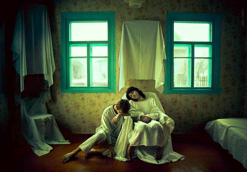
Fourth and Fifth Images: These two images are very similar they both have, what could be seen as a family, sitting on a chair in a front room. The mise en scene in both images is very old fashioned, the wallpaper in particular. In the fourth image the couple appear to be distressed, they're dressed in white which brings about associations of ghosts. Some of the furniture in the room is covered up which creates a mysterious effect, why is it covered up? what is it?
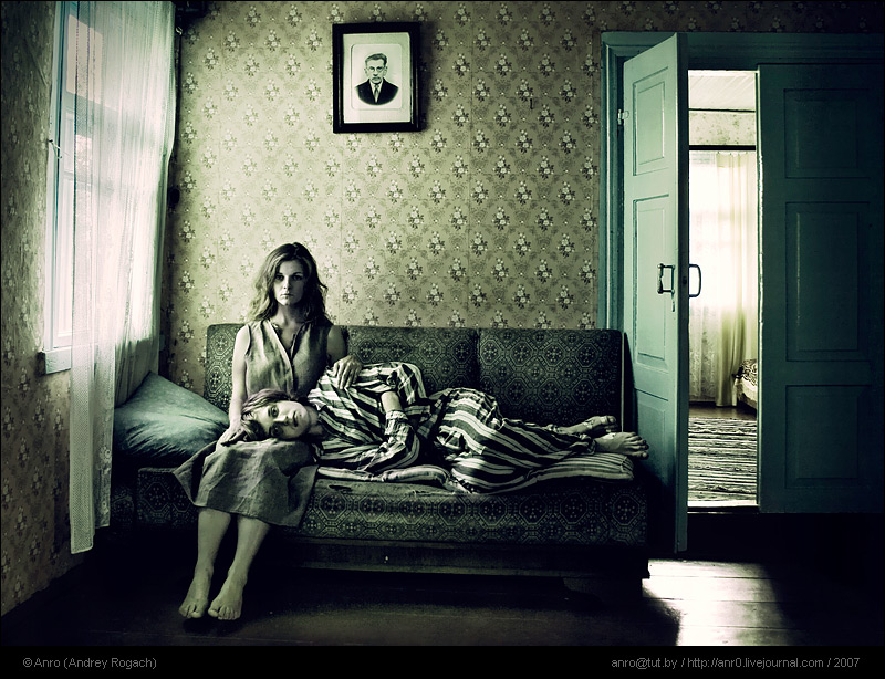
The fifth picture, similarly to the fourth, is of a couple sitting on a sofa. However, this couple appear to be in a ghostly trance staring into nothing. Their eyes are glazed over and their skin tone is an unhealthy white complexion. There is a very low saturation in this image, the photo is borderline on black and white creating a gothic feel.
Sixth Image: Once more, this image is also very ghostly. The woman's face cannot be seen, it appears to be shadowed or blurred out. The photo looks very old fashioned with a sepia tone to it. There is a lot going on with the contrast of the pattern on the woman's clothing and the wallpaper behind her creating a busy effect. The wallpaper, like the fourth and fifth images is also old fashion. I like the fact you cannot see her face, it's very surreal and un-humanly. As her face is unclear, her emotions can not be seen either - effectively making the image hard to read. Opening a lot of questions.
First Image: The costume in this photo was what grabbed my attention, the old fashioned white nighty contrasted against the deep wild greenery of the forest around the girl create a mysterious, horror film like vibe to the photo. The girl appears to be hiding from someone or something, the fact that we do not know what she is hiding from, again, creates a sense of mystery. The photo is incredibly simple yet the colour contrast is very powerful. A variety of different emotions are captured when looking at the image, we sympathise with the girl, we're afraid for her, and we are curious as to what her situation is.
Second Image: I like the depth of field in this image, the person behind the masked figure, on a swing is so out of focus that they appear very ghostly. The masked figure is looking directly at the camera which immediately involves the audience in the image. The fact that the masked figure is hiding under a bench creates the sense of not belonging, they should not be there. When looking at this photo I feel scared for the character on the swing, I get the impression that something bad is going to happen to them. Additionally the use of black and white in this image creates a stronger sense of mystery and bleakness. The contrast is increased and there is strong shadowing under the bench, again adding to the mystery of the masked figures presence.
Third Image: I like the ghostly camera techniques used to capture this image, everything is very blurry and out of focus. The figure's hand is almost entirely opaque, the background is so blurred and foggy that it almost looks like a painting. I think that camera techniques such as these have the ability to create a mysterious image even if there is nothing particularly mysterious subject in the image. For example, if this photo was taken with high colour contrast and the mask was bright red and the sky bright blue, and the character was in perfect focus the image would not be very mysterious. However, the fact that everything is very hard to make out and appears to be covered in a layer of fog creates a sense of mystery.
Fourth and Fifth Images: These two images are very similar they both have, what could be seen as a family, sitting on a chair in a front room. The mise en scene in both images is very old fashioned, the wallpaper in particular. In the fourth image the couple appear to be distressed, they're dressed in white which brings about associations of ghosts. Some of the furniture in the room is covered up which creates a mysterious effect, why is it covered up? what is it?
The fifth picture, similarly to the fourth, is of a couple sitting on a sofa. However, this couple appear to be in a ghostly trance staring into nothing. Their eyes are glazed over and their skin tone is an unhealthy white complexion. There is a very low saturation in this image, the photo is borderline on black and white creating a gothic feel.
Sixth Image: Once more, this image is also very ghostly. The woman's face cannot be seen, it appears to be shadowed or blurred out. The photo looks very old fashioned with a sepia tone to it. There is a lot going on with the contrast of the pattern on the woman's clothing and the wallpaper behind her creating a busy effect. The wallpaper, like the fourth and fifth images is also old fashion. I like the fact you cannot see her face, it's very surreal and un-humanly. As her face is unclear, her emotions can not be seen either - effectively making the image hard to read. Opening a lot of questions.
Process of editing an image using photoshop to create a ghostly effect:
I wanted to create an image, like one of my previous photos, where a person has no reflection. I decided to try out 4 photoshop editing steps I found on the internet to create a ghostly effect to an image. I tried it out and was pleasantly pleased with the results. First of all I edited the image to create the effect of the character having no reflection, I did this by taking two photo's form the exact same angle, one of a boy sitting on a bench looking into a mirror, the other without the boy in the photo. I edited one reflection into the other photo using the 'magnetic lasso' tool. I then followed the 4 steps below and created an image of a 'ghost' looking into a mirror.
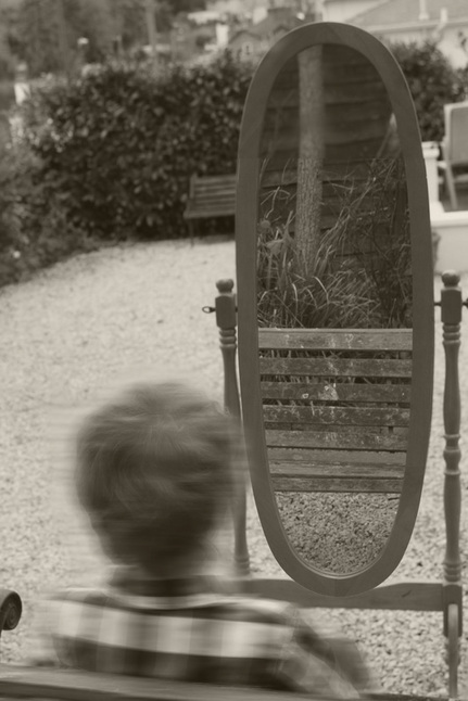 |
Step 1: Desaturation
To desaturate an image go to "Image", "Adjustments", and select "Desaturate". Though it is black and white now, you can bring color back in at the end of the process. Step 2: Blur To create a ghostly effect you'll need to blur the person in your image, go to "Filter", "Blur", and select "Motion Blur". Set the "Angle" to 0 and then play with the "Distance" to find something you like. Step 3: The Face The motion blur has now made your ghost indistinguishable, so apply a layer mask to the "Blur" layer by clicking the icon at the bottom of the layer window that looks like a gray square with a white circle. Go get your paint brush tool and set the foreground color to black. Then, adjust the "Opacity" in the options bar to around 10%. Using a relatively large brush, select the mask and paint where you want to get more detail. Step 4: Finishing Touches There are a couple of things that can make this even better. Select your merged layer and go to "Filter", "Distort", and choose "Diffuse Glow". Play with the sliders until you find something that works for you. This should add a soft quality to the ghost which will help imply translucency. Finally, try to pull the image out of strict black and white. With the top layer still selected, click on the ying-yang looking icon at the bottom of the layer window. This will "Create new fill or adjustment layer" and will provide you with a list of options, choose "Solid Color". When the window comes up, pick a color that will give your ghost an appropriate tone. Then, go to the drop down at the top of the layer window and change the blend mode to "Color". It will still be too intense, so use the "Opacity" control to bring it down to your liking. |
Andrey Rogach - Ghostly image:
|
I really like this image by Andrey Rogach, I think it conveys mystery and imagination perfectly.
The image is very ghostly, the ghostly effect of the models in the image contrasts well with the eroded and run down state of the building they are walking through. Form: The photo is of two ghostly female characters running through what appears to be an abandoned run down building. Process: This photo has been taken indoors using a digital camera. There is various different openings in the building which have natural sunlight coming through, creating a strong sense of shadowing. Content: The building is generally quite bright and full of natural light, however there is some shaded areas with strong shadows. - This adds to the ghostly mysterious effect of the image, if the entire building was light it wouldn't come across as very eerie. The shadows and dark areas of the photo successfully create more mystery about the image. The ghostly figures appear to be running from the light into the shadows, this could be interpreted in many different ways. Furthermore, There is an interesting sense of space in this image. The corridor the figures are running through appears to be quite wide, but as you look further down the image the corridor appears narrower. I also like the shape of the ceiling, it almost looks distorted. |
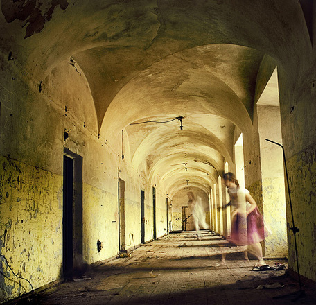 |
Ghostly reflections:
Aim: I wanted to create a set where no mirror was used to create a reflection. I used my photoshop skills to merge two images into one creating the perspective of a reflection. I continued the theme of adding ghostly effects to my images using photoshop, as I really like the effect it has on an image - creates a very mysterious image.
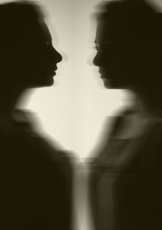

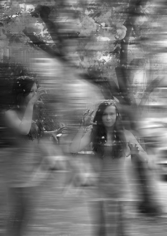
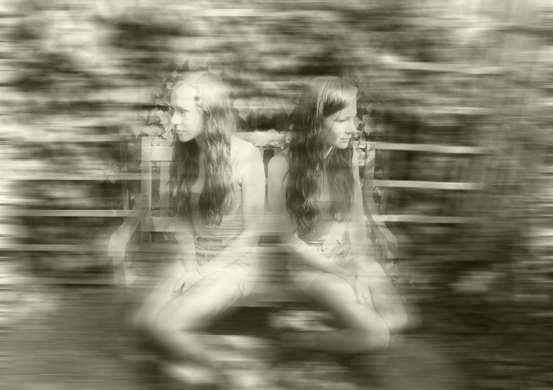


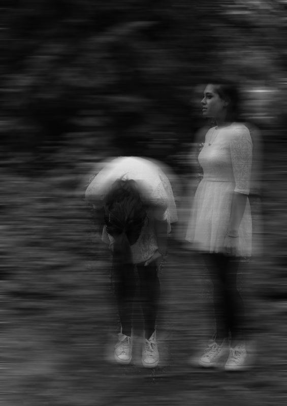
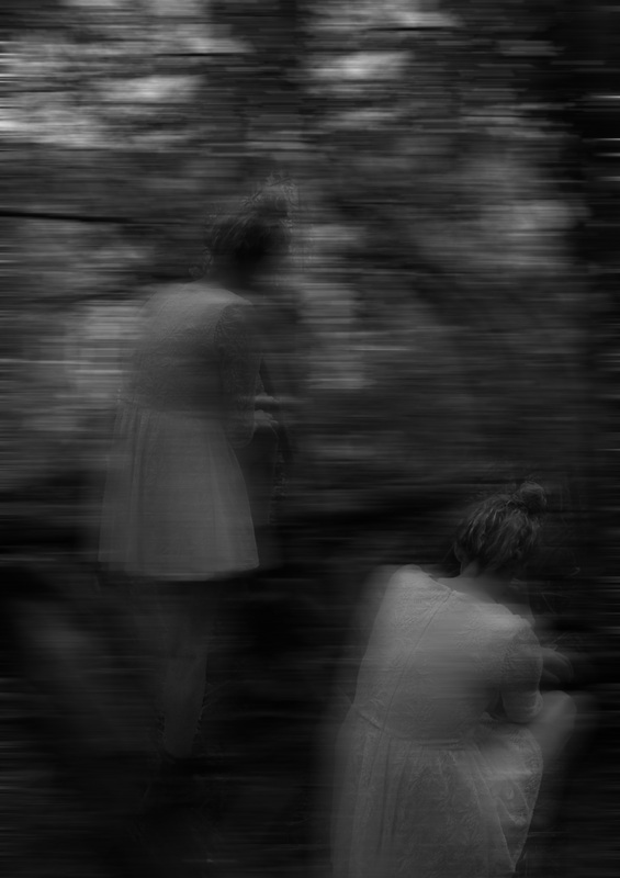
Process: I took a series of photos using manual settings (1/123, f6.3 and an iso of 400) I changed the iso from time to time depending on whether I was outside or inside. I took a selection of different images standing in the exact same place but having the model move around the frame - I did this so I have a variety of different reflections I could use when editing my images on photoshop.
Critique: The photo's lack variety as I used the same model for most of them.
Further Development: If I was to further develop this set I would try different techniques to add to the mystery of the image, perhaps by creating an interesting and unusual scene in the woods, using a variety of different props and locations. Also, instead of blurring the background and having the ghostly figure more in focus than the rest of the image, I would like to reverse this effect and create something similar to the Andrey Rogach image above. - With the ghost very blurred and almost opaque, with a solid in focus background.
Final Idea:
Throughout attempts of development for my reflections idea I have decided to not use a mirror or obvious means of creating a reflection for my final piece. Instead I would like to use photoshop to create an image with the same model in a variety of different poses, therefore a sense of reflection and mirroring is still there, however I am not using an obvious means of reflection such as a mirror - I've decided to take a more subtle approach, something that will keep my audience thinking. Especially as I've decided on creating a ghostly final piece, I think that using something as obvious as a mirror makes it less unusual and mysterious.
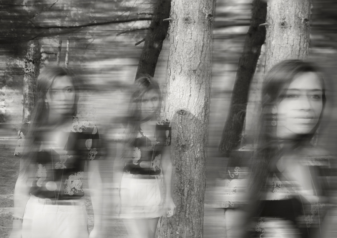
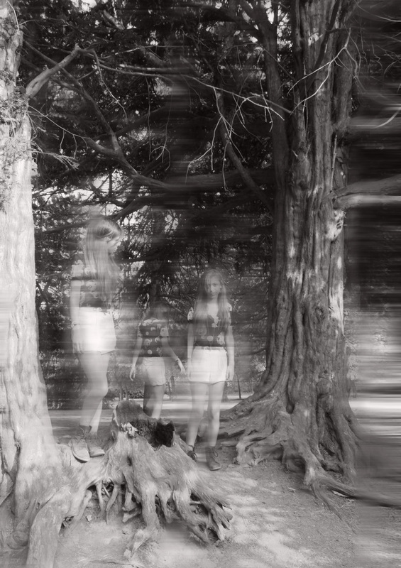
For my final piece I have decided to stick with this ghostly theme, using photoshop to completely alter the perspective of the photo. I also want to use only one model in each photo, in a variety of different poses. I have decided on using only one subject/model as I like the effect it has - an almost mirrored effect relating to the idea of reflections. Furthermore, I think it's very unusual seeing one person in a variety of different poses in the same scene it brings about many questions and could be perceived in many different ways. - I like the idea of my final piece being somewhat confusing, causing the audience to question the idea's behind my work. In the two above photos I have tried to edit the models more than the background, it was hard to not blur out the background entirely as the photo's don't completely align up correctly and the blurring of the image corrects this and makes the 3 different photo's look like just 1 photo/1 scene.
Brighton Ghosts:
When I went to Brighton I took a series of photo's, making the most of the beautiful scenery. I took photo's of my friend moving around each frame, ensuring I kept the camera very still so it would be easy to piece together the photo's on photoshop (using the same techniques as explained previously).
I especially like the photo's in front of the West Pier, the burnt down and eroded pier is very mysterious and ghostly, adding blur effects to it and desaturating the picture intensifies this ghostly, run down look.
I left the first two pictures in colour as I really like the rusty colour of the iron pillars alongside the pink sunset sky. The picture was too beautiful in colour to desaturate, but as I'm planning on printing my final piece onto acetate I understand they will look better in black and white rather than colour.
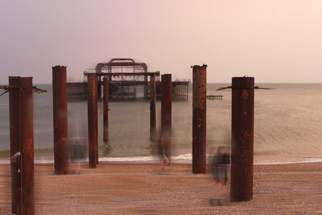
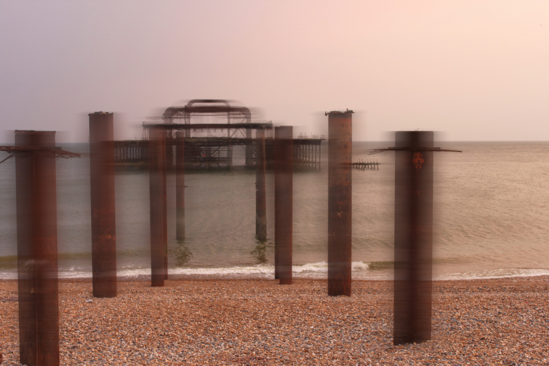

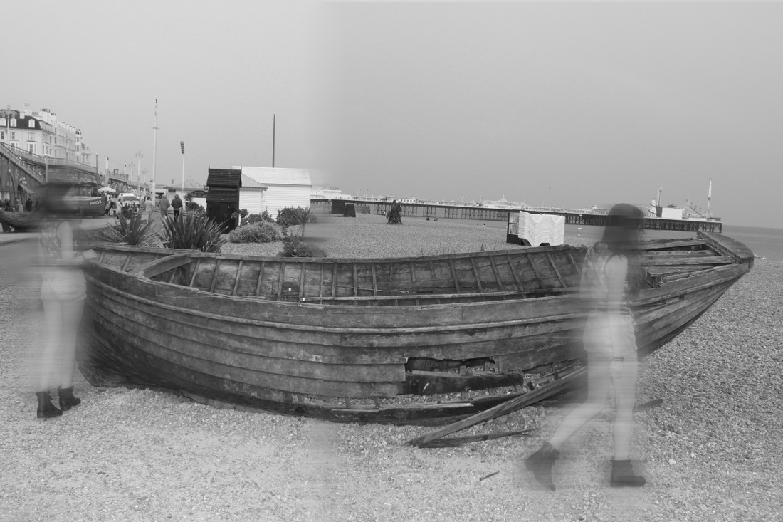
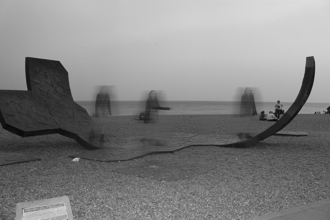
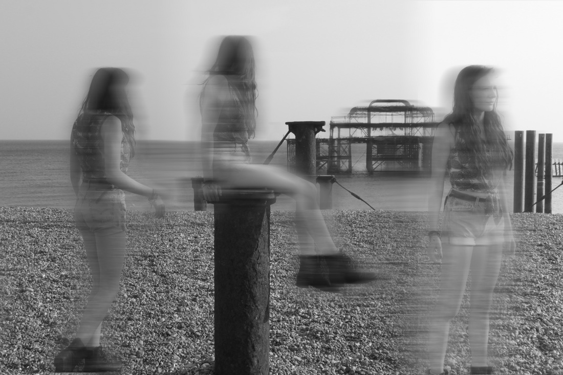

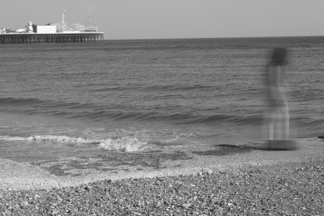
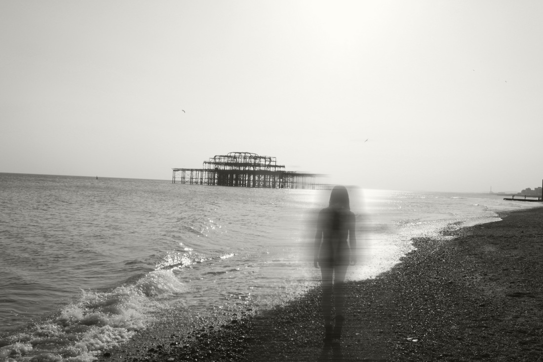
Garden Ghost:
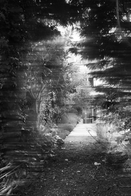

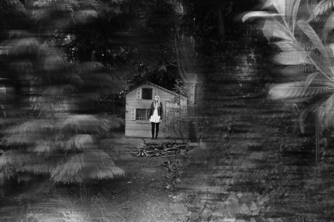
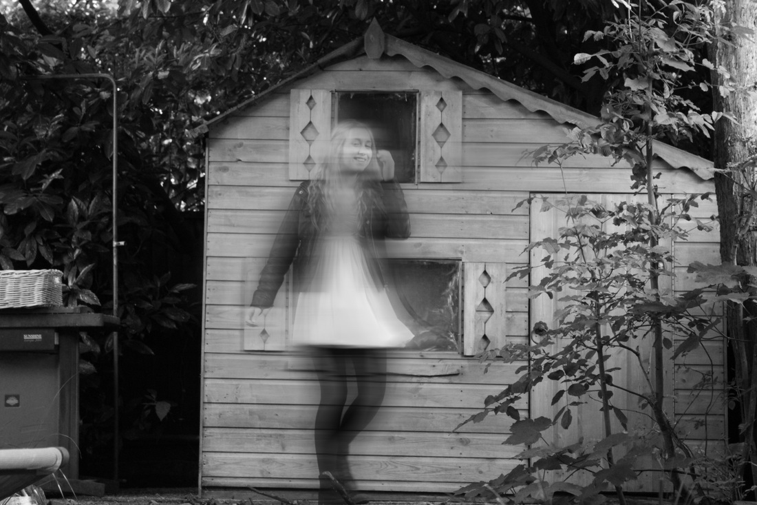
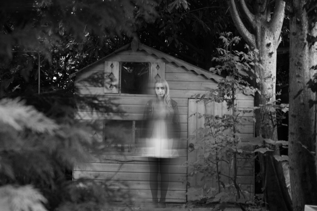
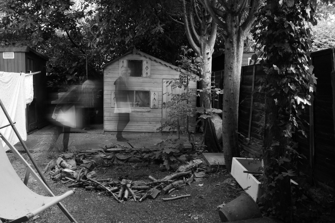
Final piece: Homemade light-box and raised mounts.
For my final piece I have decided on making a light-box and a selection of raised mounts. I wanted to make a light-box because I thought it would be challenging as it's something I've never attempted before. However, I understand I should aim for more than one final outcome incase my light-box didn't work for what ever reason so I decided on also making raised mounts as well as a light-box. My mounts will be made out of white card and I have decided on creating a raised mount effect by using thick double sided sticky tape, having two photo's (one behing anot per mount. As I have printed on acetate paper I discovered having one photo in front of another creates a very interesting effect. For my raised mounts I will have two pieces of acetate in front of one another creating a sense of depth to my photos.
I wanted to make sure I had enough time to achieve all of this in the given exam time of 8 hours, therefore I decided to make the box for the light-box at home first. I took pictures of myself making the box to show I made it myself.
I wanted to make sure I had enough time to achieve all of this in the given exam time of 8 hours, therefore I decided to make the box for the light-box at home first. I took pictures of myself making the box to show I made it myself.