Combinations and Alliances:
The Sunday Times Magazine 50th Anniversary - The Saatchi Gallery:
50 years of The Sunday Times Magazine.
The Saatchi Gallery showcased the work of some of the world-famous photographers who have contributed to The Sunday Times Magazine since its launch in 1962. Photographs by Don McCullin, David Bailey, Eve Arnold, Snowdon, Sam Taylor-Wood, Terry O'Neill, Uli Weber and manywere exhibited.
In February 1962, The Sunday Times launched the Magazine – the UK’s first colour newspaper supplement. “My God, this is going to be a disaster,” groaned Roy Thomson, the then owner of The Sunday Times. Newspapers in those days were dull dogs and the idea of putting a colourful magazine with a paper was seen as barmy! Mark Boxer, the first editor of the Magazine, later recalled, “A curious truth soon emerged: readers liked it – so much so that about a quarter of a million new readers were attracted to the newspaper.” It was not only part of Swinging London, it helped to create the 1960s spirit.
From the outset, the Magazine was innovative, enthralling readers with the peerless quality of its writing and photojournalism, while offering advertisers the opportunity to pitch their wares in full colour to a new generation of consumers. Fifty years later, and much emulated, the Magazine continues to innovate. With its unique Spectrum photography section, the Magazine remains the first port of call for the world’s best photographers and photojournalists.
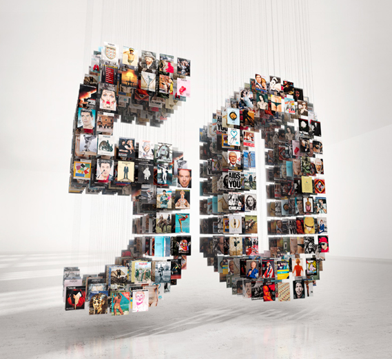
In honour of its 50 years, the cover of the anniversary edition magazine showed an installation of more than 100 magazines hanging on wires to form the number 50. The piece was created by Taylor James.
|
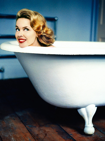
Photograph of Kylie Minogue by Uli Weber
|
Out of all of the fantastic photography work I came across my favourite had to be Uli Webers celebrity portraits. I thought Webers portait of Boy George as drag-queen-slash-devil was humorous but didn't really like the style in which it was taken; the bright red was a bit gaudy. I did however favour Webers portrait of Kylie Minogue taken very much in the style of the 50s with only her head seen bobbing from the bathtub (above). The image immediately caught my attention as Minogue is captured as a mere head with no body attatchment, quite surreal to look at. I really like Webers style of photography, in this photo, there is a strong vintage ora about the image; the large bathtub and Minogues 50's styled hair and makeup which really appeals to me. I love the contrast of the bright red of her lispstick with the quite bleak background lacking colour and vibrance.
Photos from New York:
In half term I went on a trip to New York for a school trip. Here are some photos I took on my iphone.


Initial ideas:
Video
As I have recently been experimenting with video photography in unit3 I decided to continue using video for unit4. My initial thought when I heard the exam theme was 'Combinations and Alliances' was to document the alliances between relationships.
Video
As I have recently been experimenting with video photography in unit3 I decided to continue using video for unit4. My initial thought when I heard the exam theme was 'Combinations and Alliances' was to document the alliances between relationships.
- Speed dating
- Interviews with single people describing their 'perfect partner'
- Couples match up
- Documentation of alliances between relationships
- Family alliances
Research - Brian Duffy:
Below are two of Brian Duffy's studio portraits of what I see as relationships; alliances. A couple and a mother and a child. The images represent the bond between different relationships.


Set tasks:
We have been given some set tasks to complete to get us started with Unit4. The two I have chosen to complete are "An alliance with the camera: the process of recording and documenting the everyday" - which entails taking a photography of myself every morning and evening for 2 weeks. I will be starting the project from the 22nd of March and document the final outcome on my weebly. The second set task I have chosen to complete is experimentation with "Stop Frame Animaton".
An Alliance with the camera:
"Photograph yourself each day. This could be head and shoulders or a document of everything you wear each day."
I have chosen to complete the above task because I think it's a very interesting approach to take, I have never documented an alliance with the camera before and think it will be a new and interesting topic to experiment with. Below is an example of someone who has taken a photo of himself everyday for 6 years. The final outcome resembles a Stop Frame Animation which is interesting as it will link into my second task.
I will be photographing myself every day and night for 2 weeks; I have decided to photograph myself in both the morning and the evening in order to reveal the contrast of my appearance between the both times of day.
I think Noah's video (below) is very effective as his appearance changes quite noticably, however, I think the video goes on for too long for the viewer to notice a very clear dramatic change. By chosing to photograph myself in both the day and night I feel I will provide a clear contrast of how my appearance differs on a daily basis; from having my hair up to having my hair down, from wearing no make-up to wearing lots of make-up, from wearing casual clothes to wearing dressy clothes etc.
What is Stop Frame Animation?
|
Stop motion (also known as stop frame) is an animation technique to make a physically manipulated object appear to move on its own. The object is moved in small increments between individually photographed frames, creating the illusion of movement when the series of frames is played as a continuous sequence. Stop frame can take a lot of time and precision but if planned well the outcome can look fantastic! I really like the process of stop frame animation because I love the idea of objects coming to life and having a world of their own where they can move around and interact. I plan on producing a variety of stop frames for the exam theme of "combinations and alliances" as I feel this theme idea will work really well with the process.
I'm very keen to try out a new technique in photography, something that I have not yet experimented with and feel stop frame animation will be a fun and imaginative process. |
Here is a video I found on YouTube explaining how to make your own stop frame animation.
|
Stop Frame Animation research:
Stop Frame Animation is something that really appeals to me, from my experimentation with making videos in my last project I have really gotten into the idea of producing an exam piece with moving image. After seeing the below video of "Western Spaghetti" I was immediately interested in producing something that used Stop Frame Animation. My favourite of the two Stop Frame Animations has to be the second, "Coinstar" purely because I love the idea of the coins coming to life and moving around the room. I have been experimenting with this process in the studio using random everyday objects. I think Stop Frame Animation is very clever as it has the ability to bring everyday still life objects TO LIFE!
|
|
|
Still Life - artists: Laura Letinsky and Fischli and Weiss.
Laura Letinsky (born Canada, 1962) is a contemporary photographer, best known for her still lifes. Much of Letinsky's work alludes to human presence, without including any actual figures. In many of her photos Letinsky seems to document the aftermath of a sumptuous gathering or dinner party. For her series named "in the Morning", "Melancholia" and "I Did Not Remember I Had Forgotten" she documents Faded flower petals intermingle with empty glasses and crumbs of food on partially cleared tables, often covered with a white linen that bears the mark of spilled wine.
I find Letinksys work very minimalistic and effective. The quite harsh contrast between coloured food and spillages and the white of the background and table cloth creates a very surreal image where the objects on the table stand out against the plain background. What I particularly admire about Letinskys still life images is her unusual approach to taking photographs of food after it has been eaten; usually when we see photographs of food it is made to look appetising and welcoming, Letinskys does quite the opposite.
I find Letinksys work very minimalistic and effective. The quite harsh contrast between coloured food and spillages and the white of the background and table cloth creates a very surreal image where the objects on the table stand out against the plain background. What I particularly admire about Letinskys still life images is her unusual approach to taking photographs of food after it has been eaten; usually when we see photographs of food it is made to look appetising and welcoming, Letinskys does quite the opposite.


|
|
Peter Fischli and David Weiss, aka Fischli/Weiss are an artist duo that have been collaborating since 1979. They are among the most renowned contemporary artists of Switzerland. In the images to the left Fischili and Weiss have balanced a variety of different objects onto one another. The images are very thought provoking and quite strange to look at. They create sculptures where inanimate objects have been put together almost creating a sense of movement. I really like these still lifes because they're unusual, It's easy to take a photo of a wine bottle but it's more interesting to take a photo where the wine bottle is made into a sculpture-like-creation.
|


Still Life - response to Laura Letinsky:
Aims: I decided to take a set of photos in response to Laura Letinskys still life images. I tried to create a minimalistic effect where a small object such as an onion was photographed on a large white table cloth. The idea was to produce images of food - leftovers - the end of a meal - something that isn't usually associated with phtoography of food. When we see food photoography the phooographer has tried to produce something appealing; something that makes the audience hungry, we did not do this, instead we produced something unappealing and messy.


Process: The above set was taken in the studio, we worked as a class to take images of food and objects on white table cloths in response to Laura Letinskys stills.
Critique: I feel some of the images are a bit random, perhaps too minimalistic. I don't really know if a honey melon and an unpeeled onion works very well together in an image of food. - could perhaps be used for unlikely "combinations".
Further Development: If I was to furthe develop this set I would use a wider variety of food, like the last two images have an entire table set up with a variety of different objects - I would do this but using a variety of different foods and drinks.
Response to Fischli and Weiss - balancing objects/unusual angles:
Aims: I took this set in response to Feischli and Weiss' balancing objects. I wanted t take photos of balancing objects froma variety of different perspective shots/angles to document the dramatic change in the way we view an image depending on what angle it has been shot at. This was a very fun and experimental experience, as I was able to mess around with balancing different and unusual objects on one another. I particularly like the over head shots (above shots) as it compeltely changes the way in which the image is viewed. The second image which is shot from above creates a bizzare 3D effect where the orange and the sugar cube is almost jumping out of the image.


Process: I took the above set in the studio, some using studio lighting some without. We worked as a class and took photos in groups where we'd take it in turn to move the objects around and produce our own framing.
Critique: I feel the above images are not taken very well, the background is often quite busy and the photos aren't as good quality as I'd like.
Further Development: If I was to further develop this set I would ensure the setting was less 'messy'. We worked as a class to produce the above outcomes and were all taking photos at the same time which I feel can often make things difficult when it comes to framing an image the way YOU want it to be framed. The background is often quite busy in the above photos, and the layout isn't always what I had chosen. I would redo this set and take the photos in my own time without feeling rushed to take a picture.
My own Stop Frame Animation - set 1 - tablet escapes:
|
|
Aims: In this set I aimed to produce a Stop Frame Animation that documented still life objects having a life of their own. I really like the idea of everyday objects such as a penny or a piece of paper being able to come to life and move around the room. The below video is my first attempt at stop frame animation; I used a packet of tablets and created a stop frame animation where one tablet escapes from the packet and runs away. Process: I used the stop frame animation process described above to produced this animation of a tablet escaping from a packet, I used a tripod to keep the camera still and ensure the same framing was kept throughout.
Critique: I feel this animation is very short and could be a lot more adventurous. the lighting is quite harsh. Further Development: If I was to further develop this animation I would add music to bring it to life as well as using better lighting. I would also plan out my animation before hand to ensure it is as adventurous and imaginative as it could be. |
Set 2 - Polo escape & orange unpeeling:
Aims: In the below videos I was experimenting with the idea of food escaping from their packaging/shell. I wanted to document food coming to life and escaping from getting eaten.
|
|
|
Process: For the polo video I took it on the floor using a small tripod and natural lighting from a nearby glass door. I used the stop frame animation process to create a video where a polo mint unwraps itself from its packet and runs away. The polo animation is very short. The orange animation was filmed on a table using a tripod and also natural lighting. I made sure this animation was longer and took my time with un-peeling the orange and having each segment slowly move away. I edited both animations using IMovie and put an "old film" effect on them as I think it adds to the nature of the video; silent film.
Critique: I feel both animations would benefit from being longer and having smoother transactions; for example, for the orange animation I could have peeled the orange more slowly and therefore produced a larger number of pictures.
Further Development: If I was to further develop these animations I would try and make them longer, and try something a little more interesting to document the theme of combinations and alliances; perhaps create an alliance between different types of food helping each other escape from a fridge. I would also try different editing techniques such as adding music to the animation and seeing how music or sound effects can change the way the animation is perceived.
Banana - set 3 - nails: stop frame.
Aims: In this set I wanted to produce something a little different, fruit un-peeling itself appealed to me as I find it fascinating seeing objects come to life and take control. I continued this idea of using fruit as an object but combined the fruit with a manmade object; nails. I wanted to document the unlikely combination of fruit and nails.
|
Original stop frame:
|
Edited stop frame - gritty effect:
|
Process: I used the stop frame process to produce this video of a banana un-peeling itself and revealing nails inside. I slowly unpeeled the banana bit by bit and stuck in a nail each time I did so to create the image of the banana un-peeling revealing nails.
Critique: I feel the transaction where the banana turns over to un-peel on the other side could be a lot smoother and this messy transaction ruins the animations pace.
Further Development: If I was to further develop this animation I would un-peel the banana more slowly so that the video is smoother and elongated, I would also add some music or sound effects; something quite eerie to change the mood of the animation and highlight the quite surreal aspect of the the natural and man made coming together; alliance and combination.
Orange suicide - set 4 - stop frame:
Aims: I created "Orange suicide" as a fun animation that showed fruit and objects coming to life and working as a team to produce juice; the idea that fruit is alive and willing to be turned into juice. I wanted to produce something that was quite comical as well as surreal, we don't associate objects as being living things so its interesting to see from the perspective of an orange. I also wanted to produce something that conformed to the idea of "alliances" - the alliance between the orange and the container.
|
Original orange:
|
Edited - old film effect:
|
Process: I used the stop frame animation process to create an animation where a juice carton and an orange work together to produce orange juice. I had this idea from the previous stop frame animation I created (above) where an orange unpeels and consumes itself. I really liked using fruit in my stop frame because it's easy to move around and un-peel. I liked the effect created where the orange unpeels itself as it's highlighting on the fantastical idea that fruit and inanimate objects have a life of thier own, where they move around. The idea of the orange and juice carton working together to produce orange juice seemed like quite a clever idea as it's emphasising the "alliance" between the two usually inanimate objects collaborating to produce something that is usually associated with as being mad-made. I used IMovie to edit the animation and as documented above I added an effect called "old film effect" - which I feel added to the silent film associations of the animation. The effect also creates the effect of a slowed down pace which I really like.
Critique: Although I really like the way in which the orange and juice carton work together to produce orange juice, I feel the trasnactions could be more smooth, I feel I sometimes get impatient when I'm doing stop frame animations and don't take my time. I could have unpeeled the orange more slowly and moved each individual segement more delicately at a slower pace which would have successfully elongated the video and made for smoother transactions. I have learnt that the animations look better the more photos are used, you can see this if you compare the stop frame of the polo to the stop frame of the orange suicide.
Further Development: If I was to further develop this particular animation I would zoom out a little to give myself more room in the frame to move the orange segements around, I'm also not sure if I like the angle at which I captured the animation as one object (either the orange or the juice carton) is out of focus at all times, the depth of field is very strong and although I quite like the effect I would be interested to see what it looked like if it was captured from a lower angle rather than above. As I have previously stated I would also like to play around with the editing techniques and add some sound effects or music to the animation, having a 'plop' sound when the orange segement falls into the juice carton would be really effective and help the viewer understand what is taking place.
Group task - plasticine head - set 5:
|
|
Aims: As a set task the whole class was asked to produce a stop frame animation. Me and Bianca worked as a team to produce a stop frame animation using plasticine and a new programme that we were introduced to called iStopMotion.
Process: I used the pstop frame process to create the illusion that the plasticine head has come alive. I used a webcam which was connected to a computer that had the iStopMotion programme installed. Critique: Firstly I feel the quality of the animation isn't that great, perhaps this is because of the picture quality of the webcam. I also feel that the animation doesn't particularly focus on the given exam title of 'Combinations & Alliances'. Further Development: If I was to furhter develop this technique of stop frame animation I would try and make a stronger conntect between the animation and the exam theme. I feel since my animation of fruit where the alliance between the orange and the juice bottles alliance was expressed through the animation, I have steered away slightly from the exam theme. |
The robot - set 6:
Aims: For this animation we worked in a group of three to produce a humourous stop frame animation of a wooden figure doing the robot dance.
Process: For this set I used the stop frame process of making an object move on its own, with the programme iStopMotion, which I have found incredibly helpful. Before I was using my camera to take individual shots of an object as it slowly moved and now with IStopMotion I am able to just press a button on a keyboard which makes the entire process much less complicated. In a group of three we created a robot dance for the wodden man to do. We then accompanied the animation with music we felt fit the dance perfectly.
Critique: Although I was really pleased with the outcome of this animation, I again, feel it's not as refined as it could be. I think it would be more effective if there was a sense of allaince between the wooden hand and the robot so it could be used for my exam piece.
Further Development: I think I may move away from the stop frame animation slightly and focus on taking some portraiture photos and finding a theme that I'm interested in that fits under the title 'Combinations & Alliances' and then maybe come back to stop frame and try to collaborate my idea into an animation.


Photo manipulation idea - combination & alliance between owners and their pets:


|
Aims: In the photo to the left I took two photos from the internet of a Yorkshire Terrier and an old lady that I felt resembled a Yorkshire terrier. I am playing with the idea that owners look similar to their pets. This photo was just an experimental photo that i edited using photoshop. Process: I searched for two individual photos on the internet; one of a dog and one of a human that I felt resembled a dog (above) I came across these two photos of a Yorkshire terrier and an portrait of an old lady. I edited the photos using photoshop and merged them together. I changed the colour to black and white so the colour contrast of the two images would be more similar. Critique: Obviously the photos would be better if they were my own. I also had to make the photo of the yorkshire terrier quite grainy in order to match the texture of the old lady's skin, which I feel slightly lets the photo down as the quality of both images differ. Further Development: If I was to further develop this idea I would for a start take my own photos, and experiment with different colouring and angles. I am interested in taking photos of my friends and their animals, taking a variety of photos of people with their animals, preferably different animals, and having them all mounted together as a final piece with about 6 different photos. |
‘misfits’ by Thomas Grünfeld - research:
German artist thomas grünfeld created a series called ‘misfits’ a collection of hybrid taxidermy animals. This is a similar process to what I'm trying to do with my human/animal combination photographs. You could describe these pieces as animals collages as they meld two different animals together, one being the body and one the head. The creations are real but they appear to be the sort of creatures dreamed up by children.


|
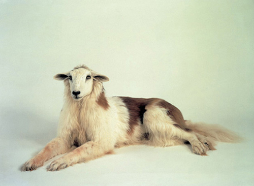
I particularly like this 'misfit' image by Grunfeld. The texture of both the sheep and the dog is very similar therefore the photo merges together very well and looks real rather than two images merged together. Although the effect here may be quite subtle it is very well edited, some of the above images are a little more obviously edited together. Grunfeld uses taxidermy animals which makes them a lot easier to photograph than real-life animals, as he is able to move them around and chose what positions to have them in etc. I like how Grunfeld uses a very simplistic background, as the hybred stands out a lot in comparison to the background. All attention is focused on the animal, and especially in this case, it may take a while for the viewer to notice that the photo is in fact a cross between a sheep and a dog. If Grunfeld had taken these photos of animals in their 'natural environment' with a busy background it would detract from the simplicity of the photo. |
Distortion - alliance betwen pets and their owners:
WHOLE FACE TECHNIQUE:


HALF FACE TECHNIQUE:


Aims: In this set I aimed to produce photos of pets and their owners morphed together; focusing on the theme of alliance and similarity between animals and their owners.
Process: For this set I used the same process as mentioned about in my mock attempt to morph a Yorkshire terriers face with the face of an old lady, however in this set I used my own photos rather than photos I found on the internet. I found the process much more difficult with my own photos as I had to try and make sure the images I took of both the animal and the human were taken in similar lighting, at a similar angle and from the same distance to ensure the outcome would look professional. I used photoshop to edit my photos.
Critique: I feel I could have perhaps used more interesting animals for this set, rather than pets which tend to be cats and dogs. However, seeing as the point of my set was to express the alliance/similarity between pets and their owners, I feel I achieve what I had wanted to achieve in this set.
Further Development: If I was to further develop this set I would experiment with different locations taking the photos outside in natural light may completely change the way in which the image is interpreted. I would like to take a set using the studio so i am able to photograph using good lighting conditions and a plain background; which will help me to achieve a more professional outcome when editing using photoshop. I'm alsoplanning on taking more adventurous photos of animals rather than just household pets. Perhaps visitng the zoo and taking photos of more exotic animals which will hopefully reflect well on the outcome of the images.
Different angle - distortion of the face through objects:
Aims: This set was very experimental, I took a few photos of my friends to use in my animals and their owners set and decided to try out some different techniques using photoshop. I took photos of different textured and patterned objects; including a dart board and some sweets. I then used photoshop to morph the objects onto the photo of the faces of my friends. I really liked the outcome as it created something quite surreal. my favourite of the set are the image where sweets, leaves and fur is used to distort the face.


Process: I took photos of people and then of objects and merged the two using photoshop, I used a similar technique to that when I was merging the the face of animals and their owners. I simply covered the face with the object and changed the opacity so I could make out the persons features underneath and brought out the features using the brush tool.
Critique: Although I really like the effect in this set I do not think it really comes under the title of 'Combinations and Alliances', and I am trying to refine my work and produced something that I will be able to use in my exam piece.
Further Development: If I was to further develop this set I would take photos of objects that have a strong connection to the person, whether it's their favourite song written on their face or an object that they hold dear to them. I would also like to see what the photos look like with using colour rather than black and white. Additionally I'd like to experiment with photographing the whole body rather than just focusing on the face. I could also re-introduce the stop frame animation process and perhaps have writing appearing on a face; the persons favourite song for example - with the song playing in the background.
Development:
In the "whole face" set where I used the hybrid technique of editing animal faces on human bodies through photoshop, the editing was very poor and the final outcomes looked very amateur. In the next set "animals around the house" I feel I have perfected the editing techniques, I took two photos one of the background with no subject in it and one with the subject in it; therefore when it came to editing I was able to rub out the human face and put the animal head on the body without any disruptive features coming through such as stray hair or pieces of clothing etc. I am much happier with this set as the editing looks more professional and there is a clear sense of development where I have fully understood the editing technique using photoshop.
Animals around the house..


Black & white / colour:
Aims: In these photos I have documented two of each photo; one in black and white and one in colour. I have done this to see the different effect achieved through the variations of colour and black and white, and what the different colouring adds to the photo.


Opinions: I personally prefer the black and white effect as I think it compliments the contrast between the animal head and the skin tone of the human. The first photo of the 3 mice
Old fashioned photography; the style of old aged photographs:
Process: I have edited these images using photoshop to create the illusion that they are "old fashioned" photographs. I added gradient to the images and a slight sepia tone to the black and white colouring to create an old discoloured vibe.


Different styles of photography through the ages:
From left to right: 1950's,1960's,1970's and 1980's photos.
The first photo from the 1950's is very posed; perhaps a school photo where the boys look very smart. The photo appears to have been taken in the studio with good lighting. Most of the photos from the 1950's are very similar; they tend to be of family portraits or large groups of people posing for their photograph to be taken. The quality of the photo's aren't very clear as the cameras used in the 1950's wouldn't have been very developed. Between the 1960's-80's the photos seem to be much more colourful and based on fashion and appearance rather than documentation of people and events. With the hippy era of the 60's the outfits are very much colourful and over the top, in the photo below (2nd) of the 60s's the outfits worn are very gaudy and colourful, the photo has a bright green background to contrast with the extreme bright colours of the subjects tanned skin and bright pink and orange outfits.The difference between the photograph from the 50's and the photograph from the 60's is very extreme, it's clear that bright colour was very much as essential factor of 1960's fashion. Photographers from the 60's wanted to capture contrasting colours for fashion purposes, where the photographers from the 50's were less experimental and focused more on capturing simplistic portraits.
The photo from the 70's (3rd) seems to be taken in the home, an obvious trait from the 70's is the colourful floral patterns seen on furniture and clothing. There's a warmth to the photo that isn't present in the 1950's photo which has quite cool colouring. The photo from the 70's is also a lot more natural and spontaneous than the other photos which are very posed. Again, the photo from the 80's is still focused on bright colour contrast. Boy George's striking fashion sense and unusual appearance very much contrasts the baby pink background; again it seems the photographers from the 80's wanted to capture images for fashion purposes.


How I'd respond to these generations of photography:
My response to the 50's would be quite simple, I'd use the photography studio to take a photo using a plain simple background and strong lighting. If I was trying to capture the school boy photo like the photo above I'd focus on the outfits of my subjects, making sure their clothing wasn't at all modern. I'd then edit the quality of the photo using photoshop, transforming it from clear and coloured to grainy and black and white.
As for the 60's photo I would again use the photography studio but this time using a colourful background rather than a plain one, my subjects would have to be wearing bright colourful outfits to maintain relevance - the 60's would be similar to the 80's where I would also use a colour background but less brightly coloured outfits; I could experiment with makeup and appearance like Boy George.
The 70's would be my favourite response as the photos would be more natural and less posed. I'd set the time by using props such as a floral sofa, or large over the top curtains from the 70's.
First response to photo from the 50's:
Below is two images that have been edited using photoshop to create the appearance of a photo from the 50's. The first is an example of what the photo looked like before I had mate the vital changes to give it the appearance of a 50's photo.
I took the photo using a photography studio with studio lighting; I had 3 powerful lights to create professional lighting. I edited the image into black and white as photos from the 50's would have been black and white. I decided to chose animals that I felt would work well with the 5's portrait vibe I was going for, I felt Emu's fitted the dated and quite sophisticated pose perfectly. In the second image I have added a slight blur, grain, brightness and a warming colour filter to the image to give the image the finishing touches that are necessary to fit the 50's theme.
I took the photo using a photography studio with studio lighting; I had 3 powerful lights to create professional lighting. I edited the image into black and white as photos from the 50's would have been black and white. I decided to chose animals that I felt would work well with the 5's portrait vibe I was going for, I felt Emu's fitted the dated and quite sophisticated pose perfectly. In the second image I have added a slight blur, grain, brightness and a warming colour filter to the image to give the image the finishing touches that are necessary to fit the 50's theme.


I have followed the same process for the other two images above; however I used a different animal. A goat. I tired to match the animal to the body language of the model. With the first model looking quite timid and shy with her hands held together I decided to use a goat with floppy ears that looks pretty harmless and cute, for the other model with his arms crossed in a quite dominant manner I decided to use a goat with horns; an animal that looked more in control and dominant.
First attempt at response to 60's photos:
Below on the left is my own photo edited in the style of 60's photography, on the right is a fashion photo from the 60's.
I have tried to achieve a similar effect to that of the 60's photo, using bright colours, a slightly orangey hue to the image and a grainy poor quality effect. The image from the 60's looks very much like a painting, that's the effect that I wanted to also achieve in my photography. The lack of clarity really adds to the 60's style, where cameras wouldn't have such a high quality focal range.
I took my photo in the photography studio using a bright green backdrop that contrasts with the pink/purple colouring of the models jumper. I then added a flamingo head to my image; I chose this particular animal as I felt the colouring would work well with the gaudy clashing of colours effect I was going for. I then editing the colour contrast and saturation on photoshop and increased the grain of the photo to create that old fashioned photograph effect.


Further research into photography of the 60's:
I quite like the vibrance of photos from the 60's, I've been working a lot with black and white photography and would like to start focusing a little more on colour so that I can have a final outcome that presents both black and white photography as well as colour photography.
Through my research, looking at photography and portraits from the 60's I came across the two images below. The first is a photography of a stripper from the 60's and the second is a recreation of a 60's housewife by an American amateur photographer called Toni Tiller. I prefer the first photo as it has the sepia tone, aged photograph appearance of an original 60's photo that lacks in Tillers portrait. However, I particularly like the clashing contrast of busy floral wallpaper and the bright pink patterned dress in Tillers photo. I would like to produce something similar to this, focusing on busy patterns and bright colours in the style of an aged sepia tone, grainy 60's photograph.
Through my research, looking at photography and portraits from the 60's I came across the two images below. The first is a photography of a stripper from the 60's and the second is a recreation of a 60's housewife by an American amateur photographer called Toni Tiller. I prefer the first photo as it has the sepia tone, aged photograph appearance of an original 60's photo that lacks in Tillers portrait. However, I particularly like the clashing contrast of busy floral wallpaper and the bright pink patterned dress in Tillers photo. I would like to produce something similar to this, focusing on busy patterns and bright colours in the style of an aged sepia tone, grainy 60's photograph.


Further research - Francesco Sambo:
Francesco Sambo is a visual artist based in Italy. The man-creatures (hybrids) in his “Bestario” photo series are created using photo manipulation, the same process that I've been using for my hybrid photography.
While Sambos hybrids may look straight out of a nightmare on closer inspection one notices that they still retain traits of human nature in them. Sambo masters the blending features and image manipulation so that the animal parts match the body in texture and contrast.
While Sambos hybrids may look straight out of a nightmare on closer inspection one notices that they still retain traits of human nature in them. Sambo masters the blending features and image manipulation so that the animal parts match the body in texture and contrast.


Response to Francesco Sambo:
Although I love the quite terrifying effect created in Sambos hybrid photography, I will not be going for such an eerie and spooky effect in my own. As I have decided that I will be producing photos that would be found in a living room set up, family photos if you will, I do not think the spooky effect that Sambo has achieved would quite fit my theme. However, I like the black background effect that Sambo has chosen and would like to see what effect it has on my photos by giving them a black background.


Formal portraits:


60's-70's


Laurie Simmons - other ideas:
Laurie Simmons is an American artist and photographer. In the photos below she has used the process of editing portraits of people into cartoon-like photos. I particularly like the second photo of a couple in a old fashioned and very grand dinning room; Simmons editing techniques are very effective and the people look very much as they belong in the photo. This process looks really effective, I wanted to try out something similar with my photography as I feel in some of the shots I have achieved an old-fashioned appearance however the background doesn't really fit the photo. For my response to Laurie Simmons I will not superimpose portraits onto cartoon backgrounds, however I will use found images of settings that fit the era of my chose photo.


Response to Laurie Simmons:


Exam ideas: Installation
As I have decided on continuing the hybrid theme that I have been experimenting with, I have been thinking about a creative and challenging set-up of my exam piece and potential ideas I could follow through. I have decided I want my final piece to consist of a variety of hybrid 'family portraits'.
Below is two family portraits that I have manipulated using photoshop and put monkey heads on human bodies, the second photo is the same but made to look 'old fashioned' through different techniques found on photoshop, such as changing the colour balance to a sepia tone and editing the gradient of the image. This gave me the idea to produce a wall of family portraits that go through the different time periods. I could take a selection of photos going from the 30's to the 21st century.
As for my set-up I have decided to create a physical living-room area where I will exhibit my photos; this will include a wall with wallpaper and photo frame, an arm chair and various other living room objects such as a lamp etc.

|

|

|
Above (left) is an installation from previous years by an ex-student, and next to it (middle & right) are found images of mismatch photo frames on a wall. all three of these photos are a combination of the final piece that I am visualising, the idea of having a living room set up with flock wallpaper, an arm chair and a few objects that could be found in a real living room with the mismatch photo frame effect. I feel this is a really powerful visual set up that will successfully attract an audience better than simple, plain and boring framing would.
For the exam I will be framing my chosen photos, I am planning on having about 10 final images, all printed in a variation of different sizes. I want to create a very mix-match living room set up, with wallpaper that clashes with the different mixture of frames. I will be buying a selection of frames that vary in shape, texture, and size and then adding to them during the exam by painting them, adding texture and various objects. As I have tried to produce photos that go through the different eras of time I want my photo frame to fit the era, while complimenting the hybrid image. For example, for the photos that are supposed to look very old fashioned, taken in the 50's, I want to decorate a photo frame in a way that makes it look quite vintage, such as spraying it with gold spray pain and distressing the wood.
For the exam I will be framing my chosen photos, I am planning on having about 10 final images, all printed in a variation of different sizes. I want to create a very mix-match living room set up, with wallpaper that clashes with the different mixture of frames. I will be buying a selection of frames that vary in shape, texture, and size and then adding to them during the exam by painting them, adding texture and various objects. As I have tried to produce photos that go through the different eras of time I want my photo frame to fit the era, while complimenting the hybrid image. For example, for the photos that are supposed to look very old fashioned, taken in the 50's, I want to decorate a photo frame in a way that makes it look quite vintage, such as spraying it with gold spray pain and distressing the wood.
