Development of project 1 - Texture and Surface
In this project 2 I aim to develop my project 1 (Texture and Surface) and produce a better, improved outcome. I have decided to refine my chosen theme and concentrate solely on close up photography of texture and surface rather than an array; which I tried in my final outcome of project 1 and feel didn't work very well as a final piece.
Class task - Find a contemporary photograph documenting something:
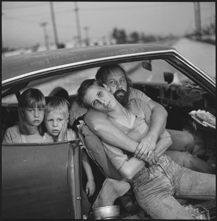
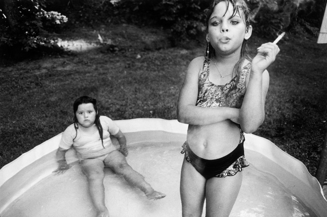
Mary Ellen Mark - I really like her style of documentary photography as it's not as 'messy' as some documentary photography. It's less spontaneous and looks more constructed even though it may not be; in a large majority of her photography the subjects are looking at the camera, which suggests some form of interaction between Mary Ellen Mark and her subjects. I like her choice of black and white photography as it creates a high contrast which works really well with her portraiture documentary. There's something quite sinister and eerie about her photos. All her photos are quite random and don't seem to fall under any specific genre/theme.
http://www.maryellenmark.com/
http://www.maryellenmark.com/


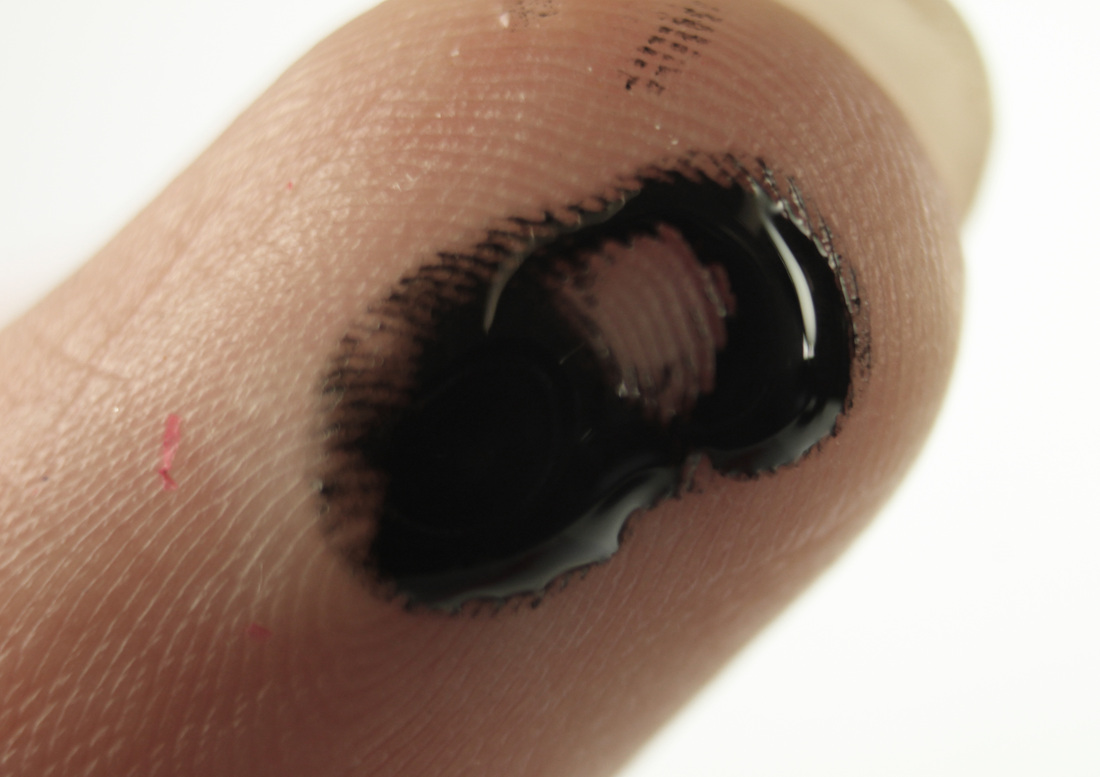
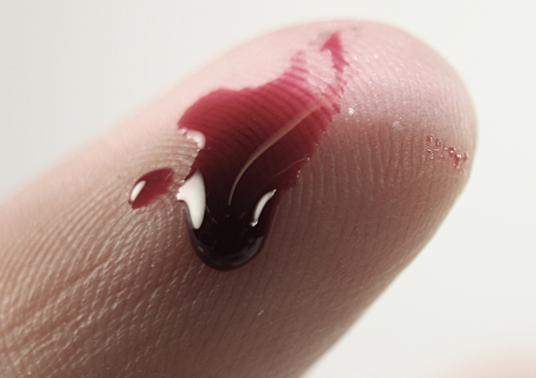
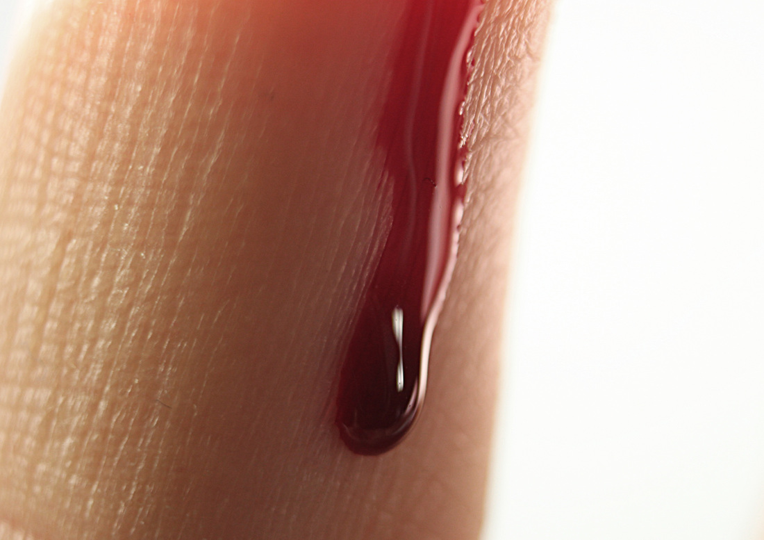
Set 1 - Developing Texture/Surface project; Ink:
|
|
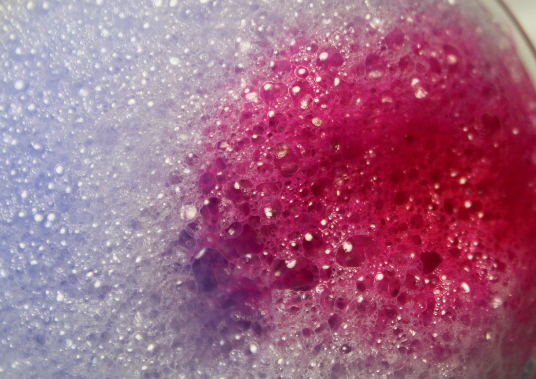
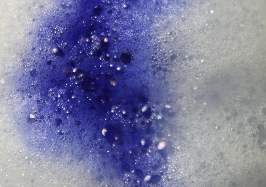
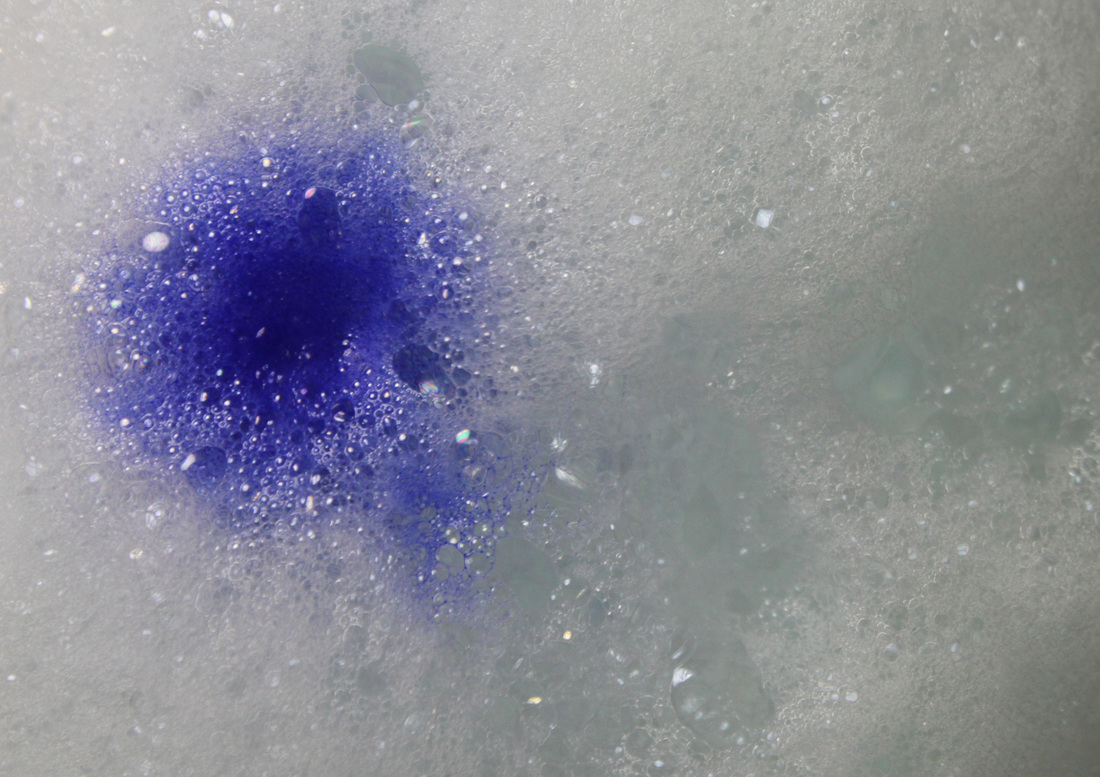
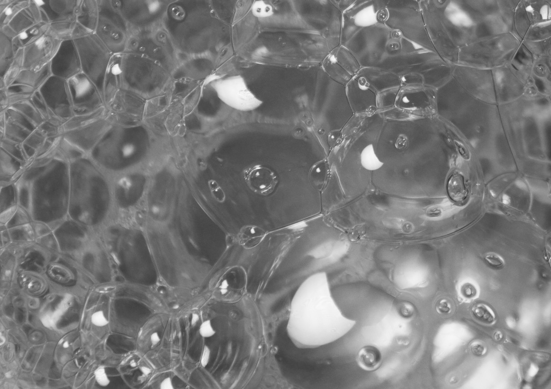
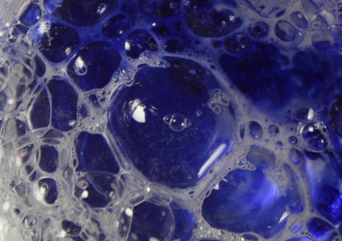
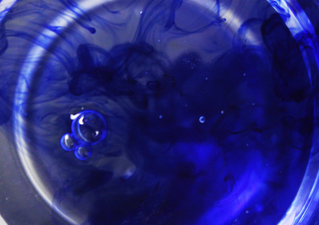
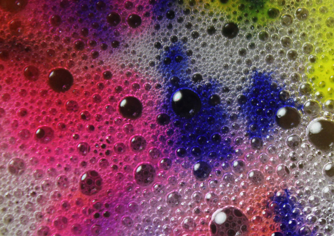
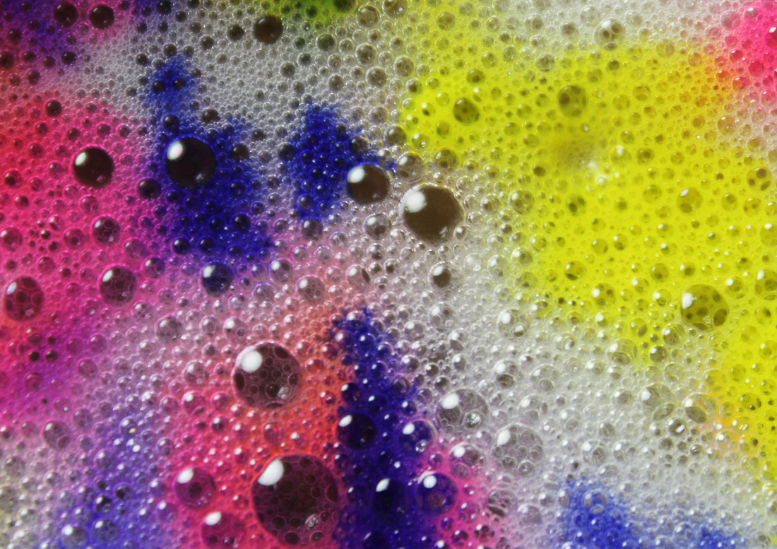
Aims: In this set I aimed to take a different approach to photographing texture/surface. In my past sets I concentrated more on rough texture objects such as wood or brick, in this set I wanted to create something a little softer; and experiment with using different colours to chance the way in which a photo is regarded. For example, although all the objects used in this set were of a soft texture; water, bubbles and ink, the black image looks less soft that the other photos. This shows that colour plays a big part in the way we see texture in an image.
Process: I took a set of photo using different coloured inks poured into containers of water and containers of water with bubbles at the top created by adding washing up liquid to the water. I took the images from directly above the containers using a tripod and a studio set up. Critique: I really like this set, I think the ink works really well and creates a different perspective of surface/texture; something I haven't yet achieved before this set, however, I think the framing of the photo's are a little boring and repetitive. When I took the images they framing was much more interesting as the water and ink were put into circular containers and in the original images the edges of the container were visible which made for a much more interesting image but when I took the images I had my camera on a large quality setting therefore I had to crop the images in order to fit them onto my weebly. Further Development: If I was to further develop this set I would experiment with different coloured inks and play around more with the framing. |

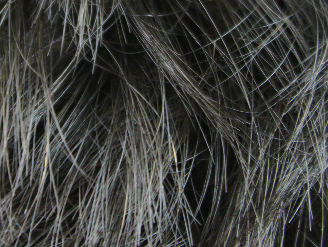
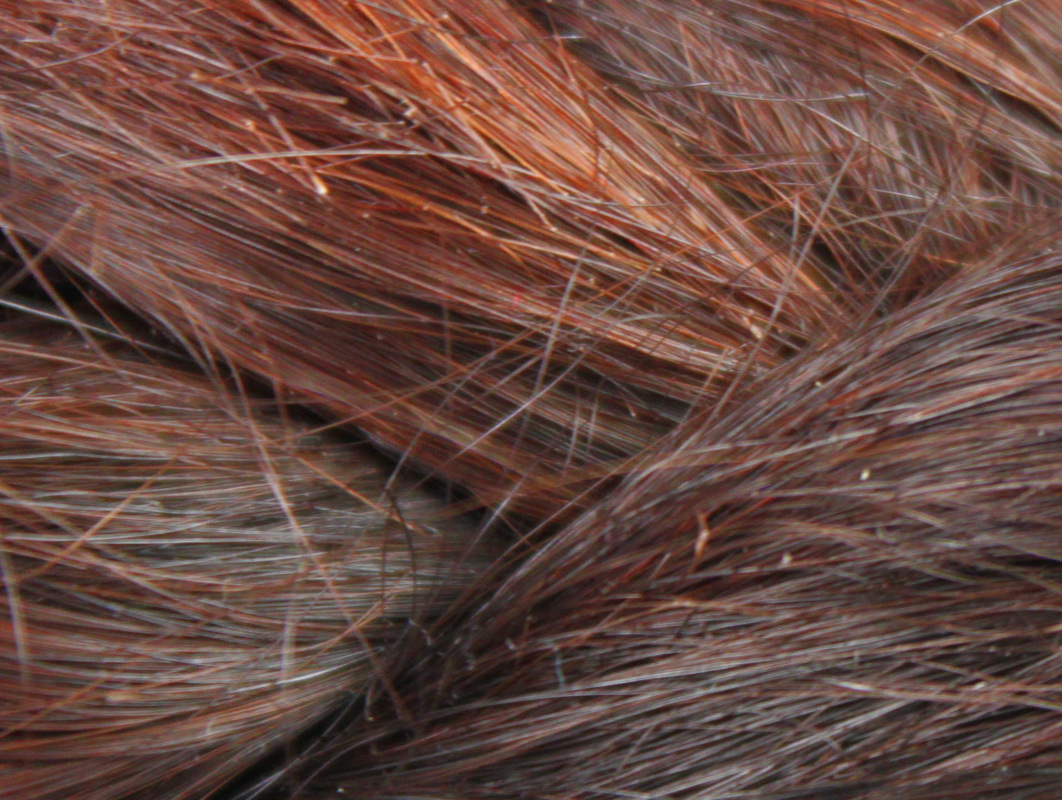
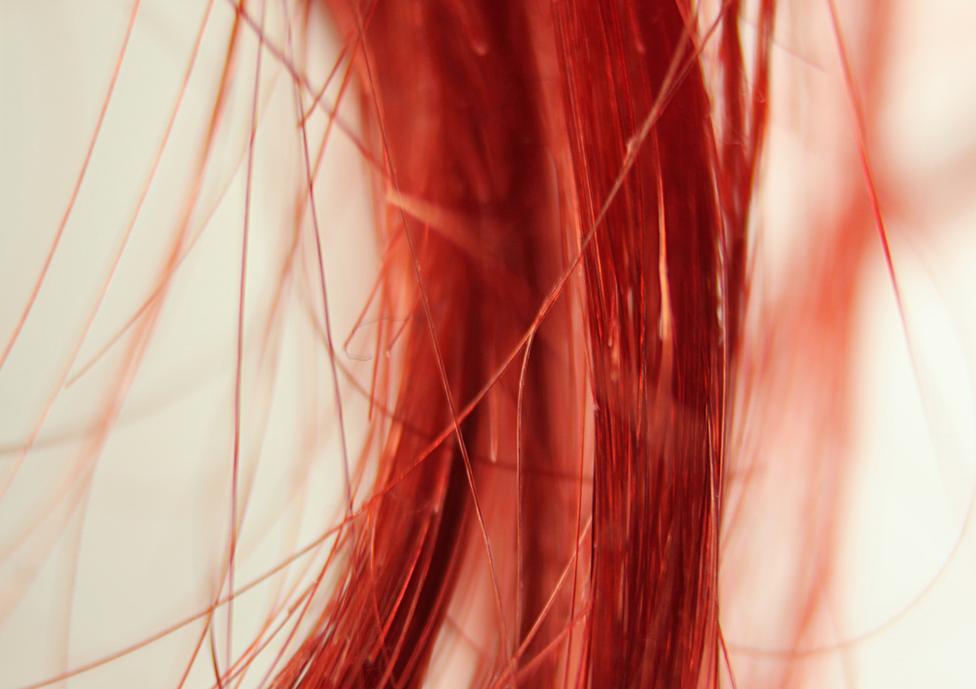
Close ups of hair texture:
|
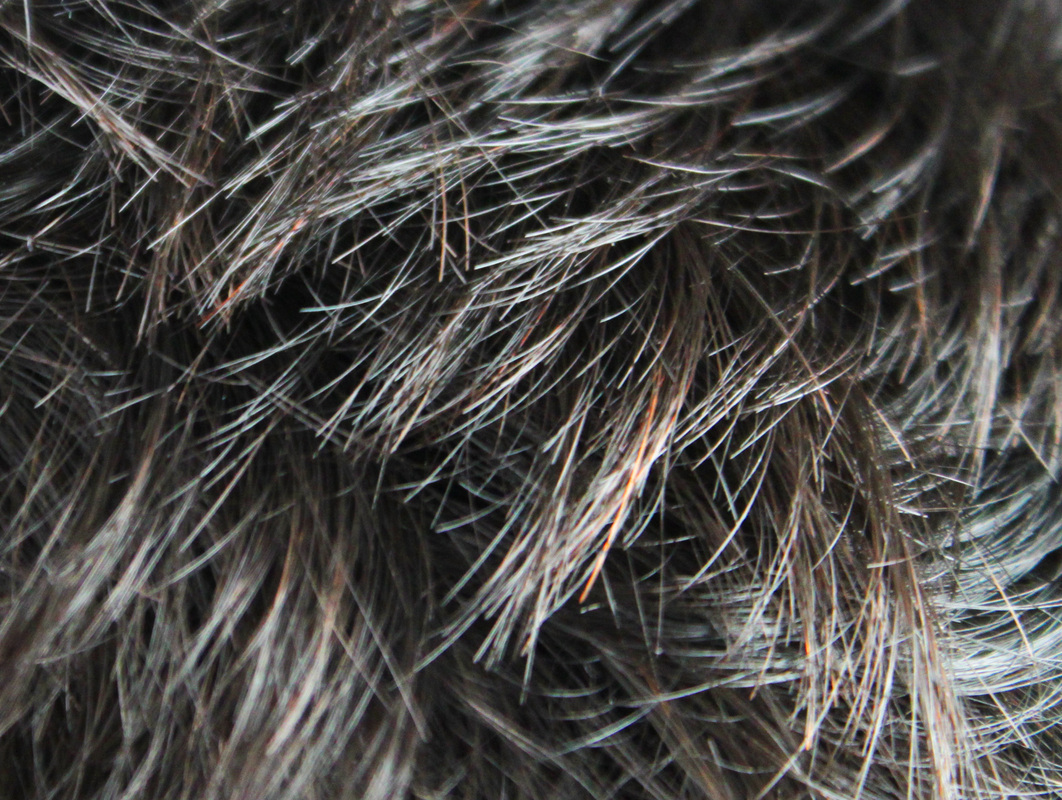
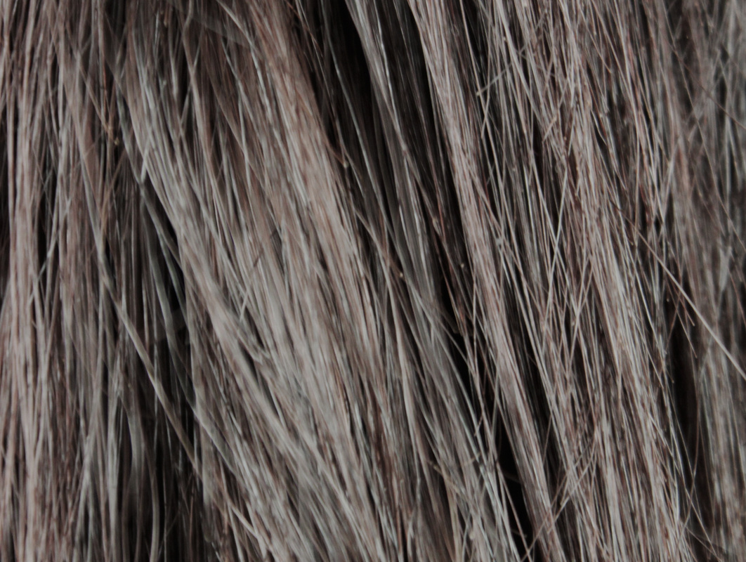
Aims: I wanted to take a set of photos that documented the textures of different hair, and how different coloured hair impacts on the way the texture is represented.
Process: I took close up photos of different peoples hair using the photography studio. Critique: Although I quite like the effect of photographing close ups of hair; as I think the framing works well, it takes a different perspective when your subject takes up the whole framing. However, I feel the images lack variety. I would have liked to get more peoples hair to photograph with an array of more interesting and unusual colours and textures. The majority of hair colour was brown/black which is a little boring. Further Development: If I was to further develop this set I would ensure I took more interesting photos. Perhaps use props to create an unusual contrast, for example, putting pencils or straws in the hair. I would also think more about my camera setting; I had to crop the images to get the subject to take up the entire image; which effected the quality of my images. |
|


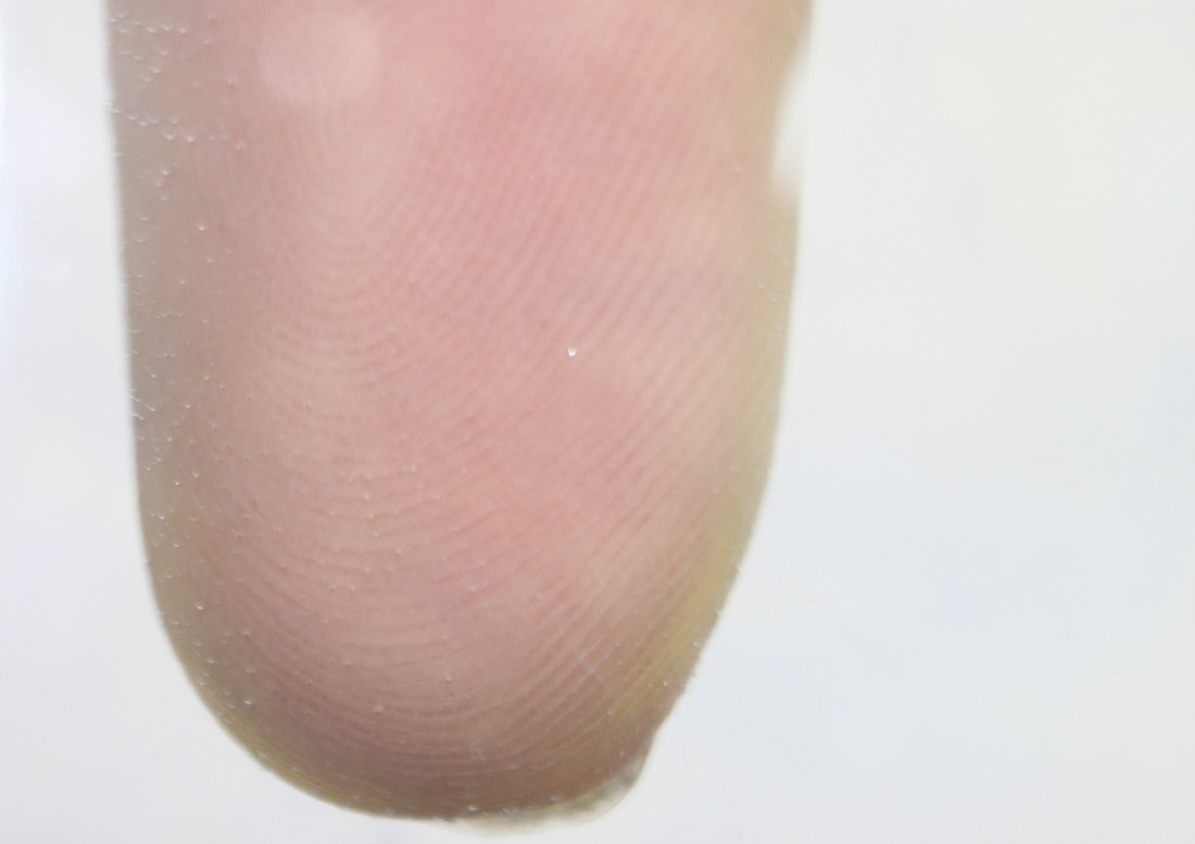
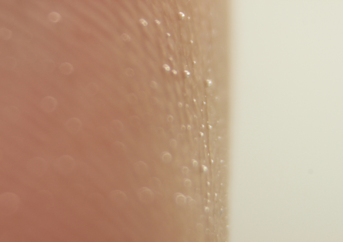
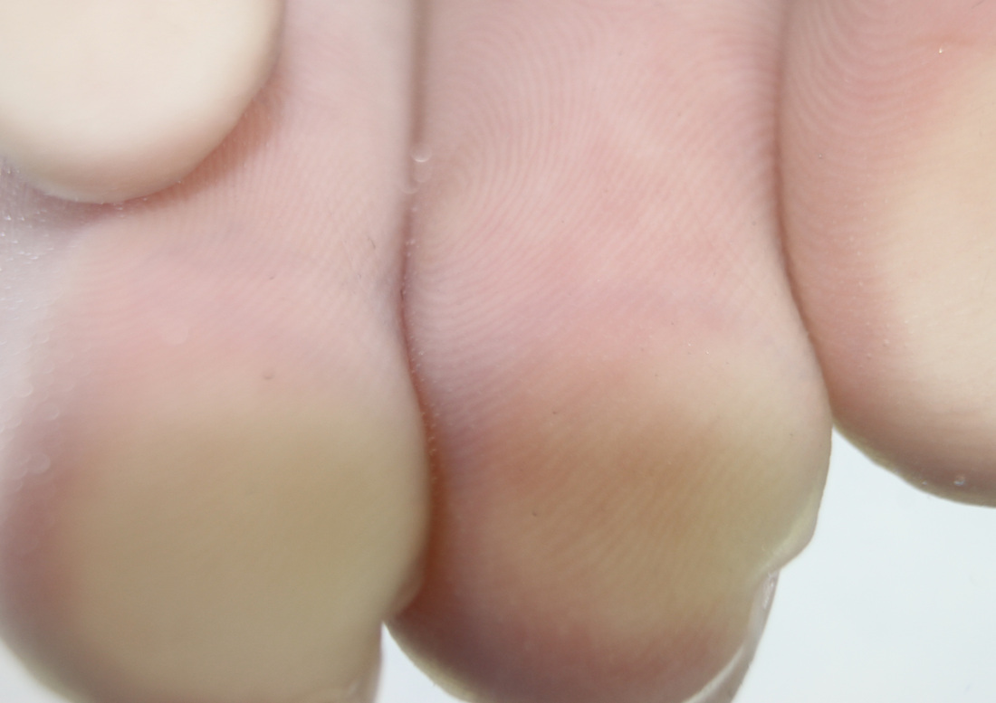
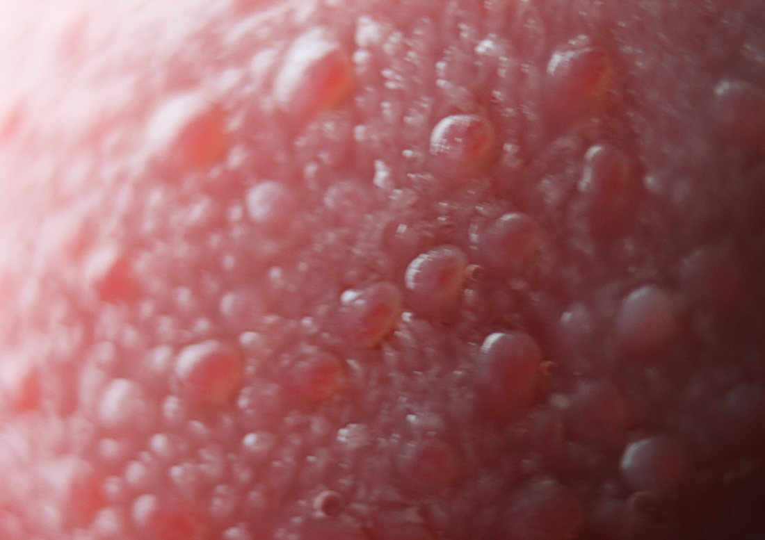
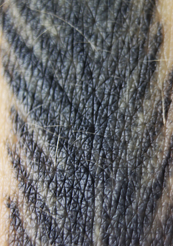
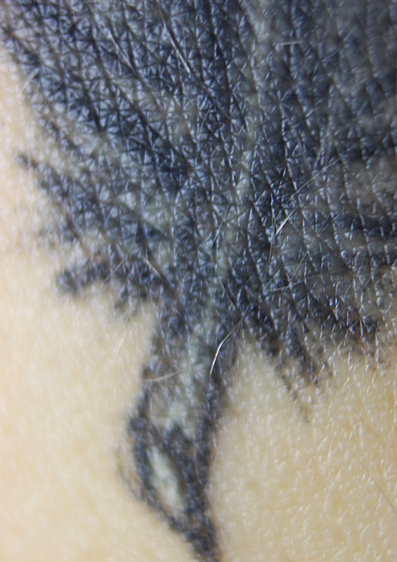
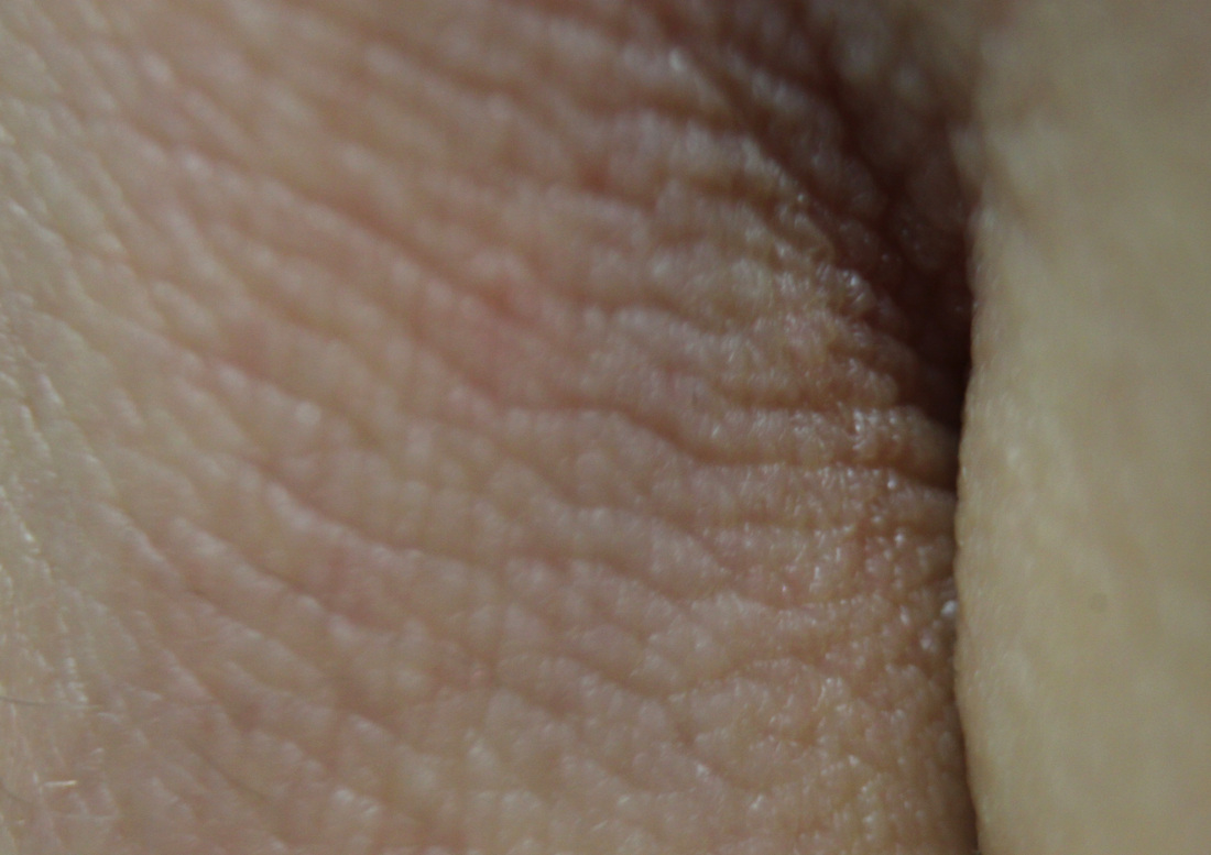
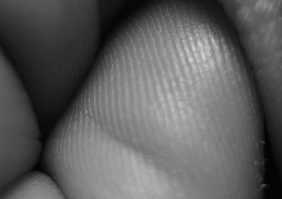
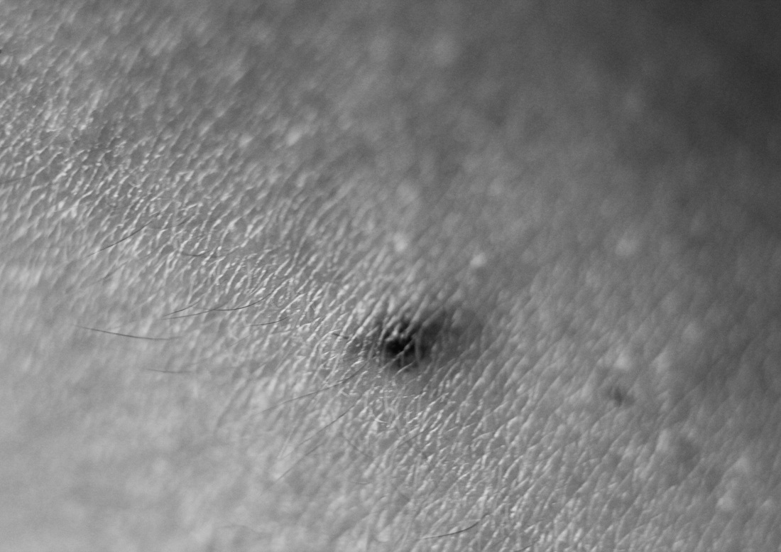
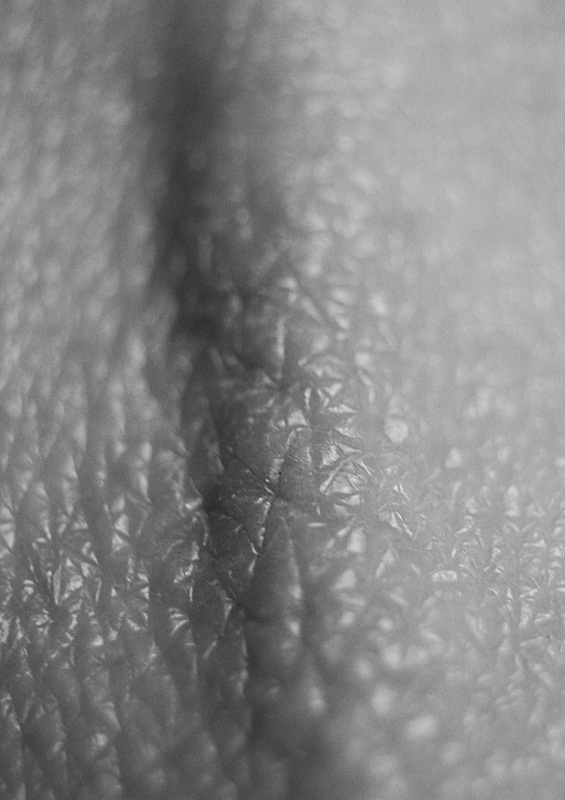
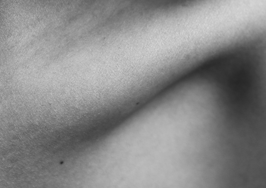
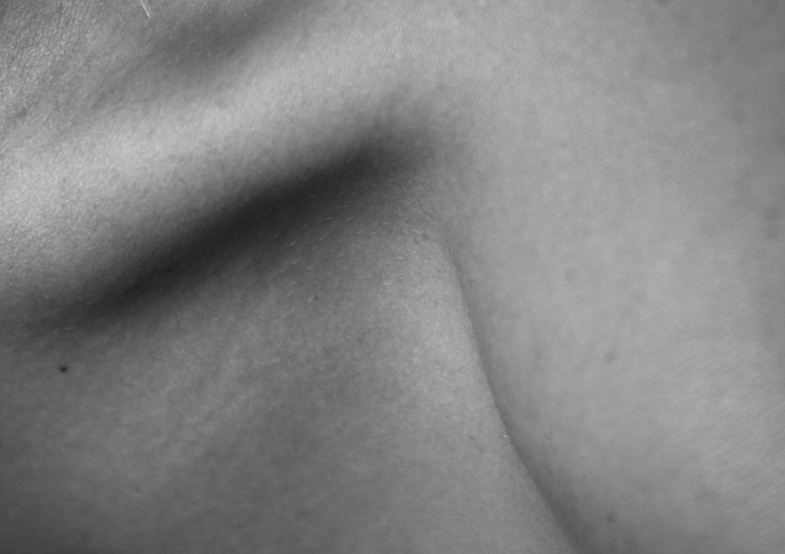
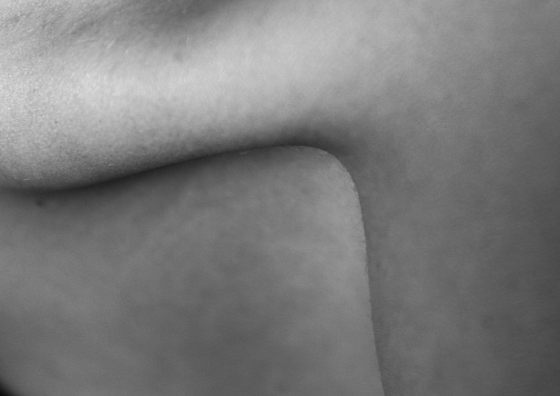
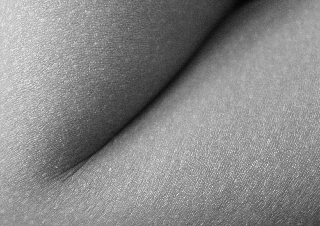
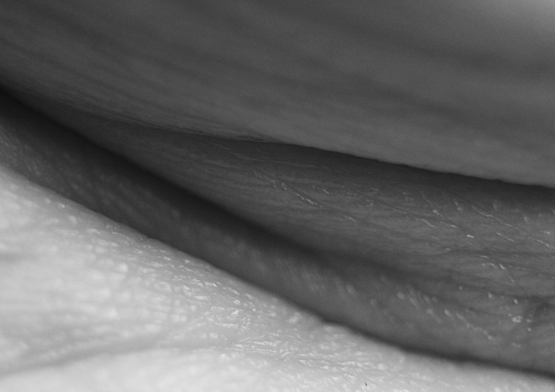
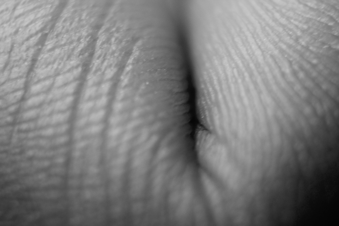
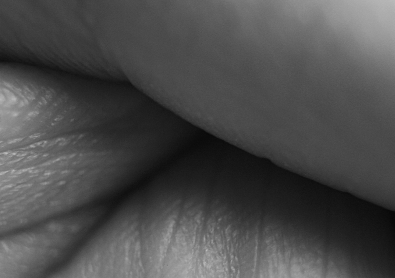
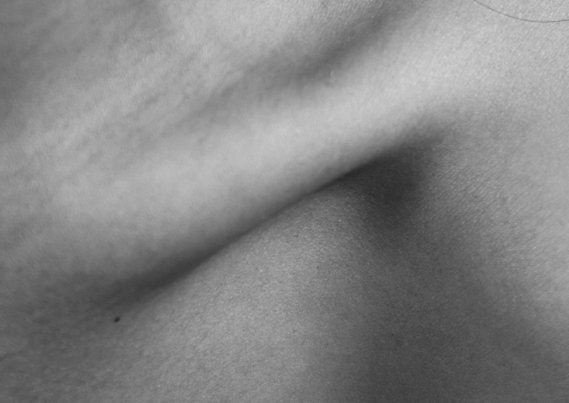
Macro photography - Skin texture
|
|
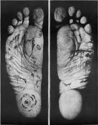
Aims: In this set I aimed to take macro photographs of skin. I really like the texture of close up skin, especially the patterns and elements of texture that is represented through fingerprints. I experimenting using liquids such as water and food colouring to achieve different effects. Process: I used the studio and a macro lens to take these close up images of skin. Critique: Although I really like the effect achieved when using a macro lens I feel I could vary my images a little more, they're all quite similar. Fingerprints. There's not a lot of colour in the images, perhaps experimenting with colour filters on photoshop would create a more interesting effect. Furthermore I feel the lighting used for the photos with dripping food colour on the finger is a bit too much as the lighting is reflected in the food colouring which distracts from the photo Further Development: I would experiment with photographing different parts of the body, and perhaps going so close up that the body part was un-recognizable. |


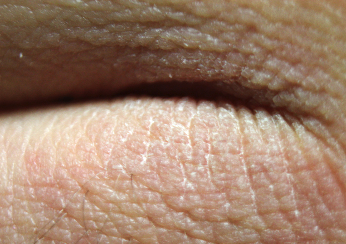
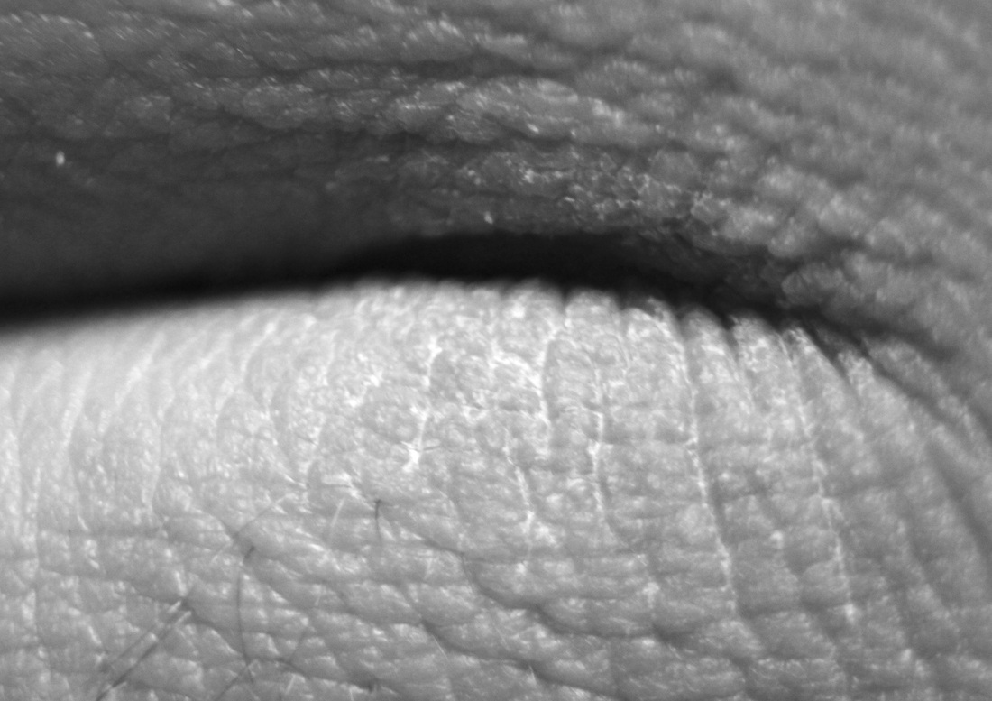
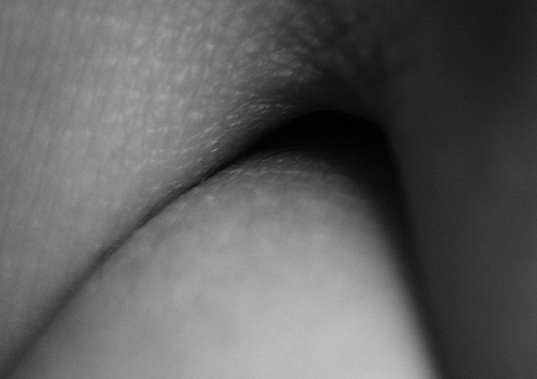
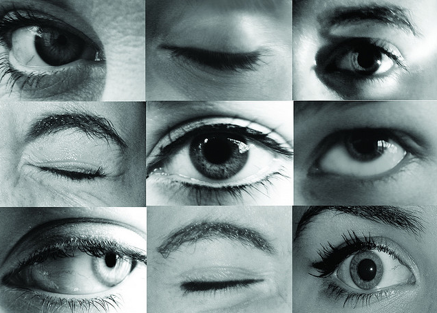
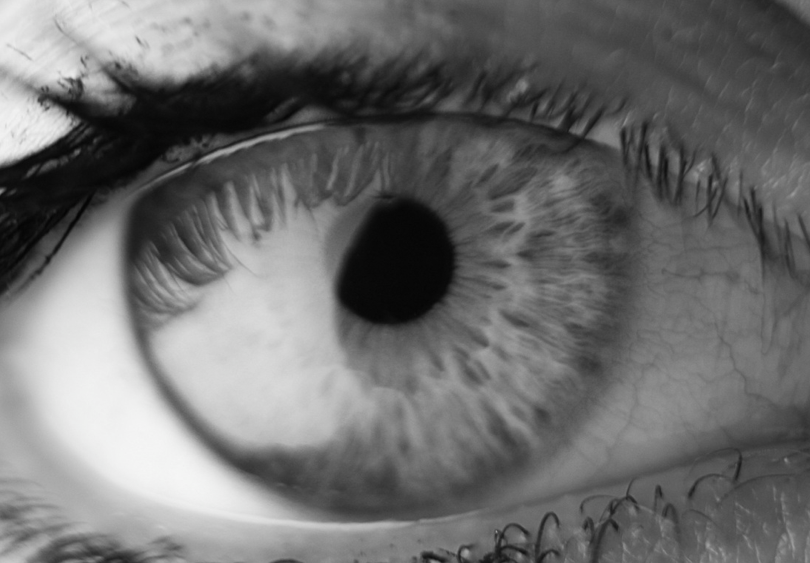
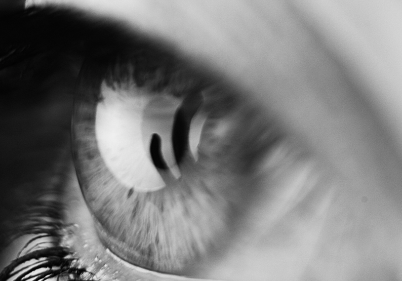
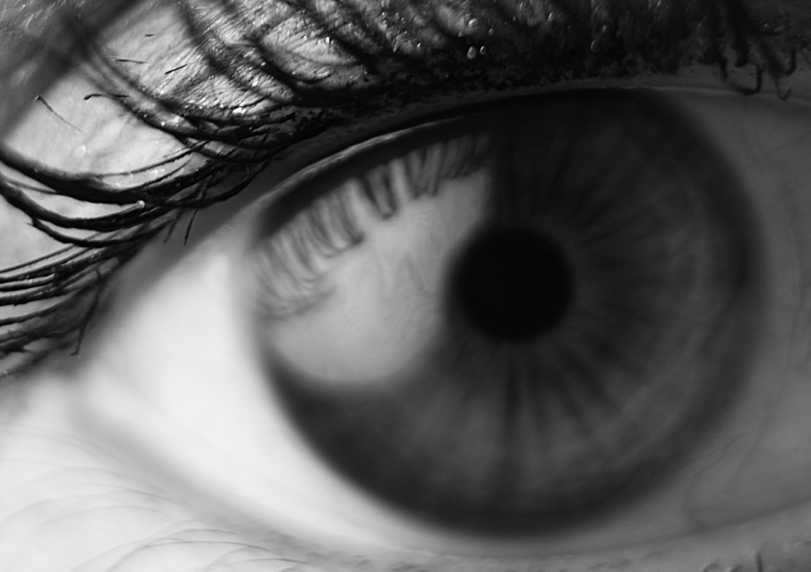
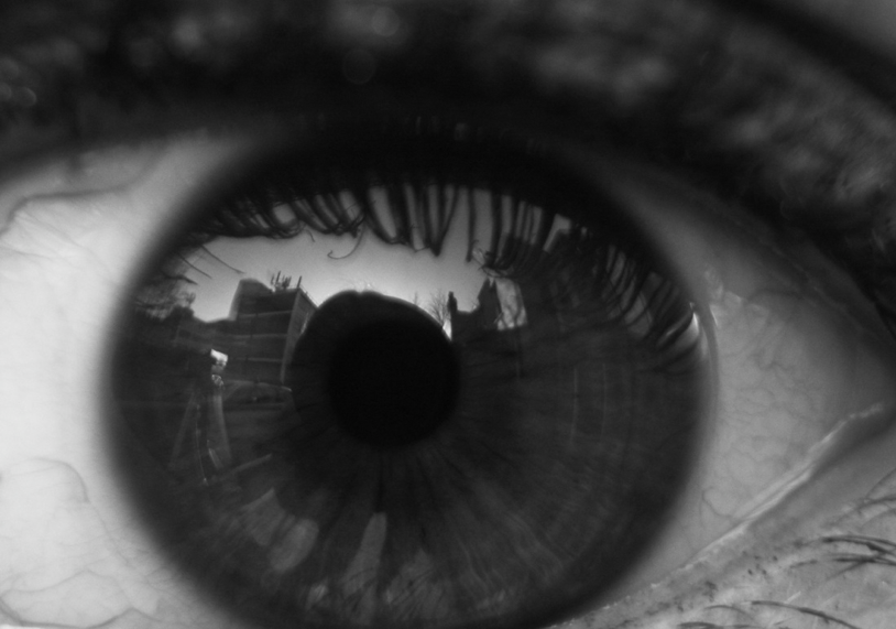
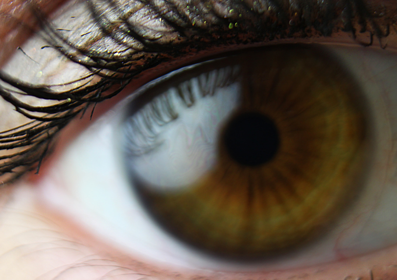
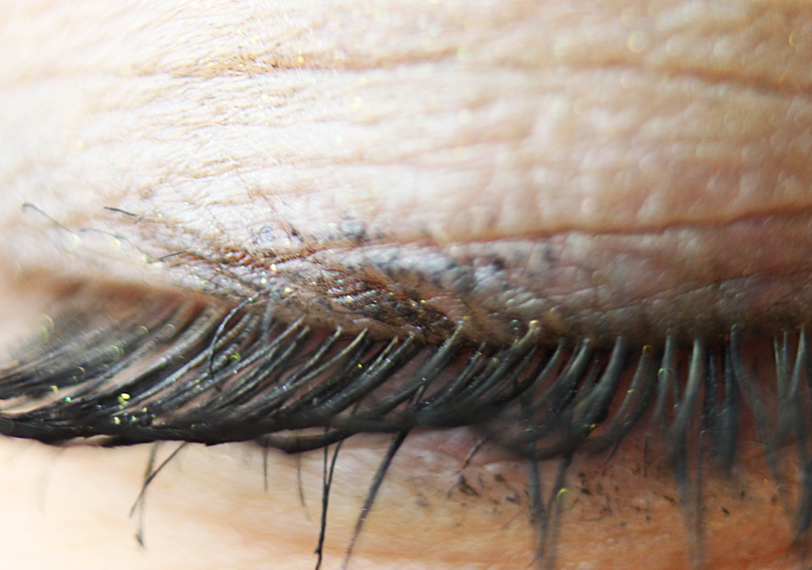
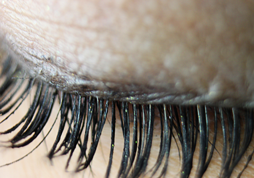
Macro photography - eyes, skin, lips texture
Aims: I aimed to take macro photos of eyes, mainly, and discover the different elements of texture and colour within a selection of eyes.
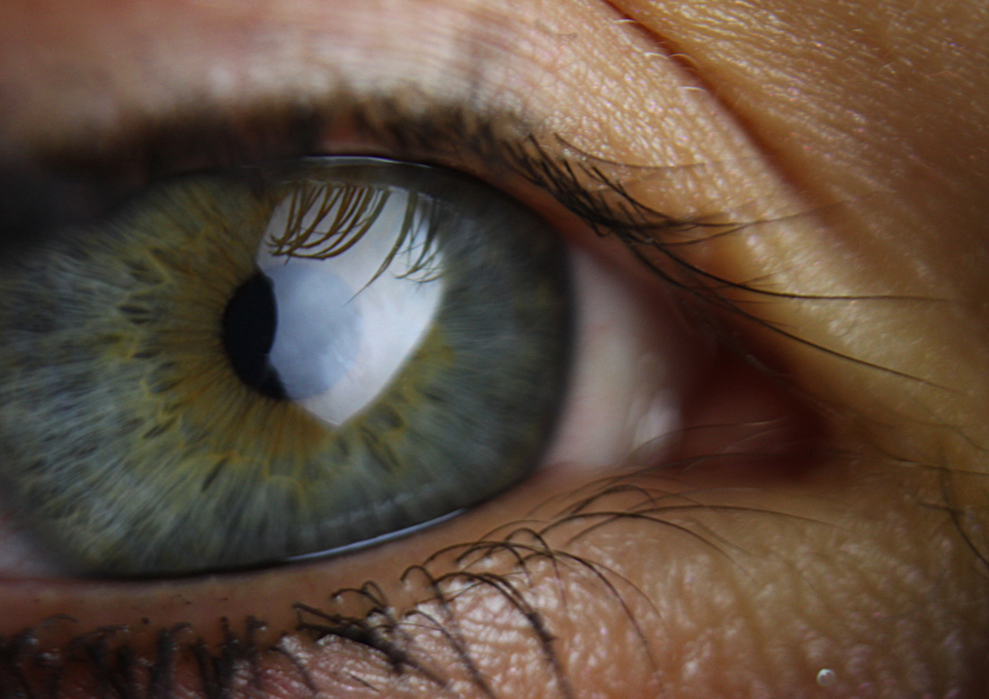

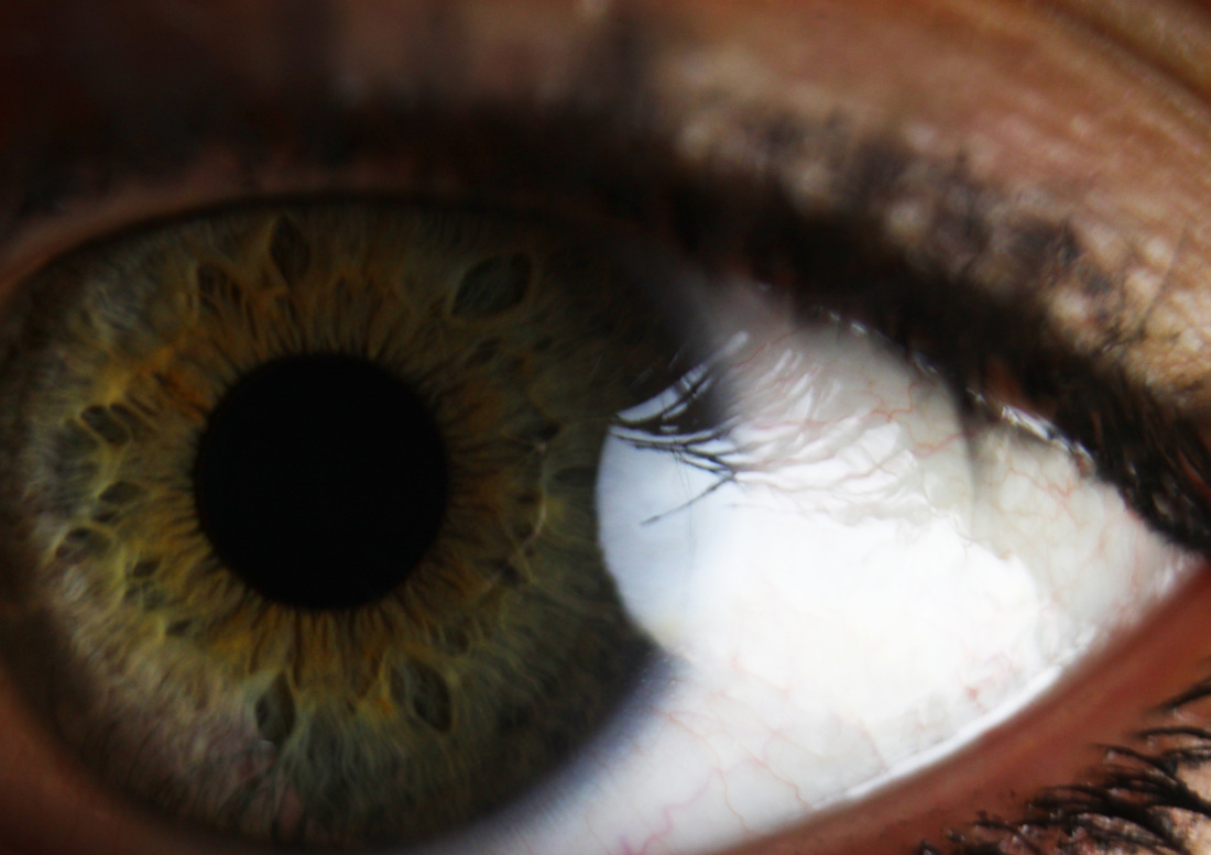
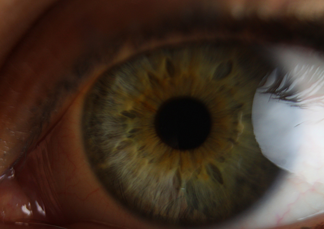


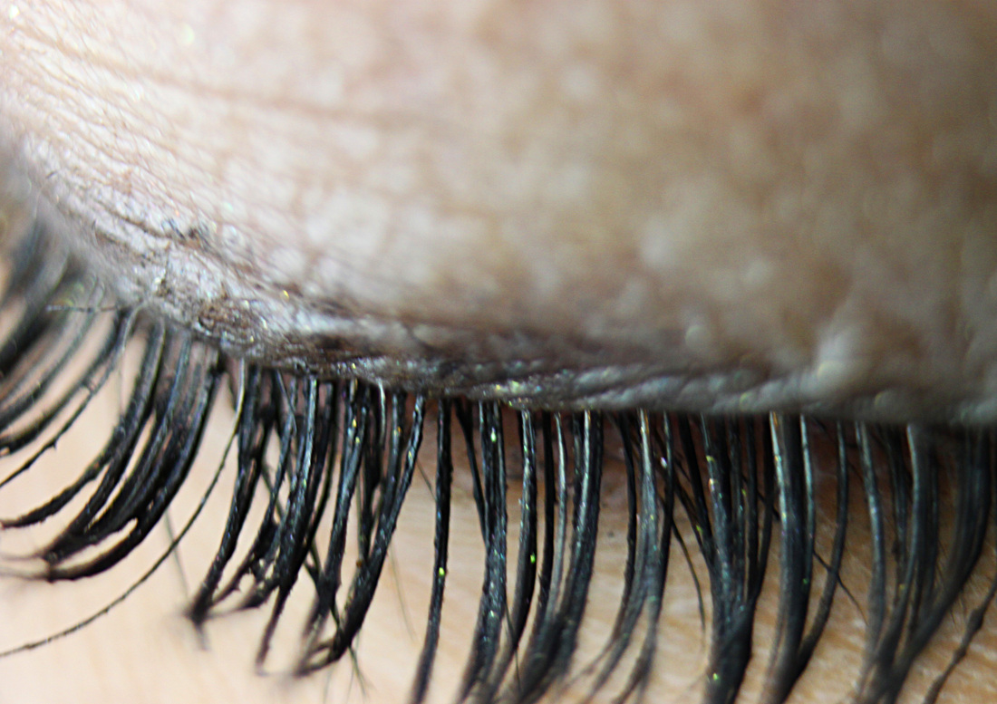
Process: I took these macro photographs in the studio with studio lighting, I used a macro lens to ensure I could obtain the best quality close up photos.
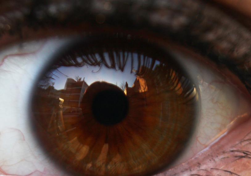
Critique: Although I really like all the images I took, I feel the lighting ruined some of the eye photographs. I tried taking the photos outside with natural light as well as with studio lighting to see if I could capture an image without the reflection of light in the eye.
Further Development: If I was to further develop this set I would experiment with reflexions of texture within the eye rather than just the texture of the eye itself, when I went outside to take photos I found that the reflection of building could be seen in the eye, I really like the effect this has on the image and would like to try out using different texture objects reflected in the eye to see what the outcome looks like.
Research - Edward Weston:
When I was researching other photographers who photography close up images of body parts, I came across Edward Weston's black and white photography. I really like his style, he captures a strong sense of the texture of the skin as well as capturing contrast between the subject and the black background. I especially like the way he captures shadowing in his images. Some of Weston's photography of body parts is very sexually suggestive, and I want to avoid this. He also doesn't photograph as close up as I'd like, I feel by photographing extremely close up or using a macro lens you will be able to achieve a much stronger visual of the texture of the skin; and that is what I want to achieve in my photography.
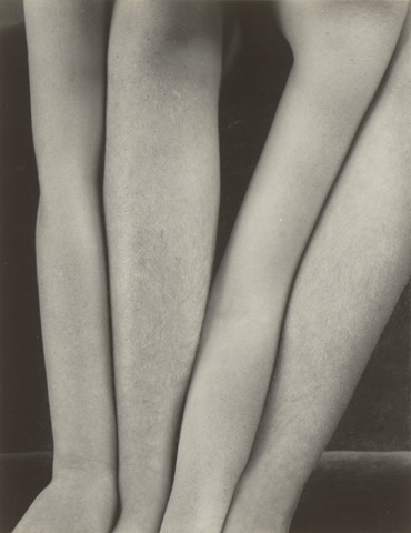
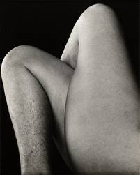
My favourite photo from above is the first as I really like how Weston uses lighting to create very deep shadows on one side of the body, it's very mysterious and eerie. However, I also really like the bizarre effect created in the second photo of the 2 pairs of legs, when I first came across this photo I was unsure what it was. There's something about it that resembles a bunch of tree trunks growing very closely together, I like the fact that some of Weston's work is unidentifiable at first.
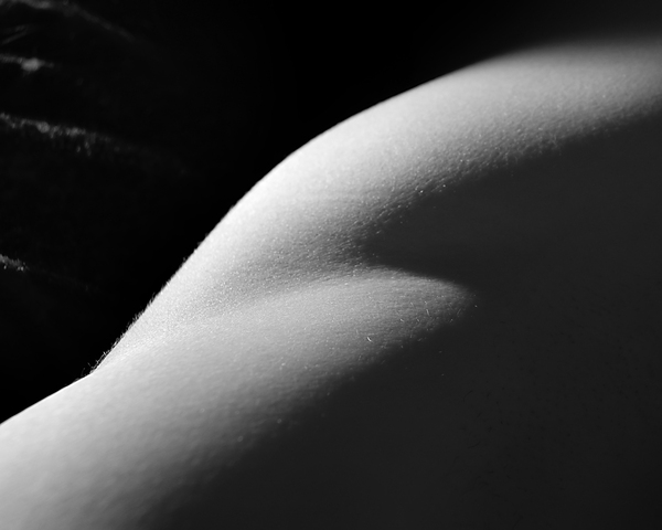
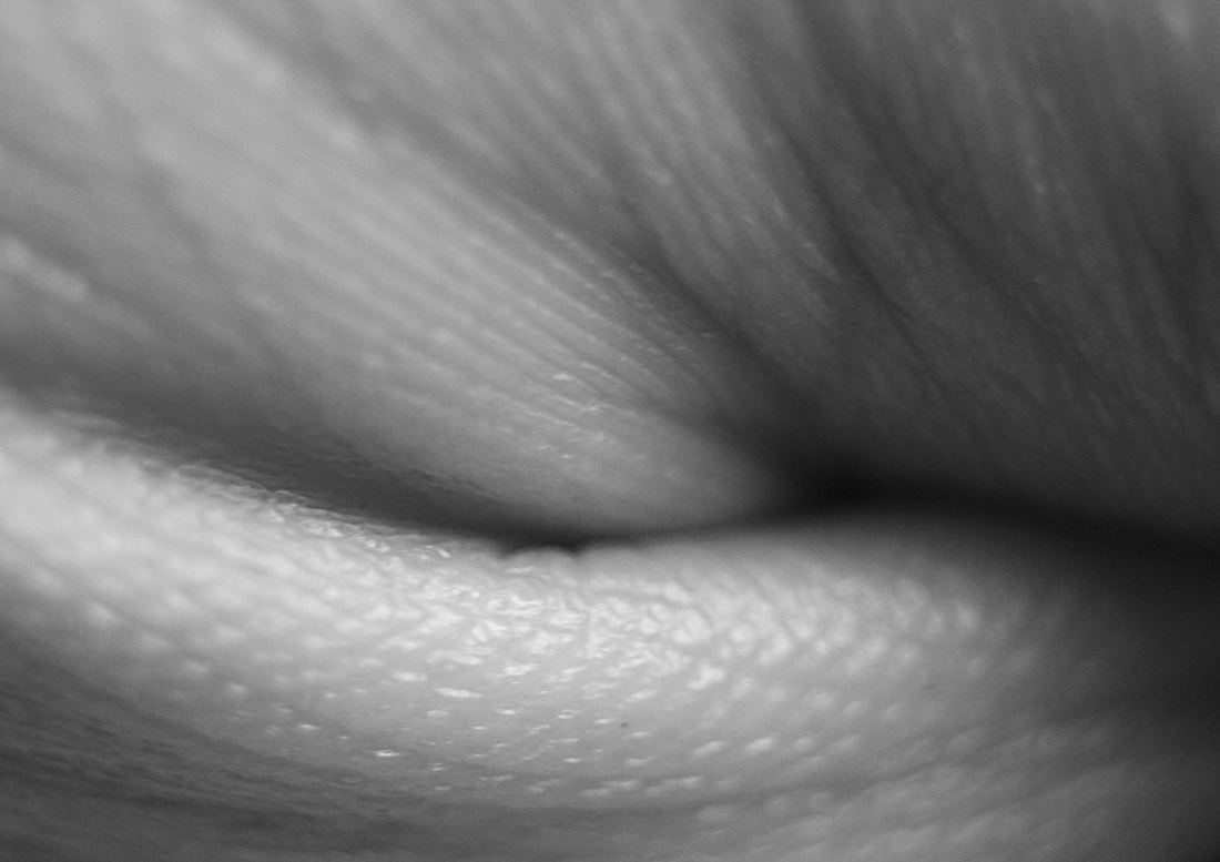
Close up of hands -black and white vs colour:
Aims: I wanted to experiment with editing my close up photos of skin and the body using photoshop. I decided to edit the photos by changing the colour to black and white. I feel they look much better in black and white and like how it intensifies the contrast.

Process: I used the studio to take some more macro photography of skin. I decided to stick with just taking photos of the skin on hands in order to refine my set and see whether it makes any difference photographing one specific part of the body rather than a variety.
Critique: I really like the black and white outcome as I feel it creates a more interesting and unusual image. I feel that I could use photoshop a little more and edit the photos to make them even better by changing the contrast slighting and perhaps sharpening the images. I found it very difficult keeping the entire image focused whilst using the macro lens, perhaps the images would look more effective
Further Development: If I was to further develop this set I would take pictures of the rest of the body rather than one specific body part. I would also take more care in editing my images, ensuring I took care in changing the contrast. I have decided I would like my next set to be in black and white as I prefer the outcome of the photos in black and white.
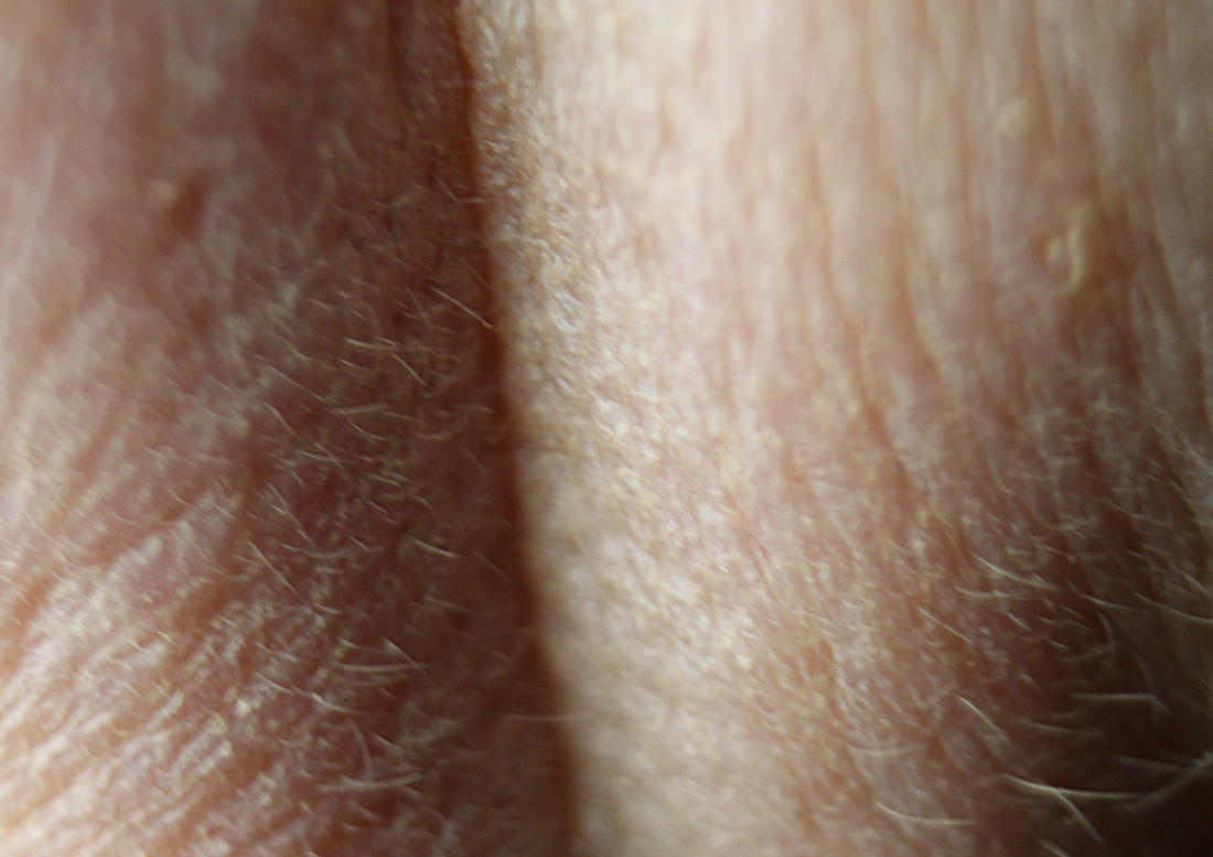
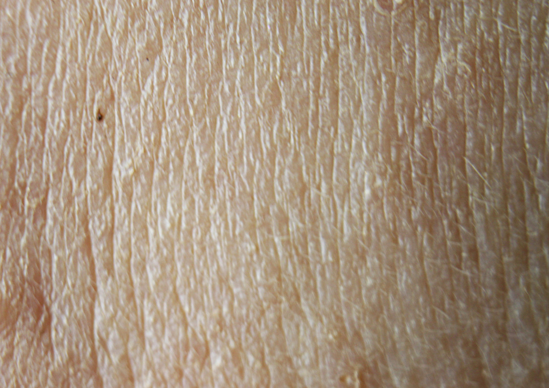
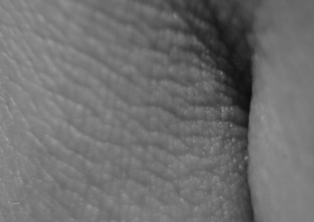
More macro photography of the body - skin (black and white):
Aims: In this set I aimed to take a set of close up photographs of different parts of the body, I used the macro lens in order to get the best possible close-up images. I wanted to produce a final piece combined with macro images of the body that are so close-up they are almost unrecognisable along with close up images that are more familiar such as feet, lips, and eyes.

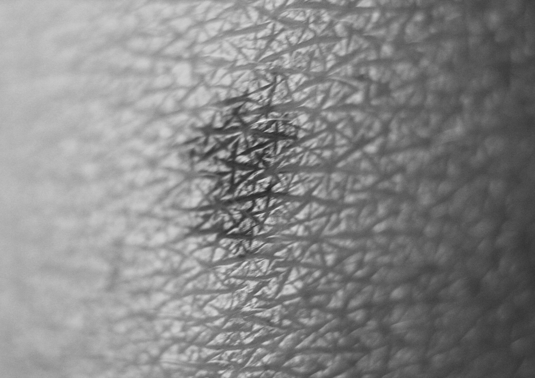
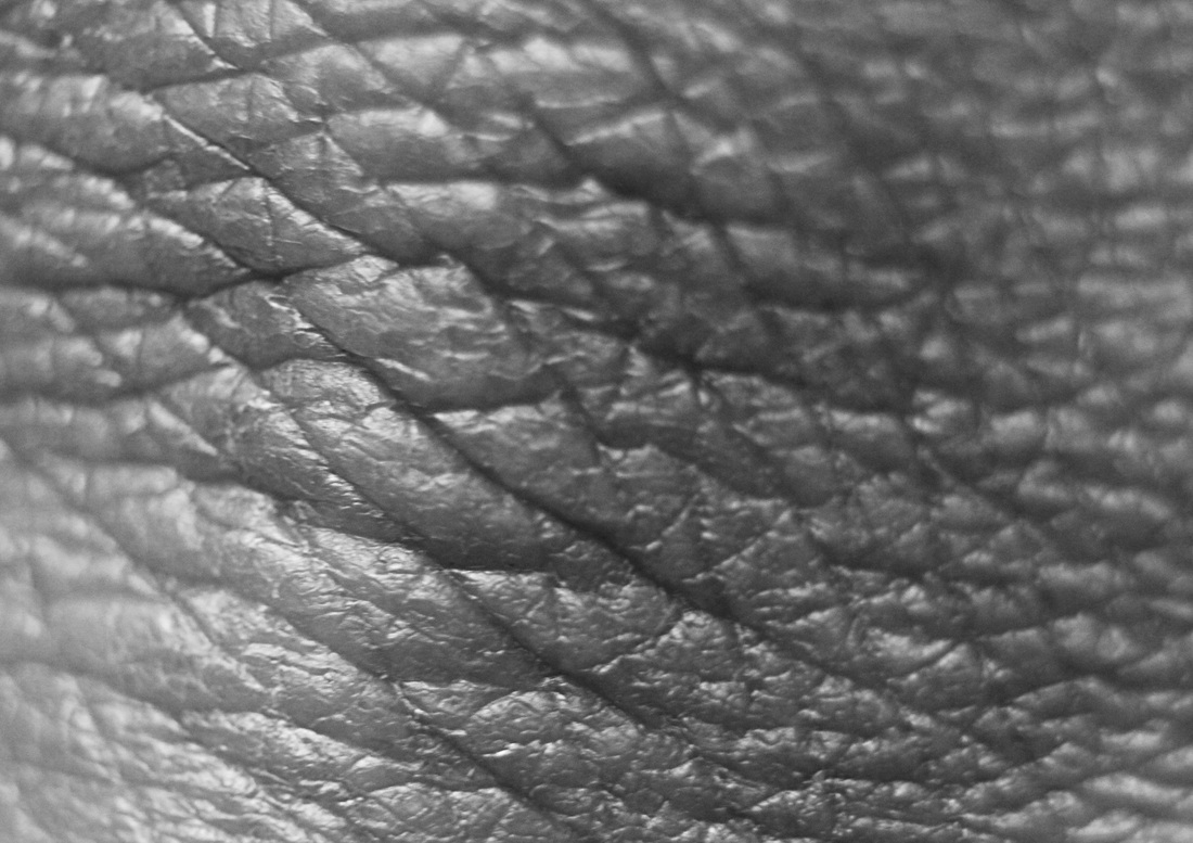
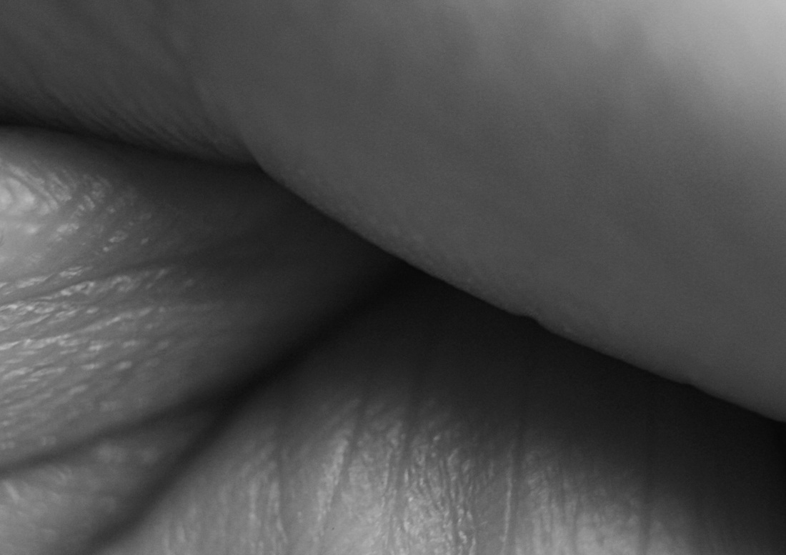


Process: I took all these images using the photography studio and a macro lens. I used the photography studio so I could get the best lighting in order to capture the detail and complexity of the skin. I then edited the images on Photoshop and converted all the images to black and white and heightened the contrast.
Critique: Some of the images taken were out of focus because I did not use a tripod, and it was very difficult to focus the macro lens accurately.
Further Development: If I was to further develop this set I would try and photograph a group of people with more noticeably different skin colour to create a clear colour contrast in my final set. As my set will be in black and white I feel using people with different coloured skin will add to the contrast and shading of the final set. It would lack in variety if all my images were of the same person with the same skin colour, I want to achieve variety through contrast and shading.
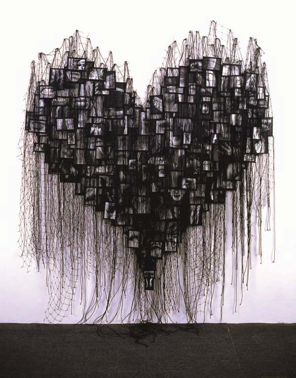
Research into photographers who photograph the human body - Annette Massager:
During my research into photographers who photograph the human body I came across Annette Massager. I really like her black and white photography of close ups of the human body. I especially like the way she displays her images as one big hanging collage. Massager has inspired me to produce a final outcome similar to the collage displayed below on the right hand side.

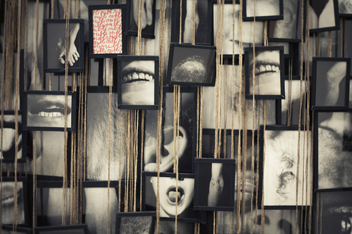
Ideas for final display:
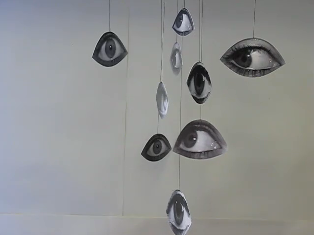
http://www.flickr.com/photos/fortismereartdepartment/3638083338/
Above is the website link to an installation created by another student. The video shows a selection of different eyes cut out into the shape of individual eyes, they're displayed as hanging from the ceiling by string. For my installation I will be using clear string to hand up my photos, as I am photographing different parts of the human body I think it will look more effective if the impression that the images are hanging in the air is created, using visible string may distract from the images. I will next have to decide whether I want to have a completely black and white installation or a combination of colour and black and white, as previously decided the close up images of skin look much better in black and white, however, the images of eyes look better in colour as the eye colour is what is most interesting about the images. From my previous piece of work on surface and texture I established that sometimes less is more, trying to combine black and white images with colour images in one installation can often look messy and disorganised.
Above is the website link to an installation created by another student. The video shows a selection of different eyes cut out into the shape of individual eyes, they're displayed as hanging from the ceiling by string. For my installation I will be using clear string to hand up my photos, as I am photographing different parts of the human body I think it will look more effective if the impression that the images are hanging in the air is created, using visible string may distract from the images. I will next have to decide whether I want to have a completely black and white installation or a combination of colour and black and white, as previously decided the close up images of skin look much better in black and white, however, the images of eyes look better in colour as the eye colour is what is most interesting about the images. From my previous piece of work on surface and texture I established that sometimes less is more, trying to combine black and white images with colour images in one installation can often look messy and disorganised.
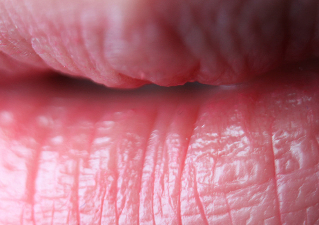
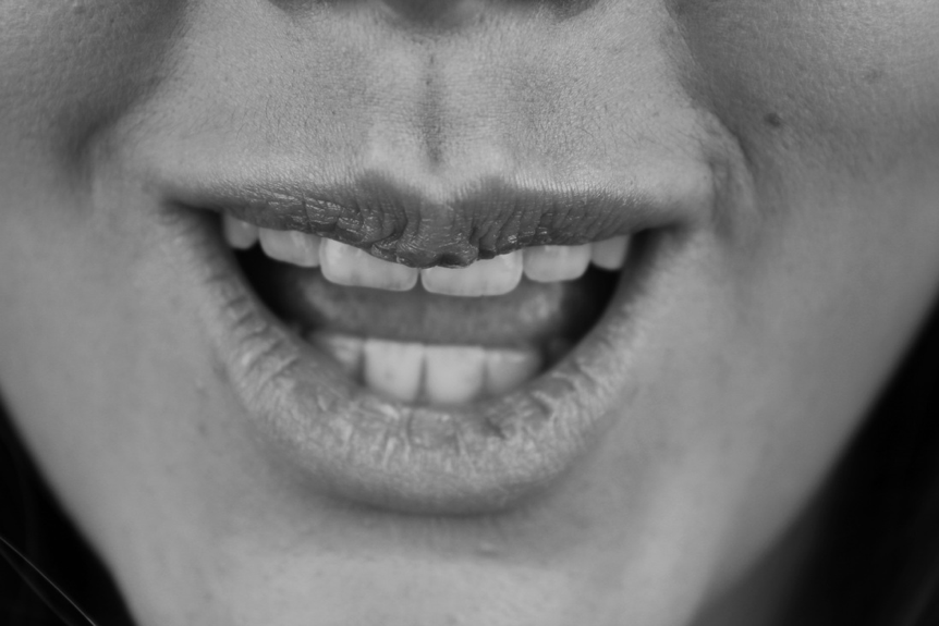
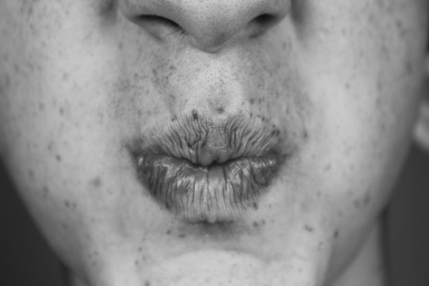
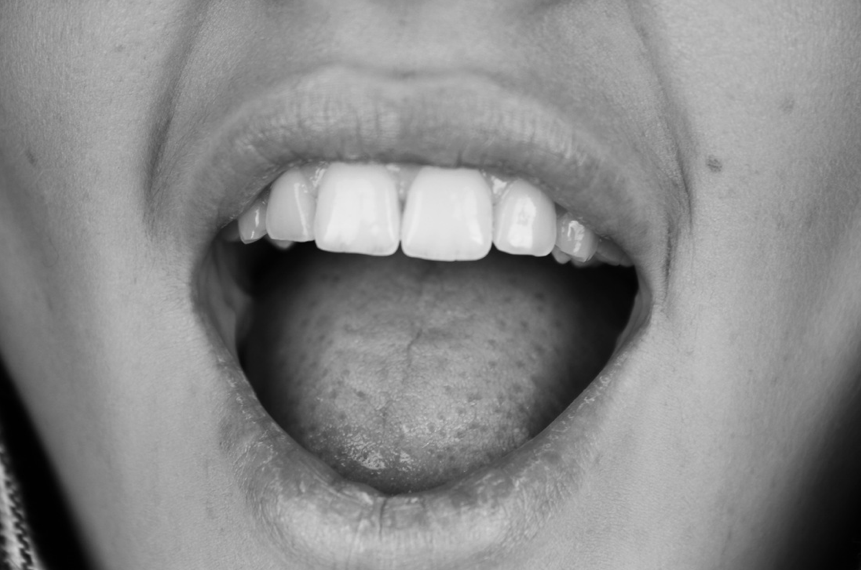
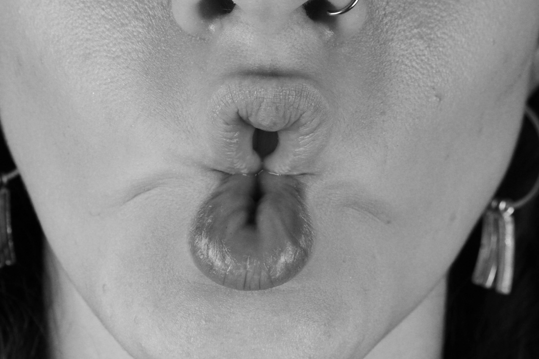
Mouth facial expressions:
Aims: In the below set I wanted to capture facial expression through photographing mouths, I find mouths very interesting when photographed on their own.
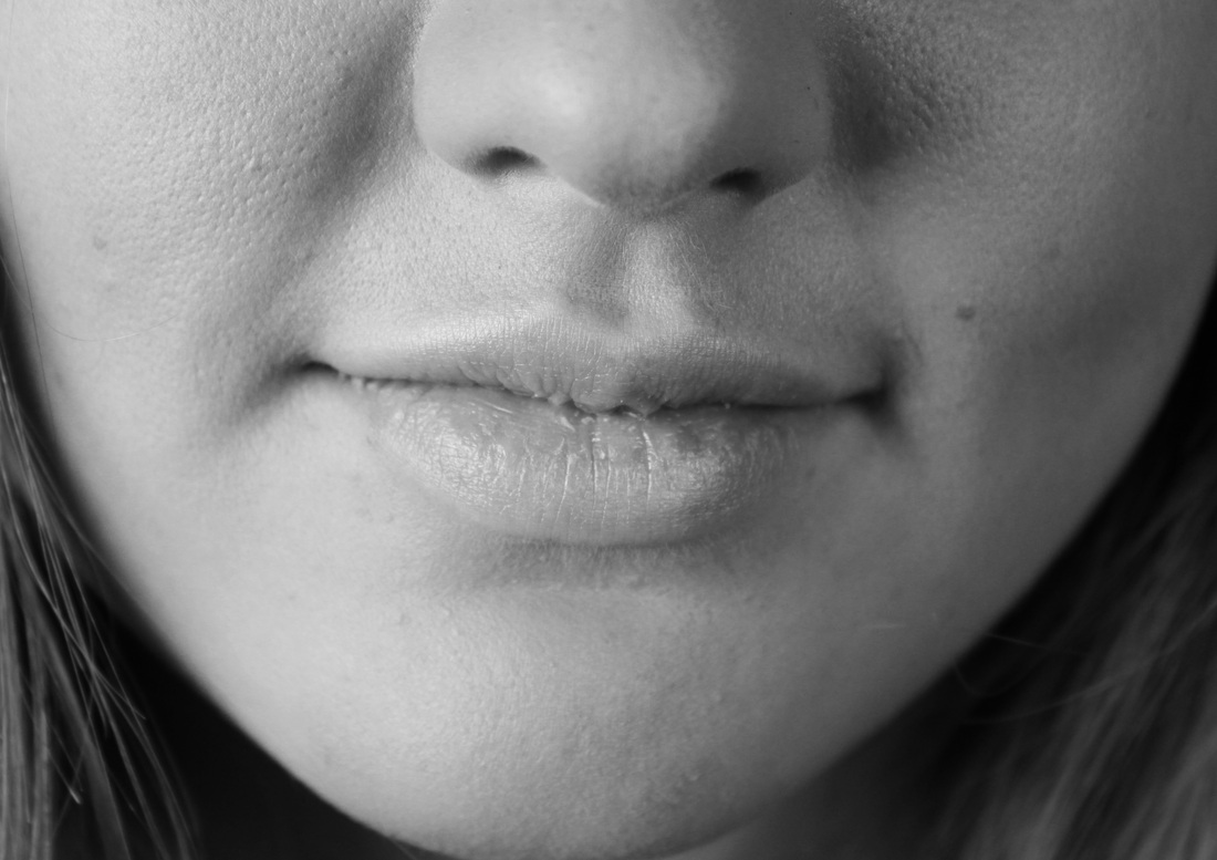
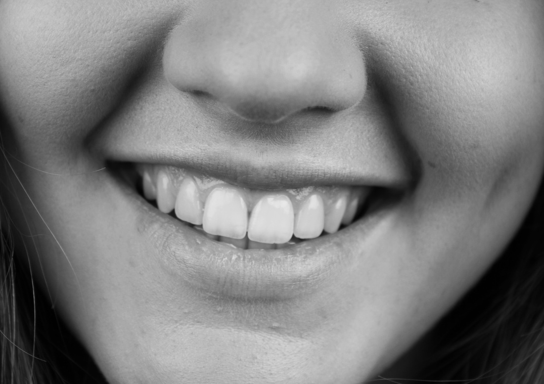
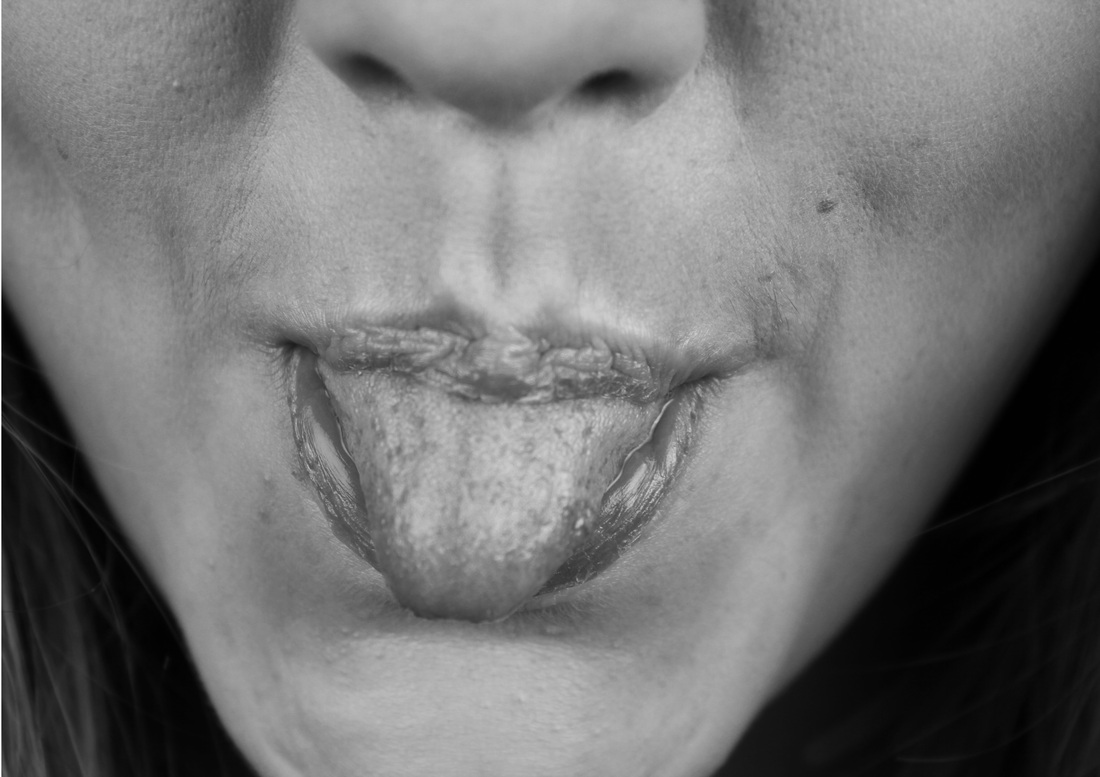

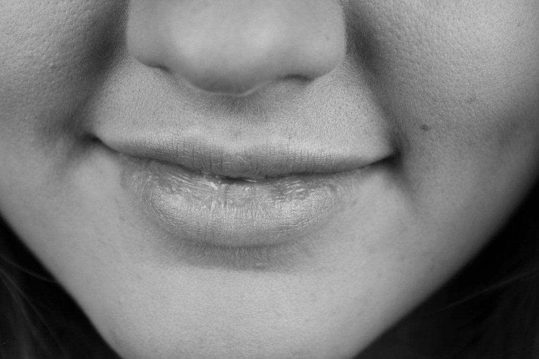
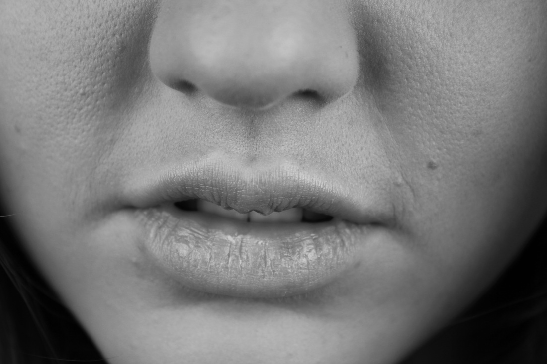
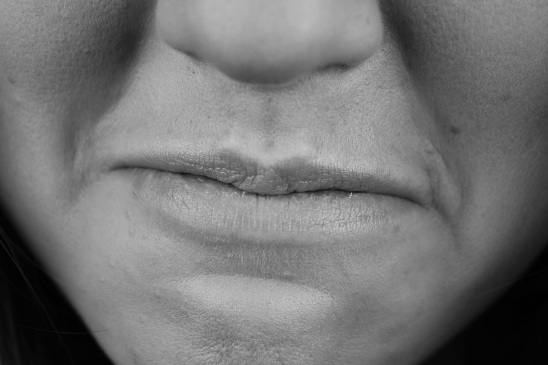
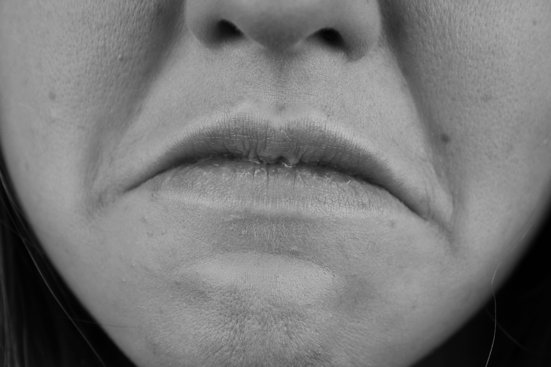
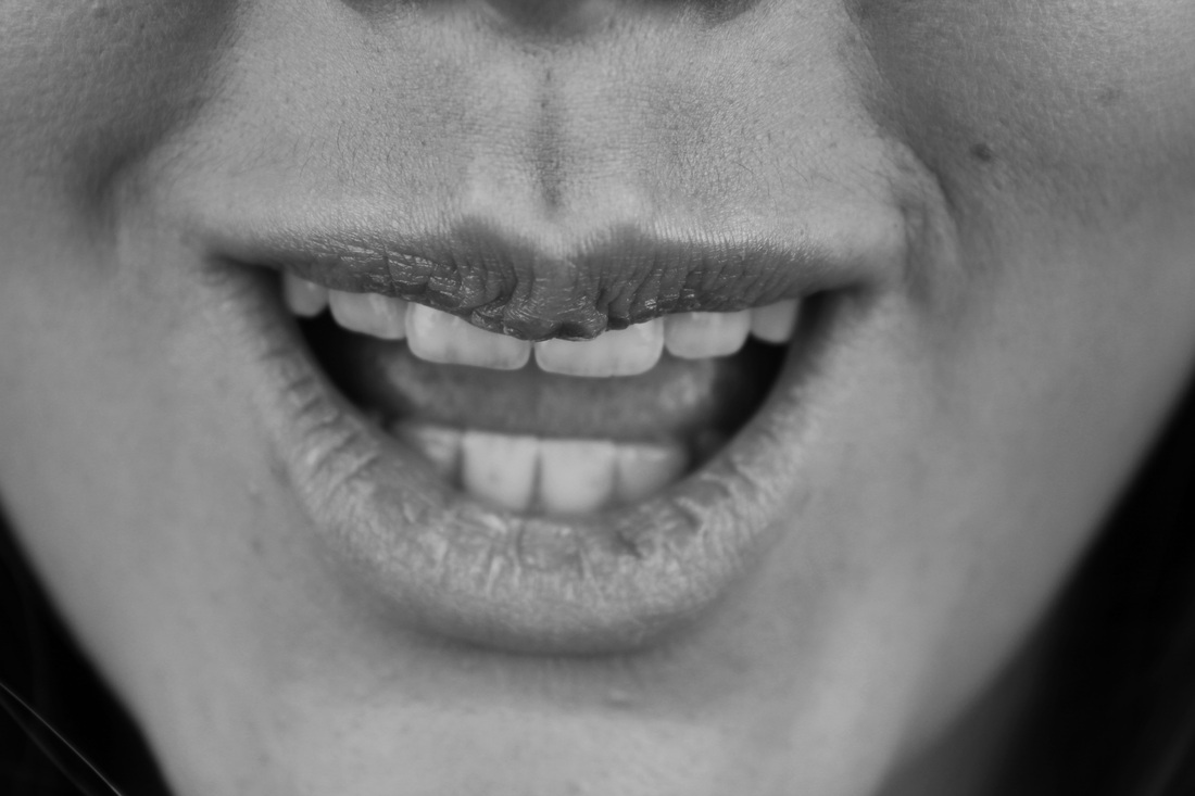


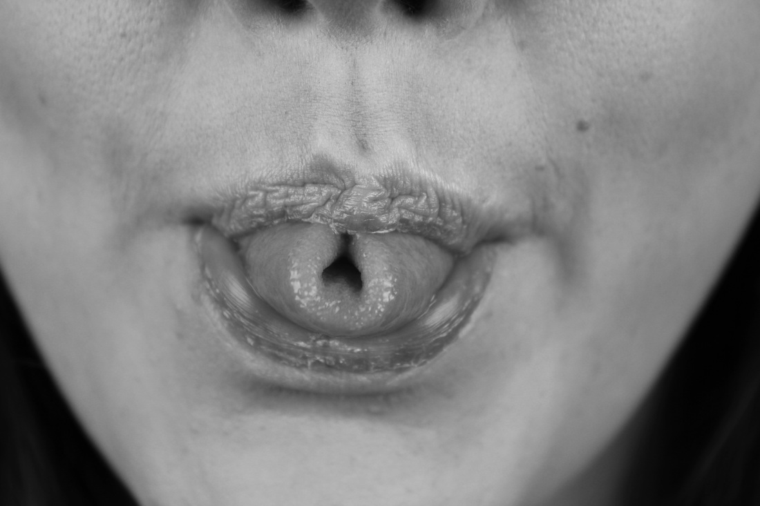

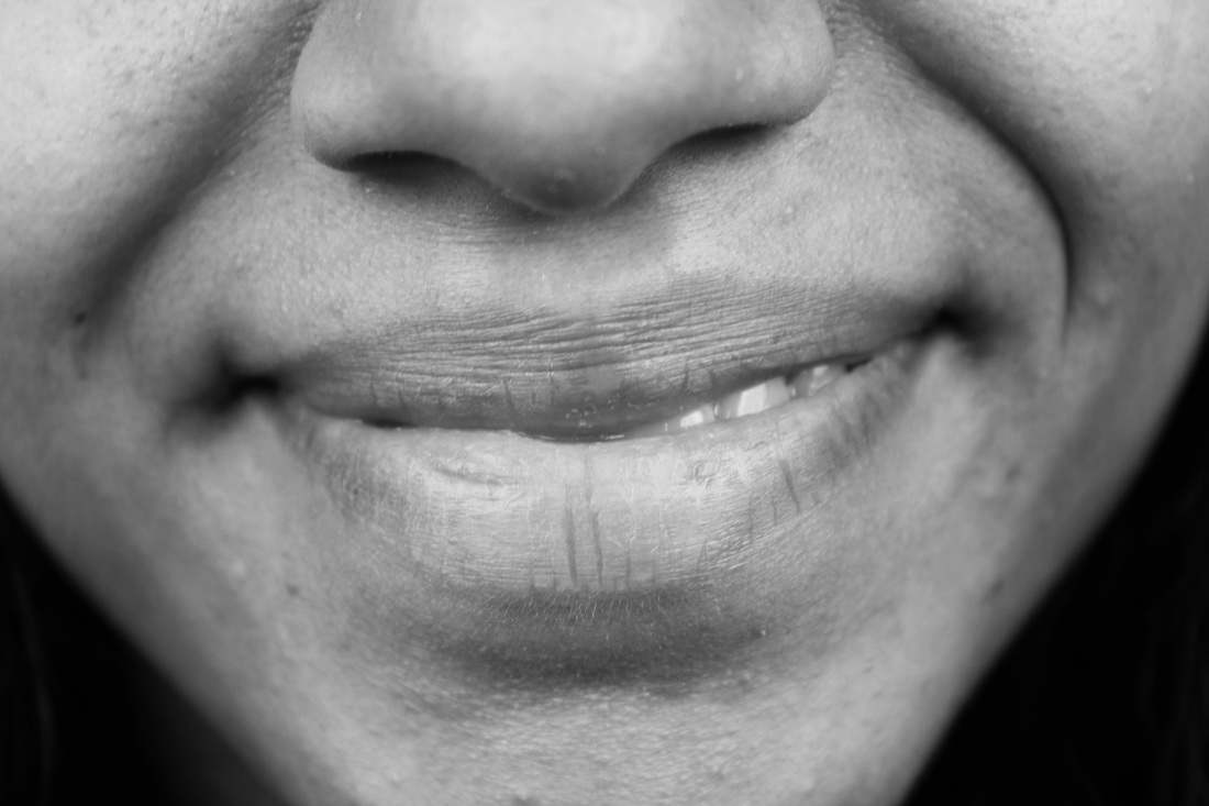
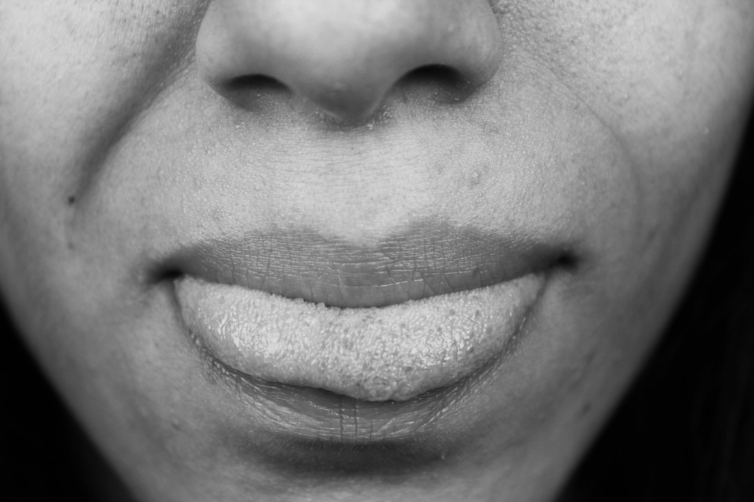
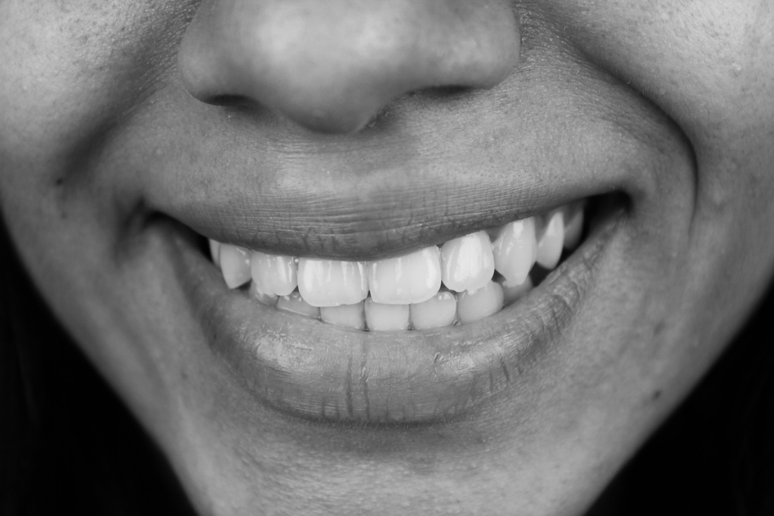
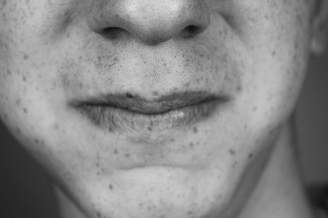
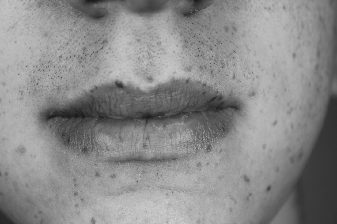
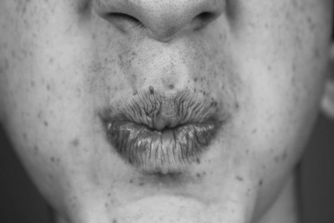
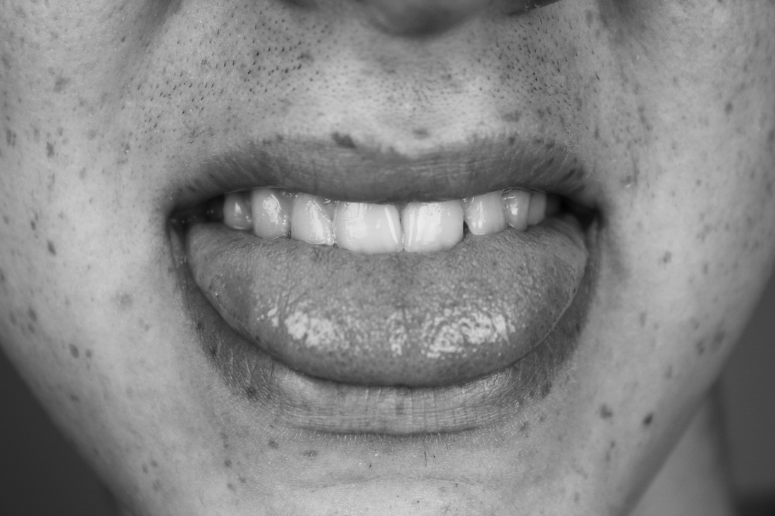
Process: I used the photography studio to capture the above images, I used TV settings on my camera with an iso of 800. I captured the photos from eye-level as I wanted a straight on set of photos that were framed in a similar way.
Critique: I feel the images could be framed better, although they're all pretty much framed in the same way some images include more of the face than others. A few of the images have more nose visible than others, and this looks a little odd.
Further Development: If I was to further develop this set I would use a tripod and make sure that all my images were better framed. I feel the images would look better if the exact same framing was used for each image.
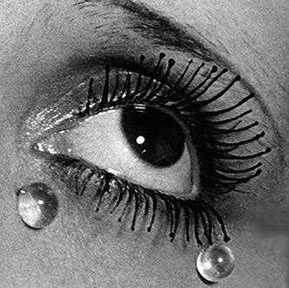
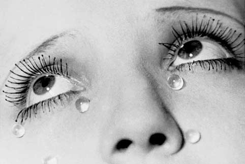
Man Ray - eyes:
Final piece layout ideas:
http://www.flickr.com/photos/fortismereartdepartment/3638083338/
Above is a video link to a previous student's mobile installation, they have taken close up photos of a variety of different eyes then cleverly cut them out to match the shape of actual eyes. The mobile instillation shows 9 eyes hanging up on thin string, the photos have 2 sides to it to ensure there is always an image visible when the mobile blows. I feel the mobile instillation is very effective as it creates something with a strong and unusual visual impact, of eyes floating in the air. Any part of the body looks usual when it's photographed detached from the rest of the body, especially eyes. I thought of having my photos hung up in a similar way to emphasise the detached body effect. The student tried out a couple of different final outcomes, my favourite being the simple 3x3 black and white grid layout.
Above is a video link to a previous student's mobile installation, they have taken close up photos of a variety of different eyes then cleverly cut them out to match the shape of actual eyes. The mobile instillation shows 9 eyes hanging up on thin string, the photos have 2 sides to it to ensure there is always an image visible when the mobile blows. I feel the mobile instillation is very effective as it creates something with a strong and unusual visual impact, of eyes floating in the air. Any part of the body looks usual when it's photographed detached from the rest of the body, especially eyes. I thought of having my photos hung up in a similar way to emphasise the detached body effect. The student tried out a couple of different final outcomes, my favourite being the simple 3x3 black and white grid layout.

Attempt to convert eyes to black and white:
|
Because the rest of my body part images are in black and white I decided to experimentally convert my images to black and white to see what effect it made. I didn't like the images of eyes as much in black and white as I feel the colour adds to the impact of the photos, and brings them to life. Its a shame because I felt that my final outcome would look better if it was in all black and white rather than a combination of black and white and colour. However, I did not want to risk losing the colour of the eyes as I feel it really adds intensity to the photos, they're not at all as effective and 'eye catching' in black and white. I particularly love depth of the colour in the green eyes and wouldn't want to take that away.
|
|
Layout for final outcome:
I decided that I wanted to use photos from 3 of my sets. I combined two sets of black and white close ups of skin and mouths, with a set of coloured close up of eyes. Usually I wouldn't try and combine a variety of coloured images with black and white images but I feel the combination of colour in the eyes works well with the black and white of the skin and faces. Seeing as I tried making the eyes black and white, and felt they lost their visual impact I decided against having all my images black and white. I positioned the coloured images in the middle to break up the black and white. I feel it works well. Ideally I would have liked to have the images of eyes at the top, the mouths below and the close up of skin at the bottom as it would mirror the order of where each part of the body fits from top to bottom. I had originally decided to have my images hanging as a mobile installation, however, I feel that with the combination of colour and black and white this may not look as effective. Instead, I decided to simply mount my images.


Actual outcome:
I decided to mount my images in a 4x4 mount that I made myself. When it came down to it I tried out mixing the coloured photos in with the black and white opposed to the black and white - colour - black and white order shown above, and I much preferred the effect.

Tony Oursler research:
Tony Oursler is an American Multimedia and instillation artist. Oursler animates non-living objects with the use of projectors. Classified, along with Bill Viola, Bruce Nauman, Gary Hill and the like artists, among the most outstanding video creators, he has employed this technique in a totally different manner. In his works, a motion picture filmed with a video-camera is projected with a projector functioning on a laterna-magica basis as in the 19th-century theatre. The viewer does not stare at a rectangular screen, rather, s/he can see before him or her enlivened flowers, giant eye-balls, or puppets - talking, swearing at one another, quarrelling, and using coarse expressions. I thought I would try out a video installation in response to Oursler's work, as I feel moving video of individual body parts work much better as an instillation in comparison to still images. There's something very strange about Oursler's work, I like the fact that it's unusual to look at and makes the viewer look twice to fully understand the effect of what Oursler has created.
Video instillation test 1:
Aims: The below video instillation is an experiment where I have composed 3 different parts of the body, doing different things. I have tried to capture different emotions and merge them together in one instillation that is visually contrasting.
Process: I took three separate videos of different parts of the body including the mouth, eyes and hands; to document body language and expression. I took the videos very close up so that only one part of the body was in the frame at each time. I then edited the three videos using Premier so that I could have the three videos playing alongside each other at the same time.
Critique: I am fairly pleased with the outcome as I feel it successfully conveys the different emotions and body language, which creates a nice contrast. However, I am disappointed in the lighting which effects the quality of the video. I also feel the framing could be a lot better if I had sized the photos to all the same size.
Further Development: If I was to further develop this project I would ensure the quality of my videos were better and improve the editing process by correcting the framing and sizing of the videos. I was also add sound to the video as I feel it's very boring as a silent video and by adding sound such as body movements like a foot tapping on the floor could really improve the quality of the video.
